
BLOG ARCHIVE
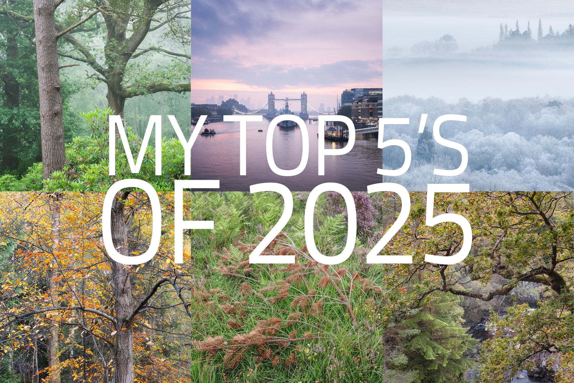
My Top 5’s of 2025
A 2025 photographic retrospective, highlighting my favourite cityscape, woodland, and landscape photos, reflecting on the year’s creative journey and looking ahead to 2026.
It’s the end of another year, and in keeping with a tradition I’ve mostly stuck to over the last few years, I wanted to take a moment to reflect on the year I’ve had and share a small selection of my favourite photos. It’s an opportunity to look back, review and curate the work with fresh eyes, now that some time has passed since I took it, and consider what still resonates with me — whether because of the experience, the conditions, or the subject.
So, how did 2025 go for me photographically?
I felt a real shift in my photographic motivations during 2025. Subjects and locations that previously pushed me to head out with my camera no longer do — the wide vista, for instance. I did very little in the way of what some might call traditional landscape photography.
I think this has more to do with my lack of motivation for the vistas close to where I live, rather than landscapes in general. I still enjoyed landscape photography when I travelled to North Wales a couple of times during the year. Living in the rather flat and geographically uneventful South East of England means there’s little real drama — no mountains, no waterfalls — and any grand vista worth photographing has already been done a thousand times over.
I’ve come to realise that I need a place with enough variability and interest that, even if it’s familiar, it can still offer a sense of novelty. That sense of novelty feeds my creativity and motivates me to make something that feels, even if only slightly, different from what I’ve already seen. It doesn’t feel like a loss of interest so much as a narrowing of focus.
With that said, while the lack of motivation for those local vistas was very real, the assumed cause might seem slightly contradicted by the fact that I’ve still really enjoyed exploring the familiar and well-photographed London cityscape. So if you’re curious as to why my motivation hasn’t waned when it comes to photographing London, read on — I’ll try to explain that in the next section.
What was my key photographic takeaway for 2025?
If I had one word to describe 2025 photographically, it would be PROJECTS. Throughout the year, I’ve continued with existing projects and started new ones, and it’s these that have motivated me the most to grab my camera and head out. I have several on the go — some I’ve shared already, such as my city and streetscape work in London — but I also have a few others, mostly woodland-based, that I’ve not yet detailed, as I’m still figuring them out.
Whatever the subject, these projects have provided me with greater focus and intent, a deeper connection to the place or subject, and — with any luck — take me on a journey to refine and mature my photographic voice. Perhaps a topic to explore in more depth in its own article one day.
Who knows — with the added motivation and focus that projects have given me this year, this might be the spark I need to one day find the fire in my belly to photograph my local grand landscape once again.
My top 5s of 2025
From the mountains of North Wales, the high-rise cityscapes of London, to the quiet intimacy of my local woodland, it might seem that I’ve spread myself quite thin with the time I have to take photos. But I love photographing all of these places. For this article, I’ve decided to organise the images by subject or location and share a few of my top five photos from each. Each series tells its own quiet story of the year, capturing moments of mood, atmosphere, and the things that still resonate with me.
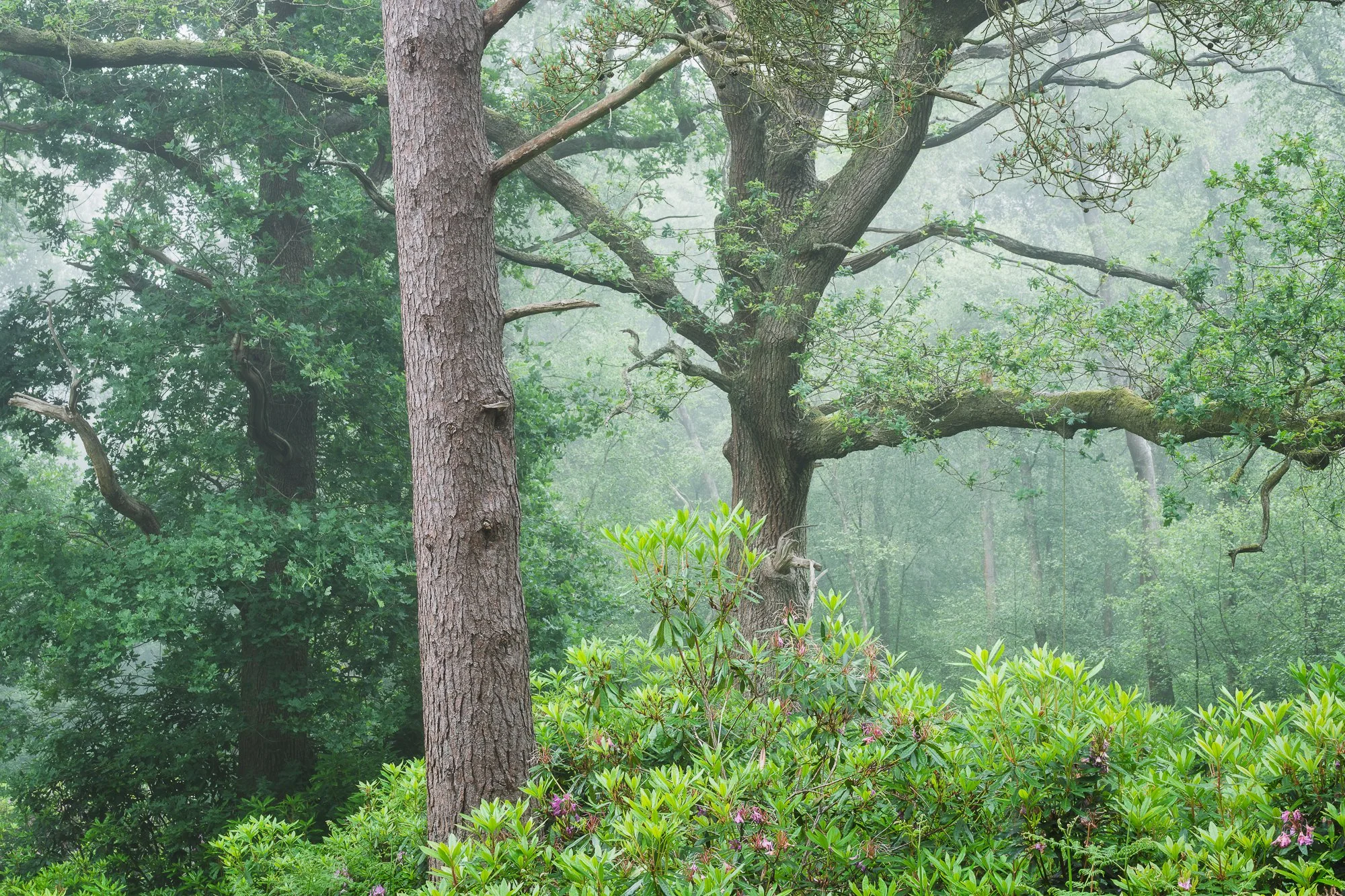
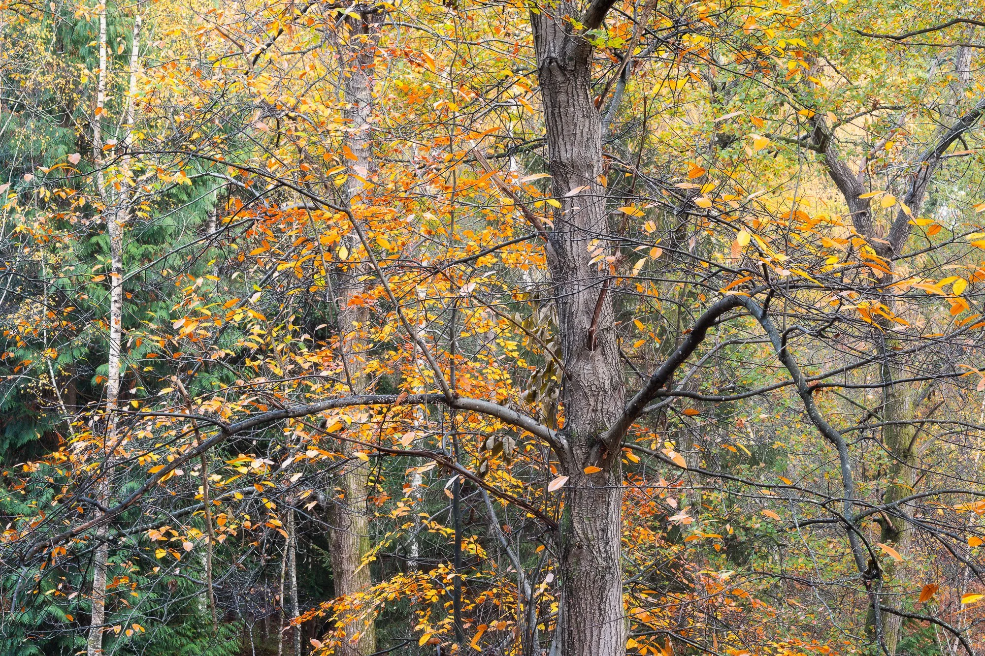
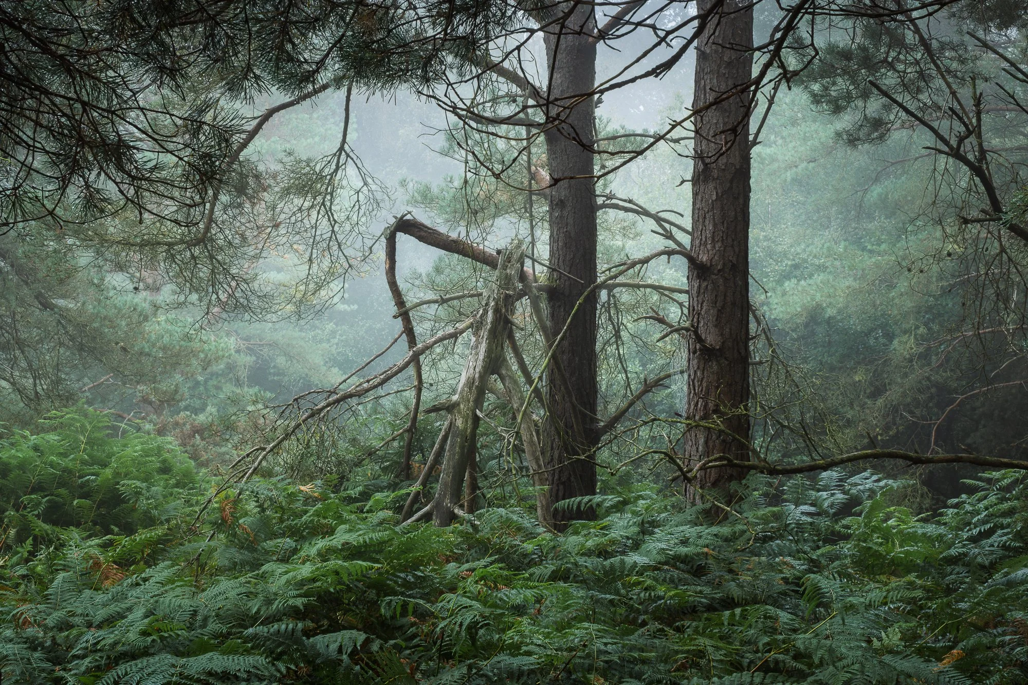
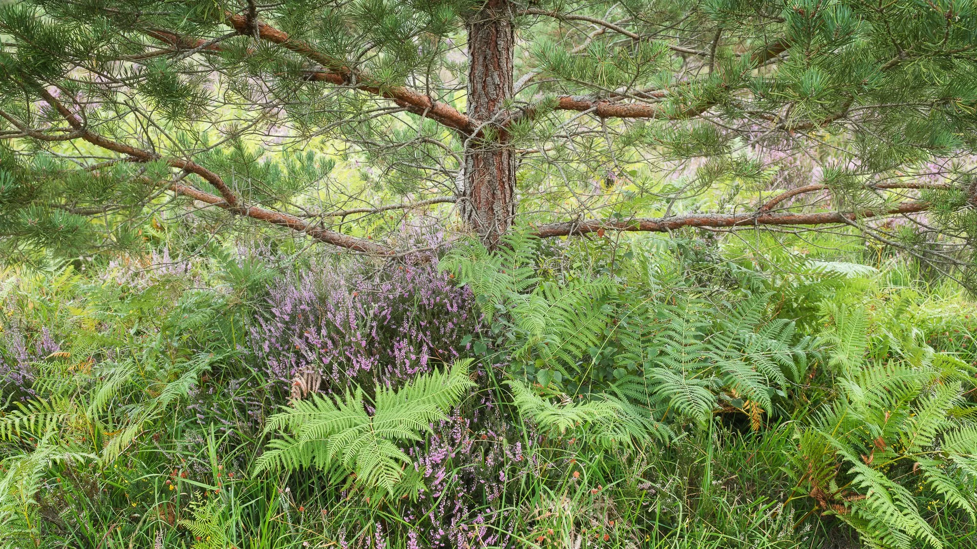
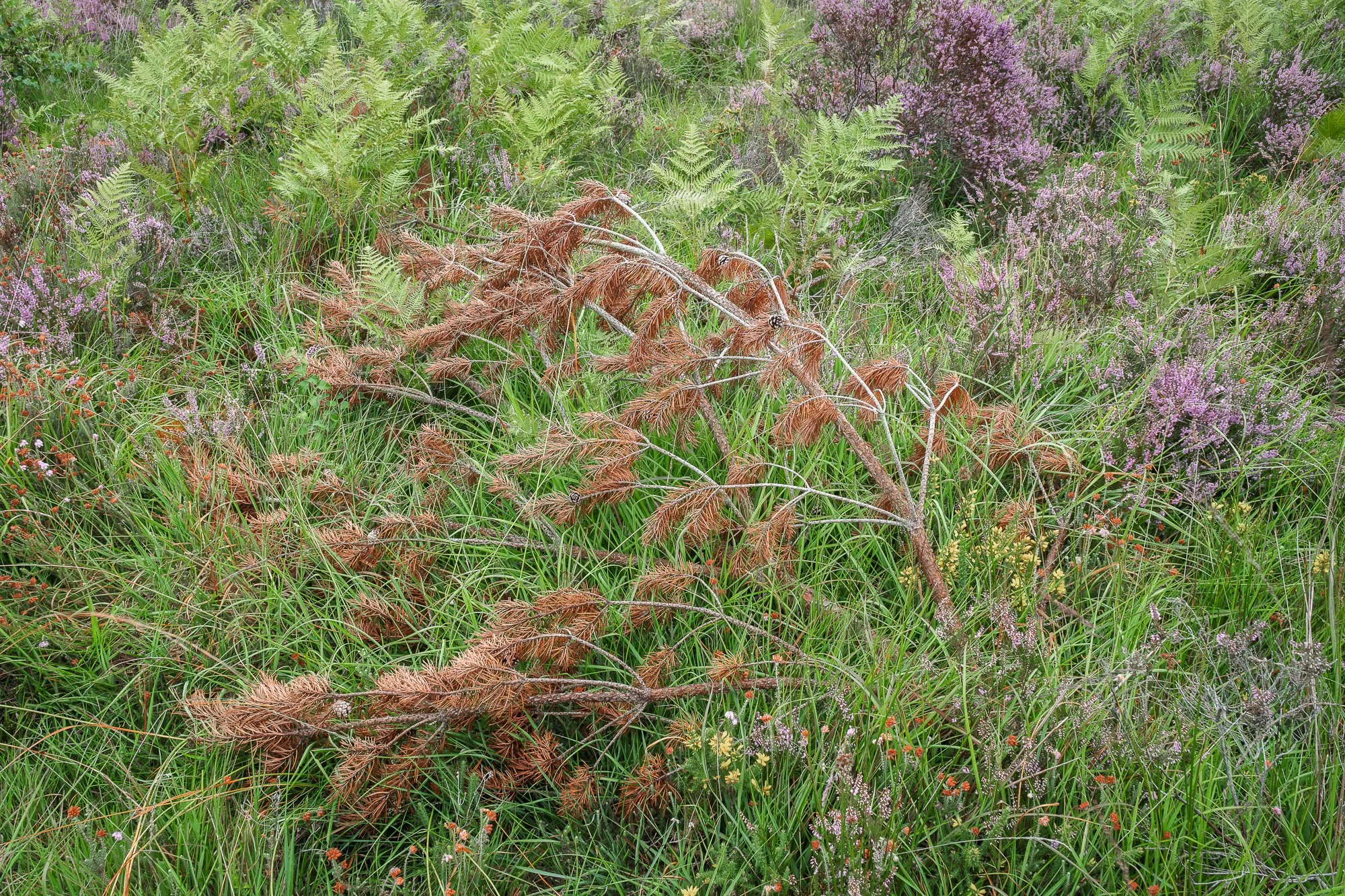
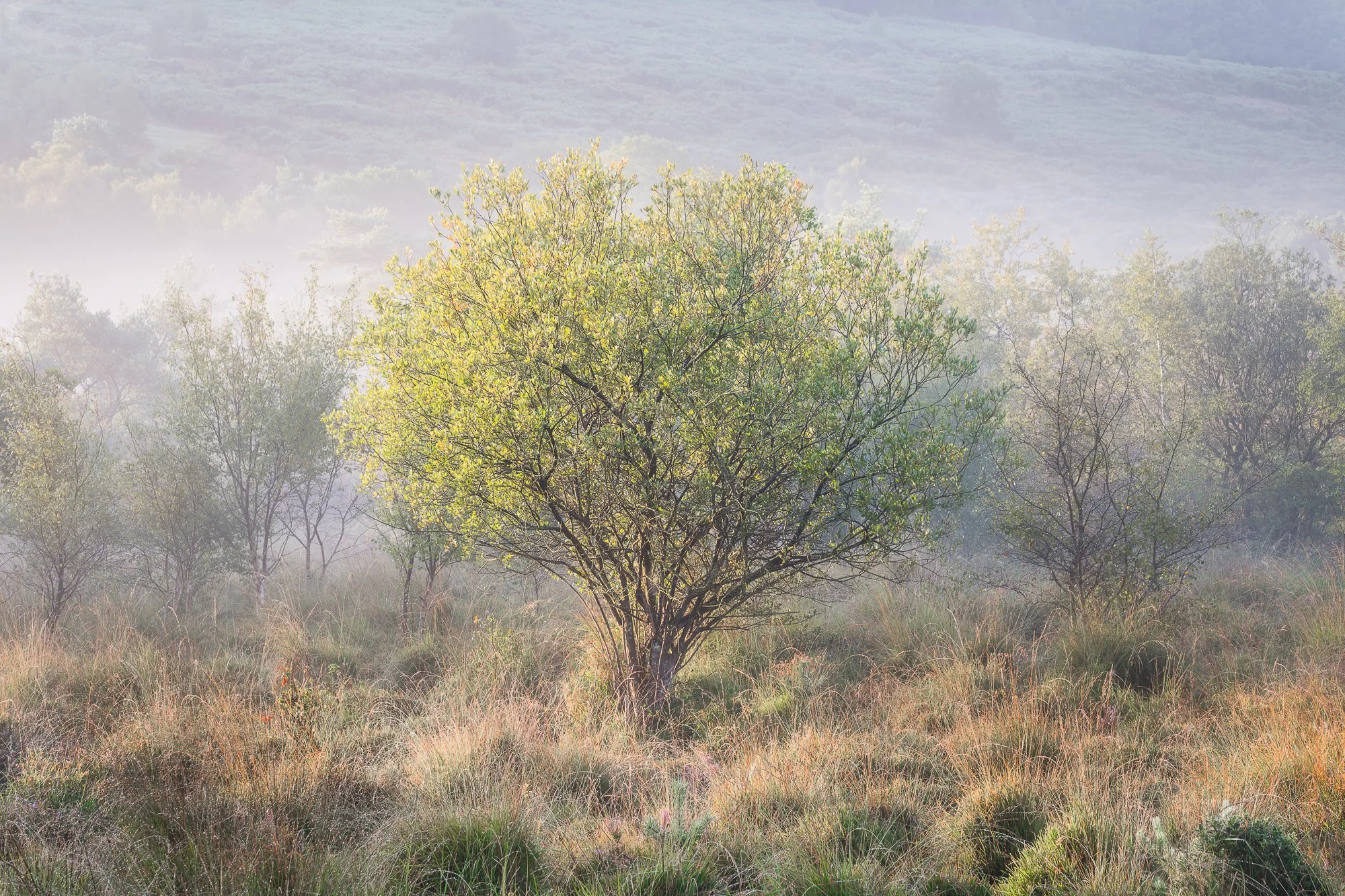
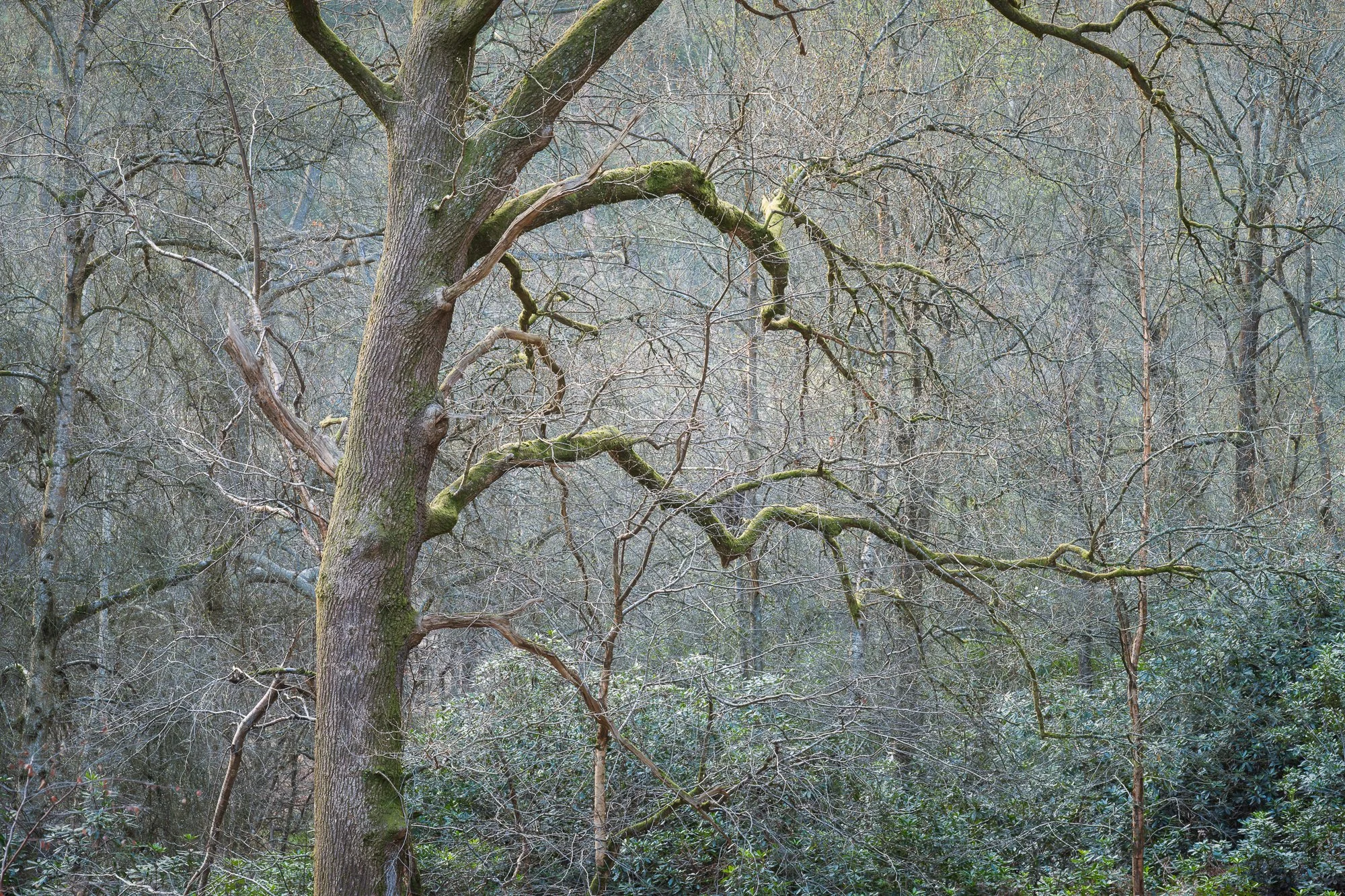
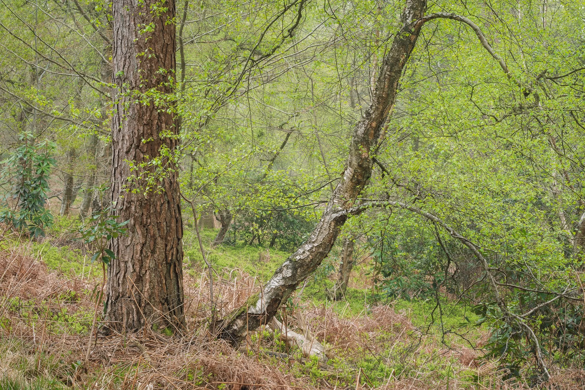
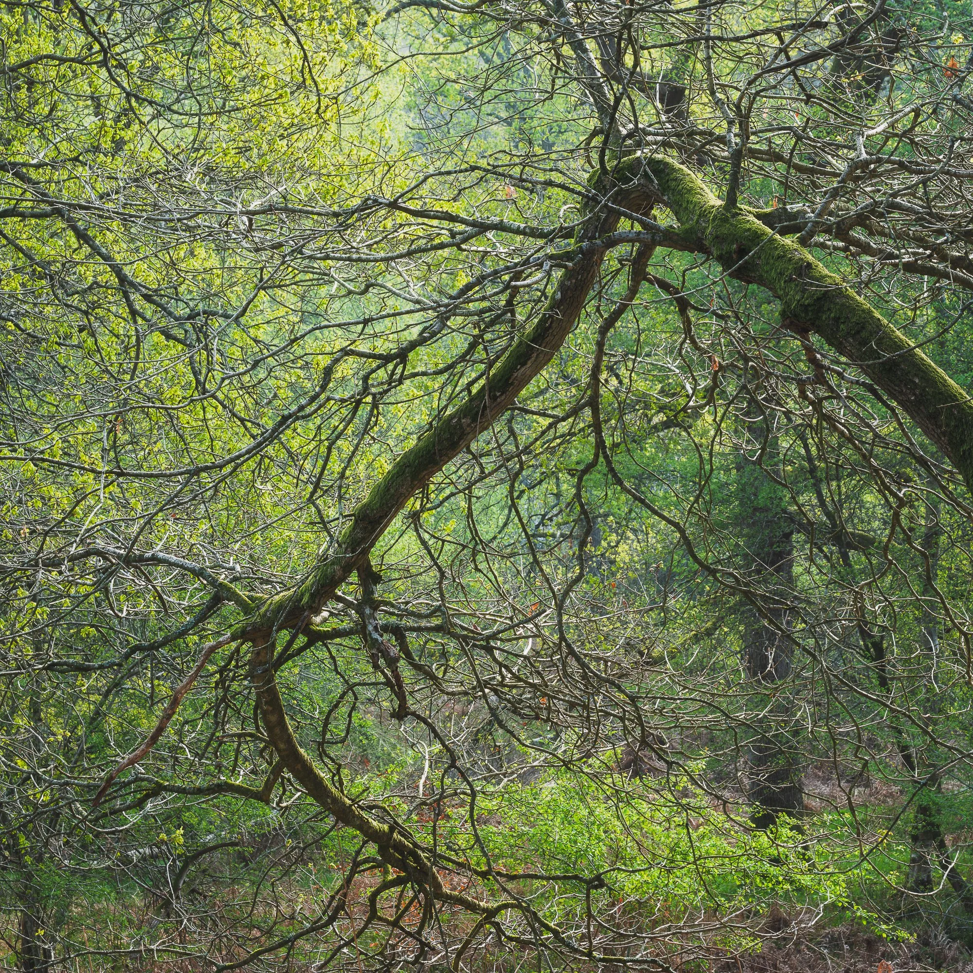
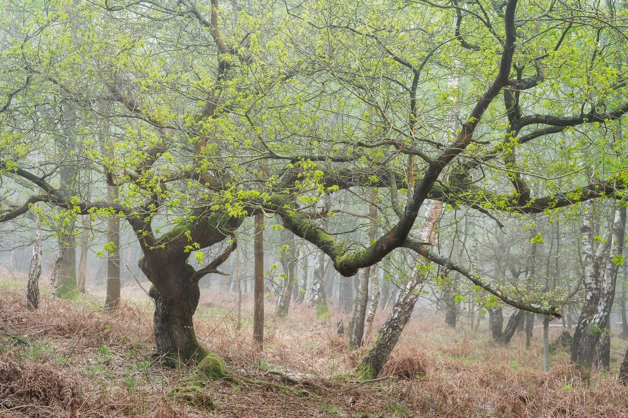
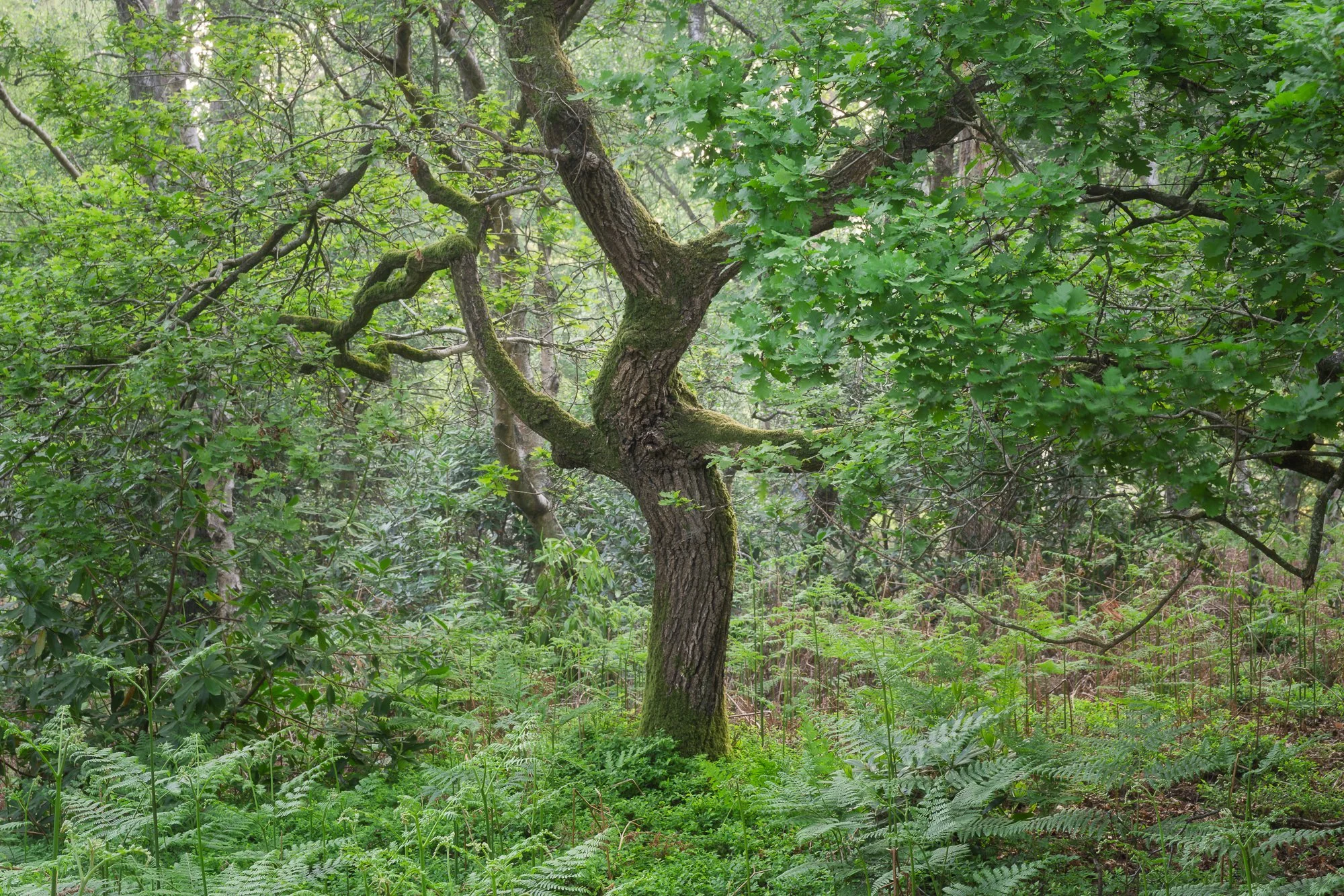
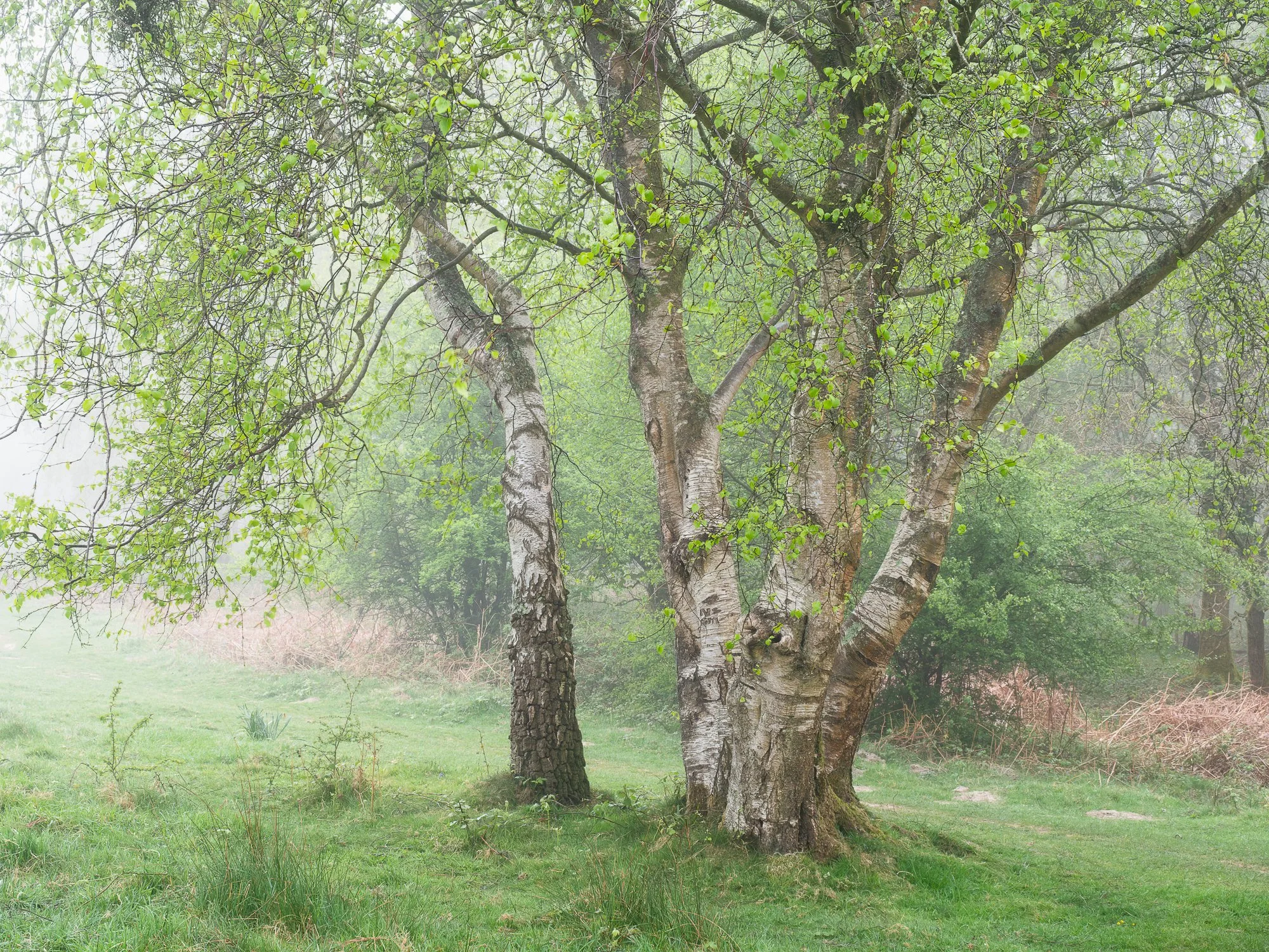
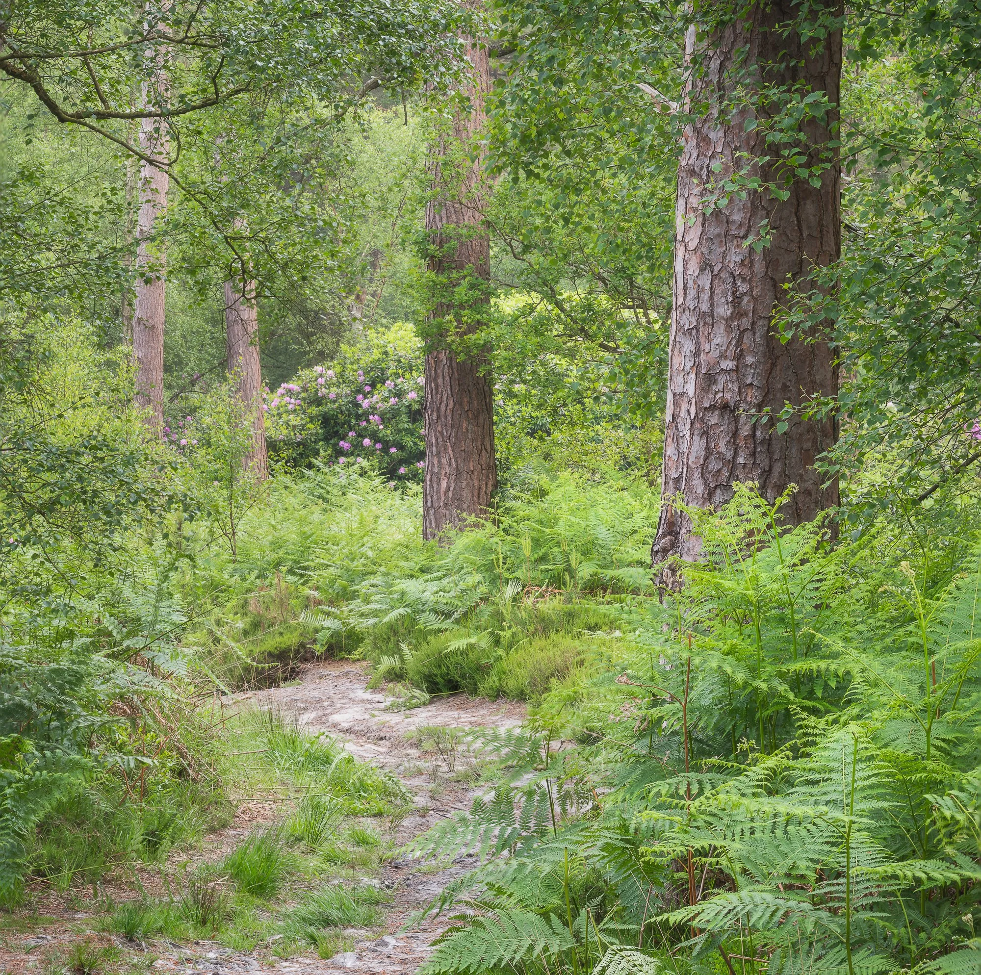
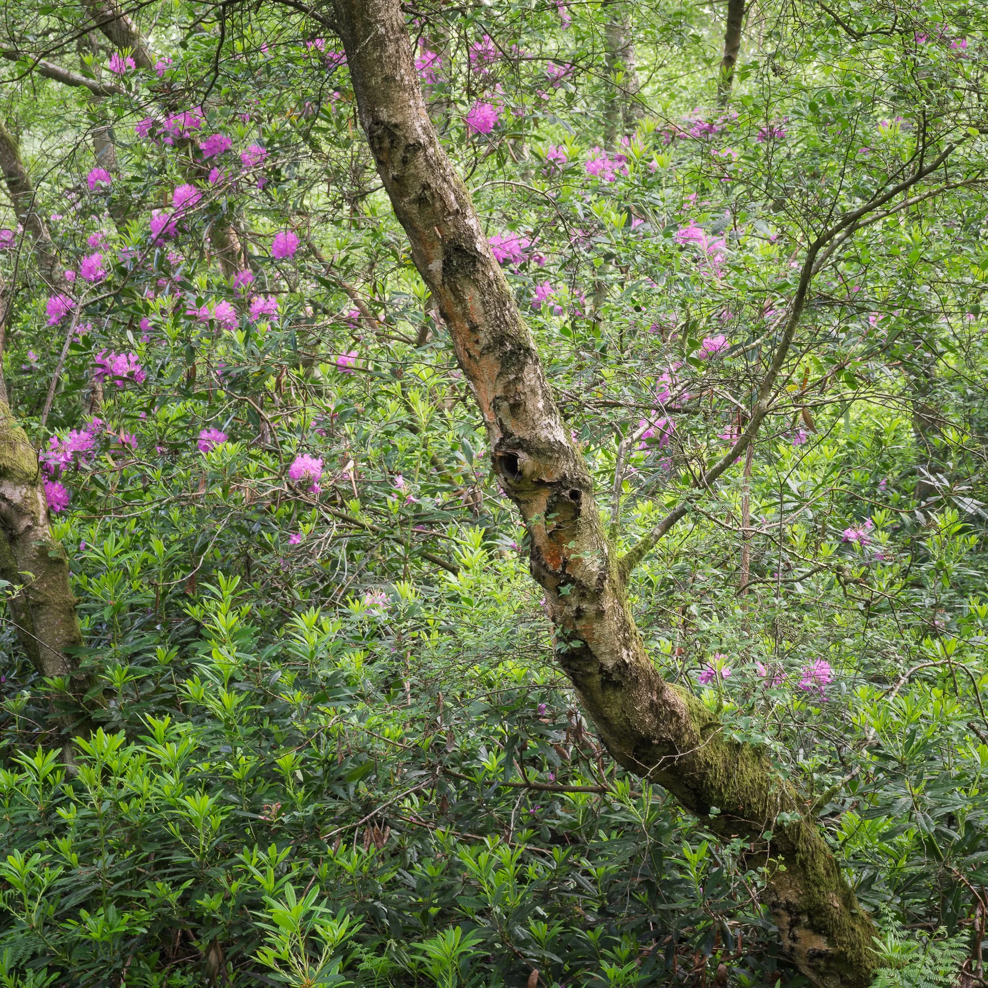
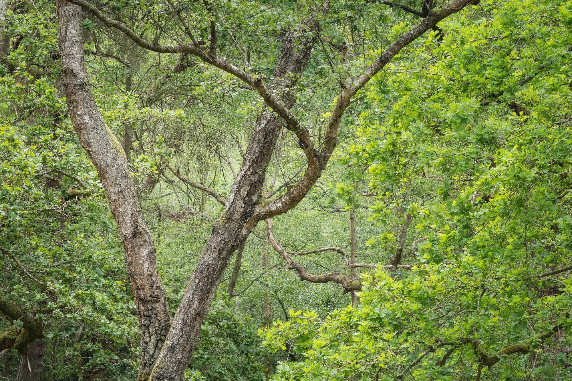
My top 5 local woodland photos of 2025
I’ve spoken before about the need to find places where I can explore the landscape and make unique photographs. The local landscapes near me haven’t quite fulfilled that need lately, but one place where I can still create new work and experiment with light, colour, and composition is the woodland. It’s a constantly changing environment, and although I have returned to the same forest for most of 2025, I’ve still been able to produce fresh and unique work. The five photos below are some of the ones that stood out to me as I reviewed my woodland photography from the year. Each visit offered a slightly different story, a new way of seeing the familiar.
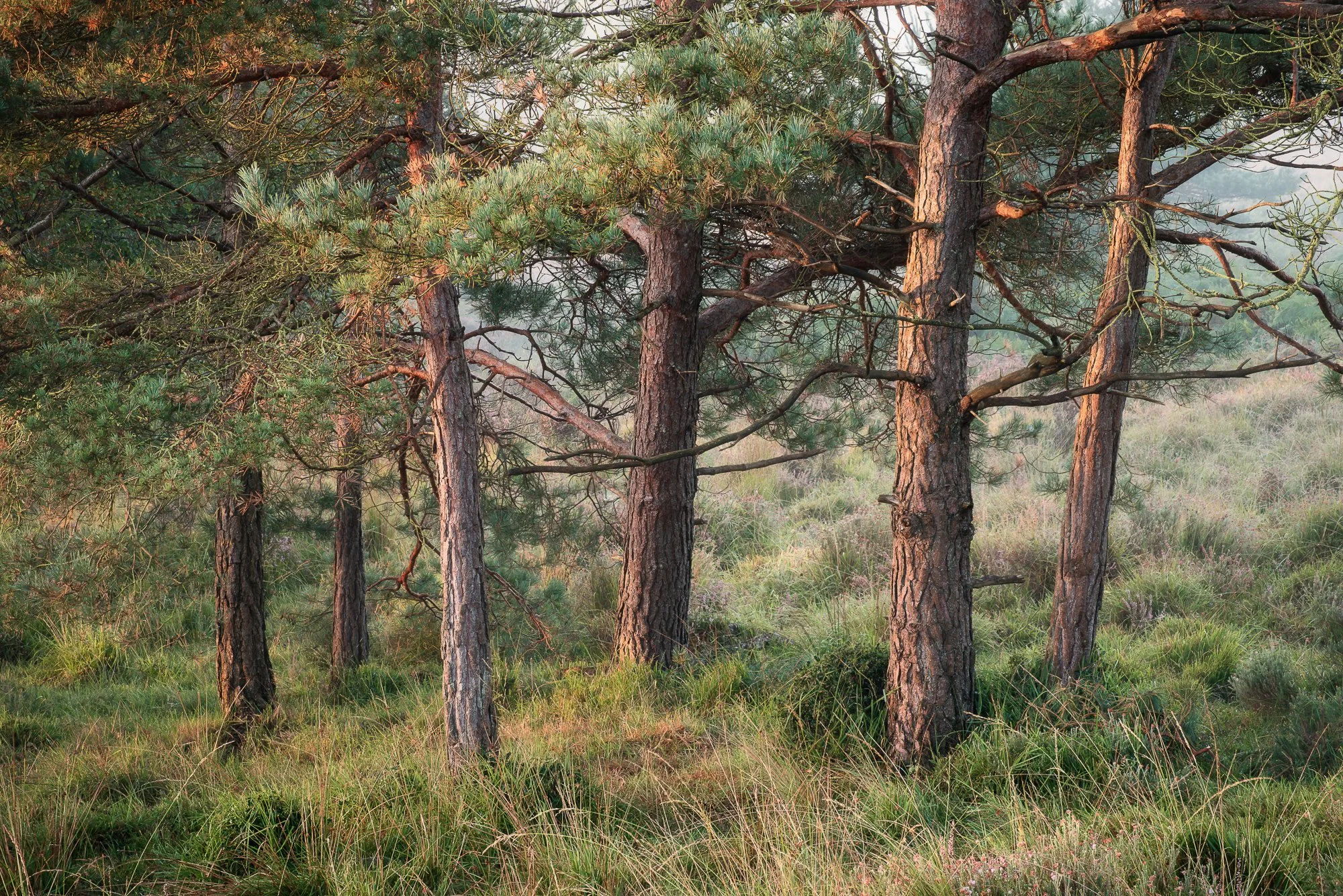

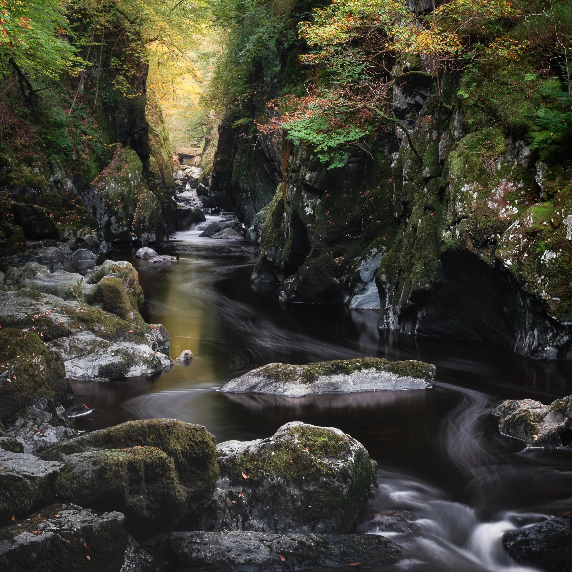
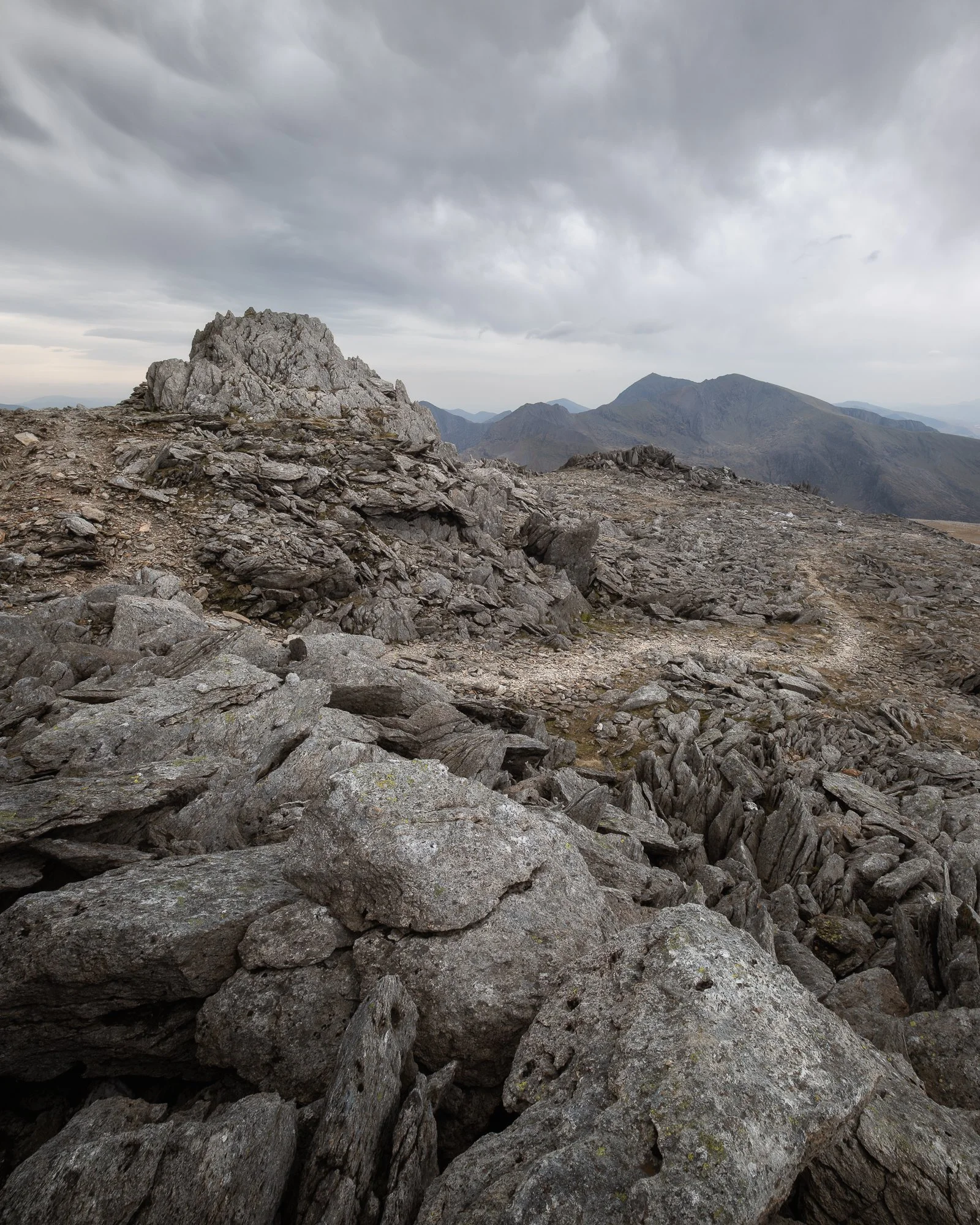
My top 5 photos taken in North Wales in 2025
I usually make one or two trips to North Wales each year, and with its waterfalls, wooded valleys, and epic mountains, there’s always something to capture. I visited in both March and October 2025, and here are five of my favourite photos from those trips.

If you want to see more of the work I made during these and other trips to Snowdonia, then check out my blog for more on-location trip reports.
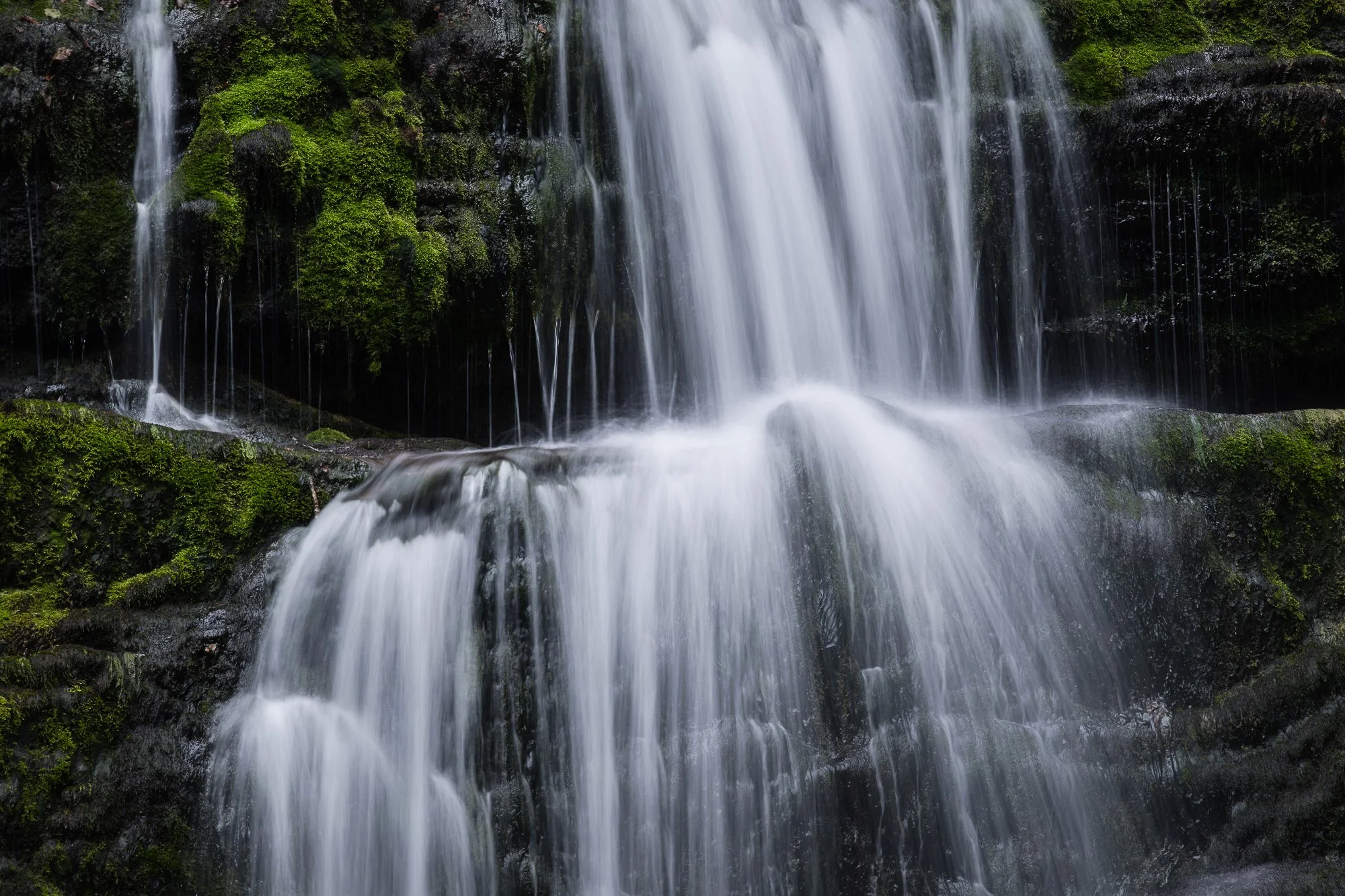
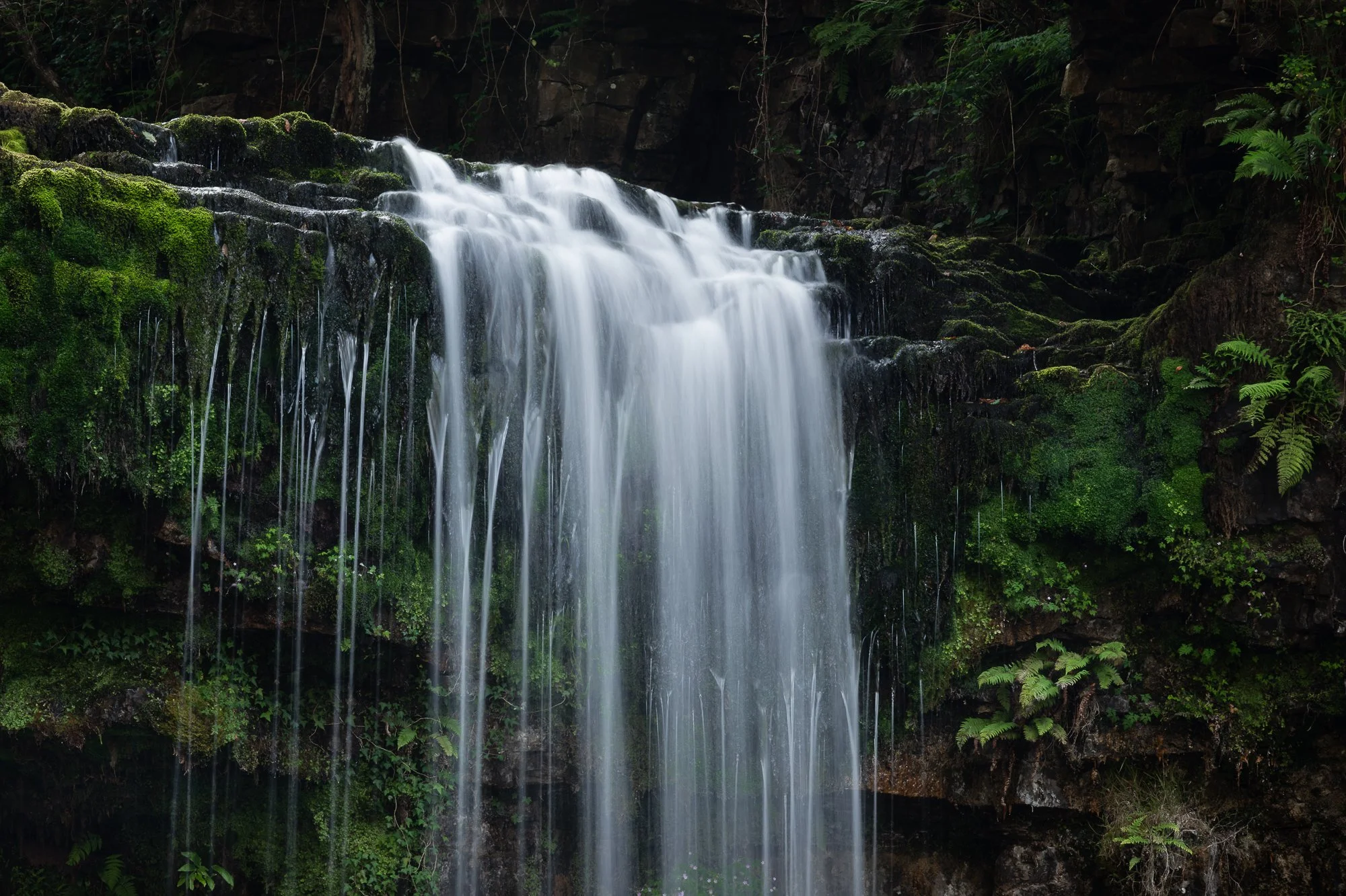
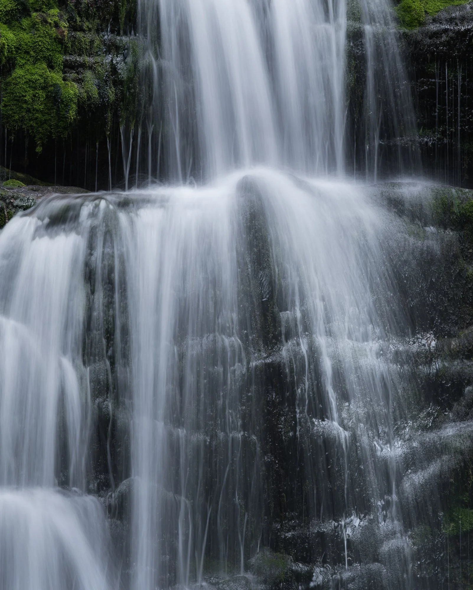
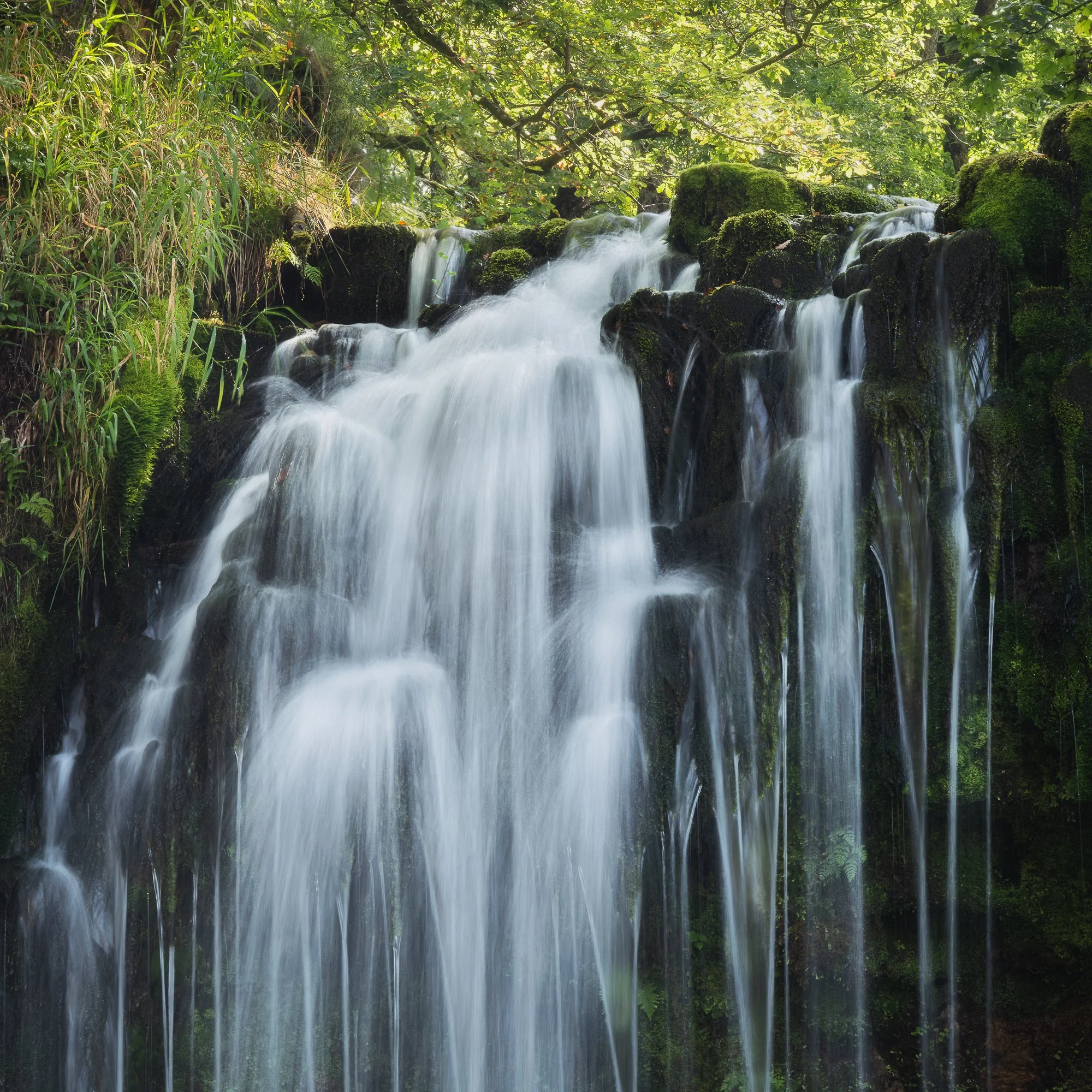
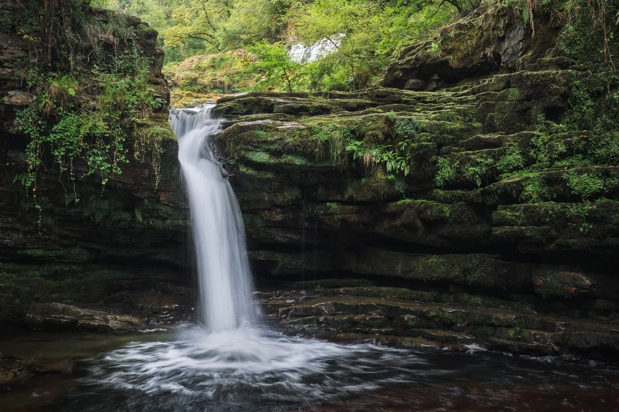
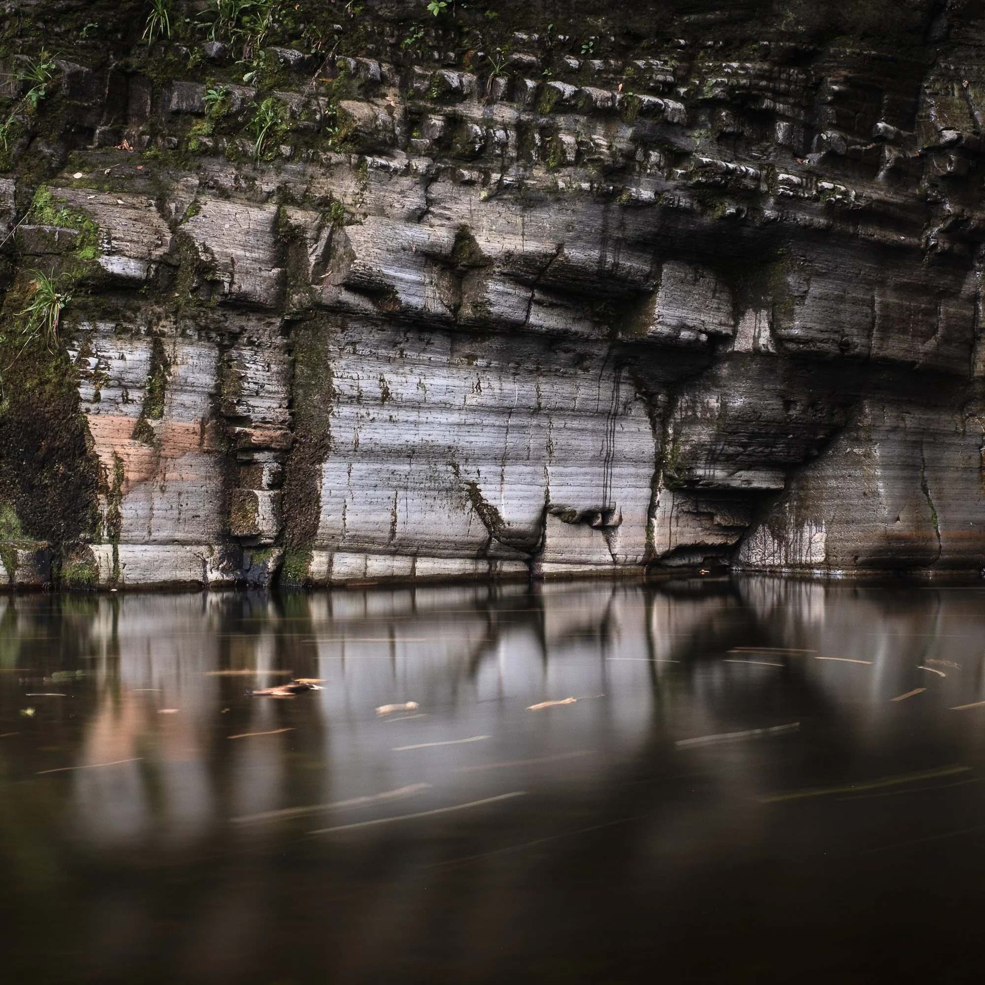
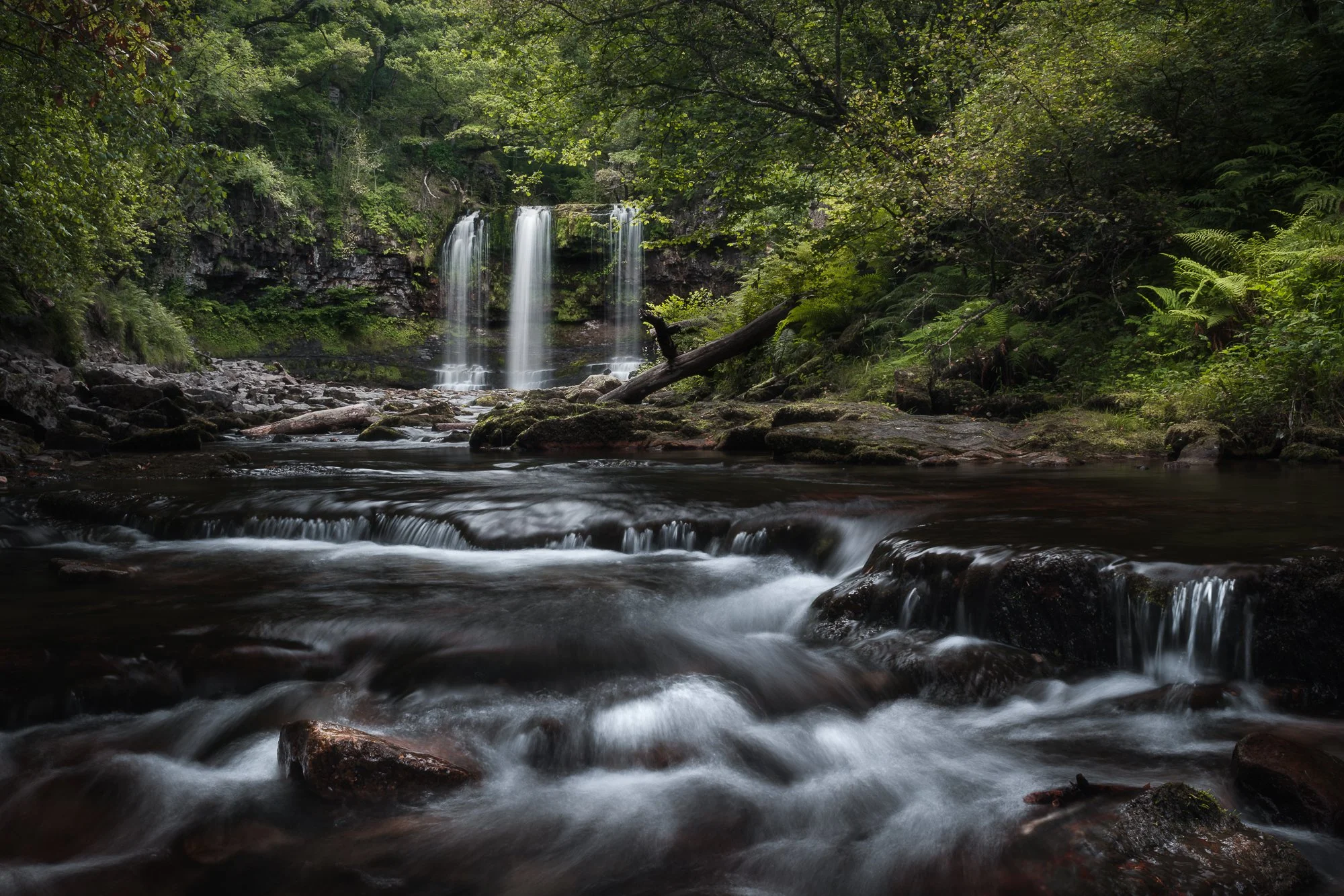
My top 5 waterfall photos of 2025
Like my regular trips to North Wales, I also make it a point to visit the Brecon Beacons once a year or so, hiking and photographing along the waterfall trails. This year I went in late summer, when the leaves were still green but the water flow was modest. I made the most of it and captured a few images I’m happy with, some of which I’ve shared below.
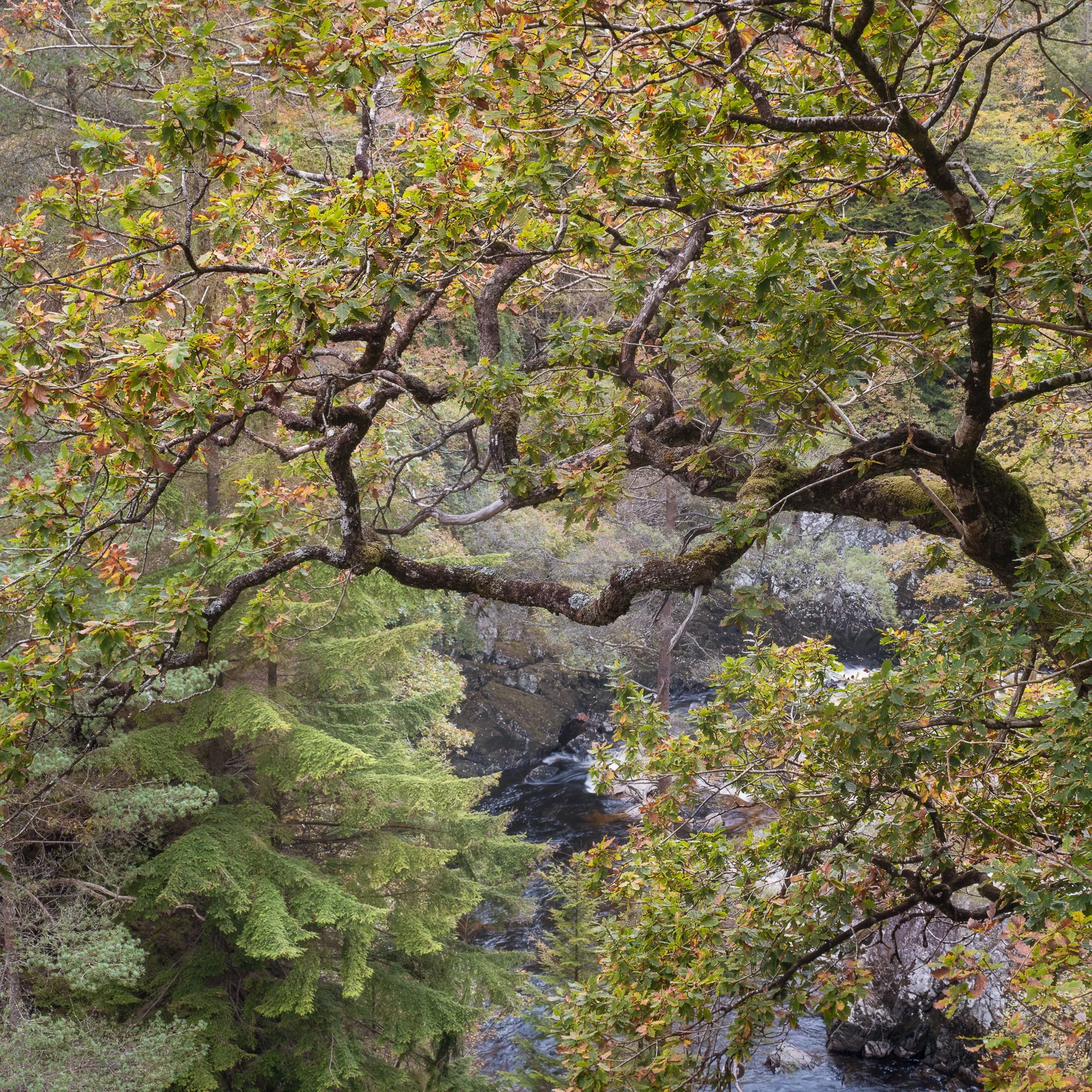
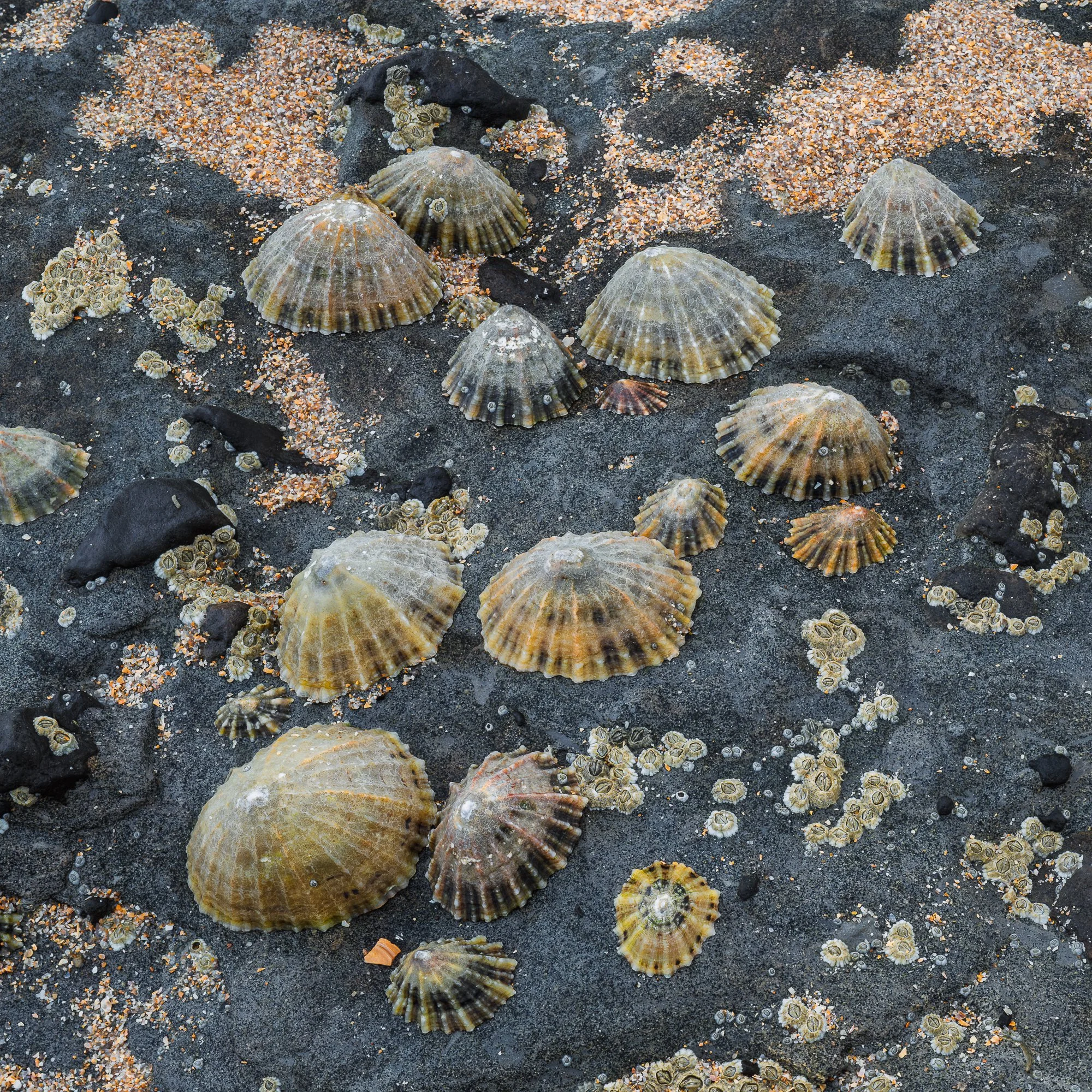
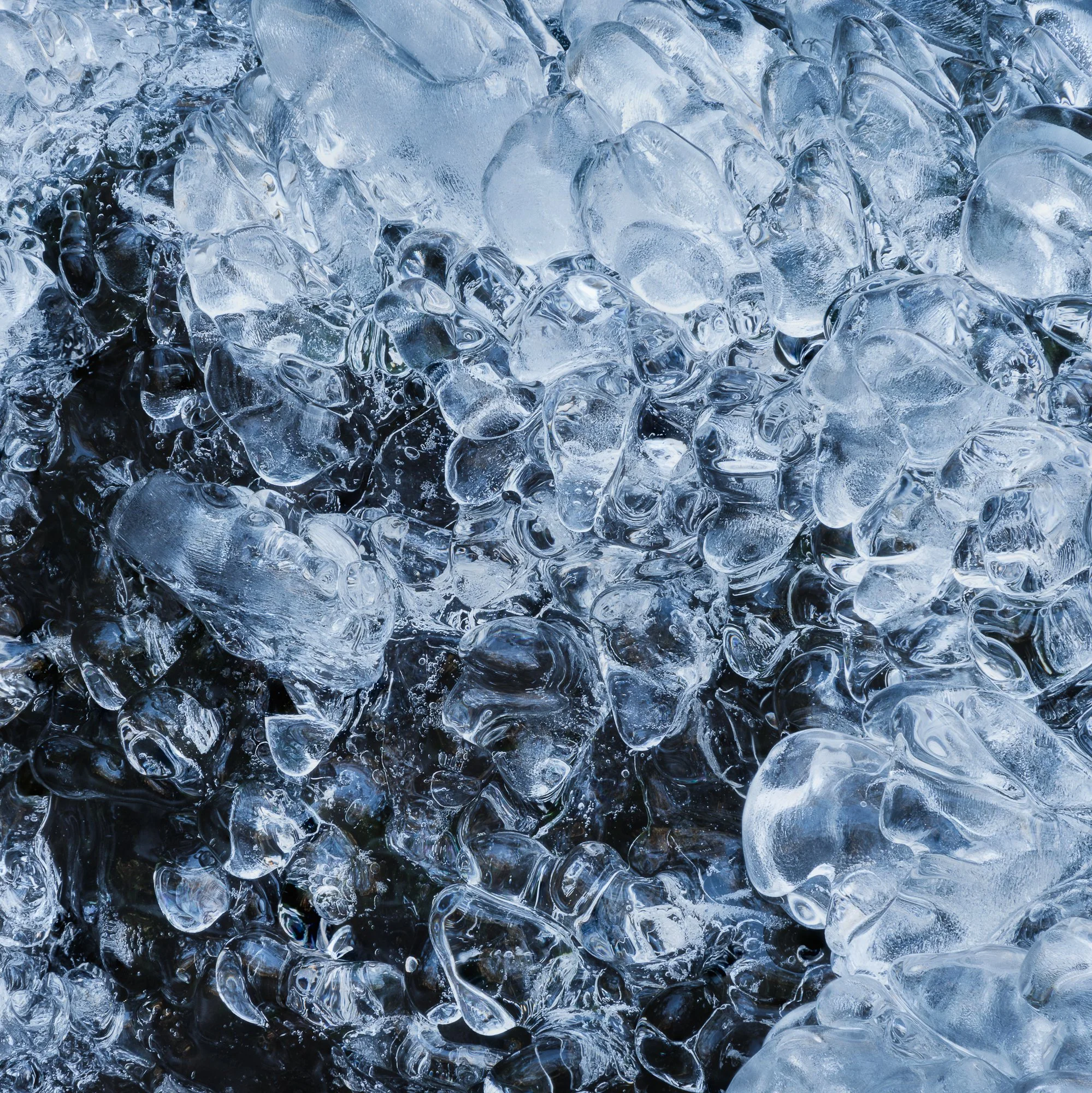
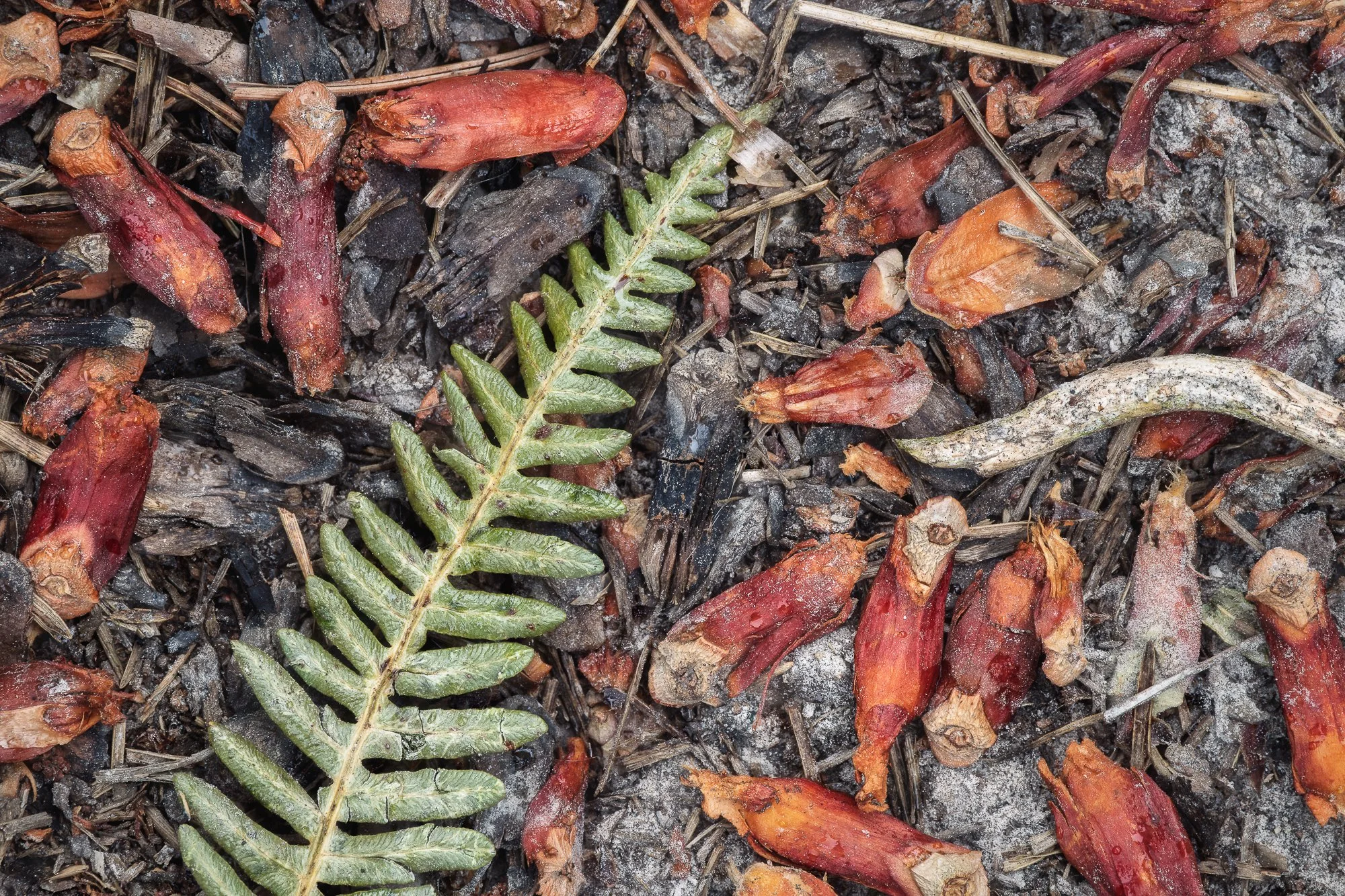
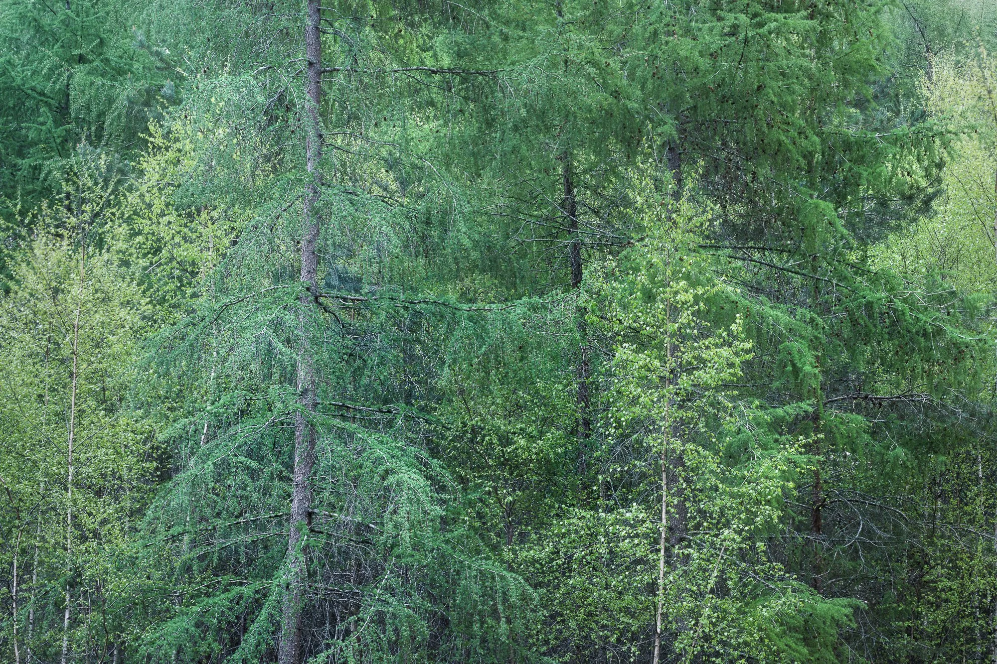
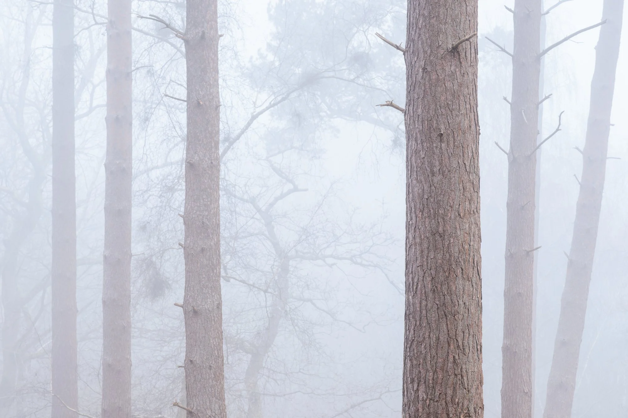
My top 5 small and intimate scenes in 2025
Although I rarely go out with the explicit intention of photographing small scenes, when one catches my eye, I make a point of capturing it because I love getting close and revealing nature’s finer details. Here are a few of my favourite small scenes and intimate landscapes from 2025.
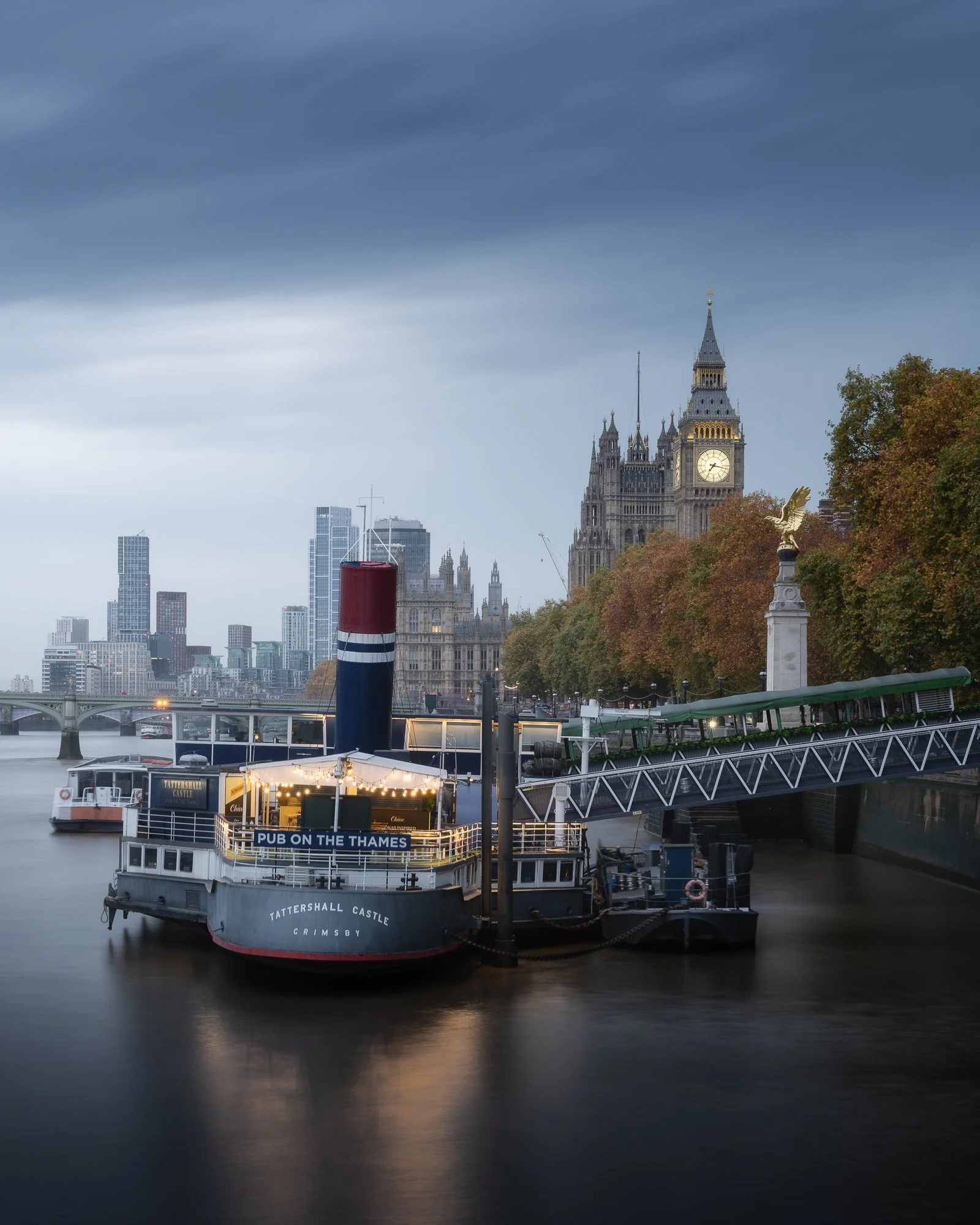
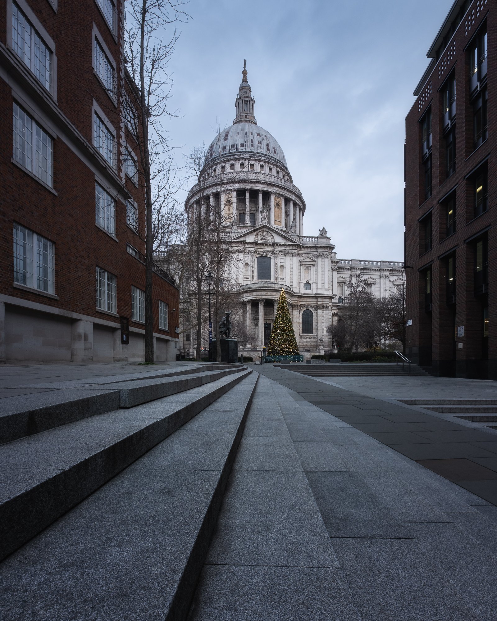
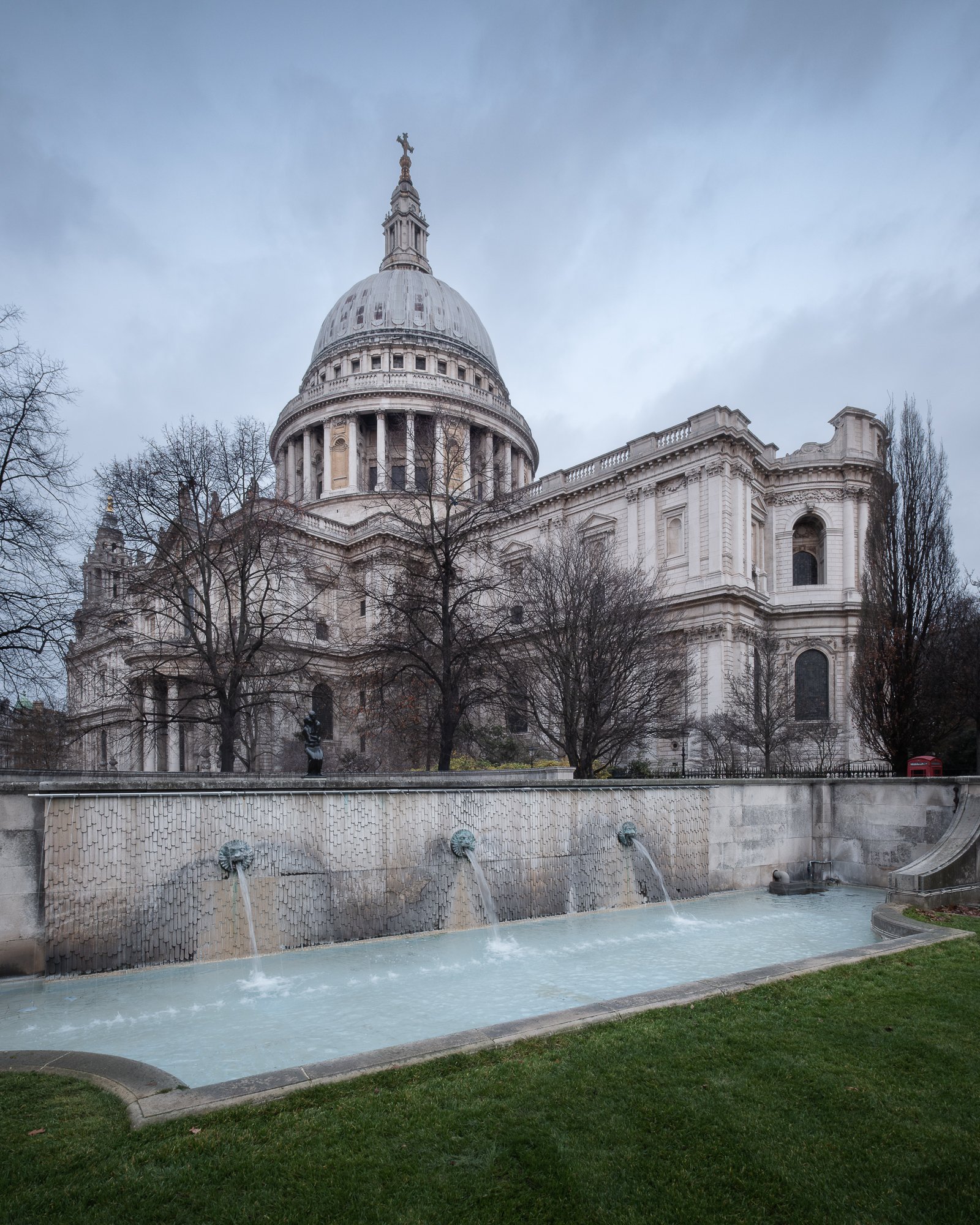
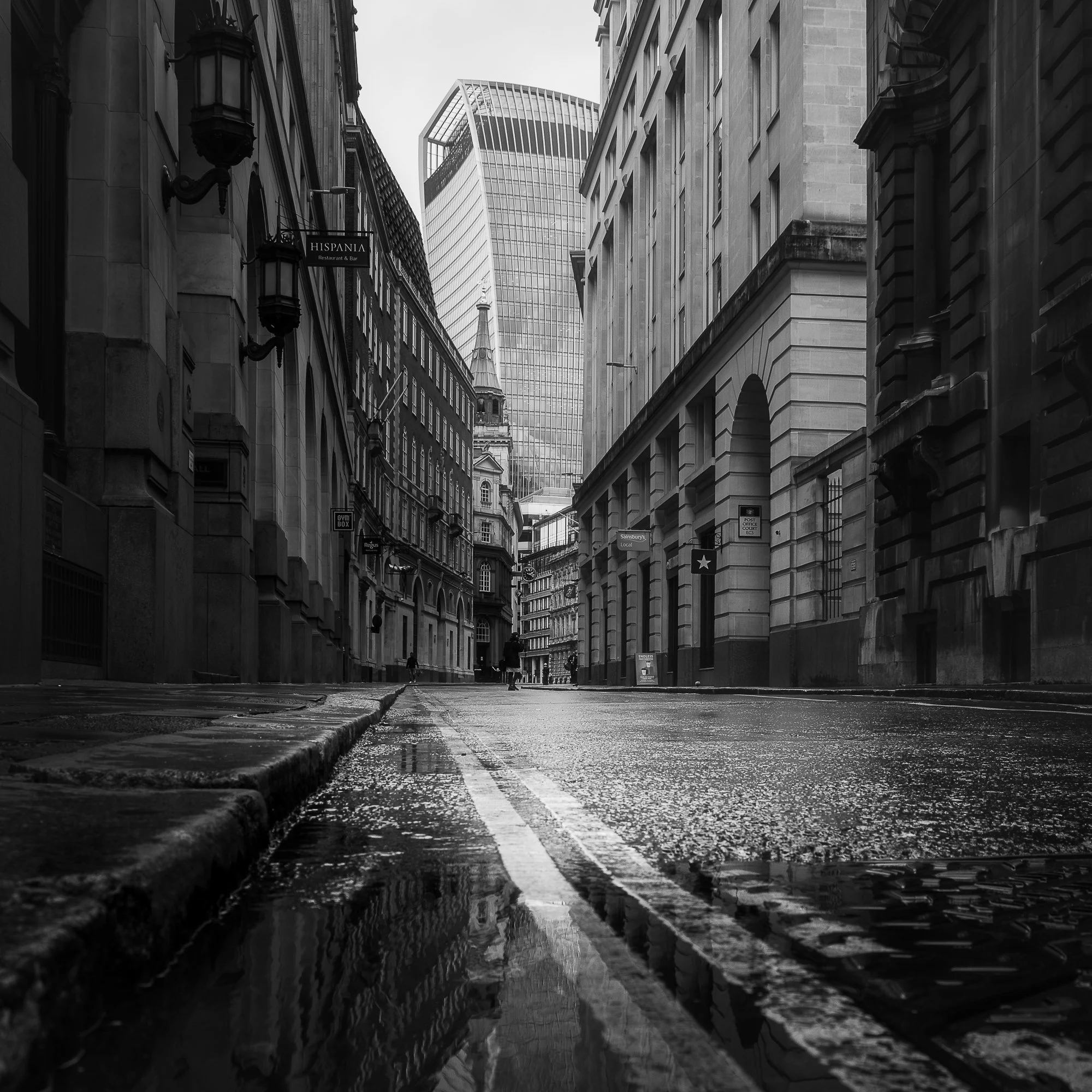
My top 5 London cityscape photos of 2025
With the creative spark from the projects I’ve been working on, I spent much more time in London photographing its city and streetscapes during 2025 than in recent years. I continued taking square, black and white photos for my Timeless City work and, often in the early mornings, captured images for City Stille. Here are a few of the colour photos I took, but if you’d like to see more of my black and white cityscapes, you can pop by [here] to view them.

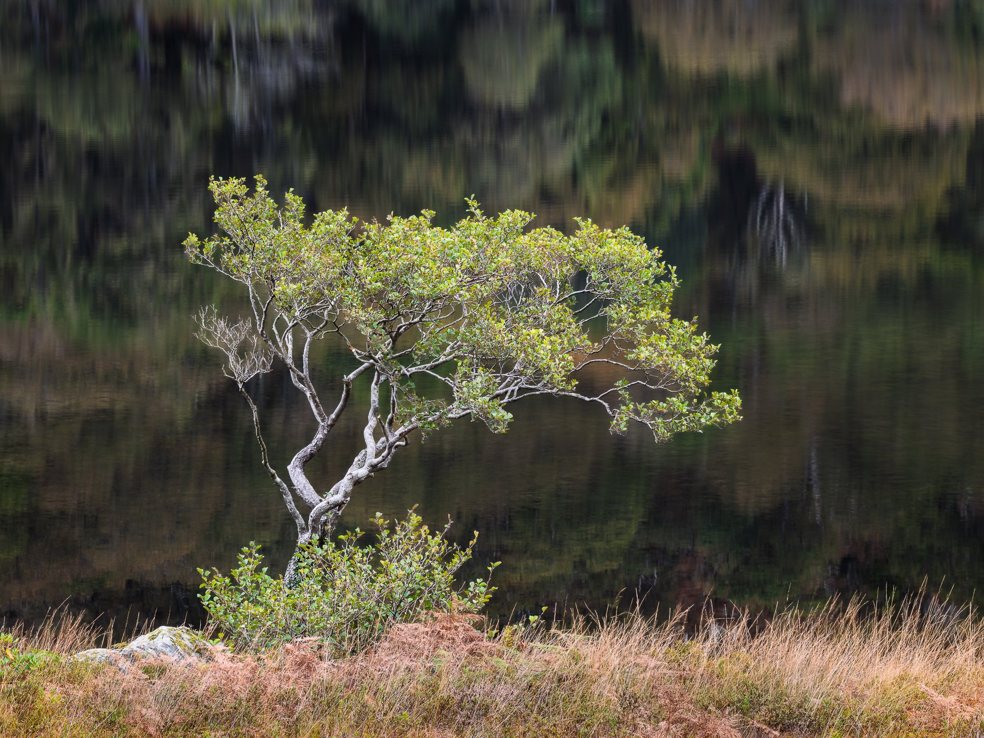
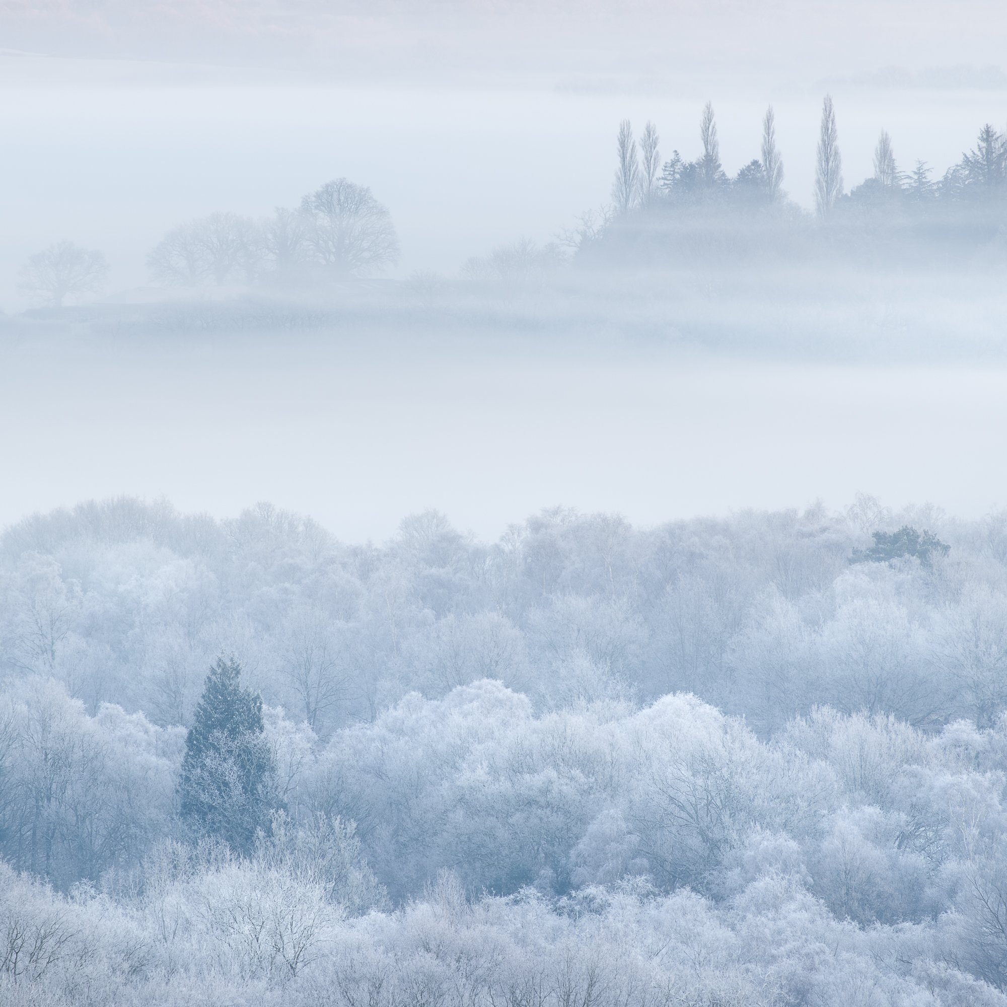
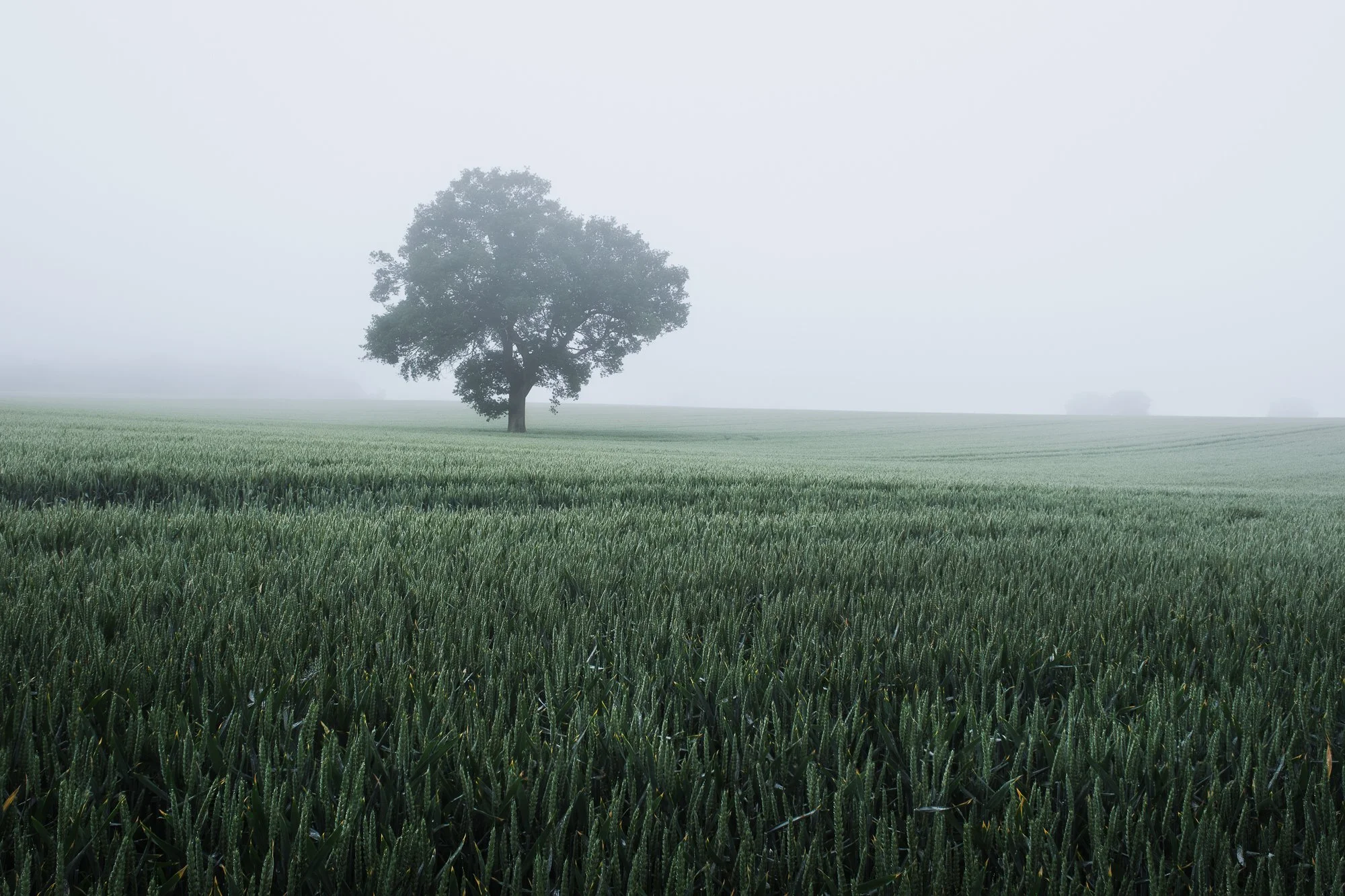
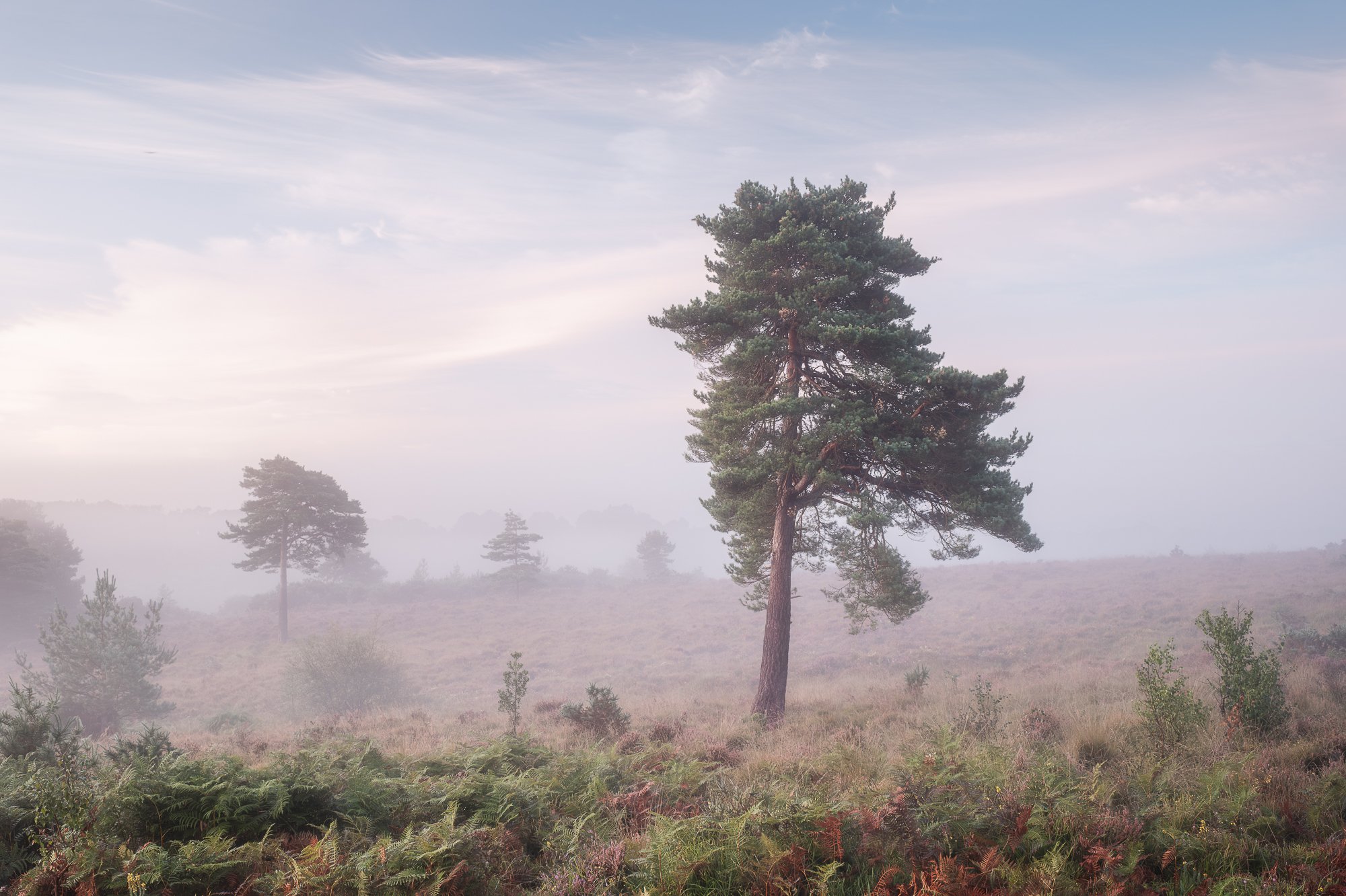
My top landscape photos of 2025
Although I didn’t take many wide vistas in 2025, I still captured some scenes I would consider traditional landscapes. Most of my work this year is on the intimate side, offering something more unique and less recognisable — something I’ve been intentionally working towards. Alongside these intimate scenes, I’ve also shared a couple of wider views from my local area below.
Hopefully, you’ve enjoyed this glimpse of the work I’ve created in 2025. With the variety of subjects on show, I hope it offers a small window into the different places, moods, and stories that have captured my attention over the year.
Looking forward to 2026
With my photographic tastes and motivations evolving somewhat in 2025, I’ll refrain from trying to predict where things might head in 2026 and simply let them unfold. That might mean spending more time in the city, or satisfying that creative itch by exploring and photographing my local woodland. I have a couple of project ideas I want to explore further — something featuring trees or natural landscapes, but I also want to be mindful of the time I have to devote to these various projects.
At this stage, all I would say is to expect more urban city and streetscapes, as well as plenty more woodland photography, over the next 12 months.
I also want to work harder at adding content to my website, as I didn’t feel as motivated as before to write new articles. And lastly, I hope to self-publish a Timeless City project zine. I won’t put pressure on myself — my photography remains a hobby and does not need to generate an income — so above all else, it must stay fun and creatively fulfilling.
This will be my last article of 2025, so whatever you do and whatever you have planned, I wish you all a happy and successful 2026.
Until next year.
Trevor
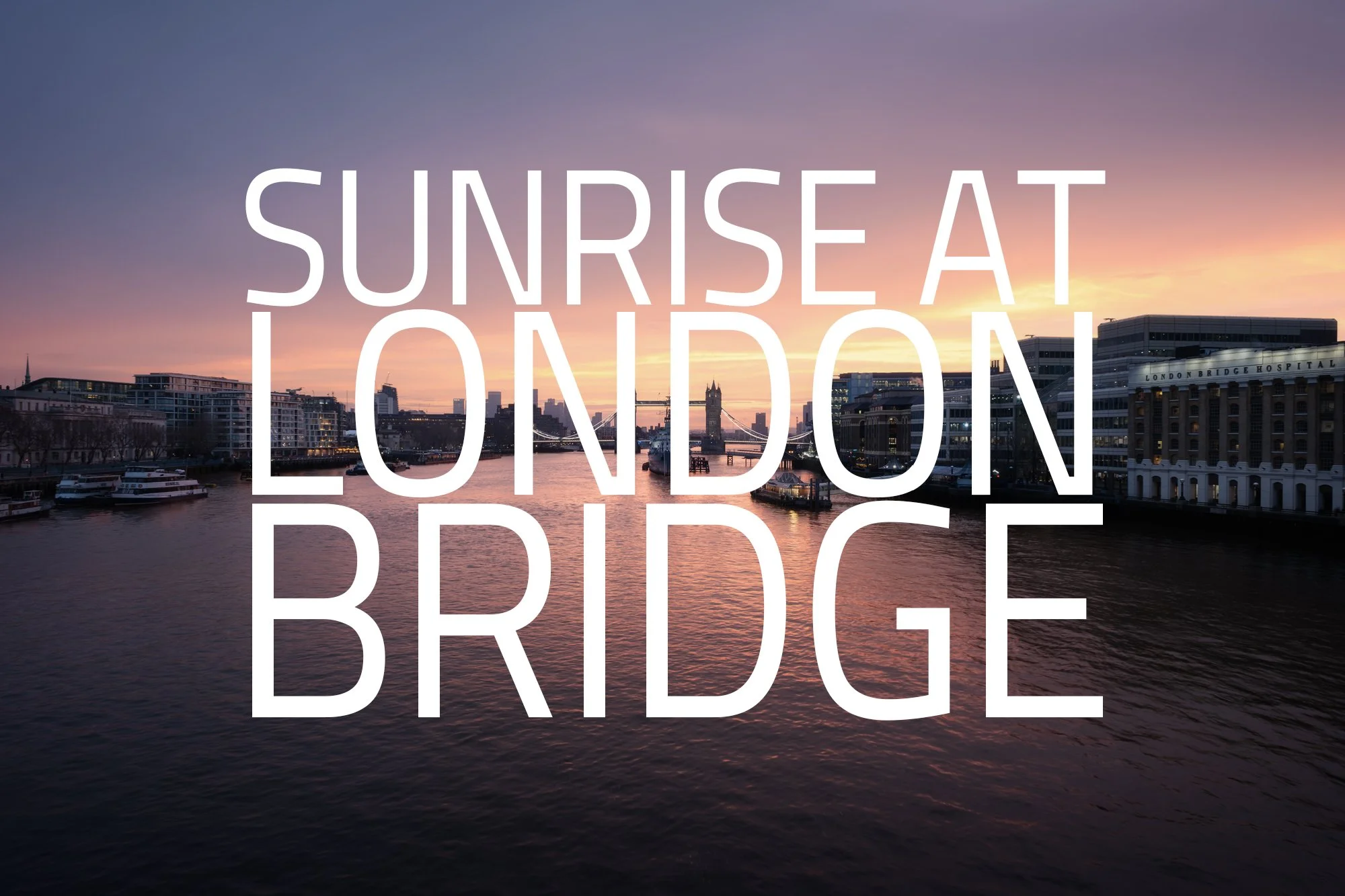
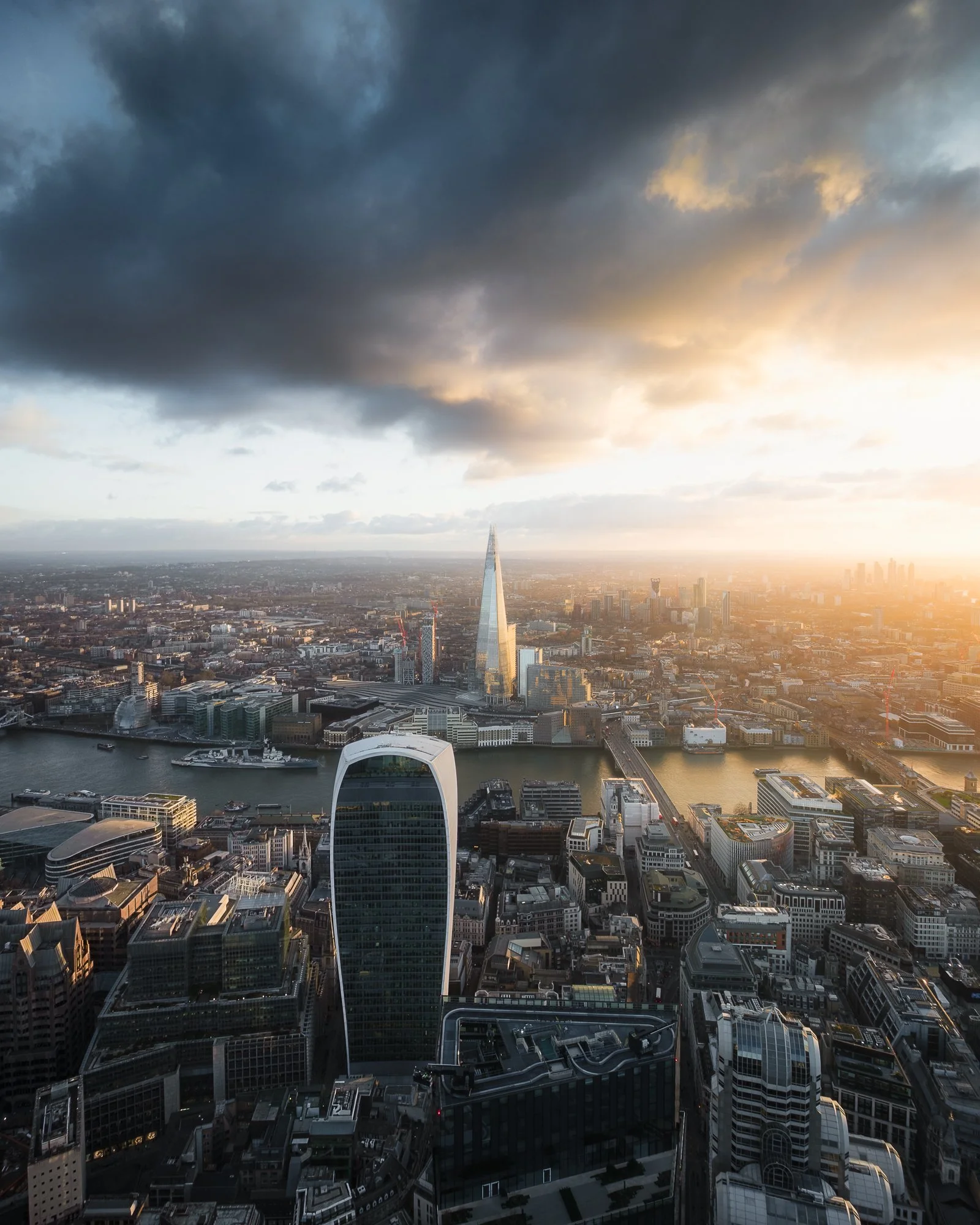
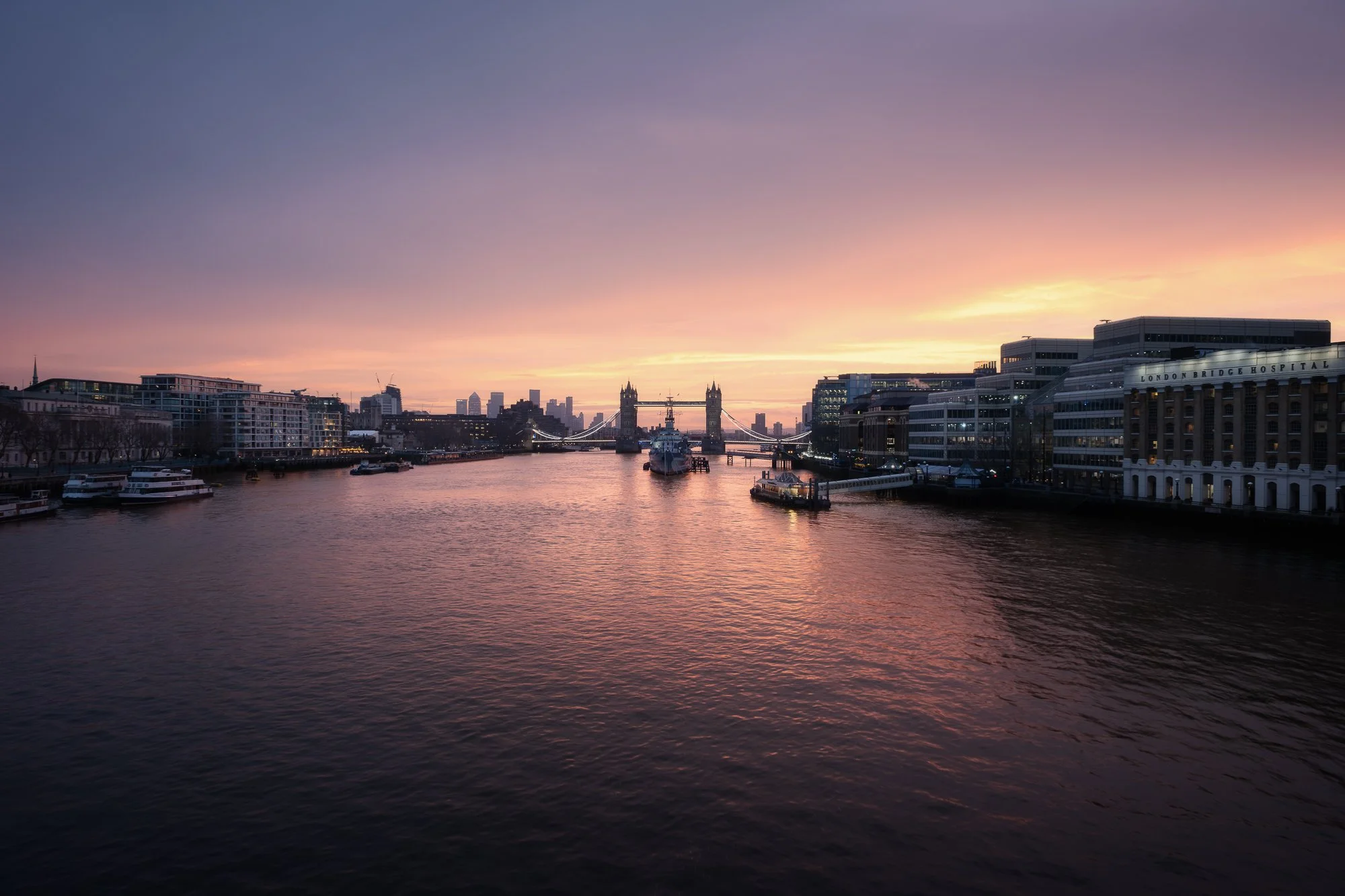
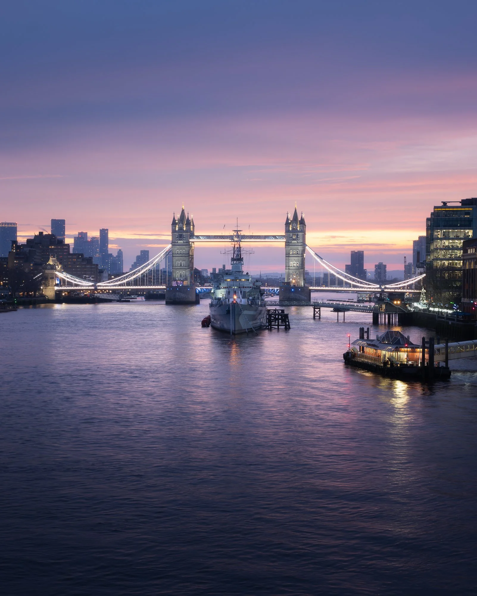
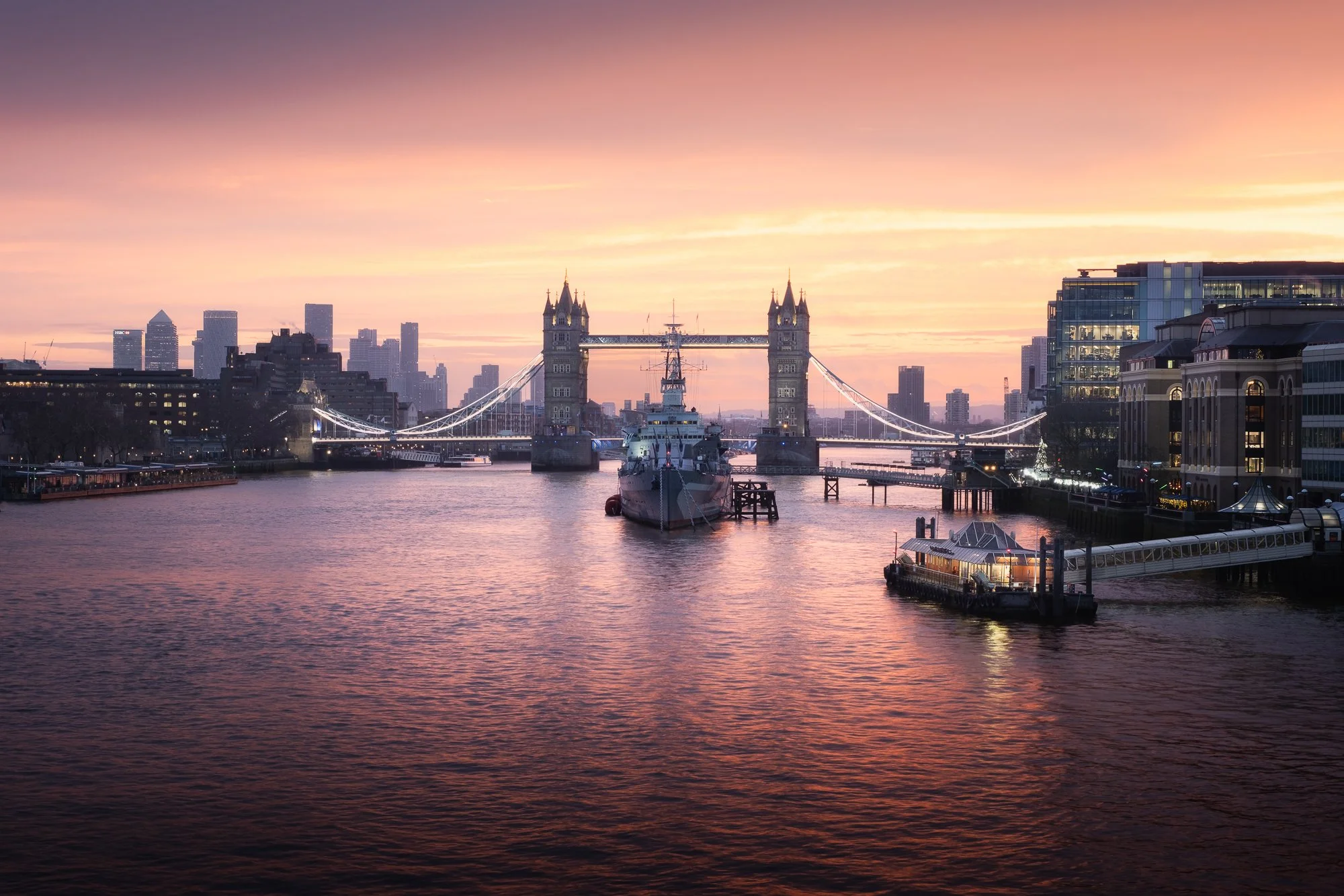
A Winter Sunrise at London Bridge
A winter sunrise wander around the London Bridge area, capturing HMS Belfast, Tower Bridge, and The Shard as they are bathed in soft early morning light.
I often wander around this area of London. It’s popular with tourists for good reason, with so many of the city’s iconic landmarks close by. As my train into the city terminates at London Bridge Station, it has become a natural starting point for many of my morning photo walks.
I’ve spoken many times about photographing London early in the morning, when the city is just waking up and the usually busy streets have a little more room to wander. I enjoy taking the time to explore, to appreciate the architecture and the photographic opportunities it offers, and to try and capture the sense of calm I feel when all I can hear are my own footsteps. It’s a similar feeling of familiarity and quiet I experience when wandering my local forest, and one that sits at the heart of my London-based photography project, City Stille.
After leaving the station, I made my way towards the river. It’s here that the space opens up, allowing me to get a sense of the conditions and the potential for light. With so much light pollution around, it isn’t always easy to read the sky until the light levels begin to lift, but looking east, I could just make out some pre-dawn colour starting to filter through. It felt like a long time since one of my early morning trips into the city had coincided with a good sunrise, and if there was even the smallest chance of colour, I wanted to be in one of the best spots to witness it — slightly upstream on London Bridge.
As I walked along the Thames, I had around twenty minutes before any significant colour might appear. I stopped to photograph this view of HMS Belfast and Tower Bridge. I’ve photographed this spot a few times before, but never at night, so mindful not to miss any potential colour, I quickly set up the camera and composed the image below.
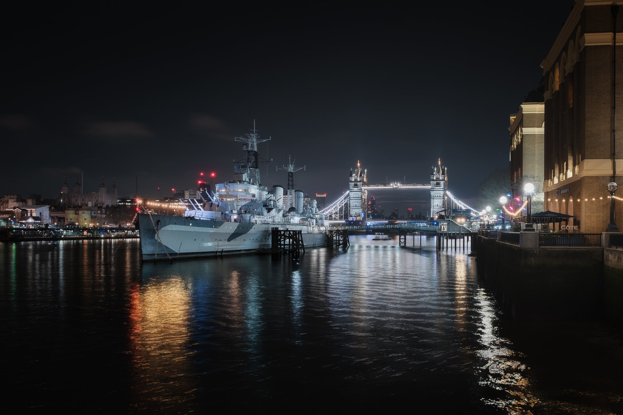
Fujifilm X-T50 | XF16-80mm | 20mm | 1/8th Second | f/5.6 | ISO800
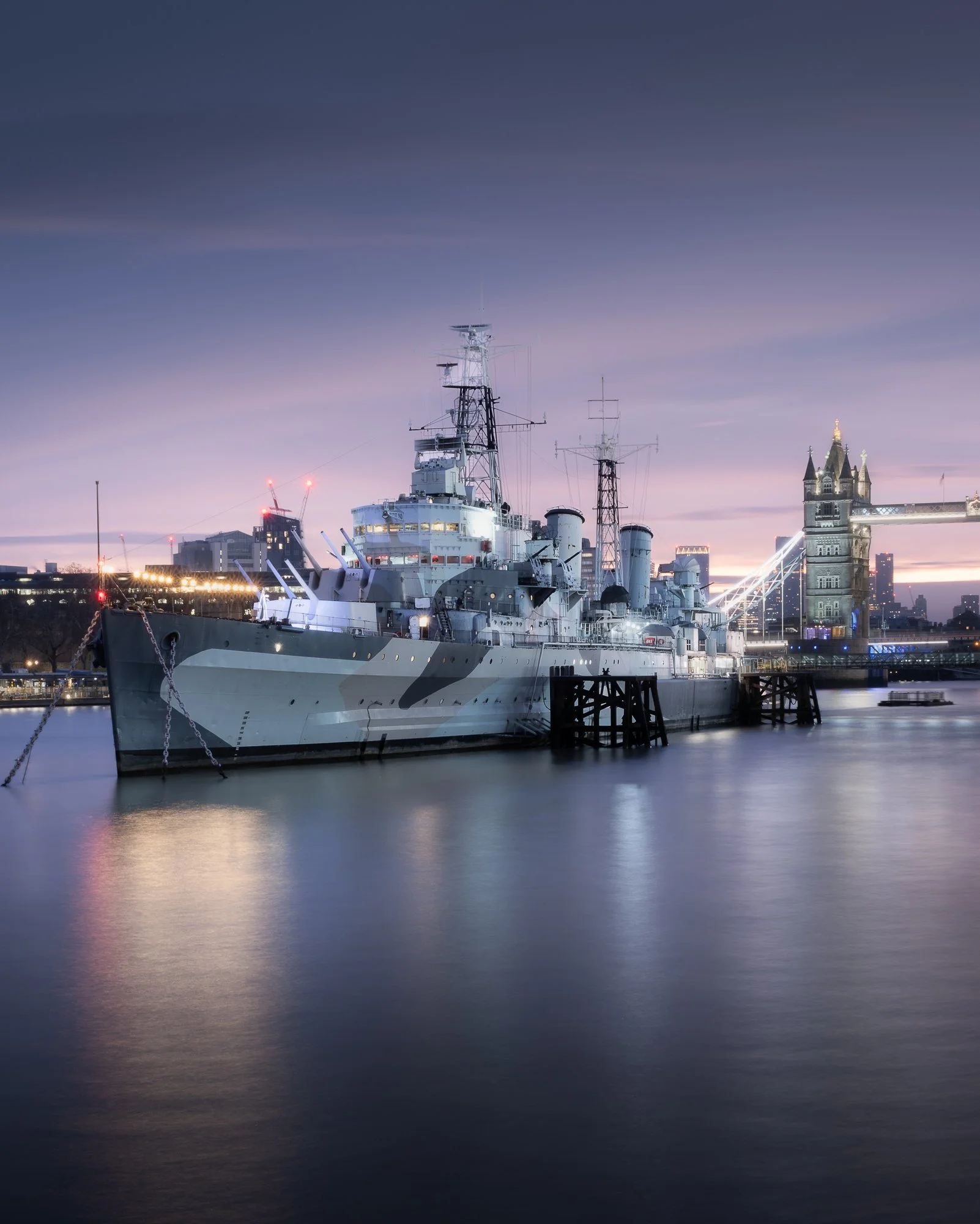
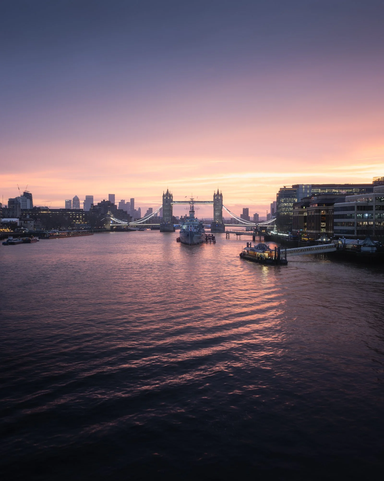
As the sliver of light near the horizon began to glow, subtle pre-dawn colour started to emerge. I stayed just long enough to take a few variations, experimenting with different shutter speeds and focal lengths. Many who read this will know I tend to lean towards a more restrained colour palette, and the soft blues and magentas in the sky provided a fitting backdrop for this familiar London view.

Fujifilm X-T50 | XF16-80mm | 32mm | 30 Seconds | f/16 | ISO125
Fujifilm X-T50 | XF16-80mm | 32mm | 30 Seconds | f/16 | ISO125
Fujifilm X-T50 | XF16-80mm | 21mm | 0.8 Seconds | f/6.4 | ISO400
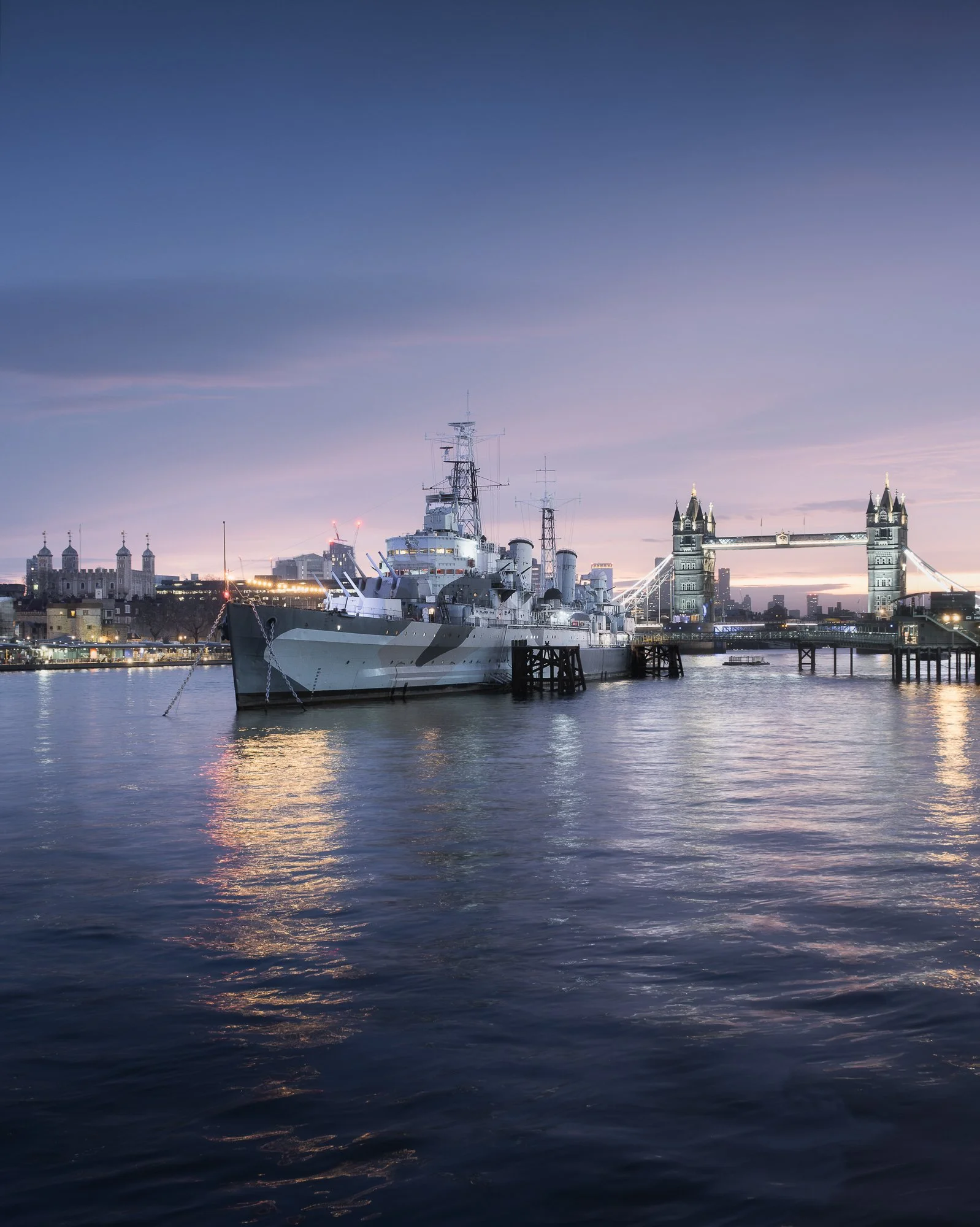
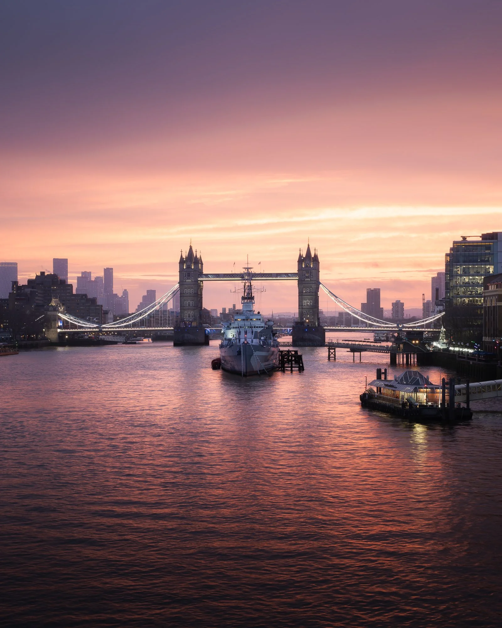
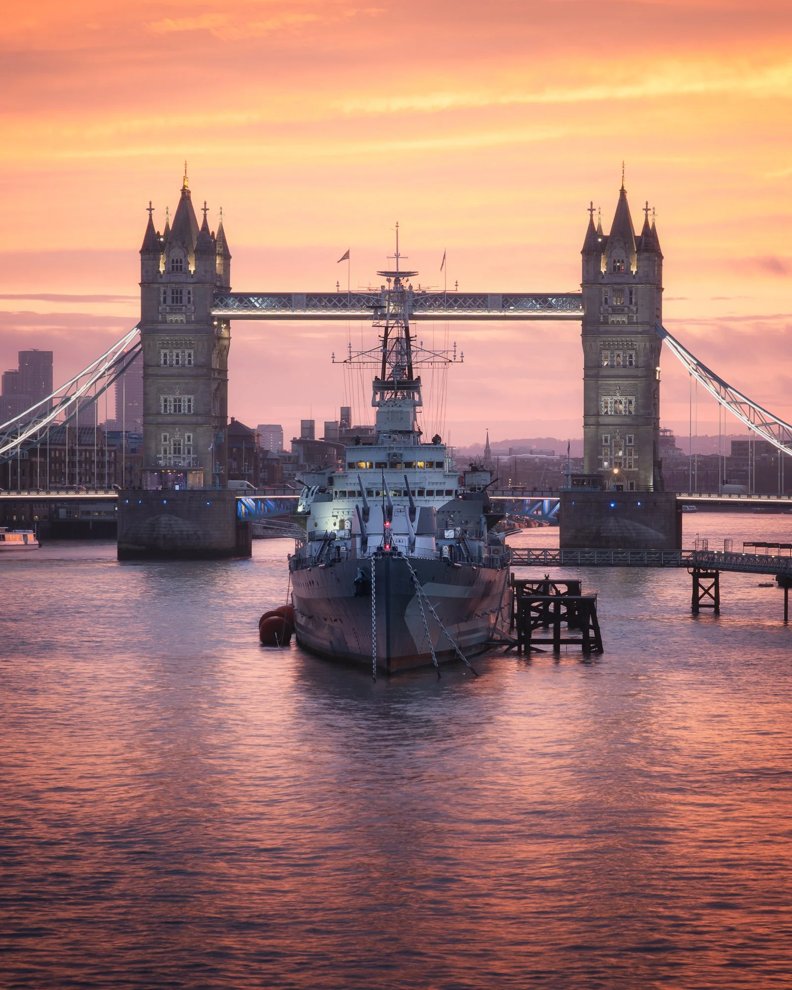
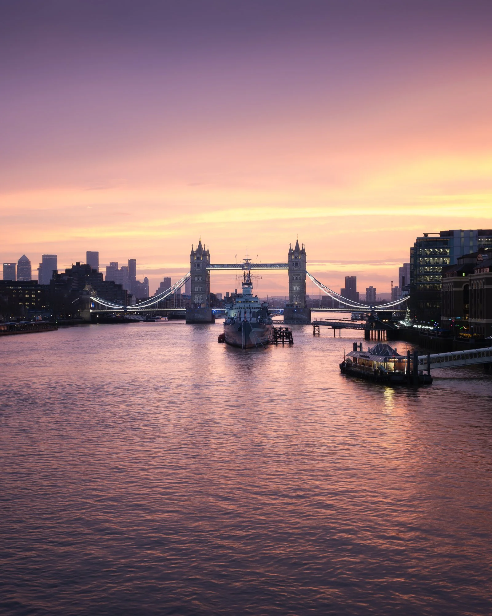
Finishing up near HMS Belfast, I made the short walk up to London Bridge, settling in where the ship lines up centrally with Tower Bridge (as you may have guessed, I have a fondness for symmetry in my cityscape compositions). The sun had not yet risen, but the colour was growing stronger. Once the tripod was set up and the camera mounted, I began capturing the scene as warm tones gradually intensified.
Below is a selection of the photos I took from this spot over the course of thirty minutes.
Fujifilm X-T50 | XF16-80mm | 38mm | 0.8 Seconds | f/8 | ISO125
Fujifilm X-T50 | XF16-80mm | 20mm | 1/3rd Second | f/8 | ISO125
Fujifilm X-T50 | XF16-80mm | 36mm | 1/3rd Second | f/8 | ISO125
Fujifilm X-T50 | XF16-80mm | 74mm | 1/3rd Second | f/8 | ISO125
Fujifilm X-T50 | XF16-80mm | 39mm | 1/3rd Second | f/8 | ISO125

Fujifilm X-T50 | XF16-80mm | 16mm | 1/3rd Second | f/8 | ISO125
Fujifilm X-T50 | XF16-80mm | 31mm | 1/3rd Second | f/8 | ISO125
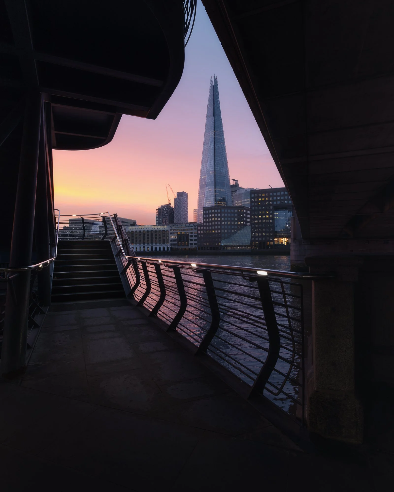
One photo I had never successfully captured was this framed composition of the Shard from beneath London Bridge at sunrise. It works best in winter, when the sun rises in the south-east, and although I’ve photographed from here many times, I had never managed to time it right with the backdrop of sunrise colour. Before the light faded, I crossed to the north side of the river and descended the stairs just in time to take this shot before the colours fully retreated.
That’s what I enjoy about photographing sunrise here: the compositions are so close together that it’s possible to capture several in a matter of minutes without feeling rushed.
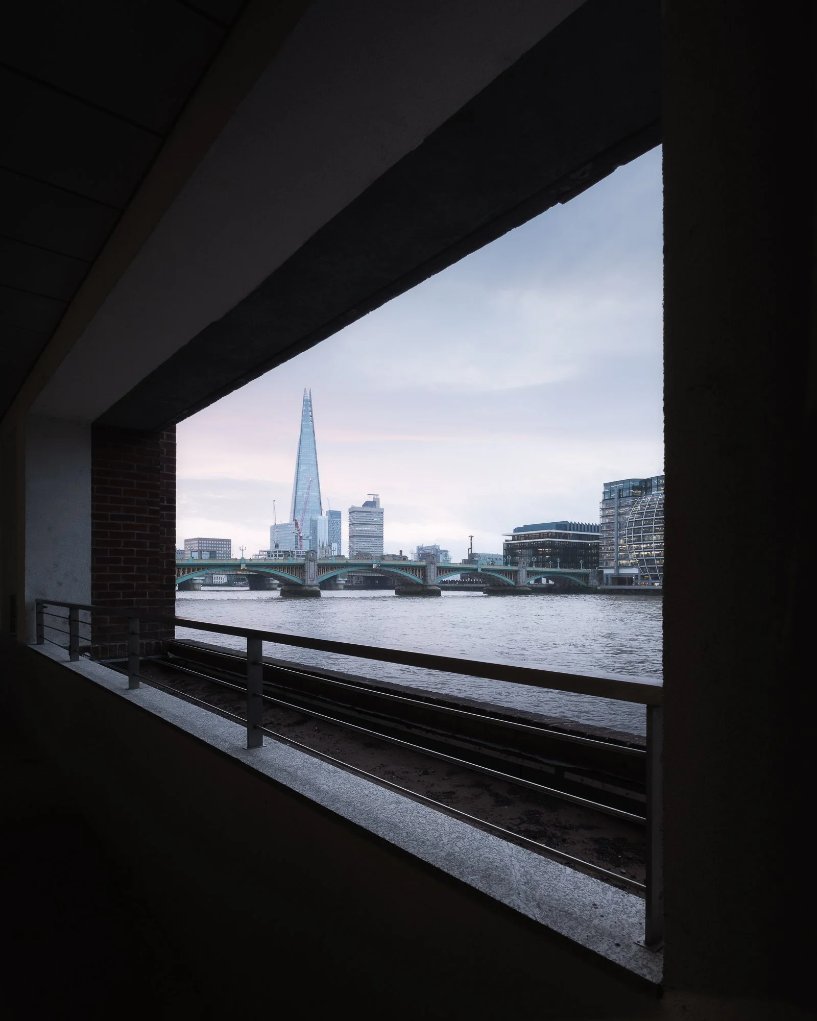
As the colour faded, I packed the tripod away and, with my camera in hand, wandered west along the north bank of the Thames towards St Paul’s Cathedral, where I would finish the morning shoot and catch the Tube. The morning light had a soft, subtle quality, and along the way I stopped to take a distant framed view of the Shard. I had discovered this composition a year or two earlier but had only photographed it for my black and white Timeless City project, so I took the opportunity to capture it in colour — however muted the tones were.
Fujifilm X-T50 | XF10-24mm | 11.5mm | 1/13th Second | f/10 | ISO400
Fujifilm X-T50 | XF10-24mm | 10.5mm | 1/30th Second | f/9 | ISO400
Arriving at St Paul’s, and with it still being early, there weren’t too many people around, so I took the opportunity to photograph the cathedral in the soft, cool ambient light. I couldn’t avoid people entirely, so one technique I use in situations like this to create cityscape images free of other figures is a long exposure. Using the steps as a foreground and an ND filter mounted on my lens, I took a long exposure to blur the movement of people as they passed through the frame.
Fujifilm X-T50 | XF10-24mm | 10.5mm | 40 Seconds | f/11 | ISO125
Fujifilm X-T50 | XF10-24mm | 10.5mm | 1/30th Second | f/11 | ISO400
I’m sure — actually, no, I’m certain — there are many who could not imagine anything worse than spending time in a busy city like London. To those people, I would say: before making up your mind, try a sunrise walk in your nearest town or city. The silence and stillness can be intoxicating. For someone like me, who appreciates the history and architecture a city like London offers but doesn’t particularly enjoy the crowds, waking up early and heading out before sunrise is truly the best time of day to experience this great city.
I now have two London city and streetscape projects on the go: my black and white project, Timeless City, and another aligned with the photos in this post, called City Stille. Feel free to check them out and follow along as they progress.
Until next time.
Trevor

Oak by Simon Baxter | My Photo Bookshelf
Oak combines stunning woodland images with insightful essays, revealing the depth of Simon Baxter’s connection to this iconic tree.
To many, woodland photography is one of the trickiest landscape genres to master, and in many ways, I’d probably agree. It demands patience, vision and a genuine passion for the subject to create compelling photographs of the woodland. It’s not simply a case of being in the right place in the right conditions; it’s about an internal moment—being in the right frame of mind to notice something beautiful at a particular point in time, when on any other day you might simply walk past without a second glance.
Simon Baxter’s love for the woodland is infectious, and I have to admit that his photography was a major influence on me when I first began turning my own lens towards the trees back in 2019. I bought his first book, Gathering Time, and more recently Woodland Sanctuary, which accompanied an exhibition he created with Joe Cornish. So, when Simon announced he would be releasing Oak earlier this year, I didn’t hesitate—I pre-ordered a copy straight away.
Synopsis
OAK celebrates a very special species of tree that captured Simon’s heart and imagination as he explored his local countryside in North Yorkshire. Captivated by their beauty and richness of life, Simon has discovered and immersed himself in some of the very best oak woodlands his local area has to offer. OAK includes 38 beautiful images that were all made close to home and haven’t appeared in previous publications.

My thoughts about the book
Oak represents a personal photographic study of a single tree species and opens with a brief but engaging history lesson, taking the reader back to the first forests 56 million years ago, followed by an overview of the life of an oak tree. It’s mind-boggling to consider how long an oak can live and the span of historic events that may have unfolded during the lifetime of just one tree.
The book itself is a high-quality 11 x 8.5-inch softcover zine, printed on 150gsm silk paper. It’s an excellent paper choice, complementing the work beautifully, with enough weight and subtle sheen to bring the images to life without becoming distracting.
After reading about the oak’s origins, the book flows seamlessly into Simon’s photographs—a beautiful collection showcasing this woodland icon in a variety of conditions and across all seasons. Simon chose not to group the images by season, which is a common approach and one that can work well, but I’m glad he decided against it here. As I turned the pages, not knowing what mood, colour or feeling awaited me, the experience felt more varied and engaging. It kept the book fresh and surprising throughout. This approach undoubtedly made the sequencing more challenging, but it was certainly worth the effort in my opinion.
Intertwined among the beautiful photographs of the oak tree is a captivating personal thread, shared through a handful of essays in which Simon reflects on discovering the importance of composition, his own connection with the oak, and how being curious about the subject—rather than prioritising the act of photography itself—can ultimately lead to stronger, more meaningful work.
That last point about creating stronger, more meaningful work struck a particular chord with me. If Simon has taught me anything about making the very best woodland photographs, it’s the importance of looking deeper—studying the subject, noticing its subtle shifts in character and the way it interacts with its surroundings.
This beautifully crafted project is a highlight on my bookshelf, offering inspiration and insight for anyone passionate about woodland photography.
Book Details
Softcover Zine
Size: 11 x 8.5 inches
Pages: 55 pages and photos printed on 150gsm silk paper
Availability at the time of writing: Purchase directly from Simon Baxter’s website https://baxter.photos/shop/oak-zine.
Until next time.
Trevor

My Essential Gear for Timeless City Photography
The equipment I use for Timeless City photography in London, from cameras and lenses to tripods and filters
I’ve spoken before about what motivated me to start my Timeless City project in an article I wrote to introduce the project called Timeless City - An Introduction, but I’ve yet to speak in detail about the gear I use while wandering the historic streets of this city I am so fond of. So, in this post, I want to share the gear I rely on, how I use it, and why it’s become integral to my workflow.
Whether you’re exploring London’s streets for the first time or looking to refine your own cityscape photography, this guide will give you insight into what works for me.

Behind the camera taking a black and white cityscape photo of London
Key Priorities When Choosing My Gear for London Cityscape Photography
There are endless options when it comes to photography gear, and I should say upfront that what works for me might not work for you. I’m not suggesting you rush out and buy the same camera body or lenses I use — this post simply offers a bit of insight into the gear I rely on and why it suits my Timeless City work.
When choosing my camera gear for photographing London’s cityscape, a few key priorities guide my decisions:
1. Compatibility with my landscape setup.
My city and landscape work often overlap, so I prefer gear that’s compatible across both. This gives me backup camera bodies and lenses when needed, and keeps me familiar with the same menu system and controls — no matter what I’m photographing.
2. Lightweight and portable.
I hand-hold the camera for long periods and rarely use a neck strap, so lighter gear makes a huge difference. Compact equipment also helps keep my camera bag manageable, which is essential when walking around London for hours.
3. Minimal and fuss-free.
I like to keep things simple. The less I have to think about switching lenses or adjusting accessories, the more I can focus on composition and atmosphere — the parts of photography I care most about.
The Gear That Helps Me Create My Black and White Cityscape Photos of London

The essential gear I use for taking black and white photos of London
Camera Bodies
The camera I use for taking my black and white London photography is the Fujifilm X-T50
For my black and white London photography, I use the Fujifilm X-T50. Many of you might already know that I’ve been shooting with Fujifilm X Series cameras for nearly 10 years, starting with the X-T10 back in 2016. Over the years, I’ve upgraded a few times, and the X-T50 is now my go-to for city and streetscape work.
Pros:
Small, lightweight body
Same high performance and image quality as the XT5
Familiar menu system and compatible with all of the lenses I own
Cons
No weather sealing
Smaller battery with fewer pictures per charge
Single memory card slot

Fujifilm X-T50 - my trusted body for black and white city photography
The X-T50 has the same processor and stills-making capabilities as the X-T5, which I use for landscape work, but packed into a smaller, lighter body. This makes it perfect for carrying around for hours while roaming London’s streets.
While the X-T50 ticks most of the boxes for my city photography, it does have a few drawbacks compared to its bigger sibling, the X-T5 — though none are deal-breakers. The smaller battery means fewer shots per charge, but that also contributes to a lighter, more portable camera. Similarly, the single memory card slot is a minor compromise. And yes, there’s no weather sealing, but a little damp or drizzly weather is usually fine. On days with heavy rain, I can always switch to the XT5 if needed.

The Fujifilm X-T50 makes a great companion to the XT5
I’ve written a more detailed review of the Fujifilm X-T50 in another post called Why I Chose the Fujifilm X-T50 as a Second Camera. While that article focuses on using the X-T50 as a backup for my landscape work, it’s still a useful read for anyone wanting to learn more about this very capable camera.
Lenses
My Go-To Lenses for Urban Landscapes

My go-to lenses for cityscape photography
From most to least frequent, here are the three lenses I typically reach for when shooting my Timeless City photos, listed in order of how often I use them.
Wide-angle - XF 10-24mm F4 IOS WR
With so many tall buildings and limited space to back away, my XF10-24mm wide-angle lens is by far the lens I use most when photographing London.
For my Timeless City project, part of the look I aim for includes cloudy, moody skies. Having a wide field of view is essential — it allows me to include both the subject and plenty of sky without tilting the camera upward, keeping vertical lines straight and preserving the clean, classic feel of the scene.

Add image exif
Standard Zoom - XF16-80mm F4 IOS WR
I also include the XF16-80mm lens in my kit because, aside from the 10-24mm range covered by my wide-angle lens, it handles about 95% of my remaining focal length needs.
The 80mm reach gives me a little more flexibility compared to the more standard 16-50mm or 18-55mm zooms offered by Fujifilm. That extra reach means I rarely need to switch to a telephoto lens for the kinds of subjects I typically photograph in London.

Add image exif
Telephoto Zoom - XF70-300mm F4-5.6 R LM IOS WR
As I mentioned earlier, one of my priorities when packing my bag is keeping the weight down. While this lens is light for a telephoto with this kind of reach, I only carry it when I know I’ll need it — for example, when photographing distant rooftop views like this one.
I also own the XF50-140mm F2.8, but it’s nearly twice as heavy and doesn’t offer quite the same reach. For my style of city photography, the XF70-300mm is a better, lightweight telephoto option.

Add image exif
Accessories

The accessories I use for a day photographing London
Tripods, Filters, Batteries, and More
Tripod - 3 Legged Thing Corey tripod: Essential for taking long exposures or when the light is low. I’ve used the 3 Legged Thing Corey tripod for a few years now, and although it’s not quite the lightest travel tripod on the market, it’s a great compromise between sturdiness and weight.
Filters - Kase Wolverine magnetic filters: My filter set includes a CPL, 3-stop, 6-stop and a 10-stop filter. These magnetic filters are super quick to use and perfect for taking long exposure cityscape photos to help smooth the water in the River Thames or even blur our people from my photos.
Camera Bag - Manfrotto Street: I bought the Manfrotto Street backpack 5 or 6 years ago, and although I’ve tried a few other bags since, this one has always been my go-to for carrying my lightweight cityscape gear. A small compartment for the camera and lenses, and plenty of space for holding other bits and pieces in the top compartment.
Wrist strap: I don’t typically use a neck strap, but the wrist strap stays in my bag. I might use it when walking with the camera for long periods or if I’m up high and worried about dropping my camera.

Spare batteries: As I mentioned earlier, the X-T50 still uses the smaller NP-W126S batteries. I’m fine with that if it keeps the camera compact and lightweight, but it does mean I usually carry a spare or two on my trips around the city.
Power bank: If I’m spending a full day out with my camera, I often take a portable power bank with me. The one I use, which I picked up from Amazon, can charge my iPhone, AirPods, Apple Watch — and importantly, the camera itself. It features magnetic charging and comes with both USB-C and Lightning cables built in, making it incredibly convenient for a day of city photography.
Spare memory cards: I also carry a robust metal case to store my memory cards. I always keep it with me because I’ve learned the hard way not to forget a card in the camera! Having spares in my bag ensures I’m never caught short during a day of London city photography.
A small, compact Umbrella: If rain is forecast, I make sure to dress appropriately. Since I often photograph for my Timeless City project in overcast conditions, there’s always a chance of getting caught in a shower. I actually enjoy shooting in wet weather — it adds drama and creates interesting reflection opportunities. Having an umbrella with me means I can keep photographing without getting myself or the camera wet.
Lens Hood: I picked up this lens hood for under £10 on eBay a few years ago, and it now stays in my bag for those times when I want to reduce reflections while shooting city or streetscapes through glass windows.
Workflow & Post-Processing
While the gear I choose helps me capture the shots I want in the field, I rely on consistent post-processing to ensure all my Timeless City black and white photos share a cohesive aesthetic. If you’d like to learn more about my workflow, you can check out the blog post I wrote about my post-processing approach below.

How I edit my black and white photos of London
Here’s another of my finished images, capturing a quiet, reflective street in London. The combination of gear and technique allowed me to bring out the timeless, classic aesthetic I strive for in this project.
The finished image – a quiet, reflective London street captured in black and white.
The final point I want to mention about the image aesthetic is that all the photos in my Timeless City project use a square crop. From maintaining consistency to enhancing composition, there are several reasons I chose this aspect ratio, which I discuss in more detail in my post titled The Square Photo Format.

Why I use the square crop when taking my Timeless City cityscape photos of London
Ultimately, gear is only part of the story, and as I mentioned at the begining of this post, what works for me will not work for everyone but knowing why i make the choices I do could help others know what to look out for when choosing their own gear for cityscape photography. The combination of cameras, lenses, and accessories I’ve chosen helps me bring my vision for timeless cityscapes to life, allowing me to create images that reflect the look and feeling I am trying to convey.
I’d love to hear what gear you rely on for city photography, or how you capture mood in your own urban explorations. Share your thoughts in the comments below!
Until next time
Trevor

The World’s Top Photographers - Landscape | My Photo Bookshelf
The World’s Top Photographers – Landscape showcases 38 influential photographers and the stories behind their most iconic and timeless landscape images.
If you’ve browsed my Inspiration page, you’ll know I often look to photographers like Joe Cornish, David Ward and Christopher Burkett for guidance and inspiration. So, when I stumbled across The World’s Top Photographers and the Stories Behind their Greatest Images – Landscape, I knew immediately that it was a book I had to own.
Synopsis
Bringing together landscape shots by the world's most acclaimed professionals, this collection features the work of such luminaries as Charlie Waite, Galen Rowell, Yann Arthus-Bertrand and other top photographers. It reveals the stories behind some of their favourite images, with anecdotes, tips and technical details, providing an insight into the creative process behind the world's most stunning landscape photographs. There is also a brief biography of each photographer, including a bibliography of his or her published work.

My thoughts about the book
The full title of this book is The World’s Top Photographers and the Stories Behind their Greatest Images – Landscape. Too long for the title of this blog, perhaps, but it perfectly describes the book’s content. I have a fondness for books like this, where accomplished photographers share not only their images but also the stories behind them. It’s a wonderful resource for both appreciating expertly crafted photography and gaining insight into the process behind the work—often offering lessons along the way.
The book opens with an introduction by the author, Terry Hope, followed by 38 chapters, each dedicated to a single landscape photographer and their work. Each chapter follows a consistent format: a headshot and short introduction offer a glimpse into the photographer’s background, followed by a collection of images accompanied by brief narratives and camera settings.
As you might expect, some of the work resonated with me more than others. Even so, I could appreciate the skill, dedication, and vision each photographer invested in their craft. Landscape photography, after all, is a highly subjective pursuit, as is the selection of contributors to this book. What does “Top” really mean—best of the rest, at the peak of their career, or simply the most recognised? My advice is not to dwell on whether these photographers were truly the “top” back in 2003, but to enjoy the work for what it is and connect with the images that speak to you personally. That’s the approach I took.
Despite being published in 2003, this book feels remarkably timeless. Many of the photographs still hold up against contemporary work created with today’s gear and techniques. Age has not diminished the artistry, and in some ways, it adds a sense of history and context that modern publications often lack.
If you ever find a copy of this book, I would wholeheartedly recommend picking it up. For anyone practising landscape photography today, it’s not just a collection of beautiful images—it’s a window into the dedication, vision, and storytelling that define this craft.
Book Details
Hardcover
Size: 26cm x 26cm
Pages: 176
Availability at the time of writing: Unavailable from the usual UK booksellers. Consider buying a used copy.
Until next time.
Trevor
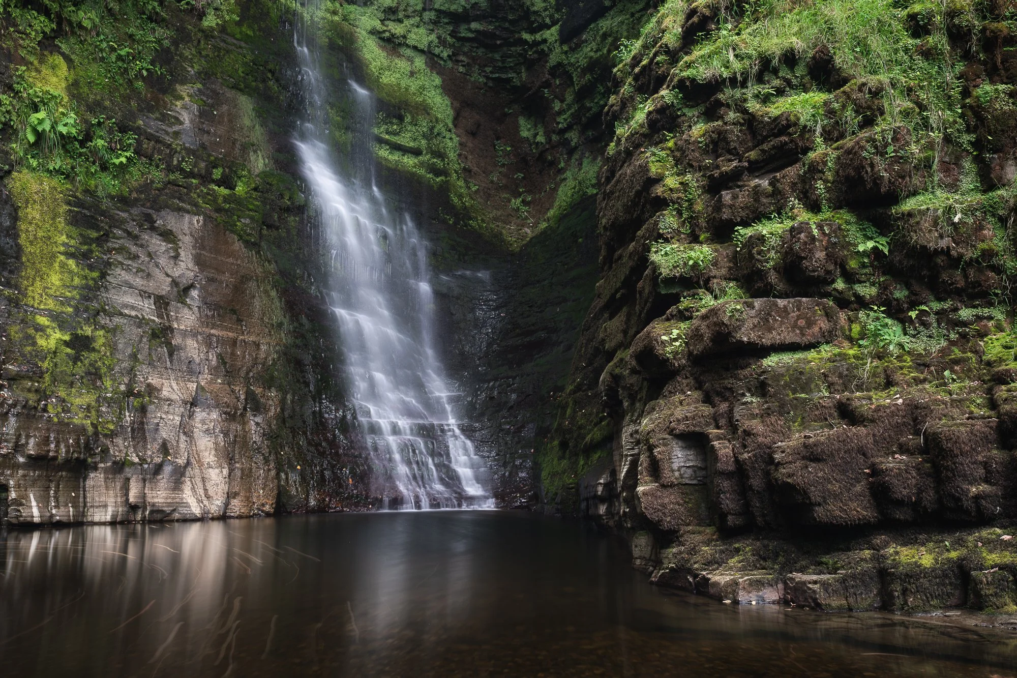
Summertime Waterfall Photography in the Brecon Beacons
Join me for a 2 day summertime trip to photograph the waterfalls in the beautiful Brecon Beacons National Park
To date, I’ve made quite a few trips to photograph the waterfalls in the Brecon Beacons, and I’ve typically chosen to visit this area of Wales during spring and autumn to take advantage of the vibrant greens or autumnal colours provided by the woodlands at those times. This year, to mix things up a bit, I decided to schedule a visit towards the end of summer. Unlike many landscape photographers, I actually enjoy photographing the summer woodland and relish the challenge of seeking interesting images in a relatively difficult environment. With the fuller foliage helping to keep the bright skies out of my compositions, I set off on the 3–4 hour drive to the Brecon Beacons National Park in South Wales.
It’s worth noting that this summer has been quite a dry one, so I was expecting a light flow of water along the Afon Hepste—and as you can see from the photo of me standing in front of the upper section of Sgwd Isaf Clun-Gwyn, this was indeed the case. Typically, where I’m standing has gushing water falling over it, but with it being so dry I was able to climb down and stand in a spot that’s not often reachable.

Fujifilm XT5 | XF10-24mm | 10mm | 1/6th Second | f/10 | ISO125
Photographing the details
The day I arrived, there was very little cloud and plenty of high-contrast sunlight filtering into the valley, which made it difficult for me to take the style of photo I prefer. So, instead of fighting those specular highlights in the scene, I mounted the telephoto lens and spent the first part of the day zooming in on the falls and photographing smaller, more intimate compositions.

Fujifilm XT5 | XF50-140mm | 111mm | 0.6 Seconds | f/11 | ISO125

Fujifilm XT5 | XF50-140mm | 111mm | 0.6 Seconds | f/11 | ISO125
I spent a fun couple of hours with the telephoto lens, experimenting with different shutter speeds to create various effects in the water. The longer the shutter speed, the silkier the water became, and you can see the different settings I used directly beneath each photo in this article.

Fujifilm XT5 | XF50-140mm | 111mm | 0.6 Seconds | f/14 | ISO125
Fujifilm XT5 | XF50-140mm | 140mm | 1/2 Second | f/9 | ISO125

Fujifilm XT5 | XF50-140mm | 111mm | 1 Second | f/14 | ISO125

Fujifilm XT5 | XF50-140mm | 140mm | 1/2 Second | f/9 | ISO125
Fujifilm XT5 | XF50-140mm | 124mm | 1/3rd Second | f/11 | ISO125
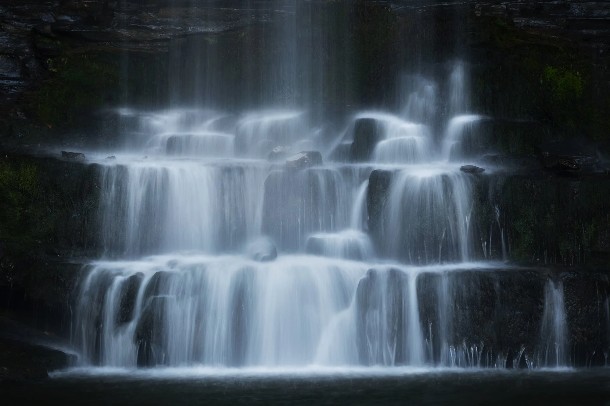
Photographing Sgwd y Pannwr
When the cloud cover finally increased, it became easier to use a wider focal length and capture the entire waterfall in one frame without contending with harsh light on the landscape. At Sgwd y Pannwr, I climbed down to the plunge pool beneath the main falls to see if I could find something to use as foreground interest. After a few minutes of hunting around and testing different compositions, I settled on a couple of options—using either the rocks on the edge of the water or the green ferns further back. Both of these are posted below.

Fujifilm XT5 | XF10-24mm | 14mm | 1/6th Second | f/14 | ISO125

Fujifilm XT5 | XF50-140mm | 52mm | 1/2 Second | f/9 | ISO125

Fujifilm XT5 | XF10-24mm | 10mm | 1/3rd Second | f/11 | ISO125

Fujifilm XT5 | XF50-140mm | 140mm | 1/2 Second | f/9 | ISO125
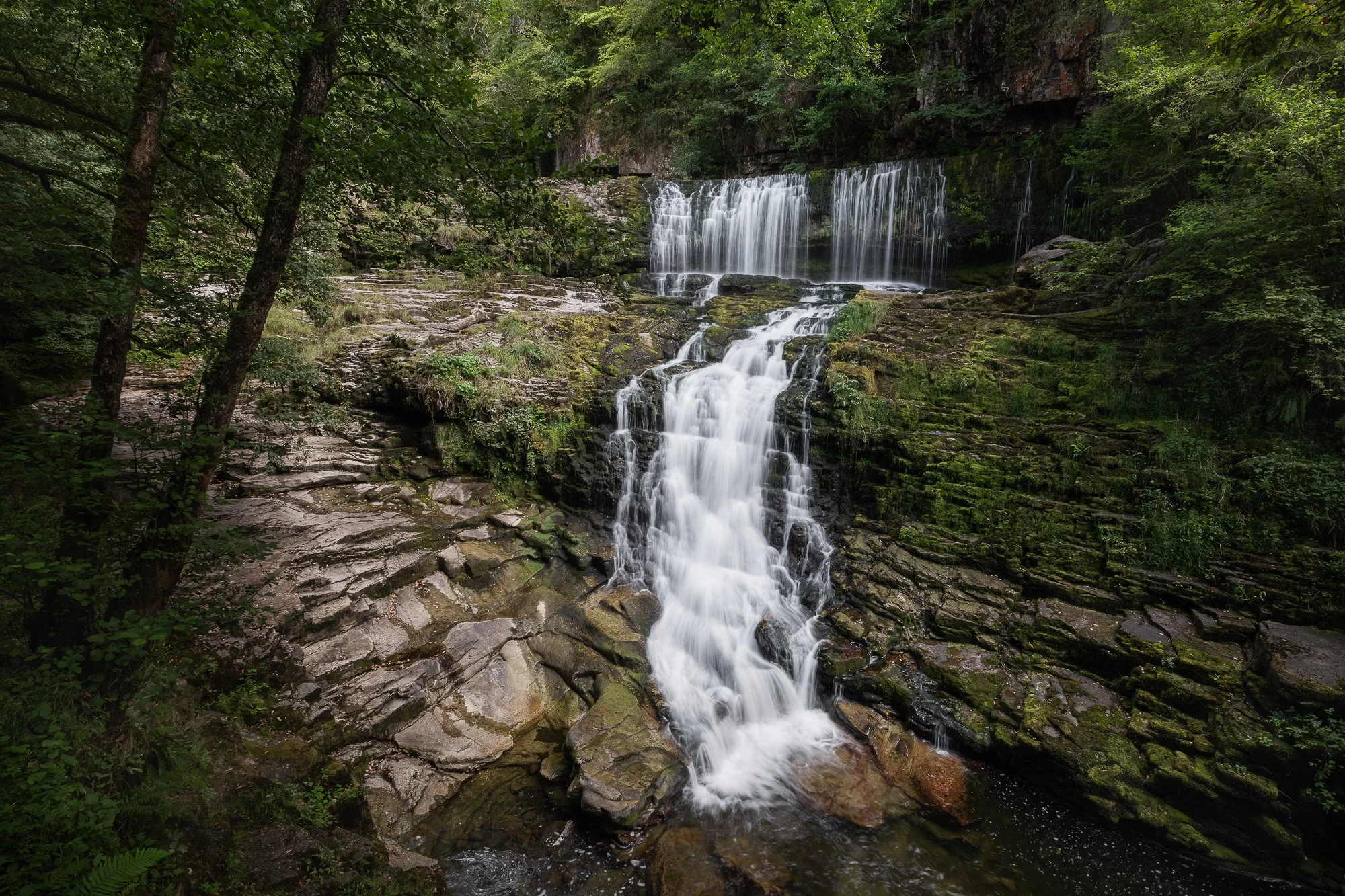
Photographing Sgwd Isaf Clun-Gwyn
During the two-day trip, I spent a little time at Sgwd Isaf Clun-Gwyn, my favourite of all the falls along the Four Falls Trail. This waterfall is made up of multiple drops, offering many different photographic opportunities, but what I really like is how, beyond the obvious compositions, it challenges you to work harder to find interesting shots.
Fujifilm XT5 | XF16-55mm | 25mm | 1/4th Second | f/11 | ISO125

Fujifilm XT5 | XF10-24mm | 17mm | 1/4th Second | f/7.1 | ISO125

Fujifilm XT5 | XF10-24mm | 17mm | 1/6th Second | f/6.4 | ISO125
I’ve mentioned in previous blog posts that this view of Sgwd Isaf Clun-Gwyn is by far my favourite. Reaching it isn’t easy, and I mean that literally—this waterfall really makes you work for your shots. There are a couple of ways to get here: one involves scrambling down an almost vertical rock face (not for the faint-hearted), while the other is an easier stroll along the edge of the river—but only when water levels are low enough. Once you arrive, the effort feels worth it: the trees naturally frame the falls, highlighting the cascading water as it tumbles down the rocks into the plunge pool below.

Fujifilm XT5 | XF10-24mm | 11mm | 1/3rd Second | f/8 | ISO125
Photographing Sgwd Einion Gam
During previous visits to the Brecon Beacons, I’ve hiked along the Elidir Trail a couple of times, but I’ve never managed to reach Sgwd Einion Gam. It’s nicely tucked away upstream from Sgwd Gwladys, but to get there, you need to cross the river a couple of times—and on previous visits, the water levels have been too high.
As I wandered along the Elidir Trail this time, I could see that the water levels were far too low to make interesting waterfall photos, so I decided to hike up the river to Sgwd Einion Gam and use the opportunity to familiarise myself with the route for a future visit when conditions might be a little better.

Fujifilm XT5 | XF16-55mm | 26mm | 40 Seconds | f/9 | ISO125
As I suspected, the waterfall itself was underwhelming due to the lack of water, but it was still an impressive space to experience. Even though I wasn’t expecting much, I managed to capture a couple of long-exposure photos, making the most of the time I had there.
The image below is the result of being drawn to how the reflective light was falling on the rockface, making it appear almost metallic to the eye. With the help of an ND filter, I made a long exposure, smoothing out the water, leaving just a few trails of fallen leaves and enabling the texture of the rocks to stand out in the composition.
Fujifilm XT5 | XF16-55mm | 39mm | 25 Seconds | f/9 | ISO125
Photographing Sgwd Yr Eira
No trip to the Four Falls trail would be complete without photographing the famous Sgwd Yr Eira waterfall. Due to its popularity along the trail, I always make a point to arrive early in the morning, as that’s the only time you can take photos free of other people, so the next morning, I woke up and headed straight here.
Having spent some time here the day before photographing the details with my telephoto lens, I wanted to take a few wider compositions to feature the summer foliage, and by getting my camera lower to the ground, I could use the rocks and small cascades to add some foreground interest.

Fujifilm XT5 | XF10-24mm | 17mm | 0.6 Seconds | f/13 | ISO125

Fujifilm XT5 | XF10-24mm | 10mm | 1/4th Second | f/6.4 | ISO125
Shortly after taking the photos of Sgwd Yr Eira above, I noticed an impressive fern on the other side of the water. I stopped what I was doing, mounted my telephoto lens to gain a little more reach, and composed the shot so the fern would fill the entire frame. I think it’s important to keep an open mind while out in the field, as I’ve certainly been guilty many times of focusing on a single subject or composition and potentially missing out on others.

Fujifilm XT5 | XF50-140mm | 129mm | 1/4th Second | f/9 | ISO125
Fujifilm XT5 | XF16-55mm | 23mm | 0.8 Seconds | f/16 | ISO125
A quick stop at Blaen-y-glyn Falls
Before heading home, I made one last stop at the Blaen-y-glyn Falls. My expectations for waterfall photography were quite low, as the flow was just as light here as it had been along the Elidir Trail. Still, I made a point of visiting, wanting to explore and see how the place looked in summer. I did get my camera out a couple of times and took a few scouting shots, but only one made the cut to be featured below.
This composition is similar to one I photographed on a previous visit, though back then the greens were more subdued and there was more water falling onto the log wedged solidly at the base of the waterfall. I like the subtlety of the water as it falls, framed by a wall of green moss and plant life, and I find it interesting how the fallen branch has come to rest exactly where the water lands, sticking out from the wall at an almost perfect 90-degree angle. Using a similar composition to the one I captured the previous year, I took this final photo of the trip.
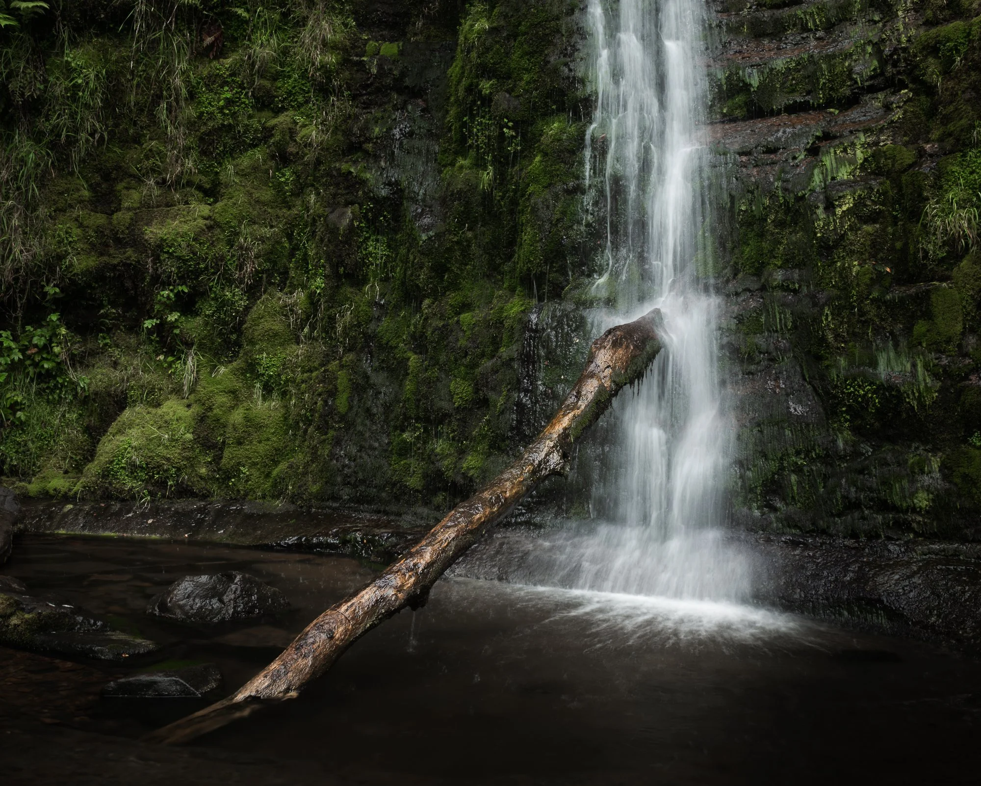
Fujifilm XT5 | XF16-55mm | 25mm | 0.4 Seconds | f/14 | ISO125
That’s it for another trip to this beautiful location in the Brecon Beacons, Wales. If you want to read about some of my previous trips photographing the falls in the spring and autumn months, check out the links below.
Until next time,
Trevor


Examples: The Making of 40 Photographs by Ansel Adams | My Photo Bookshelf
Examples: The Making of 40 Photographs reveals the stories, techniques, and creative vision behind Ansel Adams’s most iconic images.
To most landscape photographers — or photographers in general — Ansel Adams needs no introduction. Considered by many to be one of the greats and an early pioneer of the craft, he was, I must admit, someone I knew very little about before owning this book. I had watched a few videos and heard plenty of discussion about him and his photography, but to truly understand his work, I needed to explore it more closely. After reviewing the options available, I felt The Making of 40 Photographs was the best choice to do so.
Synopsis
"How did you make this photograph?" This is the question that Ansel Adams was asked repeatedly during his lifetime. In this book, Adams shares the circumstances surrounding the making of many of his most celebrated photographs. Each of the 40 photographs are superbly reproduced in duotone, is accompanied by an entertaining and informative narrative that combines reminscence of people and places with precise recall of technical details and aesthetics considerations.
The specific technical information on camera and lens, filters, exposure times, developing, and printing provided in each example illustrates his approach and methods and will assist amateur and professional photographers alike in learning the craft. Through this case study approach, Adams' philosophy of craft and creativity unfolds: his credos of visualisation, image management, and the Zone System are demonstrated: and the colour story of a lifetime devoted to photography is revealed.

My thoughts about the book
The premise of this book — and the reason I bought it — is that it showcases forty photographs taken by Ansel Adams throughout his career, each accompanied by his own words describing the story behind the image. He shares the physical experience of making the photograph, why and how it was taken, and, of course, the technical details such as the camera, film, and settings used.
The book opens with an introduction by Adams, followed by forty chapters, each featuring one image and a short essay. Some may assume the book focuses solely on landscapes, and although that genre does dominate, I was pleasantly surprised by the variety of work included — from still life to portraiture. It reminded me how little I actually knew about the full range of his photography. Some images resonated with me more than others — particularly those classic vistas or more intimate scenes — but that didn’t detract from the enjoyment of reading the stories behind each one.
Being Ansel, he never shied away from discussing the technical side of his work. That’s probably the part I found hardest to connect with, as I’ve never photographed using large-format film cameras. At times he delves into great technical depth, and I found myself skimming through those sections. I’m far more interested in the personal stories — and thankfully, there’s plenty of that to keep the reader engaged.
As I mentioned above, before reading this book, I knew an embarrassingly small amount about Ansel Adams, and buying it was my attempt to change that. If, like me, you’re curious to look deeper into his work, Examples: The Making of 40 Photographs is a great introduction to Ansel Adams’s photography and a worthy addition to any bookshelf.
Book Details
Softcover
Size: 231mm x 266mm
Pages: 192
Availability at the time of writing: Although I purchased a used copy, this book is still in print. Available from Amazon.

Photographing the Snowdonia Mountains by Nick Livesey | My Photo Bookshelf
Photographing the Snowdonia Mountains. A comprehensive guide combining striking photography with practical information for those looking to explore this inspiring landscape.
Before my first dedicated trip to photograph Snowdonia a few years ago, I was searching for information and inspiration. That’s when I came across Nick Livesey’s book, Photographing the Snowdonia Mountains, published by Fotovue, a book dedicated to landscape photography, packed with location tips, tricks, practical information, and inspiration.
Synopsis
Snowdonia is one of the most accessible mountain areas in the UK and photographer Nick Livesey knows it better than most. Having lived in the heart of Snowdonia for the last five years, Nick walks these hills and mountains with his camera most days.
In Photographing The Snowdonia Mountains, Nick shares his knowledge guiding us around the best mountain walks, short walks and roadside locations for mountain photography.

My thoughts about the book
Like most of Fotovue’s titles, Photographing the Snowdonia Mountains is as much a showcase of superb landscape photography as it is a location guide, and that’s precisely why I chose it over other books on offer. When researching a location, I tend to look for visual inspiration, not to place my tripod in the same holes as Nick, but to get a sense of what might be possible. I want to know whether that long slog up a particular mountain could reward me with the kind of photographic opportunity I’m after.
The book begins with some acknowledgements, followed by an engaging foreword by British mountaineer Sir Chris Bonington and an introduction by Nick himself.
Alongside the photography, Nick has assembled a wealth of information to help anyone new to hiking around Snowdonia get off to the best possible start. Even before he gets into the locations, he covers important topics such as:
An overview of the book
The equipment he uses
Weather, climate and seasonal advice
Sunrise and sunset information
Places to stay, eat and drink
Clothing and gear for surviving harsh mountain conditions
Safety and camping tips
Planning your own trip
A few pointers on the Welsh language
That section alone feels like a book’s worth of content.
From there, the main body of the book contains 15 chapters, each dedicated to a specific mountain walk. Every chapter provides clear, detailed information — written directions, route maps, viewpoints, elevation, accessibility, parking, and the best time to visit. Alongside all that practical guidance, Nick includes some beautiful photographs from the viewpoints described, helping the reader to visualise what awaits them.
For those without the desire or ability to hike up the mountains, there’s also a thoughtful section at the end dedicated to photographic locations accessible from the roadside or within a short walk from a car park. These easier spots are presented with the same level of care and detail as the main routes, making the book useful to any landscape photographer visiting Snowdonia.
Ultimately, this book serves as both an inspiring collection of work by an accomplished landscape photographer and a reliable guide for anyone planning to explore the region. Even now, before setting off on any trip to Snowdonia, I often find myself flicking through its pages for inspiration — which, I think, speaks volumes about its value. For that reason, I’d happily recommend it to anyone planning their first (or 50th!) photographic adventure in Snowdonia.
Book Details
Softcover
Size: 189mm x 246mm
Pages: 288
Availability at the time of writing: New copies are out of stock, but there are plenty of used copies available at the time of writing.
Until next time.
Trevor

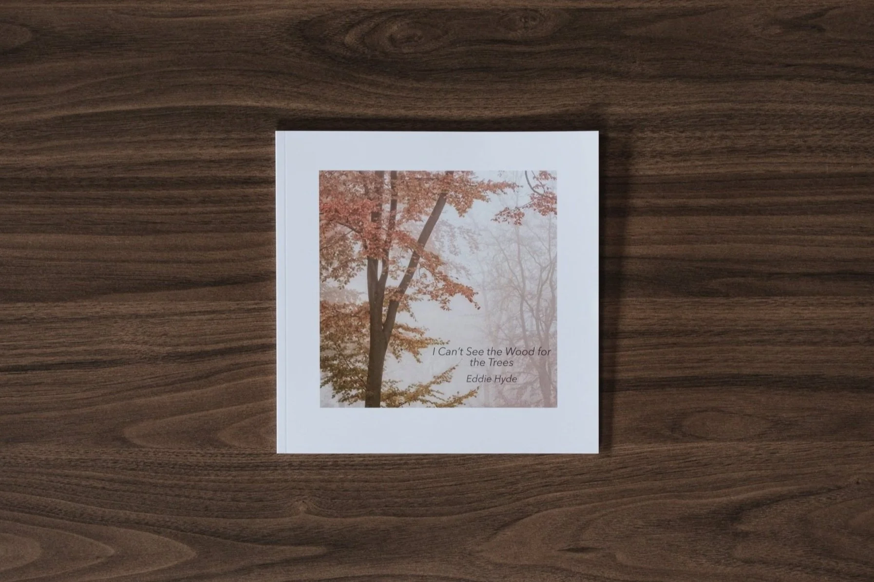
I Can’t See the Wood for the Trees by Eddie Hyde | My Photo Bookshelf
A woodland photography book by Eddie Hyde, featuring beautiful images of the Surrey woodland
Eddie Hyde is a photographer based in Surrey, and UK. In 2024, I attended an exhibition he co-hosted with Vanda Ralevska, showcasing some of their beautiful landscape photography. While there, I picked up this self-published photobook by Eddie titled I Can’t See the Wood for the Trees, which features a selection of his beautiful woodland images.
Author’s Synopsis
Just to note, I couldn’t find this book on Eddie Hyde’s website, so this is an extract from the book’s introduction.
I have always had a strong affinity for nature and woodland. The range of sensations within a wood brings a sense of wonder, comfort and peace. In Japan, they call it Shinrin-Yoku: taking in the forest atmosphere or “forest bathing”.
Living in Surrey, which has the most trees of any county in England, I am in easy reach of many of these woodland areas and visit them almost daily, most often in the early morning or late afternoon when the light is at its best. For me, being amongst the trees is calming, invigorating and therapeutic. I love to search for order in the chaos.
In this booklet, I hope to share with you this experience and to show the beauty to be found in my local woods.
My thoughts about the book
This modestly sized softback book opens with an introduction by Eddie Hyde, in which he explains his interest in landscape photography and his connection to woodland, particularly in Surrey. When you turn the page, the first woodland photograph appears, setting the focus for the rest of the book.
There’s something deeply satisfying about focused photobooks that explore a single subject or theme in depth. Showcasing the beauty of the Surrey woodland (home to more trees than any other county in England), these smaller, carefully crafted monographs allow the photographer to immerse themselves fully in their subject. I especially appreciate this approach because it gives the author space to reveal what truly draws them to the subject, capturing nuances and moods that broader collections might overlook. For me, such books offer a richer, more intimate connection to the place and the artist’s vision.
Regarding the design, I appreciated the sequencing, which helps the eye flow effortlessly between the pages, and the use of a square crop on each page suits the individual compositions well, giving the book a consistent and balanced look. The images, mostly taken during autumn and winter, are stunning. While including spring and summer scenes might have added a little more variety, leaving those seasons out perhaps opens the possibility for a future volume.
I’m not entirely sure of the paper specification, but each page has a pleasing weight and appears to use a soft-sheen, lustre-like finish, which I feel suits the mood of the work perfectly.
I’m pleased to have discovered Eddie’s book while visiting the exhibition. If you’d like to own a copy, I recommend contacting Eddie via his website to check availability.
Book Details
Soft cover book
Size: 21cm x 21cm
Pages: 46 pages
Availability at the time of writing: I looked on the author’s website to find out more about this book’s availability, but it was not mentioned. I recommend contacting Eddie via his website to check availability. https://eddiehydephotography.zenfolio.com
Until next time.
Trevor
New Photos | Spring 2025
A collection of photos taken during Spring 2025.
One reason I like to write these quarterly retrospectives is that they give me a chance to look back at the photos I’ve taken and reflect on them — and sometimes even relive those moments. Not every picture is what I’d call portfolio-worthy, but if I share it here, it’s because it connects with me in some way. Without these seasonal posts, many of these photos would at best have a brief moment on social media, or at worst, never see the light of day at all.
Welcome to the sixth post in my “New Photos” series, this time featuring some of the images I took in spring 2025. Alongside a couple of short trips to the Welsh mountains and the Cornish coast, I spent a lot of time working on my woodland photography. I wanted to teach myself to look deeper, building interesting compositions from the shapes and patterns in and around the canopy, rather than just taking tree portraits or relying on fog to create atmosphere and depth.
March to May 2025 - Spring 2025 collection.
Before getting to my woodland images, I thought I’d start with my early spring visit to Eryri (Snowdonia). Because of scheduling challenges, I ended up wandering these majestic mountains in that seasonal no-man’s land where it’s too warm for winter conditions but still too early for any real spring colour. Even so, I made the most of it and had a great time exploring the landscape, hiking the hills, and photographing this stunning national park.
I’ve shared just a handful of the photos I took here, but if you’d like to see more from this trip, I put together a dedicated post covering my time there. You can find it below.


Photographing the woodland in Spring
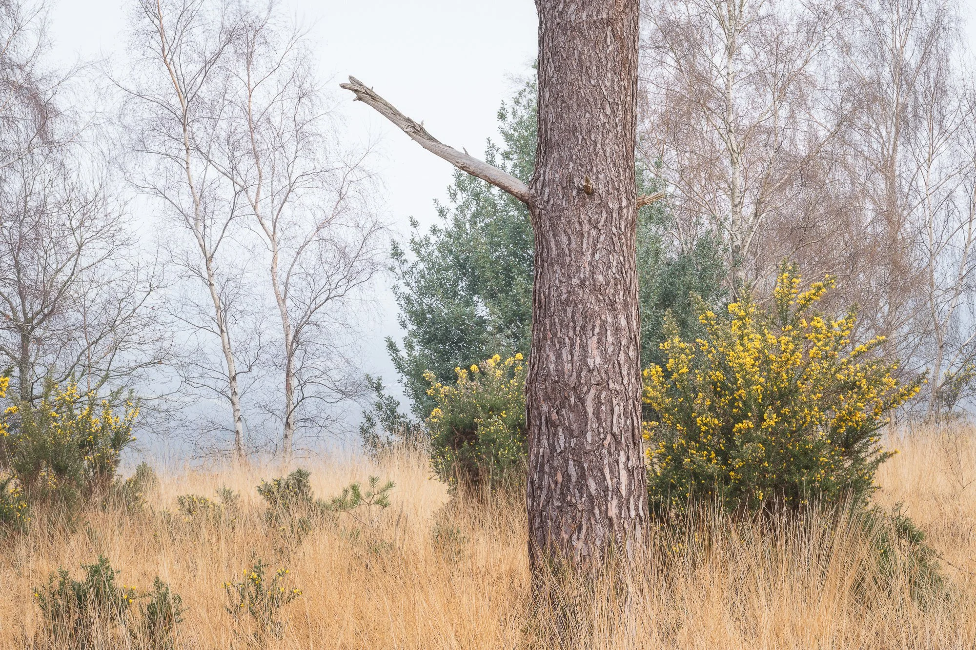
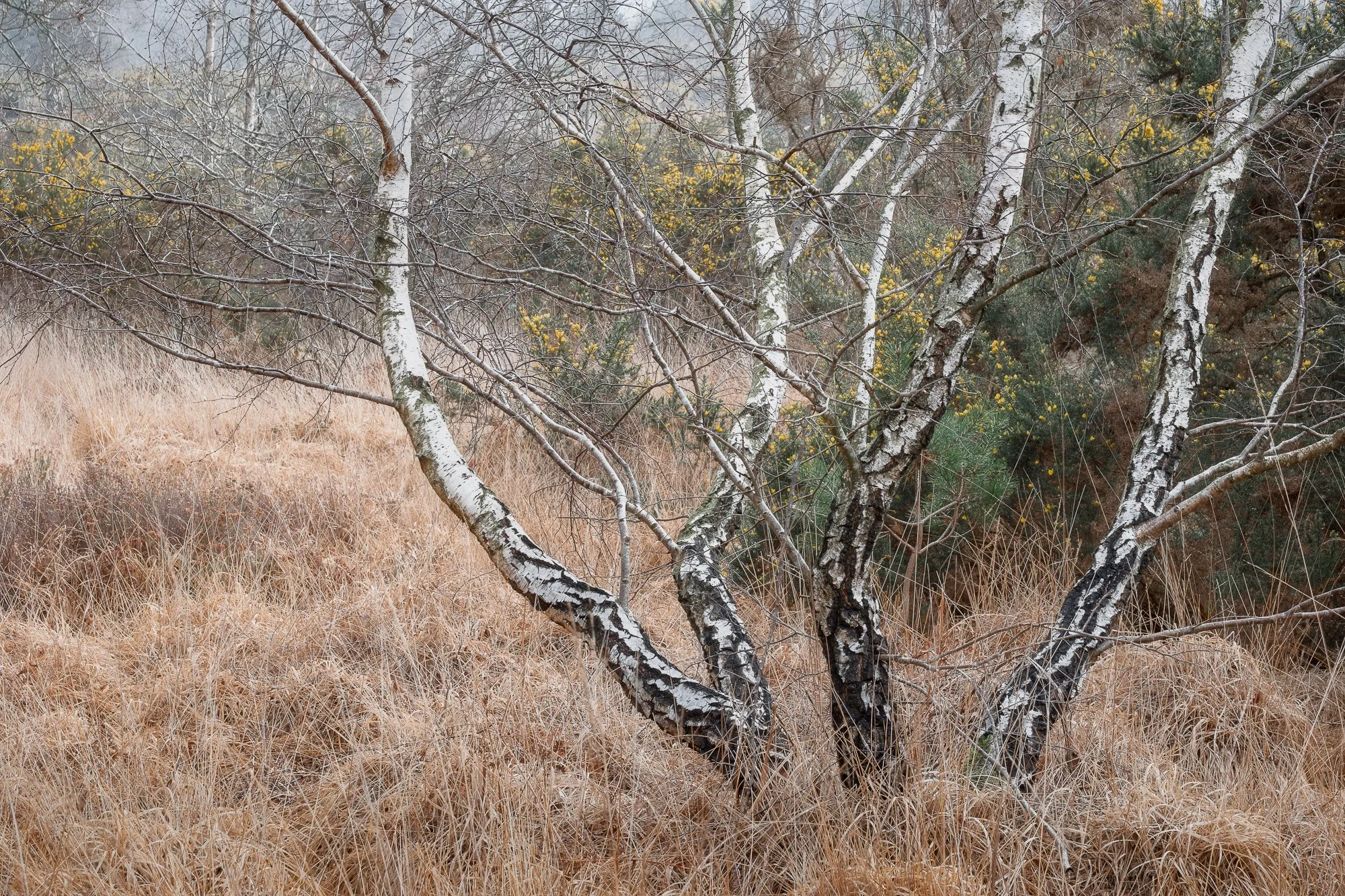
As I mentioned earlier, alongside looking for more traditional woodland scenes, I also made a point to seek out interesting shapes and textures in and around the trees, especially up in the canopy. The forest I spend most of my time photographing is home to both older, gnarled trees and tall Scots pines with their straight trunks, so it offers a good variety of subjects and compositions. The tough part, as always with woodland photography, is actually finding them.


Seascapes in Cornwall
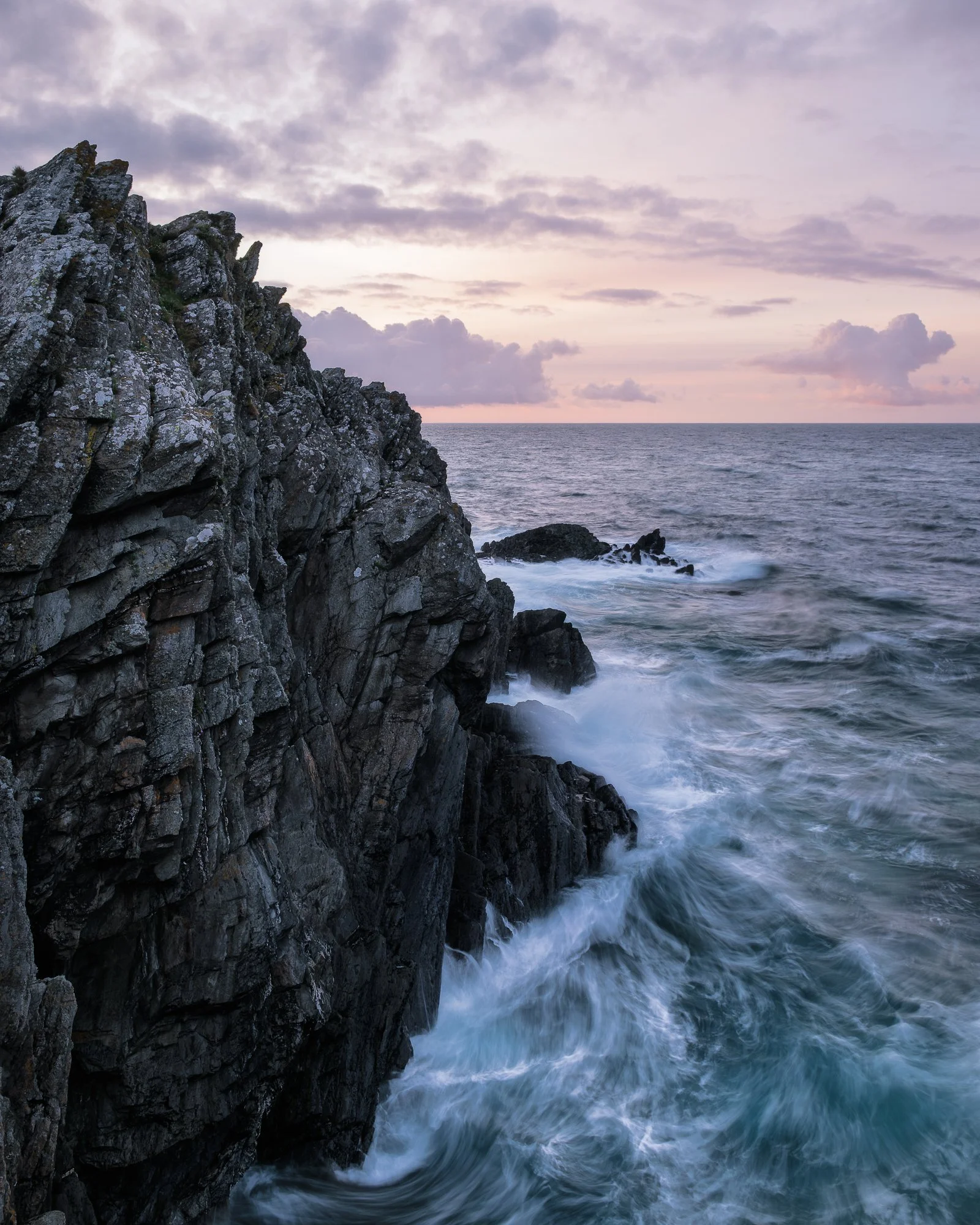
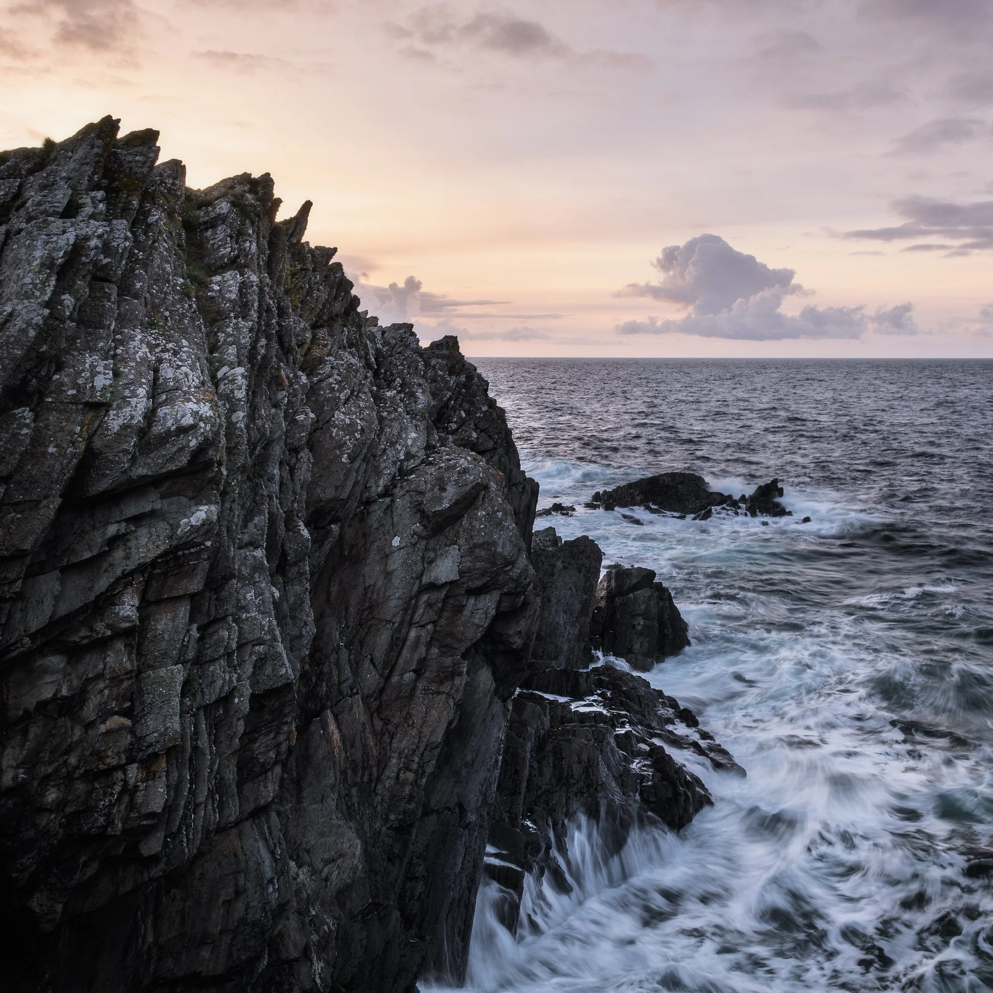
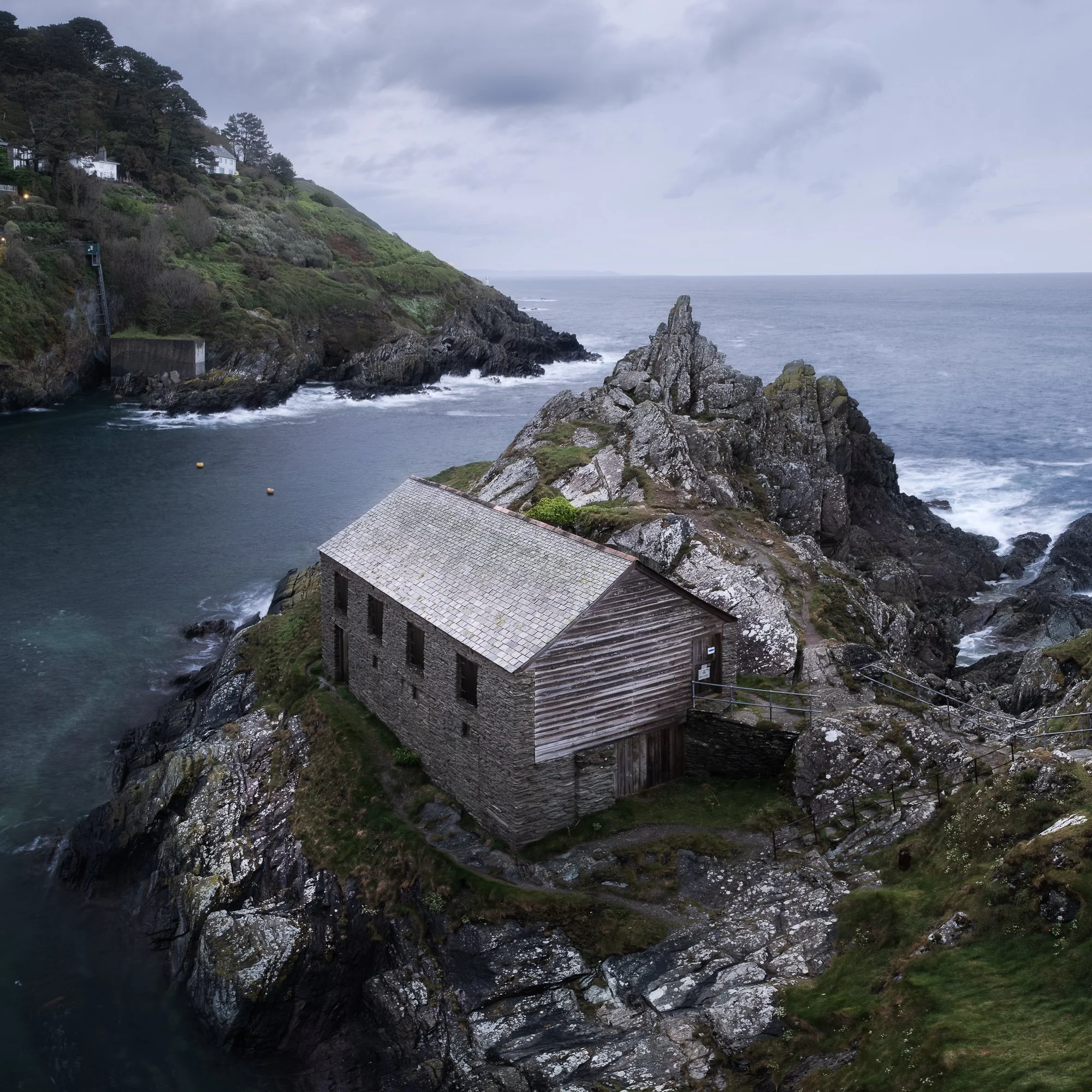
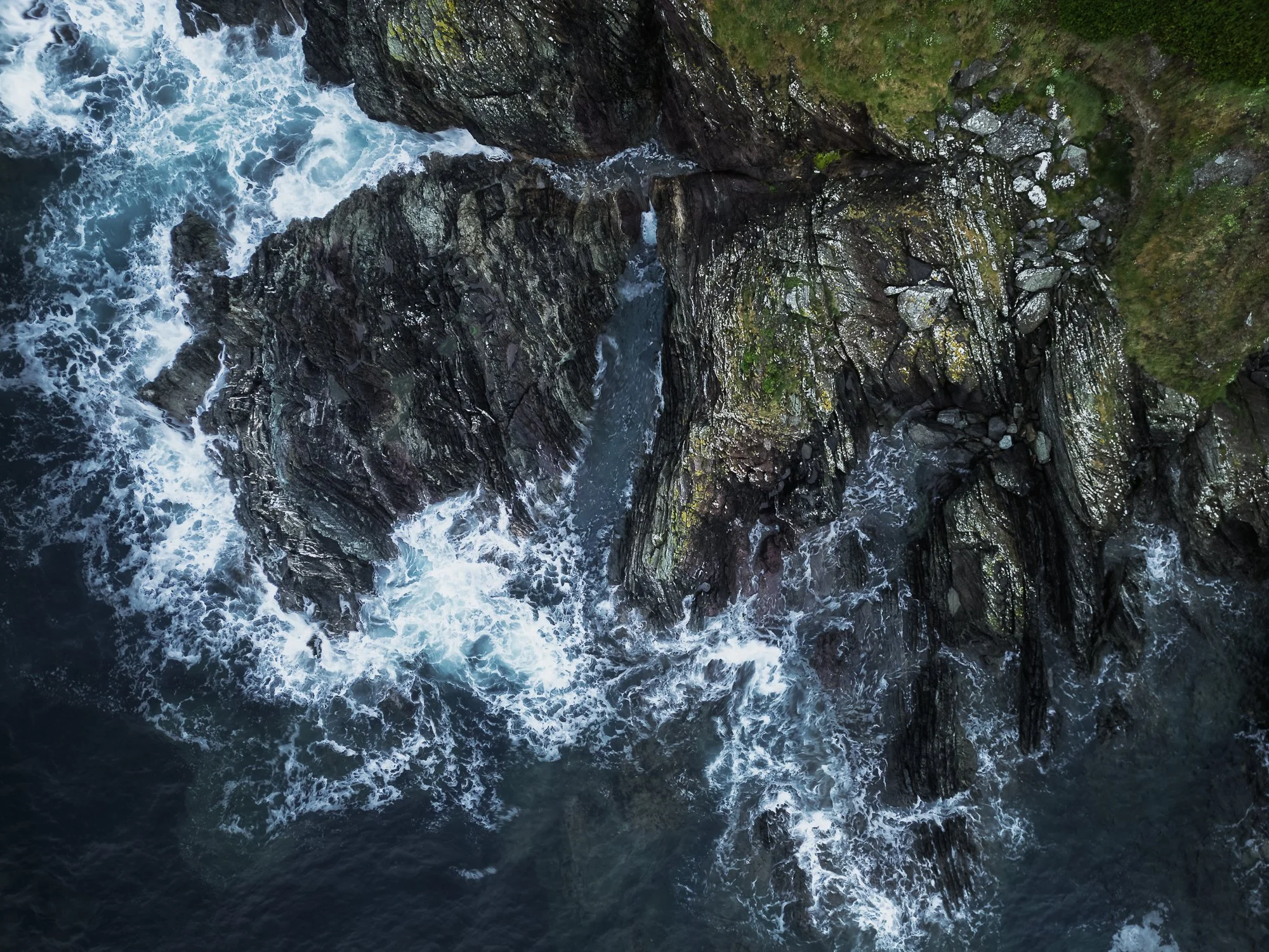
Back in April, I spent a few days on Cornwall’s south coast. It was a last-minute family getaway for some much-needed R&R in Polperro. Being early in the season — and with some pretty miserable weather (the colour in the sky in the first image was definitely the exception) — this small but usually popular fishing village was blissfully quiet during our stay.
I wasn’t there to spend loads of time with my camera, but I did pop out a couple of times and spent a few hours by the water taking pictures. I’ve posted a few of my favourites below.


Photographing the Landscape
Apart from my trip to Snowdonia, I didn’t really spend much time photographing the wider vistas or more “traditional” landscapes this spring (and so far, the same could be said for summer too!). I’m not entirely sure why, other than splitting my time between photographing London for my Timeless City project and exploring the woodland, which hasn’t left much room for anything else.
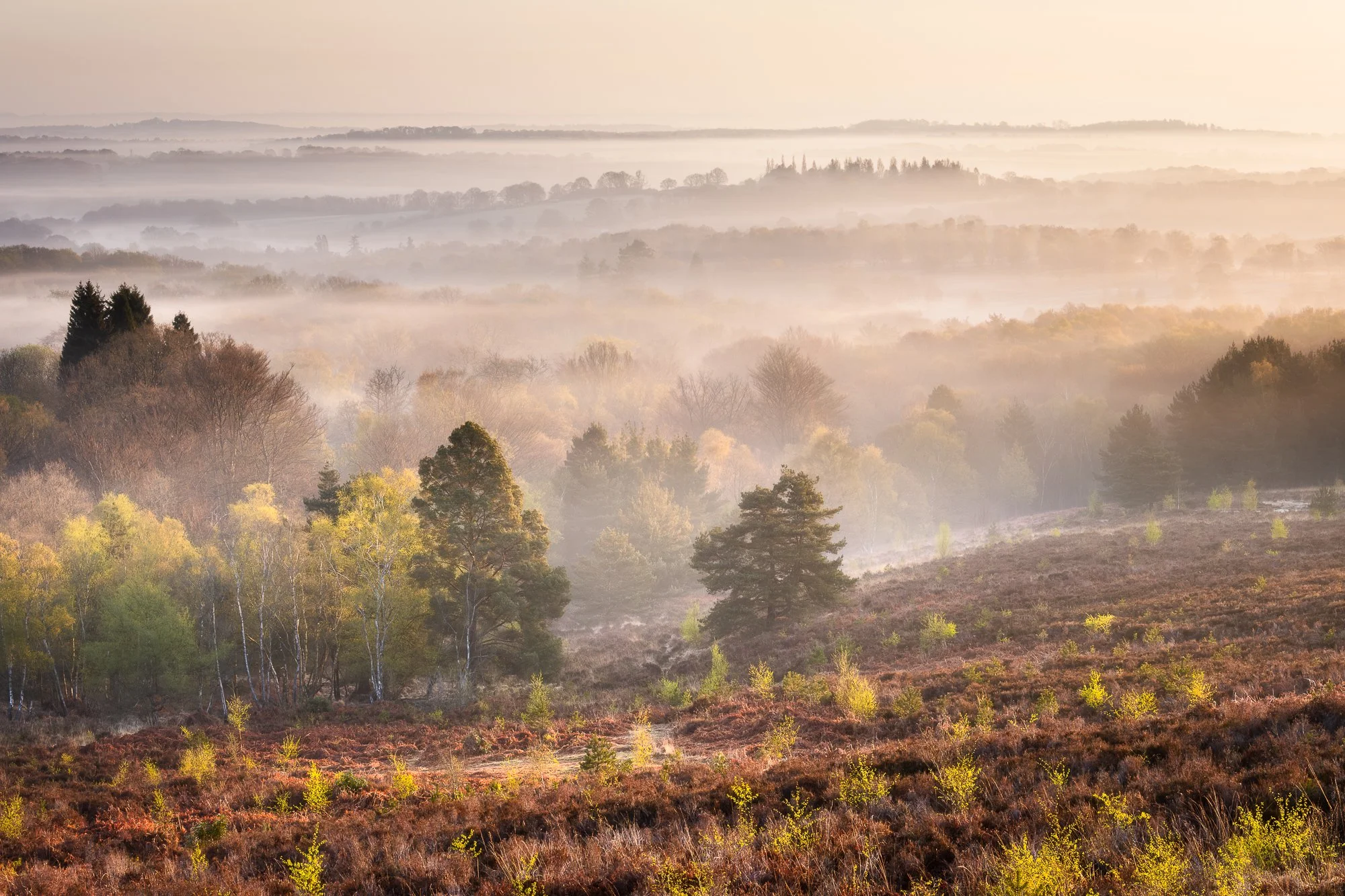
I did, however, manage to take an aerial photo with my drone in Sussex that I quite like. It was captured early one morning during a stunning cloud inversion. Underneath that drone photo, you’ll also find a few shots from a morning spent wandering the open heathland near my local woodland.
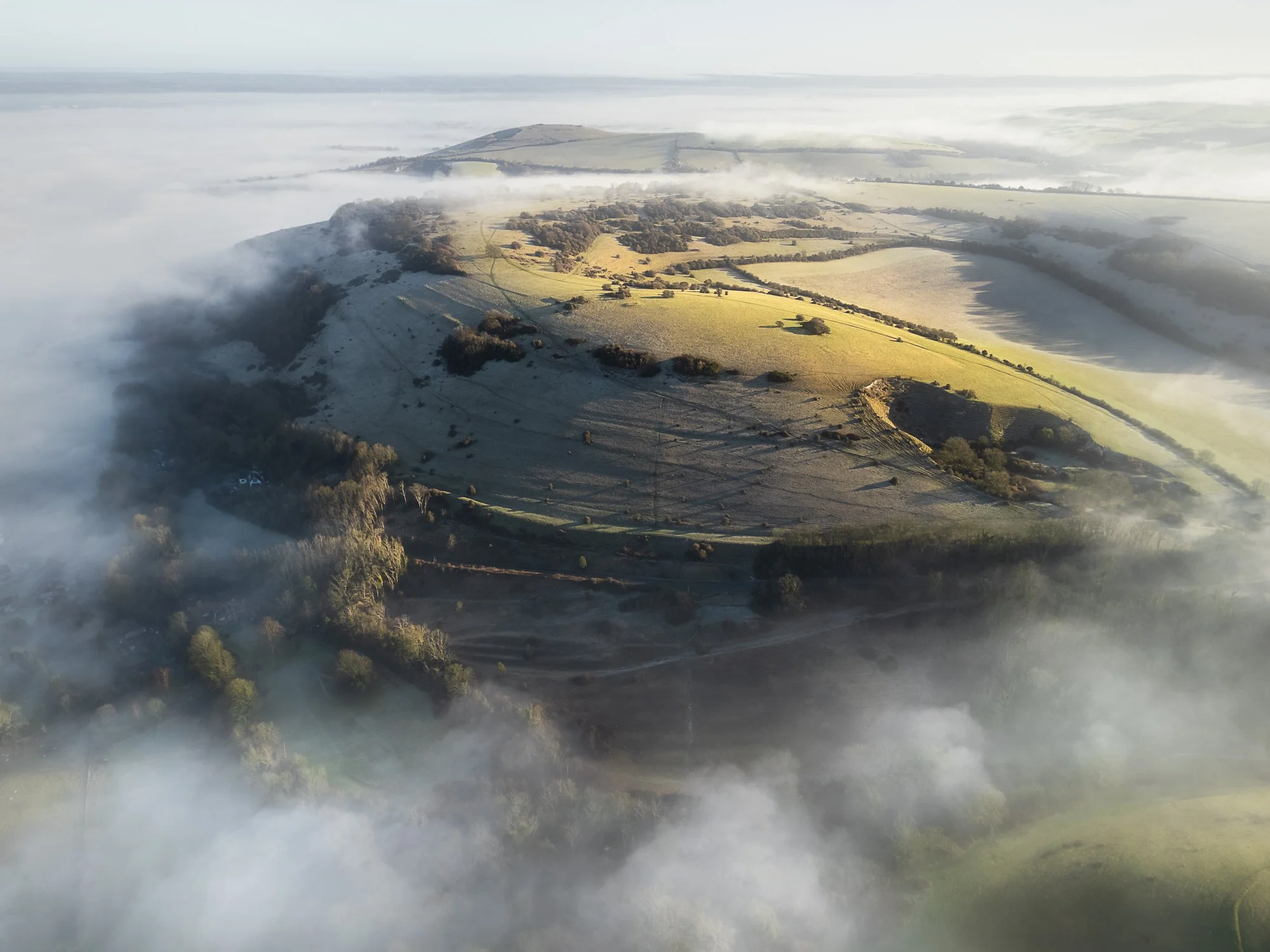

Just a quick note about the next few landscape photos. It’s a scene I photograph regularly, and it’s turned into a bit of a personal project to capture it in all seasons. I know I’ve shared similar versions many times before, but it doesn’t hurt to explain why, as it might seem a little odd to keep photographing this nice, but hardly “epic,” view.
This spot is right next to the woodland where I often shoot. Since I usually arrive before sunrise, with the woodland still dark, I’ll typically stop here for my morning coffee. Over the years, I’ve grown particularly fond of this view — sipping coffee, contemplating the world while the sun comes up. Visiting so often, through different seasons and changing conditions, I’ve built a small collection of photos of this single view. I’ve taken wide panoramas, distant layers (like the one further below), and close-up shots of the treeline. I may one day post them here as a dedicated project, but for now, here’s the handful I captured this spring.


The London Cityscape
I purposely choose not to share new Timeless City work in these “new photo” blog posts. I think it’s because I see that project as something separate from my usual colour work, and I want to give it its own space on my website. During the spring months, I spent a lot of time in London photographing for this series, but still managed to take a few colour cityscape images as well.
The view of St Paul’s and the Millennium Bridge is by no means unique — it’s a composition I’ve shot countless times over the years and never really been happy with. Until now. I’m incredibly pleased with the photo below. The texture in the sky and water, and the subtle light across the scene, all work together to complement the dominant front-to-back architectural subject.

Another common theme running through much of my cityscape work is the use of the 5x4 portrait aspect ratio. It’s something I started experimenting with a year or two ago, and now I’ve built up a growing collection of London cityscape photos shot this way.


As I mentioned earlier, this is the sixth edition of my New Photos series. It probably deserves a dedicated home on my site someday, but for now, you can browse the previous releases by clicking the thumbnails below.


As ever, feel free to drop a comment below, as it’s always good to hear your thoughts about the pictures I take and how they might resonate with you.
Until next time,
Trevor

Reflected Light - Volume One by Ben Horne | My Photo Bookshelf
The first in Ben Horne’s Reflected Light zine series features large-format film photographs from one of his seasonal outings to Zion, Death Valley, and southern Utah.
If you weren’t already aware, Ben Horne is a large format landscape photographer from the United States, best known for his beautifully composed, carefully crafted images captured on 8x10 film.
I’ve followed Ben’s work for a few years now, primarily through his YouTube channel and website, and I’m a big fan of both his photography and how he approaches his craft. I’ve already bought one of his books with my own hard-earned cash — Between the Wind, published by Kozu Books, but, Just to be fully transparent, I received volume one of his Reflected Light series as a gift, along with a book by Guy Tal (another one to read and review here), as a competition prize from a podcast Ben used to host called Creative Banter.
Author’s Synopsis
Included in this zine is my favorite work from 2023, spanning my two winter trips, my spring trip, and my fall trip. Each photo is accompanied by text, along with information about the film, camera, and lens used.
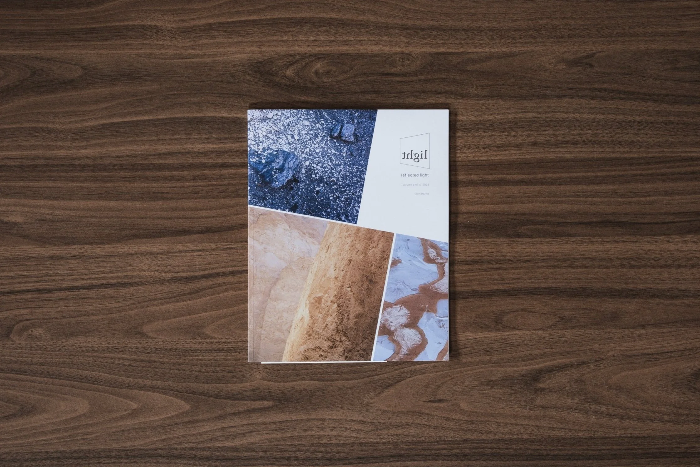
My thoughts about the book
First of all, the zine itself. Printed on satisfyingly heavy, uncoated recycled paper, it feels great to flick through, and the photos, with their matte finish, look fantastic on the page. It’s a perfect example for anyone who doubts the quality of lower-cost zines compared to traditional photo books.
Inside, the zine opens with a short introduction by Ben and then goes straight into the images. Presented in various orientations and sizes, he’s done a great job adding variety to how the photos appear on the page, which makes the book flow beautifully. I particularly like the full-bleed portrait images; printed at 8x10 inches, they’re shown at their native size, so I get to experience them much like viewing the original film.
Alongside each photo are technical details like the film used and exposure settings, and nearly all are paired with a “behind the lens” story. These add great context, offering insight into what drew Ben to the scene, how repeated visits paid off, and the subtle compositional choices that made the final image work.
I mentioned above that I received this zine as a gift from Ben, but I strongly believe that artists should be supported, and alongside buying his first book, Between the Wind, I have since purchased a copy of the sequel to this Reflected Light zine, and will post my thoughts on that one at a future time.
This edition is now sold out, but if you’re only just discovering Ben’s work or this zine series, I’d recommend subscribing to his newsletter and keeping an eye out for the next release.
Book Details
Soft cover zine
Size: 8” x 10”
Pages: 32 (18 images) - 100% recycled uncoated paper stock
Availability at the time of writing: Out of stock, but in the unlikely event this zine is reprinted, it will be available on Ben Horne’s website here: https://www.benhorne.com/store
Until next time.
Trevor

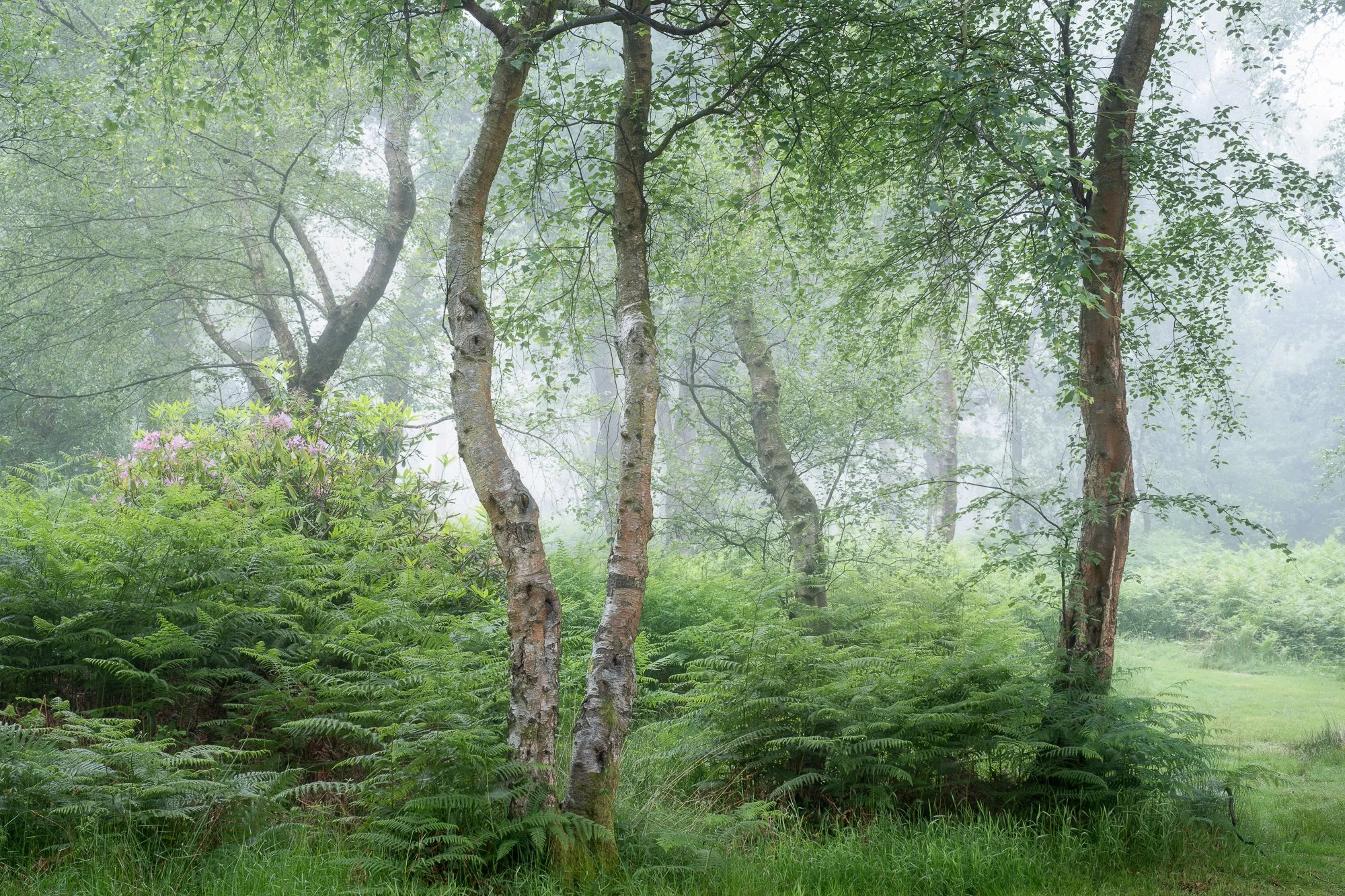
Photographing a Summer Woodland
I enjoy a fantastic morning in early June photographing a local woodland
Photographing the woodland in summer can be a bit of a challenge. The overwhelming green tones and lack of contrast between the trees often make it harder to pick out strong compositions. Dense foliage — particularly the ferns in my local woodland — also makes it more difficult to stray from the established paths, so exploring new areas can be tough going. On top of that, I prefer to photograph the woodland before sunrise, taking advantage of the softer, diffused light. But those early alarm calls definitely take some of the fun out of it. So it begs the question: why do I even bother?
Despite the difficulties, the summer woodland can be an incredibly rewarding place to be. The vibrant colours, the sounds of wildlife, and the cool early morning temperatures often lift my mood and set a positive tone for the rest of the day. And when the forecast calls for high humidity and little to no wind — the perfect conditions for mist or fog — that's all the encouragement I need to charge the batteries, pack my bag, and set the alarm for another early start.
Even when all the signs point to great conditions for woodland photography, it often doesn’t go the way I’d hoped. But one thing’s for sure: I never regret an early morning walk through the forest — even if the camera stays in the bag the whole time. As I mentioned, whether I take a photo or not, getting out early always gets my day off to the best possible start.
That said, it all comes together now and then — and that’s exactly what happened in early June, when I had a fantastic morning photographing my local woodland in misty conditions.

Fujifilm XT5 | XF50-140mm | 50mm | 1.5 Seconds | f/9 | ISO400

Fujifilm XT5 | XF50-140mm | 73mm | 1.5 Seconds | f/9 | ISO400

Fujifilm XT5 | XF50-140mm | 50mm | 0.8 Seconds | f/9 | ISO400
The photo above is probably my favourite from the day. This woodland has a mix of trees — from the mighty English oak, the delicate silver birch, to the tall Scots pine. When composing images, I’m often looking to combine different species, as they tend to create interesting contrasts while also complementing each other.
Take the Scots pine in the photo above: it doesn’t have much in the way of gnarly character, but its tall, straight trunk contrasts nicely with the more irregular shapes of the other trees, helping it to stand out, building a stronger, more varied composition.

Fujifilm XT5 | XF50-140mm | 50mm | 0.8 Seconds | f/9 | ISO400

Fujifilm XT5 | XF50-140mm | 140mm | 1 Second | f/9 | ISO400
Fujifilm XT5 | XF16-55mm | 35mm | 0.5 seconds | f/10 | ISO400

Fujifilm XT5 | XF16-55mm | 49mm | 1/4 second | f/10 | ISO400

Fujifilm XT5 | XF16-55mm | 55mm | 1/8th second | f/10 | ISO400
On most outings with my camera, I’m happy to come home with one — maybe two — photos I’m pleased with and want to keep. But every so often, everything falls into place, and I come back with a much larger set of images I’m genuinely happy with. This was one of those times.
I’ve lost count of how often I’ve been out in great conditions but just couldn’t find a composition. My brain needs to switch into “composition mode,” and no matter how much I try, I can’t force it. My most enjoyable trips — and often my best work — happen when compositions seem to appear on their own, without much effort on my part. It doesn’t happen often, and usually I have to work much harder. But on this rare occasion, the scenes seemed to present themselves without too much hunting.

Fujifilm XT5 | XF16-55mm | 38mm | 1/3rd second | f/10 | ISO250

Fujifilm XT5 | XF16-55mm | 55mm | 1/5th seconds | f/10 | ISO250

Fujifilm XT5 | XF16-55mm | 37mm | 1/8th second | f/10 | ISO250
So, why do I keep setting those ridiculously early alarms during the summer? For mornings just like this one. The quiet, the mist, the soft light—they make the effort worthwhile. Even when the shots don’t come easily, being out there always gets my day off to the best possible start.
If you’re thinking about trying woodland photography yourself, I’d say don’t be discouraged by early starts or tricky conditions. Sometimes the best shots come when you least expect them. Keep exploring, and enjoy the calm of those quiet mornings.
If you enjoyed this post, feel free to check out more of my woodland photos or share your own experiences in the comments!
Until next time.
Trevor

Venice in Solitude by Christopher Thomas | My Photo Bookshelf
A beautifully crafted book by Christopher Thomas, featuring 83 city portraits of Venice taken on Polaroid Type 55 film.
There’s something undeniably captivating about film photography, and even though I shoot digitally, I’ve always been drawn to its timeless quality. I follow the work of many photographers who shoot on film, and I find myself constantly inspired by the nostalgic mood it evokes. While I haven't yet explored film myself, I hope to one day have the time and patience to experiment with it. So, when I discovered Venice in Solitude by Christopher Thomas—a beautifully crafted book of black and white film photography capturing one of my favourite cities, it felt like a natural addition to my collection.
Synopsis
From the lonely, rain-swept piazzas to silent rows of empty gondolas, one of the world's busiest and most beautiful cities lies frozen in time in this stunningly illustrated book that captures the city without people. Whether you're a first-time tourist or seasoned traveler, it's virtually impossible to find yourself alone in Venice. The city's many architectural splendors, its winding canals, ancient piazzas and charming markets are marvelous to visit--and crowded with people in every season. In these hauntingly beautiful photographs, Crhistopher Thomas takes readers on a solitary tour of the city Lord Byron once called "the Most Serene Republic."

As he did with his previous volume, New York Sleeps, Thomas uses long-term exposures and a now discontinued large-format Polaroid film to capture places bereft of humans in the early hours of the day. Readers can almost feel the ghosts of Titian, Shakespeare, Vivaldi, and Henry James wandering these canals and cobblestones; and they can experience the city as it was intended to be: an ingeniously planned, aesthetically delightful oasis of beauty, light, shadows--and serenity.
My thoughts about the book
In 2010, Christopher Thomas temporarily set up home in Venice, embarking on a new photographic project, capturing 100 pictures using his large-format Linhof Technika camera, a selection of lenses, a tripod, a dark velvet cloth, and many boxes of Polaroid Type 55 film. This book features 83 of the photos Christopher made.
The book itself is beautifully produced, bound in linen with one of Christopher Thomas’s photographs—showing a row of gondolas—featured on the front cover. This image offers a fitting preview of the photographic style and atmosphere found throughout the book (more on that later). Inside, the book opens with another image leading into an introduction written by Ira Stehmann, an editor and co-editor of numerous fine-art photography books. In the introduction, Stehmann discusses Thomas’s background, his photographic approach, and the equipment used for the project. She also reflects on the work as a whole, exploring the choice of subjects and the feelings of enchantment and surrealism it evokes—sentiments I strongly share when viewing these images.
Accompanying the photographs is a collection of poems by Albert Ostermaier, a contemporary poet from Munich, Germany. I consider myself a novice when it comes to poetry, and while I found some of the pieces a little difficult to fully grasp, they add an intriguing and thoughtful layer to the book. Overall, the poems are a welcome addition, complementing the mood and tone of the photography effectively.
The images are presented almost exclusively one per spread, surrounded by generous white space, occasionally interrupted by a title or a poem. Second only to the photographs themselves is the way they are displayed—uncropped, with the rough, original film borders left intact. As someone once described it, “a perfect negative surrounded by an imperfect frame” (a line I’ll admit I borrowed from Wikipedia). I love this approach, as it lends a timeless quality to images of a timeless city.
While I admire every aspect of how this book is presented, it’s the work itself that truly matters—and it does not disappoint. These city portraits are wonderfully varied, ranging from classic views of Venice to hidden corners that would be difficult to find without a local’s knowledge. To capture the true essence of Venice in any medium, both the well-known landmarks and the lesser-seen places must be included, and I believe this body of work succeeds in doing exactly that.
If you love Venice, classical architecture, black and white imagery, and the unique character of film photography, this book delivers all of that and more. It’s a beautifully crafted tribute to one of the world’s most enchanting cities.
Book Details
Hardcover
Size: 300mm x 280mm
Pages: 160
Availability at the time of writing: Available from the author’s website here: https://www.christopher-thomas.de/product/venice-in-solitude
Until next time.
Trevor

Landscape Photography in Snowdonia
A landscape photography trip to Snowdonia/Eryri in north Wales in March 2025.
A few months ago, in late March, I spent several days in Snowdonia (Eryri) with my camera, exploring and photographing its strikingly rugged landscape. As with previous trips to North Wales, I had a few locations I wanted to visit, but I also left plenty of room in my plans for spontaneous detours, exploring areas I may not have been to (or even researched) before.
I set off early on the first day, arriving at the car park in the Ogwen Valley around lunchtime and not wanting to waste much time, I set off for a circular hike up and around the Glyders.
While most of the photos I took on this trip are in colour, there were moments when the subject and lighting naturally suited a monochrome treatment. I’ve chosen to group all the black and white images at the end of this post, not because they were an afterthought, but because I believe they work best when presented together, so stick around to the end of this blog to see them.

Fujifilm XT5 | XF10-24mm | 15mm | 1/125th Second | f/8 | ISO125
From the path leading from Ogwen Cottage towards Llyn Idwal, I veered left midway along the Cwm Bochlwyd Path, past Llyn Bochlwyd and made my way up Y Gribin (The Ridge). The last section of Y Gribin was rather technical with some scrambling needed as I plotted my path up towards Bwlch y Ddwy Glyder (Pass of the Two Glyders), but once there, I was greeted with some cracking views towards Tryfan and across the Ogwen Valley.
Fujifilm XT5 | XF10-24mm | 18mm | 1/100th Second | f/7.1 | ISO125

Fujifilm XT5 | XF10-24mm | 11mm | 1/60th Second | f/9 | ISO125
As you can see from this view looking west toward Y Garn, the light was fairly flat that afternoon, which, in hindsight, summed up the tone of the entire trip. During my three days in Snowdonia, I can only recall one or two brief moments of direct sunlight. That wasn’t necessarily an issue for me, as I’m not a big believer in ‘bad’ or ‘wrong’ light; I just need to adapt and make the most of the conditions I’m given.
With distant views defused slightly by the haze, I chose to stick with my 10–24mm wide-angle lens and focus on the textures and forms of the rocks as the primary subject in this set of images. I also used my Kase circular polariser throughout the afternoon, which helped cut through some of the haze, adding a touch of clarity and a bit more punch to the final shots.

Fujifilm XT5 | XF10-24mm | 13mm | 1/100th Second | f/8 | ISO125
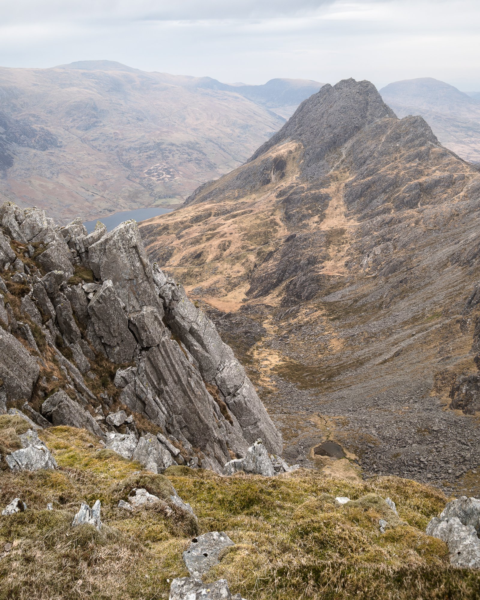
From Bwlch y Ddwy Glyder, I headed west toward Glyder Fawr, and as I climbed toward the summit, I came across this imposing jagged rock formation jutting up into the sky. Trying to capture some of the awe and dominance the structure was projecting as I stood beneath it, I moved in closer, staying low, and manoeuvred around until I landed on the composition you see here.

Fujifilm XT5 | XF10-24mm | 19mm | 1/60th Second | f/8 | ISO125
At just over 1,000 metres, Glyder Fawr is the highest peak in the Glyderau range and photographing the area around its peak was my favourite part of this walk around the Glyders. The rock formations appeared otherworldly and made for some interesting subjects to photograph. According to Sir Ifor Williams (a Welsh scholar), the word "Glyder" derives from the Welsh word "Gludair", meaning a heap of stones, and that’s a pretty accurate description of the landscape up there.
This location provided great views across the Nant Peris valley towards the Snowdon massif, and contrary to the flat, featureless clouds I had around me on the Glyderau massif, the clouds towards the south were a lot more dramatic, and none more so than in this photo below where the clouds seemed to converge directly above Snowdon. Composing so that the fractured stones in the foreground mirrored those interesting cloud formations in the sky, I took the photo below, which turned out to be my favourite of the day, maybe even my favourite of the entire trip to Snowdonia.

Fujifilm XT5 | XF10-24mm | 10mm | 1/60th Second | f/8 | ISO125
As I explored the peak further, I looked for different ways to make interesting compositions of the incredible rock formations. After taking the photos below, I used some dodging and burning in post-processing to enhance the subtle light falling across the landscape. This helped to separate the various layers and added a stronger sense of depth as the rocks stretched out before me.

Fujifilm XT5 | XF10-24mm | 10mm | 1/40th Second | f/9 | ISO125

Fujifilm XT5 | XF10-24mm | 10mm | 1/60th Second | f/11 | ISO250
After spending some time on Glyder Fawr’s summit, it was time to make my way downhill towards Llyn Y Cwm (Lake of the Dogs) and over to Y Garn, the final peak I’d be summiting before making my way back down towards Llyn Idwal. The descent towards the small lake was tricky as it was steep with lots of loose scree, so I had to tread carefully as I made my way down.

Fujifilm XT5 | XF16-55mm | 43mm | 1/60th Second | f/9 | ISO250

Fujifilm XT5 | XF16-55mm | 16mm | 1/100th Second | f/9 | ISO250
After navigating that rather sketchy 250-metre descent, I arrived at the top of the Devil’s Kitchen and from here, I had some great views of Tryfan and the Ogwen valley. It was at this point that I felt “inspired” to take the selfie below. The views were stunning, but I wanted to demonstrate the scale of the landscape and placing myself in the scene was a way I could achieve that.
With the selfie taken, I made my way up to Y Garn and then back down the mountain to Llyn Idwal.

Fujifilm XT5 | XF16-55mm | 43mm | 1/125th Second | f/9 | ISO125

Fujifilm XT5 | XF10-24mm | 20mm | 1/60th Second | f/10 | ISO125
While passing Llyn Idwal on my way back down, there was some nicely diffused light hitting the steep, rocky face of Glyder Fawr, and I thought it would round the hike off nicely to get a photo from ground level of the peak I’d not long been standing atop just an hour or two before.
This is a popular spot to photograph Cwm Idwal, but instead of trying to get the entire lake and valley in the frame, I decided on a vertical composition, which gave me the room needed to include more of the foreground rocks in the photo. It was a tricky one to compose as achieving a balanced feel depended on how the foreground was arranged, and with a little shuffling left and right, I landed on this composition here, which I think, to my eye at least, works well.

Fujifilm XT5 | XF10-24mm | 10mm | 0.8 Seconds | f/13 | ISO125
The next and final stop of the day was over on the opposite side of the valley at this popular spot along Afon Lloer. It’s a popular location as this vantage point provides a fantastic view of Tryfan and the Glyderau Massif behind.
It’s a composition I’ve photographed on each of my previous visits to Snowdonia and feel I’ve never quite come away with a picture good enough to put the location to bed. There’s always something I’m not happy with, and with the clouds starting to thin and the sunlight hitting the landscape for the first time that day, maybe this would be the time I get “the shot”.
I mentioned previously that I had just one or two periods of direct sunlight on this entire trip, and this was one of them. Just as the sun was dipping, it illuminated the top half of Tryfan, and I had just enough time to fire off a few photos, with this one below being the best of those I took.

Fujifilm XT5 | XF10-24mm | 10mm | 1/10th Second | f/8 | ISO125

Fujifilm XT5 | XF10-24mm | 10mm | 0.5 Seconds | f/9 | ISO125

Fujifilm XT5 | XF10-24mm | 10mm | 0.5 Seconds | f/14 | ISO125

Fujifilm XT5 | XF10-24mm | 10mm | 0.4 Seconds | f/14 | ISO125
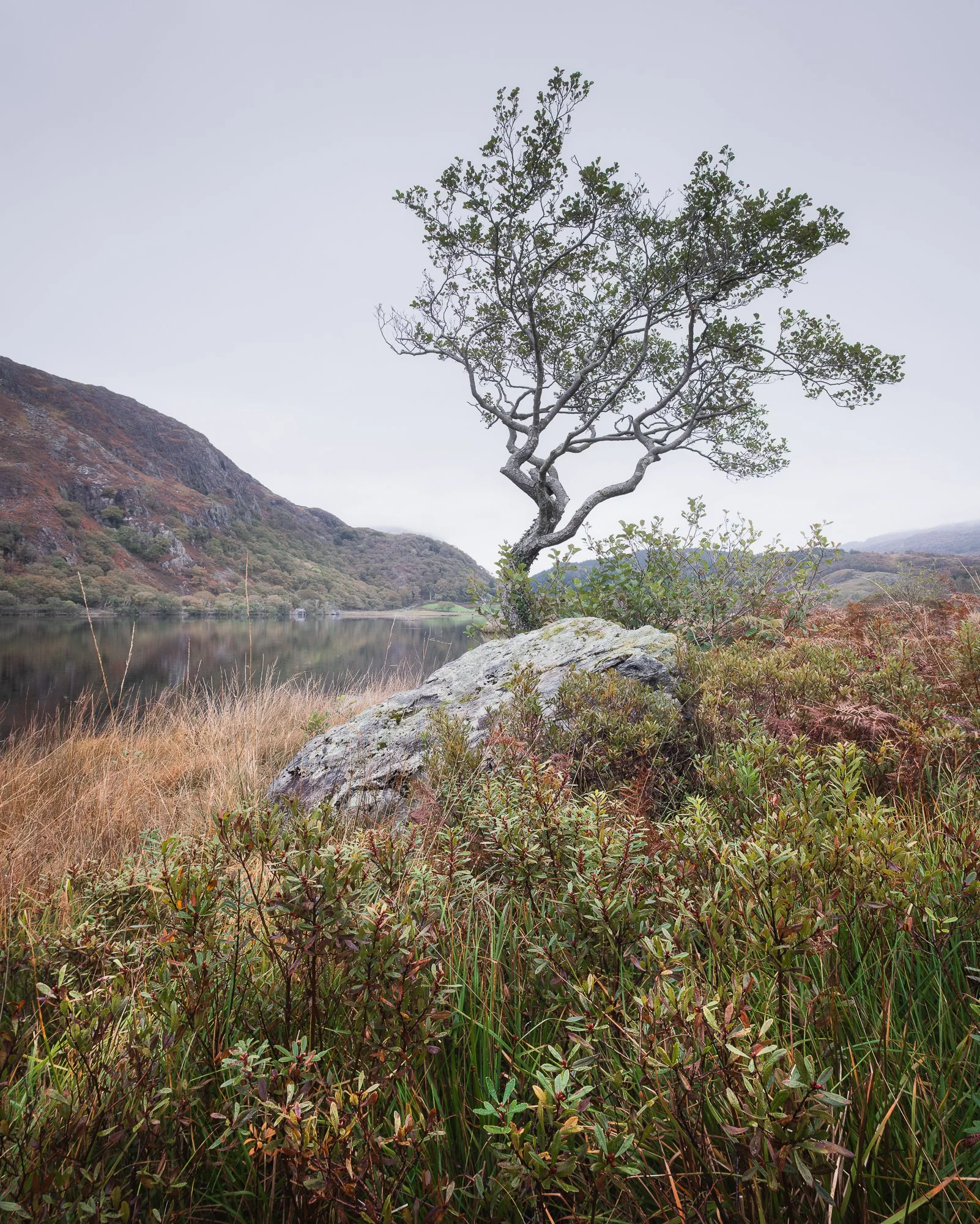
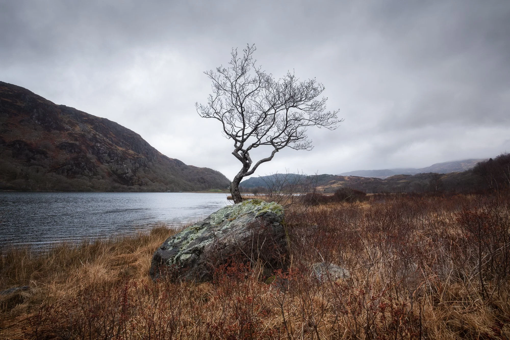
The next morning, I drove along the Nant Gwynant valley to photograph Snowdonia's second most famous lone tree. I like the way this old tree emerges from behind the rock with its branches reaching up into the sky, splitting the valley in the background and having seen it photographed a few times before, I decided to pop down to see what I could make of it.
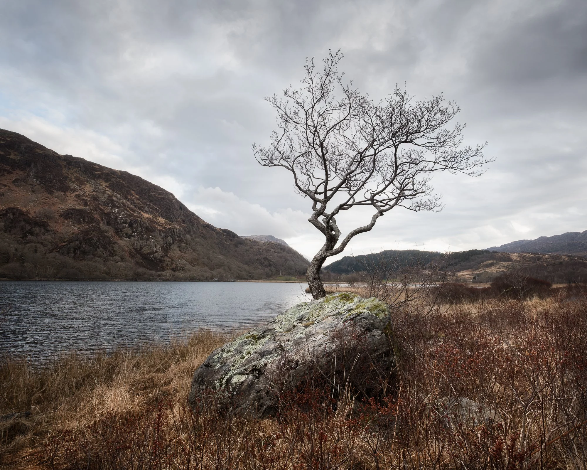
Fujifilm XT5 | XF10-24mm | 12mm | 1/100th Second | f/10 | ISO400
Compositionally, the two most important factors for me were to ensure the tree was positioned correctly in the centre of the valley’s “V” shape and that my camera was close enough to the ground so that the lowest branch didn’t overlap and get lost in the background. I took a photo in both landscape and portrait orientations and feel the landscape version just about wins as the tree has more space around it, particularly on the right.

Fujifilm XT5 | XF10-24mm | 13mm | 1/100th Second | f/9 | ISO400
Although I had my drone with me throughout the trip, for various reasons I didn’t use it as much as I thought I would, but while standing next to the lake, I was curious to see how the valley would look from up high.
This would be the second and last time I would see the sun hitting the landscape during this trip. As the drone gained some altitude, the clouds briefly parted, illuminating the south-eastern side of the Snowdon Massif. The light didn’t last long, but I managed to take this aerial photo before it disappeared again.

DJI Mini 3 Pro | 24mm (effective) | 1/640th Second | f/1.7 | ISO100
One thing I wanted to achieve during this visit to Snowdonia was to explore new (to me) areas without researching any particular photo spots, enabling me to come away from the trip having photographed both well-known and lesser-known locations. This was the case on the previous day during my walk around the Glyders as although I had researched the route, I hadn’t researched any photographic compositions. With this in mind and once finished photographing beside the lake, I headed off on a small circular walk around the eastern side of the valley to gain a little elevation and explore this area further.
By this point, there was plenty of ambient light, but it was nicely defused by the clouds and not too long after leaving the side of the lake, I came across this small stone building nestled perfectly in the landscape. I continued past the cottage to get to a bit higher, and with the mountains providing a great backdrop, out came the camera, and I took this photo below.

Fujifilm XT5 | XF16-55mm | 32mm | 1/25th Second | f/11 | ISO125
With the lovely, defused light, this scene, with the traditional stone building set in the landscape, has a timeless, painterly feel, which I like a lot. However, in the spirit of staying transparent to those who read this blog, the building (which is actively used) has a modern solar panel on the side of the roof and it didn’t fit with the look and timeless feel I wanted to achieve with this picture, so I used some artistic license and cloned it out.
Working my way around this small circular walk in the Snowdonia hills, I came across this unassuming cascade of water tumbling down one of the hills. Ordinarily, I might have carried on walking, and I very nearly did, but I decided to stop and spent a few minutes composing this small scene nestled in the landscape. Using a combination of a circular polarising and 3-stop neutral density filters, I was able to slow the shutter speed and take some of the glare out of the scene.

Fujifilm XT5 | XF10-24mm | 11mm | 0.8 Seconds | f/9 | ISO125
Later that day, I made my way back across to the Ogwen Valley as I had some unfinished business with an elevated scene I’d attempted to photograph on my way back down from Y Garn on the previous day. On that previous attempt, the conditions weren’t great for photography as the light was flat and with so much distance between the camera and the subject, the hazy conditions left a lot to be desired.
Fast forward a day, and the conditions had improved. The sky offered more visual interest, and soft, dappled light was falling on the landscape, highlighting its contours and adding depth. It wasn’t perfect by any means, but it was certainly good enough to pull the camera out and start composing a few shots.
It’s a composition that unfortunately slices through Llyn Idwal, but necessary if I wanted to keep Tryfan fully in frame as a main focal point and after waiting a short while for some light to fall on Tryfan’s peak, I took the image below, had a snack and then made my way back down the slope.

Fujifilm XT5 | XF16-55mm | 19mm | 1/60th Second | f/11 | ISO125
I’m fascinated by the shapes, lines and textures on the rocky face of Glyder Fawr, and while passing by on my way back to the car park, I noticed some subtle light bouncing off it. Out came the camera once more, and composing a square crop to help with the balance, I took this photo below.
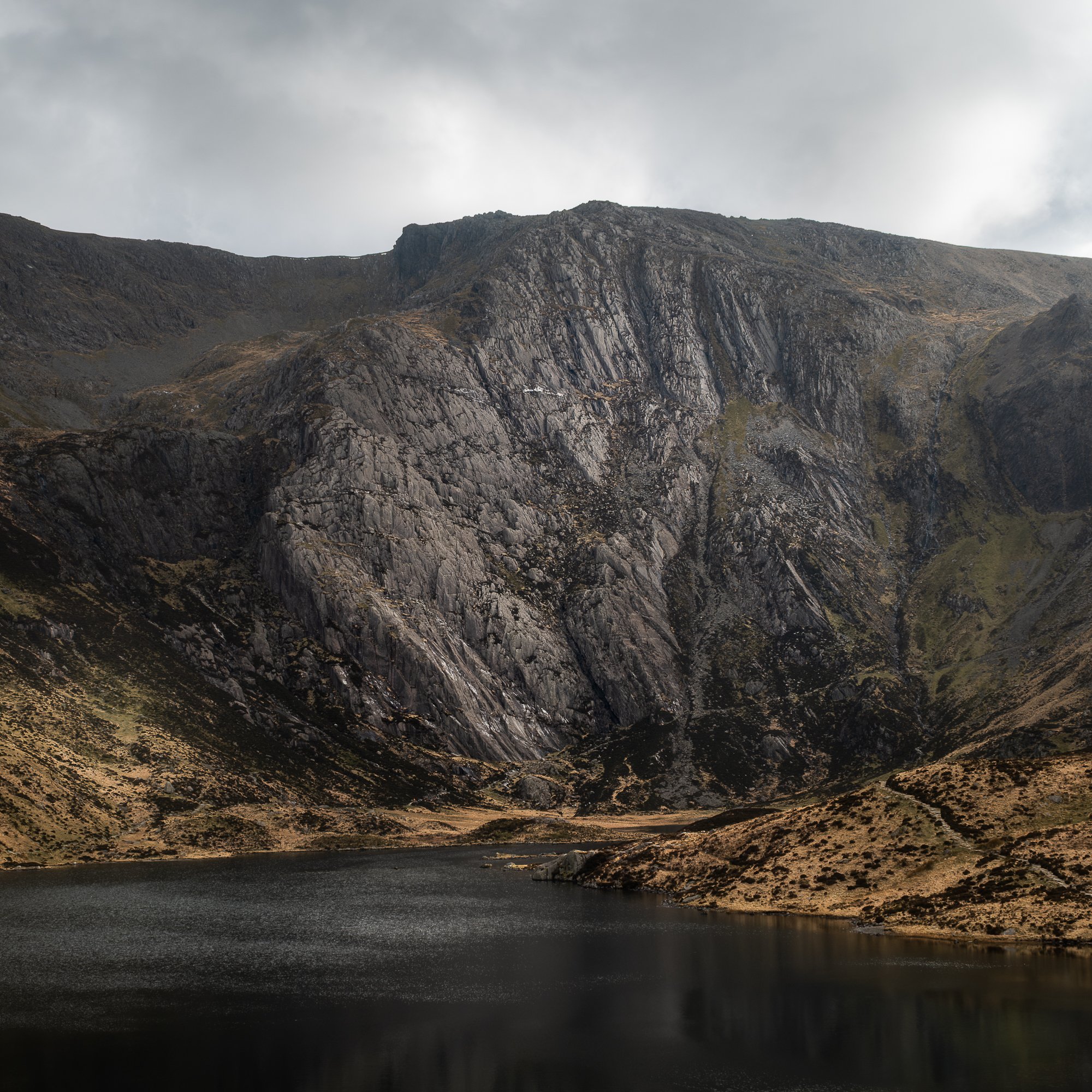
Fujifilm XT5 | XF16-55mm | 27mm | 1/80th Second | f/8 | ISO125
For the last stop of the day and with the clouds starting to clear, I wanted to get a view of the valley looking towards the west. I headed a couple of miles east along the A5 to an elevated spot along the path that takes you up to Ffynnon Llugwy, a mountain lake and the source of Afon Llugwy. I didn’t hike all the way up, just enough to get a better view of Tryfan and the Glyders behind.
I took a few photos with the telephoto lens but wasn’t really happy with what I was seeing. The scene was too busy and the light on the landscape wasn’t particularly great either. So, after some experimentation with focal lengths and with the afterglow of the sun casting some lovely pastel colours across the sky, I took this wider, silhouetted picture of the view in front of me. I like the abstract nature of this photo and feel the strong shapes of the mountains against the softly lit sky behind work well.

Fujifilm XT5 | XF16-55mm | 32mm | 1/4 Second | f/11 | ISO125
The forecast for the following morning called for low cloud cover and rain, so I opted against heading to any of the higher elevations where visibility would be severely limited. Instead, I began the day by revisiting the lone tree in the Nant Gwynant valley. With cloud levels expected to drop as low as 100–200 metres, I anticipated near-zero visibility, ideal conditions, I hoped, for capturing the tree as a minimalist subject, standing quietly in the misty, rain-soaked landscape.
As you can see, from this spot at least the rain had yet to start, and the clouds weren’t quite low enough. I took a couple more photos while I was there and headed back to the car.

Fujifilm XT5 | XF10-24mm | 13mm | 1/30th Second | f/11 | ISO400
Before travelling home later the same day, I’d planned a little time around Llanberis and the famous Dinorwig Slate Quarry. With low cloud and rainy conditions expected, I was hoping to use them to my advantage and capture some mist and mood in my photos, but before heading to the quarry, I made a quick stop at Dolbadarn Castle.
It’s a location I’d seen many times from afar but never actually visited, and I was keen to have a good look around, maybe take a picture or two while there. By the time I arrived, the rain was falling quite hard, and after having a look around, reading some of the information boards about the castle’s history, I composed this atmospheric photo below of the castle and partly obscured Snowdon range in the background.

Fujifilm XT5 | XF10-24mm | 14mm | 1/80th Second | f/8 | ISO125
Leaving Dolbadarn Castle, I made my way up to Dinorwig Quarry. I wanted to have a good explore and photograph what caught my eye, and first up, as I made my way towards the Anglesey Barracks, these old trees grabbed my attention.

Fujifilm XT5 | XF16-55mm | 23mm | 0.6 Seconds | f/11 | ISO125
As mentioned before, I don’t subscribe to the notion that there is good and bad light. In my opinion, different subjects work in different light, but if I’m being honest, the light I had to photograph both the trees above and the barracks below was flat and uninspiring. I was struggling a bit.
I don’t mind the composition I found of the Anglesey Barracks below as it provides a useful frame around the subject, and the picture feels a little painterly, which I also like. That being said, I feel that with more interesting sidelight or a little mist, both pictures could have been so much better. A location to return to, I think.

Fujifilm XT5 | XF10-24mm | 14mm | 1/8th Second | f/10 | ISO125
Dotted around the quarry are a few lone trees that seem to be growing out from the hills of slate, and I used this one below as a subject with a distant view of Dolbadarn Castle in the background. The rain in the air had defused the background, allowing the tree to stand out as the main subject, and I opted to zoom in a little to make the tree more of a feature, giving the image a slightly more intimate feel.

Fujifilm XT5 | XF50-140mm | 84mm | 1/50th Second | f/2.8 | ISO125
Further up the hill, I found myself standing on the edge of a pool of water called Sinc Harriet. After heavy rain, the volume of water in this pit can rise rapidly, but I guess there hadn’t been too much rain before my visit, as the levels were quite low. So low in fact, the slate rubble beneath was visible, and with the wind creating some ripples on its surface, I spent some time creating some abstract images, all with a slight painterly feel thanks to the texture on the water.


Moving on from Sinc Harriet, and with visibility on the low side, I set off along the path to capture some small, intimate views of the quarry. Although I’ve been a fan of the square crop for a while now, I’ve grown to appreciate how well it suits small scenes like this. With a square crop, I find it easier to achieve balance as no one side is dominant, and it allows me to be more creative with my compositions.

Fujifilm XT5 | XF16-55mm | 55mm | 1/200th Second | f/8 | ISO230

Fujifilm XT5 | XF16-55mm | 44mm | 1/30th Second | f/8 | ISO320
My last stop before driving back to leafy Surrey was at the lone tree in Llanberis. In the photography community at least, it’s quite a popular scene and having visited once before in less than ideal conditions for my style of landscape photography, I decided to pop by to see what I could make of it this time.
Down by the lake, the visibility was better, but like it was up at Sinc Harriet, the water levels here were also low. Not to be deterred, I lowered the camera down, using the exposed rubble to build a bit of a foreground and making sure the tree was positioned correctly, centred in the distant valley, I took the photo.

Fujifilm XT5 | XF10-24mm | 12mm | 1/40th Second | f/10 | ISO125
As I mentioned at the beginning of this post, I processed some of the photos I took on this trip in black and instead of injecting them in-line alongside the other photos, I wanted this collection to stand on its own as a black and white set.
Some of the pictures I’ve shared below are monochrome renderings of the same colour photos from above, but a few of them are unique to this set, consciously taken to be produced as black and white photos.

Fujifilm XT5 | XF10-24mm | 10mm | 1/100th Second | f/10 | ISO400

Fujifilm XT5 | XF16-55mm | 35mm | 1/25th Second | f/16 | ISO400

DJI Mini 3 Pro | 24mm (effective) | 1/6400th Second | f/1.7 | ISO100
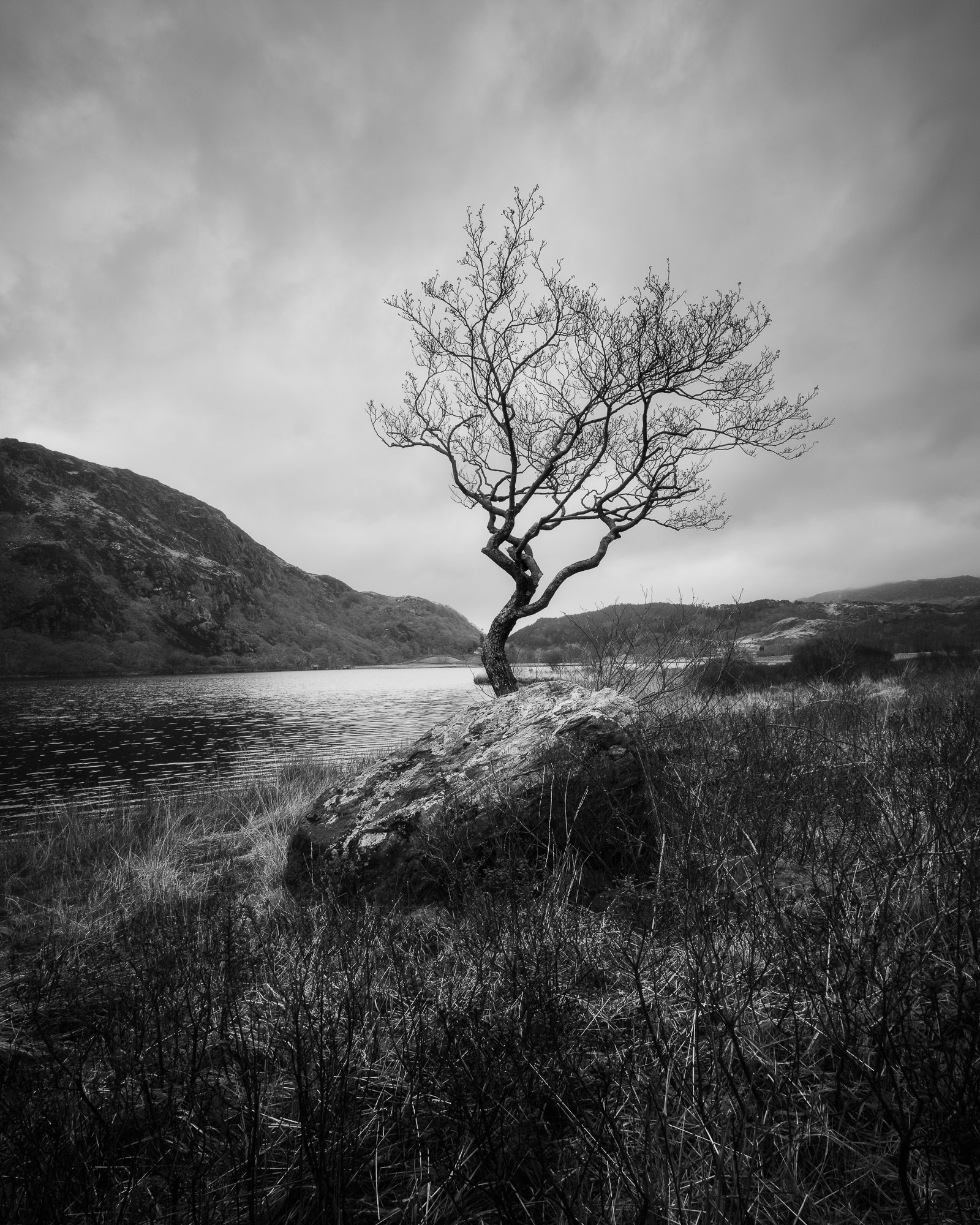
Fujifilm XT5 | XF10-24mm | 10mm | 1/30th Second | f/11 | ISO400

Fujifilm XT5 | XF10-24mm | 14mm | 1/80th Second | f/8 | ISO125

Fujifilm XT5 | XF70-300mm | 300mm | 1/125th Second | f/8 | ISO400

Fujifilm XT5 | XF16-55mm | 55mm | 1/200th Second | f/8 | ISO230

Fujifilm XT5 | XF16-55mm | 44mm | 1/30th Second | f/8 | ISO320

Fujifilm XT5 | XF16-55mm | 19mm | 1/40th Second | f/11 | ISO125

Fujifilm XT5 | XF10-24mm | 12mm | 1/40th Second | f/10 | ISO125
That’s a wrap for another landscape photography trip to Snowdonia, but if you want to see more photos of this stunning landscape in North Wales, I’ve written some more blog posts and shared many more pictures, which you can find links to below.


As ever, if you have any questions or suggestions, please leave a comment below. Otherwise, thanks for stopping by.
Until next time.
Trevor

How I Edit My Black and White Photos of London
My step-by-step process for editing this black and white photo of St Paul’s Cathedral in London
Every photographer has a different approach to editing. Some prefer a straight-out-of-camera (SOOC) image, letting the camera handle all the processing. Others work with raw files in editing programs like Adobe Lightroom or Capture One, taking the time to carefully refine each image and maintain full creative control.
There’s no right or wrong way to do it—whether you skip post-processing entirely or spend minutes (or even hours) perfecting a single photo, it all comes down to personal preference. As for me, I see post-processing as a vital part of my photographic workflow. I like having full control over how the raw file is developed, and it’s not out of the question for me to spend up to an hour fine-tuning just one image.
Okay, it’s pretty rare for me to spend an hour or more on a single photo. Most of the time, I wrap things up in about 10 to 20 minutes. That might still seem like a lot to some, but post-processing is a part of the process I genuinely enjoy. It’s a chance to unwind, maybe with a drink in hand and some background music playing, while I spend some quiet time with my images. It’s a way for me to stay connected to photography even when I can’t be out in the field with my camera.
So, when I’ve carved out a little time, poured myself a glass of whatever, and I’m ready to get to work on my most recent Timeless City images, what does my process typically look like?
In this post, I’ll walk you through the editing process I used for a photo I took of St Paul’s Cathedral, titled Dual Realms.

I’ll also include a few before-and-after photos as a little peek behind the curtain. A post-processing video might explain things better, but since I don’t make videos and prefer to write, this will have to do.
One last thing to note: there’s no right or wrong way to process your work. This is simply the method I use. I’m not claiming to be an expert—just sharing my approach in case it’s helpful or interesting to anyone. And if you have any tips or suggestions to improve the workflow, feel free to share them in the comments below!
Now, let’s get started.
The applications I use to process my raw images
I’ve been a subscriber to Adobe Cloud for a few years and predominantly use Lightroom Classic and Photoshop desktop versions to process my photos. If I were to hazard a guess, the ratio I use these two would be around 95% Lightroom and 5% Photoshop. Nearly all of the heavy lifting I do happens in Lightroom, and I’ll typically export to Photoshop just to apply some finishing touches or use features not available in Lightroom.
The raw file
This is the original file, freshly imported into Adobe Lightroom. It’s a 3:2 vertical image of St Paul’s Cathedral in London, taken during the winter months—which explains the bare trees. I took the photo in a vertical format to give myself more flexibility when cropping to a square. This way, I have extra space at the top and bottom to fine-tune the cathedral’s position in the frame, allowing for more precise control over how much sky or reflection to include.

Another important consideration for me is getting the verticals straight and keeping the camera level when taking the shot. It means less correction later in post and reflects my overall approach: to get as much right as possible in-camera from the start.
When importing to Lightroom, the default Adobe Colour profile was applied, and if you’re at all interested, the exif data of the photo is as follows: Fujifilm X-T50 | XF10-24mm Lens | 10mm | ISO125 | F/10 | 1/20th Second.
Cropping and straightening the image
The first step in my process is locking in the composition. As I mentioned earlier, shooting in a vertical orientation gave me the flexibility to decide how much sky and reflection to include. This helped me create what feels, at least to my eye, like a visually balanced image.
In the previous section, I talked about making sure the photo is straight and level while in the field, but in the screenshot above, you can see I’ve made a slight rotation, which suggests it wasn’t perfectly straight. What I’ve found is that even when the camera is completely level at the time of capture, a photo can still appear slightly off if there’s no clear visual reference, like a straight horizon, to show what "level" actually looks like. In those situations, even if I know the shot was technically straight, I’ll sometimes make small adjustments to the crop, so the final image looks balanced to the eye.
Here’s the cropped image:

How I convert my photos to black and white
I don’t really feel this step needs its own section, as the process I use is so incredibly simple. When I’m ready to convert an image to black and white, I simply select the B&W option in Lightroom’s Basic Development Panel.

Once I’ve converted the image to black and white, I get stuck into the processing.
It’s worth saying at this point, the settings I apply are applicable to this photo and the final look I’m trying to achieve, and will not necessarily apply to your photos. The goal here is simply to show you my process and how I arrive at the finished result. The exact numbers aren’t all that important and likely won’t be useful beyond this specific example.
The Curves panel
With my limited experience of observing others process their photos, many will start from Lightroom’s Basic Development Panel and work their way down the options to adjust their photo. Maybe my brain’s wired slightly differently, but my approach is to first set a black/white point and add a little contrast if needed. This is what I’ve done for the image below to add a little punch and lift the black point, as the shadows were very dark.

Adding more drama to the sky (burning)
Although not too obvious in the original raw file but to the eye, there was much more interest in the sky when I took the photo, and this section is all about bringing that back while introducing a little more drama at the same time.
If I were to give anyone one piece of advice when it comes to post-processing their images, it is to make small, subtle changes and build them up over time. When changes are made using a single mask to the sky (for instance), and if those changes involve some significant slider action, this can often result in garish results and a halo around the subject. This could easily be the case in a scene like this due to the delicate masking needed around the trees and dome.

I typically take photos of London for my Timeless City project when the sky is cloudy, as I prefer a more defused light across the scene rather than the high contrast look I get when the sun is out. By bringing back some of that contrast in the sky and lowering the exposure, it provides more drama and a natural-looking vignette around the top of the frame.
As you can see from the screen grab above, I’ve used multiple masks at different stages through the edit (hence the non-sequential numbering) to subtly bring back detail, reduce the exposure and increase the clarity in the clouds. You can see the results of these changes below.

Increasing the exposure in the shadows (Dodging)
Next, I’ll be bringing a little life back into the darkest shadows. With the light well defused by the layer of cloud above, I could still see the details and textures in the darker areas while taking the photo and knowing that detail does exist in the raw file, I simply needed to increase the exposure.
For this step, I used the Radial Gradient mask. As with previous edits, I prefer to make several smaller, more precise selections rather than applying large, sweeping adjustments. For each of the masks shown below, I’ve increased the exposure by between 0.5 and 1 stop to achieve the desired effect more subtly.


Below, you can see the results of those adjustments. There’s a bit more detail in the foliage, though the effect is quite subtle. I’ll bring out even more detail from those areas a bit later in the process.

Making the reflections pop
This composition of St Paul’s Cathedral is all about the reflection, and to be sure it gets the right attention when viewing the image, it needs to stand out just a little more.
The first, larger mask shown in the screen grabs below was made with a Radial Gradient, and all I’ve done there is increase the exposure in the water by half a stop. Like before, it doesn’t need to be dramatic. Just subtle changes layering on top of each other to help gradually build towards the final result.


I used the second Linear Gradient mask above to gently lower the luminance at the very bottom of the frame. The increased exposure from the previous step extended a bit too close to the edge, and I wanted the area nearest to the camera to remain darker. You can see the results of this adjustment below.

Applying some global edits using the Basic Develop Panel
By using masks to target specific areas, most of the work is now completed, but there are some small changes I wanted to make to the entire image using the Basic Develop settings. Specifically, I plan to lift the shadows a little and add some contrast back into the image.
The changes applied were Contrast +20, Shadows +30, Whites +13 and Blacks +16. Also, to soften the overall look and feel of the image and make it a little less “crunchy”, I will typically lower the Clarity and Dehaze sliders, and in this case, I lowered both by -10.

Sharpening the image in Photoshop
A note on sharpening. Opinions vary as to when to apply it. During the edit, or only when the file is being exported for a particular use case, such as web, socials or print. This is just my approach. I will typically add some sharpening when editing, call it a “base sharpening” if you like. This is usually fine for all of my online needs, but if I feel I need to add any more sharpening for print, I will do so when preparing the file before sending it to the printer.
So far, all of the edits have been applied in Lightroom, but the next step is one made in Photoshop.
I’ve never really been a big fan of how Lightroom sharpens my raw files, and instead, I use the High Pass filter in Photoshop to sharpen my photos. It’s a great tool to detect the edges (or high contrast areas) in a frame, which, when combined with a contrast-boosting blending mode, sharpens the photo without affecting the areas with less contrast, such as the sky.
With the image exported from Lightroom to Photoshop, I create a duplicate layer and then, from the menu, select Filter - Other - High Pass. Next, I input the Radius amount, which determines how much sharpening will be added. Choosing the right number depends on the resolution of the file and how much sharpening you want to add, and I will typically stick to between 1-2 pixels at this stage, with the view that I can add more later if needed. For this image, I made the radius 2 pixels.
Next, I use the Overlay blending mode for the same layer. This blending mode will hide the grey areas and add contrast to the edges highlighted by the High Pass filter, resulting in a clean, sharper file. The image below is probably too small for you to see a difference, but trust me, it is sharper.

Although for this image I used Photoshop for adding a little sharpening, as features are being added to Lightroom, my dependency on Photoshop continues to reduce, and these days I will typically use it to sharpen with the High Pass filter, the occasional Orton effect and for more complex cloning/distraction removal. Other than that, it all pretty much happens in Lightroom.
Boosting the whites
Once back into Lightroom, I have one last edit to make. I feel the whites in the sky and reflections could do with a boost, so I’ve added a mask for the sky and radial gradient for the reflection and boosted the whites by +21.

With the whites increased and both the sky and reflection getting a little more punch, that’s the last of the processing steps complete.
Below is the final image with all the edits applied. My goal during the processing was to bring the drama back to the sky, enhance the contrast in the reflections, and ensure that St Paul’s Cathedral stood out in the scene. I’m happy to say that I’ve achieved those objectives and am pleased with the final result.

No two photos are ever the same, and each one requires its own unique approach to editing. However, I hope this article has given you a good overview of my general process and the tools I use when processing my black and white photos of London.
Below, you’ll find a few more before-and-after images that show the changes between the raw file and the final edit. It’s important to me that the cloudy skies retain as much detail as possible, so I typically expose for the sky and bring out the shadow details during the editing process.


Hopefully, you found this article useful and at the risk of repeating myself, I strongly believe there is no right or wrong in terms of how people choose to edit their photos, but if you have any comments or suggestions about my workflow, or have any questions for me to help you with yours, feel free to leave a comment below or contact me directly via my Contact Page.
Just one last point before I wrap up. The image I used for this article is part of my limited-edition Timeless City print collection and is available to buy from my store. There’s a link to the print store below.

Feel free to follow the link above to browse my Timeless City print store.
Until next time.
Trevor
Related Timeless City articles:


This Pleasant Land | My Photo Bookshelf
An exploration of Britain through a collection of photographic projects telling just a few of the many stories of what shapes this unique landscape.
Over time, I’ve found myself more and more drawn to the British landscape. At some point, I realised that no one person can truly see and photograph it all — at least not properly. And honestly, I’m okay with that. These days, I’m more than happy to explore this country I call home through the eyes of the many talented photographers who are just as passionate about capturing its beauty and diversity.
This Pleasant Land brings together 24 small photographic collections. Each one is different in subject, but they all share a common thread: every collection tells its own unique story about the British landscape in one way or another.
Synopsis
24 photographers capture Britain today.
The British Landscape is changing. Geographically, politically, even emotionally, the boundary lines of Britain - and what it means to be British - are in flux. This book looks at the new terrains, memories and myths of this contemporary landscape through the eyes of some of the world's most exciting photographers.

My thoughts about the book
The book, written by Rosalind Jana, an arts and culture writer based in London, starts with an interesting and insightful introduction, exploring the deeper meaning of photographing the British landscape. Referring to some of the projects that feature in the book, Rosalind talks about the many connections and motivations that inspire their creation, such as childhood memories, political context, and even those who simply want to represent the subject as a visual point of interest.
After the introduction, the first of the 24 projects begins, each one paired with a short piece of writing that adds a bit of context to the photos that follow. All the featured projects were shot within the last 20 years, making this book a contemporary, 21st-century snapshot of the British landscape.
Each project in the book tells a unique story — from the way humans shape the landscape and how natural and man-made elements interact, to a series of abstract cyanotype prints made along the Dumfriesshire coast. There’s a collection focused on seaside holiday resorts, and another featuring powerful portraits of female farmers working the land in Scotland. And that’s just scratching the surface. This book takes you on a photographic journey across Britain, weaving together stories of art, beauty, history, and politics.
If you’re someone who prefers a more traditionally picturesque view of the landscape, this book might not resonate as much as some of the others I’ve shared in the Photo Bookshelf series — and that’s totally okay. But if, like me, you’re drawn to the variety of projects, the stories behind them, and the motivations that drive them, then I’d definitely recommend picking up a copy for yourself.
Hoxton Mini Press is an independent book publisher based in London. Although this was the first book of theirs I purchased, I’ve since spent countless hours exploring their extensive catalogue. The book has a traditional, high-quality feel, and the combination of compelling writing and striking imagery made it an incredibly enjoyable read.
Book Details
Hardcover
Size: 237mm x 285mm
Pages: 224
Availability at the time of writing: Available from the Hoxton Mini Press website here: https://www.hoxtonminipress.com/products/this-pleasant-land
Until next time.
Trevor

Seascapes by Nigel Danson | My Photo Bookshelf
Nigel Danson's Seascapes, the third book in his series, beautifully captures the dynamic and ever-changing coastal landscapes through a stunning collection of photographs.
Author’s synopsis
Throughout this book you will see that I have tried to capture the essence of why I love being on the coast and by the sea. A massive part of that is how the sea interacts with the land. I am fascinated by this connection and how the sea has shaped the landscape through constant erosion and pounding of the rock, sand and salt water.
I share my favourite seascape images and talk about why I photographed them, how I composed them and the cameras and settings I shot them with.

Seascapes are the most dynamic of all forms of landscape photography. In this book I take you on a journey of discovery of coastal views, stunning beaches and epic waves. These images all hold a special place in my heart.
My thoughts about the book
Keeping the familiar design of the trilogy, Seascapes features the same cloth finish and foil lettering as Vistas and Woodlands, a detail I really appreciate. The book has a high-quality look and feel, perfectly complementing the photography inside.
The book opens with an introduction by Nigel, where he reflects on his connection to the sea and coast, shaped by childhood memories. This resonates with me, as much of my photography is driven by a deep sense of connection and nostalgia, and I can appreciate the desire to create work that goes beyond aesthetics and holds personal meaning. I guess there is a stronger authenticity to work created in such a way.
The book is divided into chapters: Coastal, A Wider View, Waves, and Abstract, and each starts with a brief paragraph in the way of a small introduction to the topic. As expected, the photography throughout is outstanding, showcasing a wide variety of work that makes for a compelling and diverse exploration of the book’s theme.
Nigel is one of the UK’s most highly regarded and accomplished landscape photographers, a reputation built not only on his exceptional skill and talent but also on his dedication to his craft. His success is not just a result of his ability behind the camera but also the time, effort, and passion he invests in projects like this book. His commitment to creating high-quality, thoughtful work is what truly sets him apart.
Book Details
Linen cloth Hardcover
Size: 300mm x 240mm
Pages: 128 litho printed pages on 200gsm silk art, FSC sustainably sourced paper
Availability at the time of writing: Limited edition still available from Nigel Danson’s website here: https://www.nigeldanson.com/products/p/seascapes
Links to my review of the other two books in the series can be found below:


Until next time.
Trevor

New Photos | Winter 2024
A collection of photos taken during Winter 2024.
In keeping with the previous four seasonal photo updates, I’ve collected a few of my favourite photos taken during the winter months of 2024/2025. This is an opportunity for those visiting my site and reading my blog to see my latest work before it’s posted to social media in a format and style I want it to be presented in. There are no algorithms or preferential treatment here, meaning you get to see the photos I post in the way I want them viewed.
As ever, I welcome any feedback, comments or suggestions either by email, through my contact page or just as a comment at the end of this post.
Below are the previous four instalments of my “New Photos” series.
December 2024 to February 2025 - Winter 2024 collection.
In a change from the previous seasonal collections, I’ve started this one with a few photos I took of London during winter. It may not be apparent to everyone just how much the different seasons affects the photos I take in the city, and for sure, visually, the differences might be less obvious than other landscape photography subjects, but the time of year still makes a huge difference to how I go about taking cityscape photos in London.
The main seasonal factors that affect the photos I take are the weather conditions, the sun’s lower position during the day and where and when the sun rises and sets. I’ll expand on these as we go.
Photographing London
Although most of London requires you to obtain a permit(s), or at least formal permission to fly a drone, there are a few specific locations where my sub-250g drone can be flown freely and here, in front of the Isle of Dogs, is one of them. This photo I took of Canary Wharf highlights one of the key factors that affect my photos in London during the Winter….. the weather.
Blue sky days can be few and far between in the Winter, and the days are more likely to be cloudy like this. But to tell the truth, that’s how I like it. In the summer, I feel I am endlessly dodging the high contrast sunny conditions, which I don’t usually like to photograph in. Unless the light is amazing and the sunset/sunrise epic, I would much rather have an overcast, moody day to photograph the city.

I’ve recently started to lean towards a vertical composition using the traditional 10x8 aspect ratio. I feel I can emphasise the height and scale of the city better in a vertical format, and cropping down to the 10x8 aspect ratio makes the overall composition look more balanced than the taller, native 3x2 my camera uses.
Another advantage of photographing London in the winter is being able to get to the city before sunrise and take some photos while it’s still dark. Of course, I could simply hang around after sunset in the evening, but the advantage of taking photos early in the morning is that it’s a lot quieter, and I don’t have to contend with so many people around me walking in and out of frame.


The last point I’ll make about photographing London at different times of the year is where the sun rises and sets. You should get to know what scenes work best at specific times of year to capture the best photos. The photo above taken from the Horizon 22 viewing platform is a good example as in the summer months, the son would be setting way off to the right and this view looking towards The Shard with the sun setting just off to the right would not be possible.
Ok, so this panoramic photo I took of Canary Wharf from across the Thames is proof that we still get some cloudless skies in the winter and the fact that the skies over London are always grey is a bit of a myth really.
The Winter Landscape
This winter, I didn’t get out into the landscape of woodlands as much as usual. Instead, I spent more time photographing London, taking photos for my Timeless City project. I guess some things always have to give.
I did, however, venture out into the wintry landscape a few times and have shared some of the photos I took along the way. All the photos in the landscape section of this post were taken during a handful of trips to a local forest in East Sussex. This is my go-to for woodland photography, but with lots of open heathland and the odd lookout point, it’s also great for a bit of landscape photography.


I’m really pleased with these close-up icy scenes I found next to a small waterfall in the forest. I took three compositions of the ice, and with lots of relative depth, each one needed to be photo stacked to get the image sharp from front to back. I’m really happy with the resulting triptych below.
I’ve also posted a photo I took of the wider scene underneath, and the small patch of ice on the bottom right of the frame is where I took these close-up images of the ice so you can see how tight I needed to get.


Photographing the woodland
Along with some misty woodland adventures I had during the winter months, I also took this first group of four photos shown below. Sometimes, the eye sees what the eye sees, and on this cold but mistless morning, I was drawn to the stronger shapes created by some of the more prominent trees in the scenes I came across.
For these to work, I had to find a strong woodland subject with some character, set against thicker foliage to help remove background distractions, and with the ambient light being dull and gloomy, the resulting collection of photos all have a dark, moody feel to them.


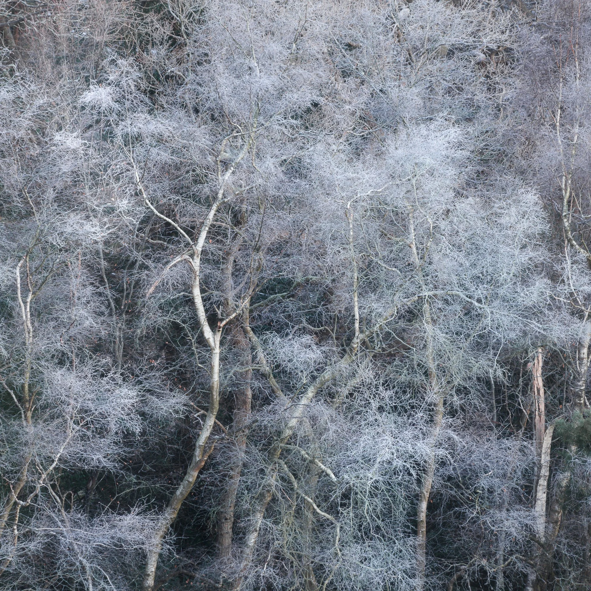


A trip to the East Sussex Coast
Finally, a trip to the seaside. I decided to head down to the coast on a chilly February afternoon to revisit my favourite lighthouse at Beachy Head, followed by a few hours in Eastbourne to photograph some of the starling murmuration around the pier.


Once the sun had just about set and the starlings safely nested under the pier, I took this last picture of what I think is the most picturesque pier along the Sussex Coast. I like the soft, blue tones across the scene, but that subtle belt of colour in the sky adds a touch of interest and is a welcome addition.

With the winter months behind me, it’s time to look forward to spring and the colour it brings to the landscape. I’ve got a few adventures planned and some new ideas for projects that will help me focus on photographing my local landscape more this year. Time will tell if that all works out as planned but if it does, you’ll see those photos here first.
As I mentioned before, feel free to drop a comment below as it’s always good to hear your thoughts about the pictures I take and how they might resonate with you.
Until next time,
Trevor

Land by Fay Godwin | My Photo Bookshelf
Land by Fay Godwin is the superb result of a decade-long photographic project to capture an unfiltered view of Britain’s diverse landscapes
As I delved deeper into the history of landscape photography, it was inevitable that I would come across some of the most well-known American photographers, such as Ansel Adams and Edward Weston. But what about the iconic British landscape photographers? Of course, we have David Ward, Charlie Waite, and my personal favourite, Joe Cornish—all still actively practicing landscape photography. However, in the same breath, one must also recognize Fay Godwin, one of the few professional landscape photographers of her time.
Fay Godwin travelled across the UK, documenting its landscapes through her lens. In 1985, she released Land, a book featuring photographs primarily taken in the preceding decade. This book and its accompanying exhibition cemented her status as one of the UK’s most treasured landscape photographers.
Author’s synopsis
This magnificent collection of photographs is a unique celebration of the British landscape by one of the finest landscape photographers of our day. Combining documentary realism with a poetic instinct, elemental forms with visual irony, Fay Godwin brings a distinct and individual vision to her work.
Paying tribute to the achievement of a ‘true artist’, the novelist John Fowles makes his own eloquent statement on art and the landscape in his penetrating essay.

My thoughts about the book
While researching Fay Godwin’s work, I came across the video I’ve linked to below, and one thing Fay talked about that stuck with me was her take on landscape photography and her dislike for the blue sky, green grass, “postcard” scenes. Fay tried to portray a “real” view of Britain’s landscape, sometimes picturesque, sometimes bleak, but always natural and always honest.
‘Land’ starts with a multi-page essay by John Fowles, followed by an introduction by Ian Jeffrey. From there, we get Fay’s photos. Taken over ten years, the pictures (kind of) flow geographically, starting up in Scotland, working down the UK, and ending with photos taken on England’s south coast. Along the way, Fay photographed various landscapes, some more picturesque than others, visiting locations such as the Scottish Highlands, Yorkshire, Wales, Wiltshire and Kent.
It’s evident from the photos included that Fay had a remarkable ability to find beauty in a wide range of subjects. Some are familiar, such as the sweeping natural vistas of Glencoe and the Lake District, while others are more unconventional, like a close-up of a cobbled road in Yorkshire or a rusted car partially submerged in water in Kent. This diverse subject matter reinforces my belief that Fay was less concerned with adhering to traditional landscape photography conventions and more focused on capturing an authentic, unfiltered view of Britain’s landscape, one she openly admitted to finding far more compelling to photograph.
With such varied subjects, one might expect the sequencing to feel disjointed, but impressively, that’s not the case. The images flow seamlessly, a testament to Fay’s careful attention to the book’s layout.
Fay Godwin (17 February 1931 – 27 May 2005) was a British photographer known for her black-and-white landscapes of the British countryside and coast.
Along with the video, this book has reminded me that landscape photography isn’t just about finding picturesque views of the world around me. It’s about capturing something I find interesting, regardless of social norms and by doing this, I can create a more honest and unique body of work.
Book Details
Softcover
Size: 260mm x 260mm
Pages: 160
Availability at the time of writing: Unavailable from the usual UK booksellers. Consider buying a used copy.

Wish You Were Here by Vanda Ralevska | My Photo Bookshelf
A companion book set created by Vanda Ralevska featuring a collection of photos of the iconic British seaside.
I’ve always loved spending time by the British seaside in the warmer months. I love the energy, the vibrancy and who doesn’t love eating a traditional fish and chips on a deck chair while staring out to sea? But, as I’ve grown a little older, I’ve started to visit the coast more often in the colder (and wetter) months. Nothing beats grabbing a hot coffee and having a relaxed wander along a quiet promenade with just the sound of the distant waves breaking on the beach.
So, when fellow photographer (and now friend) Vanda Ralevska released her Wish You Were Here book set featuring some outstanding photography of the British Seaside, I knew I had to purchase myself a copy.
Author’s synopsis
This companion book set explores the nostalgia of the English seaside throughout the seasons, from the sombre beauty of winter months to its restored splendour in the glorious days of summer.
There is a melancholy about the English seaside in winter. No matter what Mother Nature throws at it, there is a resilience that enables it to resurrect its full magnificence in summer months.
It goes into hibernation, it falls into slumber and sleeps dormant like a perennial plant, just to flourish when the sun and warmth come back.
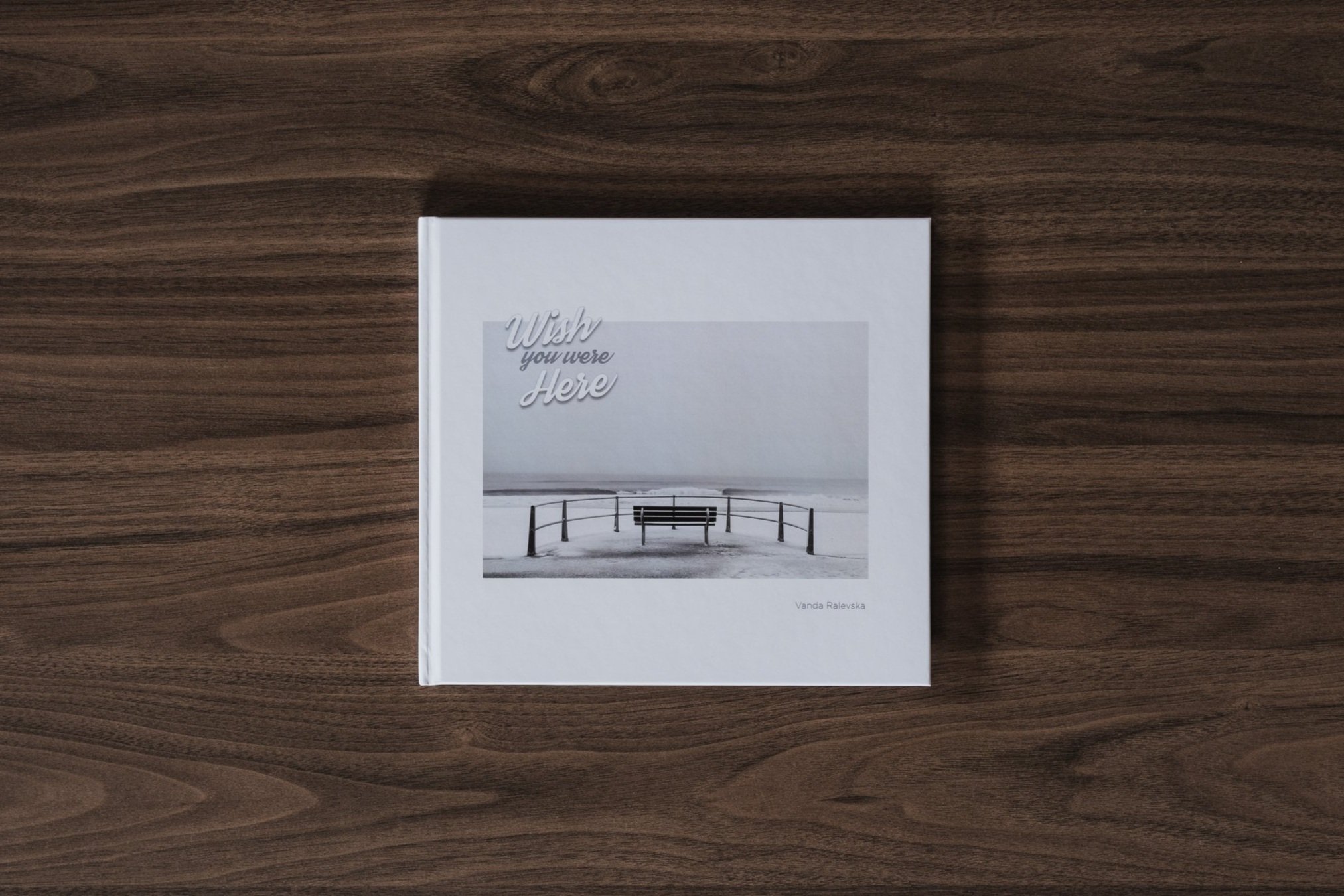
Like trees that are bare and stark in winter. But in the summer they become beautiful, vibrant and everything we love about them.
What started as a pure fascination and attraction turned into a lifelong passion. There isn't any other place I would rather be than a beach. Though I enjoy the peaceful and quiet wintertime most, I find the bright and sunny weather as captivating as the bleak and gloomy days. Therefore, I felt I needed to capture both sides of the English seaside and separate them into two books that complement each other.
My thoughts about the book
First things first, and I’m not just saying this, but I love these books. The photos included are well-crafted, and expertly composed, with subtle seaside humour and ironies implied throughout. As I mentioned in the intro, I love both sides of the seaside experience, from the fun, warm, summery days to the calmer but much colder days in the winter and this companion book set encapsulates those experiences perfectly.

The book set is comprised of two books. Kiss Me Quick is fun, vibrant, and full of photos of blue skies and seaside colours. The pictures included are colourful but well-controlled and have an aesthetically pleasing but subtle high-key processing applied to them. The photos are all in square format, which, as you may have read here, is one of my favourite aspect ratios and works incredibly well for this collection.
The image sequencing throughout is, in my opinion, a bit of a master class and taught me a thing or two about how well a book can be pulled together. There is a good mix of clever, humorous, and more subtle pairings. I know first-hand that Vanda invested a considerable amount of thought into sequencing the images for both books and the results speak for themselves.
The second book, in contrast to the first, represents a more subdued, desolate seaside experience and with the lack of blue skies and vibrant summer tones, Vanda chose to process this collection in monochrome, which suits the work well. Having recently embarked on my own black-and-white journey with my Timeless City project, I felt a deeper connection and was able to appreciate this collection of work far more than I might have before when processing predominantly colour work.
Individually, these books hold their own as separate collections of photographic work, but putting them together as a single book set was a master stroke by Vanda as together, they tell the complete seasonal story of the British seaside that most of us in the UK have experienced at some point in our lives.
Book Details
Hardcover
Size: 210mm x 230mm
Pages: 140 (Wish You Were Here)/124 (Kiss Me Quick)
Availability at the time of writing: Available directly from Vanda’s website here: https://mylenscapes.uk/wish-you-were-here/