
How I Edit My Black and White Photos of London
Every photographer has a different approach to editing. Some prefer a straight-out-of-camera (SOOC) image, letting the camera handle all the processing. Others work with raw files in editing programs like Adobe Lightroom or Capture One, taking the time to carefully refine each image and maintain full creative control.
There’s no right or wrong way to do it—whether you skip post-processing entirely or spend minutes (or even hours) perfecting a single photo, it all comes down to personal preference. As for me, I see post-processing as a vital part of my photographic workflow. I like having full control over how the raw file is developed, and it’s not out of the question for me to spend up to an hour fine-tuning just one image.
Okay, it’s pretty rare for me to spend an hour or more on a single photo. Most of the time, I wrap things up in about 10 to 20 minutes. That might still seem like a lot to some, but post-processing is a part of the process I genuinely enjoy. It’s a chance to unwind, maybe with a drink in hand and some background music playing, while I spend some quiet time with my images. It’s a way for me to stay connected to photography even when I can’t be out in the field with my camera.
So, when I’ve carved out a little time, poured myself a glass of whatever, and I’m ready to get to work on my most recent Timeless City images, what does my process typically look like?
In this post, I’ll walk you through the editing process I used for a photo I took of St Paul’s Cathedral, titled Dual Realms.

I’ll also include a few before-and-after photos as a little peek behind the curtain. A post-processing video might explain things better, but since I don’t make videos and prefer to write, this will have to do.
One last thing to note: there’s no right or wrong way to process your work. This is simply the method I use. I’m not claiming to be an expert—just sharing my approach in case it’s helpful or interesting to anyone. And if you have any tips or suggestions to improve the workflow, feel free to share them in the comments below!
Now, let’s get started.
The applications I use to process my raw images
I’ve been a subscriber to Adobe Cloud for a few years and predominantly use Lightroom Classic and Photoshop desktop versions to process my photos. If I were to hazard a guess, the ratio I use these two would be around 95% Lightroom and 5% Photoshop. Nearly all of the heavy lifting I do happens in Lightroom, and I’ll typically export to Photoshop just to apply some finishing touches or use features not available in Lightroom.
The raw file
This is the original file, freshly imported into Adobe Lightroom. It’s a 3:2 vertical image of St Paul’s Cathedral in London, taken during the winter months—which explains the bare trees. I took the photo in a vertical format to give myself more flexibility when cropping to a square. This way, I have extra space at the top and bottom to fine-tune the cathedral’s position in the frame, allowing for more precise control over how much sky or reflection to include.

Another important consideration for me is getting the verticals straight and keeping the camera level when taking the shot. It means less correction later in post and reflects my overall approach: to get as much right as possible in-camera from the start.
When importing to Lightroom, the default Adobe Colour profile was applied, and if you’re at all interested, the exif data of the photo is as follows: Fujifilm X-T50 | XF10-24mm Lens | 10mm | ISO125 | F/10 | 1/20th Second.
Cropping and straightening the image
The first step in my process is locking in the composition. As I mentioned earlier, shooting in a vertical orientation gave me the flexibility to decide how much sky and reflection to include. This helped me create what feels, at least to my eye, like a visually balanced image.
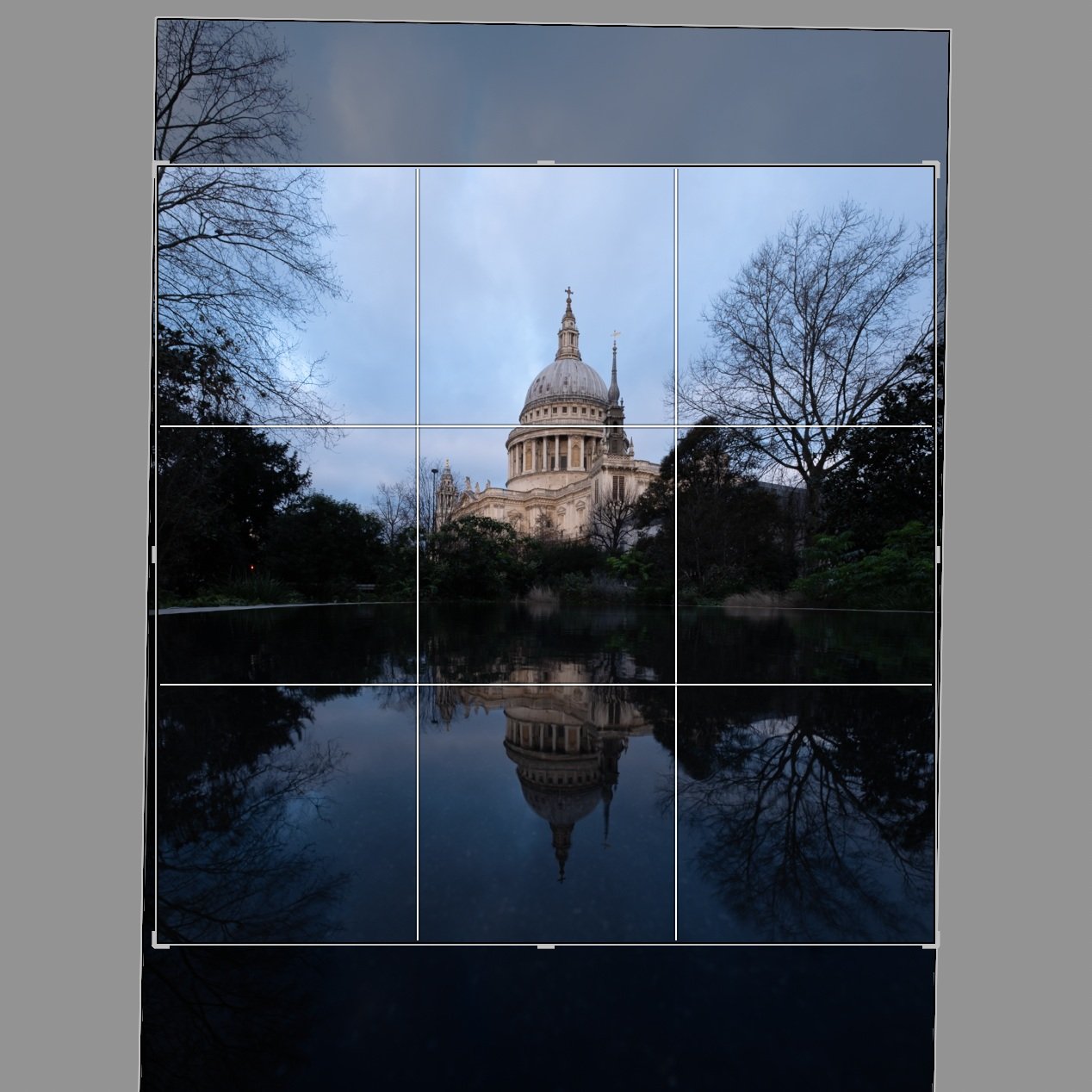
In the previous section, I talked about making sure the photo is straight and level while in the field, but in the screenshot above, you can see I’ve made a slight rotation, which suggests it wasn’t perfectly straight. What I’ve found is that even when the camera is completely level at the time of capture, a photo can still appear slightly off if there’s no clear visual reference, like a straight horizon, to show what "level" actually looks like. In those situations, even if I know the shot was technically straight, I’ll sometimes make small adjustments to the crop, so the final image looks balanced to the eye.
Here’s the cropped image:

How I convert my photos to black and white
I don’t really feel this step needs its own section, as the process I use is so incredibly simple. When I’m ready to convert an image to black and white, I simply select the B&W option in Lightroom’s Basic Development Panel.

Once I’ve converted the image to black and white, I get stuck into the processing.
It’s worth saying at this point, the settings I apply are applicable to this photo and the final look I’m trying to achieve, and will not necessarily apply to your photos. The goal here is simply to show you my process and how I arrive at the finished result. The exact numbers aren’t all that important and likely won’t be useful beyond this specific example.
The Curves panel
With my limited experience of observing others process their photos, many will start from Lightroom’s Basic Development Panel and work their way down the options to adjust their photo. Maybe my brain’s wired slightly differently, but my approach is to first set a black/white point and add a little contrast if needed. This is what I’ve done for the image below to add a little punch and lift the black point, as the shadows were very dark.

Adding more drama to the sky (burning)
Although not too obvious in the original raw file but to the eye, there was much more interest in the sky when I took the photo, and this section is all about bringing that back while introducing a little more drama at the same time.
If I were to give anyone one piece of advice when it comes to post-processing their images, it is to make small, subtle changes and build them up over time. When changes are made using a single mask to the sky (for instance), and if those changes involve some significant slider action, this can often result in garish results and a halo around the subject. This could easily be the case in a scene like this due to the delicate masking needed around the trees and dome.

I typically take photos of London for my Timeless City project when the sky is cloudy, as I prefer a more defused light across the scene rather than the high contrast look I get when the sun is out. By bringing back some of that contrast in the sky and lowering the exposure, it provides more drama and a natural-looking vignette around the top of the frame.
As you can see from the screen grab above, I’ve used multiple masks at different stages through the edit (hence the non-sequential numbering) to subtly bring back detail, reduce the exposure and increase the clarity in the clouds. You can see the results of these changes below.

Increasing the exposure in the shadows (Dodging)
Next, I’ll be bringing a little life back into the darkest shadows. With the light well defused by the layer of cloud above, I could still see the details and textures in the darker areas while taking the photo and knowing that detail does exist in the raw file, I simply needed to increase the exposure.
For this step, I used the Radial Gradient mask. As with previous edits, I prefer to make several smaller, more precise selections rather than applying large, sweeping adjustments. For each of the masks shown below, I’ve increased the exposure by between 0.5 and 1 stop to achieve the desired effect more subtly.


Below, you can see the results of those adjustments. There’s a bit more detail in the foliage, though the effect is quite subtle. I’ll bring out even more detail from those areas a bit later in the process.

Making the reflections pop
This composition of St Paul’s Cathedral is all about the reflection, and to be sure it gets the right attention when viewing the image, it needs to stand out just a little more.
The first, larger mask shown in the screen grabs below was made with a Radial Gradient, and all I’ve done there is increase the exposure in the water by half a stop. Like before, it doesn’t need to be dramatic. Just subtle changes layering on top of each other to help gradually build towards the final result.


I used the second Linear Gradient mask above to gently lower the luminance at the very bottom of the frame. The increased exposure from the previous step extended a bit too close to the edge, and I wanted the area nearest to the camera to remain darker. You can see the results of this adjustment below.

Applying some global edits using the Basic Develop Panel
By using masks to target specific areas, most of the work is now completed, but there are some small changes I wanted to make to the entire image using the Basic Develop settings. Specifically, I plan to lift the shadows a little and add some contrast back into the image.
The changes applied were Contrast +20, Shadows +30, Whites +13 and Blacks +16. Also, to soften the overall look and feel of the image and make it a little less “crunchy”, I will typically lower the Clarity and Dehaze sliders, and in this case, I lowered both by -10.

Sharpening the image in Photoshop
A note on sharpening. Opinions vary as to when to apply it. During the edit, or only when the file is being exported for a particular use case, such as web, socials or print. This is just my approach. I will typically add some sharpening when editing, call it a “base sharpening” if you like. This is usually fine for all of my online needs, but if I feel I need to add any more sharpening for print, I will do so when preparing the file before sending it to the printer.
So far, all of the edits have been applied in Lightroom, but the next step is one made in Photoshop.
I’ve never really been a big fan of how Lightroom sharpens my raw files, and instead, I use the High Pass filter in Photoshop to sharpen my photos. It’s a great tool to detect the edges (or high contrast areas) in a frame, which, when combined with a contrast-boosting blending mode, sharpens the photo without affecting the areas with less contrast, such as the sky.
With the image exported from Lightroom to Photoshop, I create a duplicate layer and then, from the menu, select Filter - Other - High Pass. Next, I input the Radius amount, which determines how much sharpening will be added. Choosing the right number depends on the resolution of the file and how much sharpening you want to add, and I will typically stick to between 1-2 pixels at this stage, with the view that I can add more later if needed. For this image, I made the radius 2 pixels.
Next, I use the Overlay blending mode for the same layer. This blending mode will hide the grey areas and add contrast to the edges highlighted by the High Pass filter, resulting in a clean, sharper file. The image below is probably too small for you to see a difference, but trust me, it is sharper.

Although for this image I used Photoshop for adding a little sharpening, as features are being added to Lightroom, my dependency on Photoshop continues to reduce, and these days I will typically use it to sharpen with the High Pass filter, the occasional Orton effect and for more complex cloning/distraction removal. Other than that, it all pretty much happens in Lightroom.
Boosting the whites
Once back into Lightroom, I have one last edit to make. I feel the whites in the sky and reflections could do with a boost, so I’ve added a mask for the sky and radial gradient for the reflection and boosted the whites by +21.

With the whites increased and both the sky and reflection getting a little more punch, that’s the last of the processing steps complete.
Below is the final image with all the edits applied. My goal during the processing was to bring the drama back to the sky, enhance the contrast in the reflections, and ensure that St Paul’s Cathedral stood out in the scene. I’m happy to say that I’ve achieved those objectives and am pleased with the final result.

No two photos are ever the same, and each one requires its own unique approach to editing. However, I hope this article has given you a good overview of my general process and the tools I use when processing my black and white photos of London.
Below, you’ll find a few more before-and-after images that show the changes between the raw file and the final edit. It’s important to me that the cloudy skies retain as much detail as possible, so I typically expose for the sky and bring out the shadow details during the editing process.


Hopefully, you found this article useful and at the risk of repeating myself, I strongly believe there is no right or wrong in terms of how people choose to edit their photos, but if you have any comments or suggestions about my workflow, or have any questions for me to help you with yours, feel free to leave a comment below or contact me directly via my Contact Page.
Just one last point before I wrap up. The image I used for this article is part of my limited-edition Timeless City print collection and is available to buy from my store. There’s a link to the print store below.

Feel free to follow the link above to browse my Timeless City print store.
Until next time.
Trevor


