
BLOG ARCHIVE

My Essential Gear for Timeless City Photography
The equipment I use for Timeless City photography in London, from cameras and lenses to tripods and filters
I’ve spoken before about what motivated me to start my Timeless City project in an article I wrote to introduce the project called Timeless City - An Introduction, but I’ve yet to speak in detail about the gear I use while wandering the historic streets of this city I am so fond of. So, in this post, I want to share the gear I rely on, how I use it, and why it’s become integral to my workflow.
Whether you’re exploring London’s streets for the first time or looking to refine your own cityscape photography, this guide will give you insight into what works for me.

Behind the camera taking a black and white cityscape photo of London
Key Priorities When Choosing My Gear for London Cityscape Photography
There are endless options when it comes to photography gear, and I should say upfront that what works for me might not work for you. I’m not suggesting you rush out and buy the same camera body or lenses I use — this post simply offers a bit of insight into the gear I rely on and why it suits my Timeless City work.
When choosing my camera gear for photographing London’s cityscape, a few key priorities guide my decisions:
1. Compatibility with my landscape setup.
My city and landscape work often overlap, so I prefer gear that’s compatible across both. This gives me backup camera bodies and lenses when needed, and keeps me familiar with the same menu system and controls — no matter what I’m photographing.
2. Lightweight and portable.
I hand-hold the camera for long periods and rarely use a neck strap, so lighter gear makes a huge difference. Compact equipment also helps keep my camera bag manageable, which is essential when walking around London for hours.
3. Minimal and fuss-free.
I like to keep things simple. The less I have to think about switching lenses or adjusting accessories, the more I can focus on composition and atmosphere — the parts of photography I care most about.
The Gear That Helps Me Create My Black and White Cityscape Photos of London

The essential gear I use for taking black and white photos of London
Camera Bodies
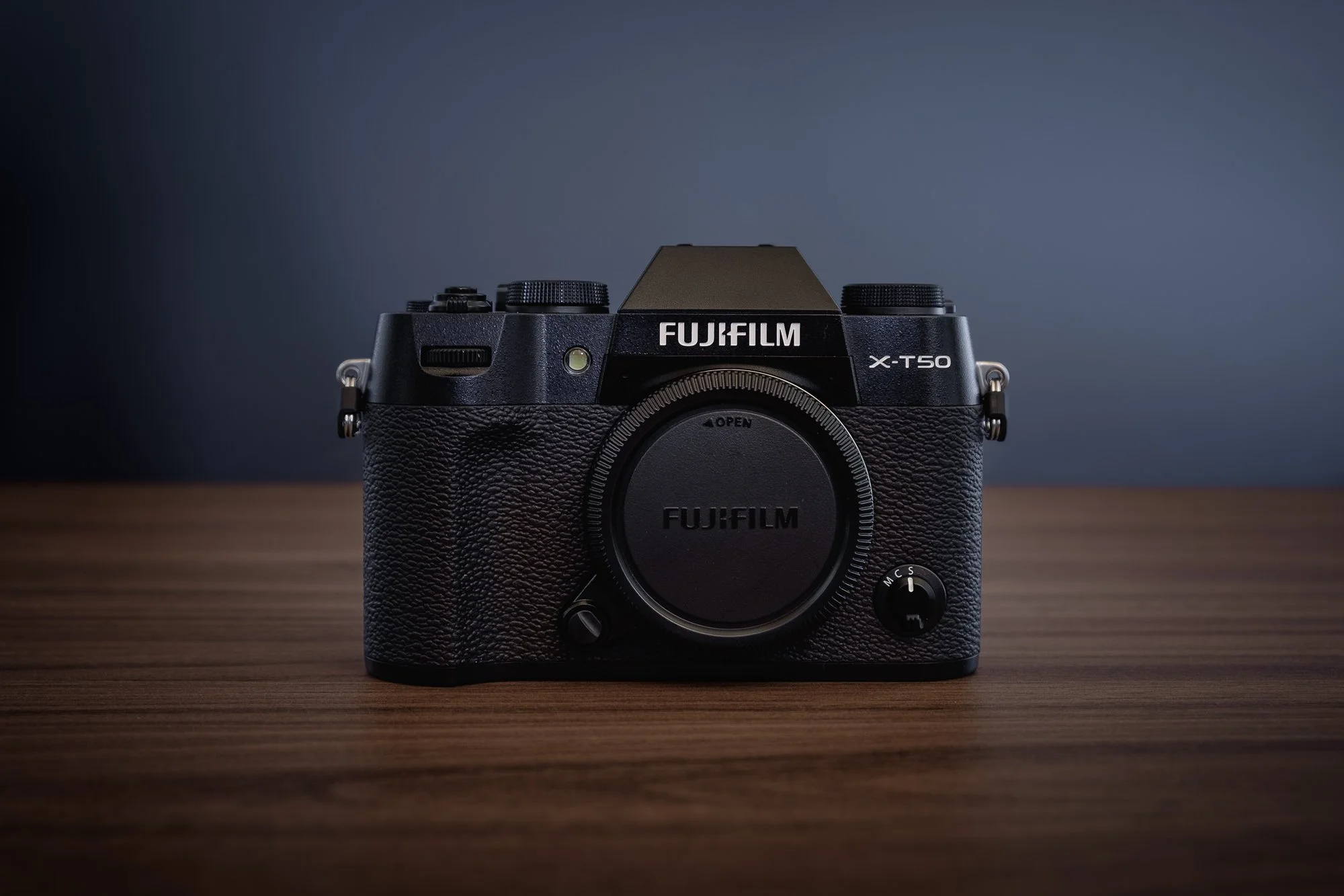
The camera I use for taking my black and white London photography is the Fujifilm X-T50
For my black and white London photography, I use the Fujifilm X-T50. Many of you might already know that I’ve been shooting with Fujifilm X Series cameras for nearly 10 years, starting with the X-T10 back in 2016. Over the years, I’ve upgraded a few times, and the X-T50 is now my go-to for city and streetscape work.
Pros:
Small, lightweight body
Same high performance and image quality as the XT5
Familiar menu system and compatible with all of the lenses I own
Cons
No weather sealing
Smaller battery with fewer pictures per charge
Single memory card slot
Fujifilm X-T50 - my trusted body for black and white city photography
The X-T50 has the same processor and stills-making capabilities as the X-T5, which I use for landscape work, but packed into a smaller, lighter body. This makes it perfect for carrying around for hours while roaming London’s streets.
While the X-T50 ticks most of the boxes for my city photography, it does have a few drawbacks compared to its bigger sibling, the X-T5 — though none are deal-breakers. The smaller battery means fewer shots per charge, but that also contributes to a lighter, more portable camera. Similarly, the single memory card slot is a minor compromise. And yes, there’s no weather sealing, but a little damp or drizzly weather is usually fine. On days with heavy rain, I can always switch to the XT5 if needed.
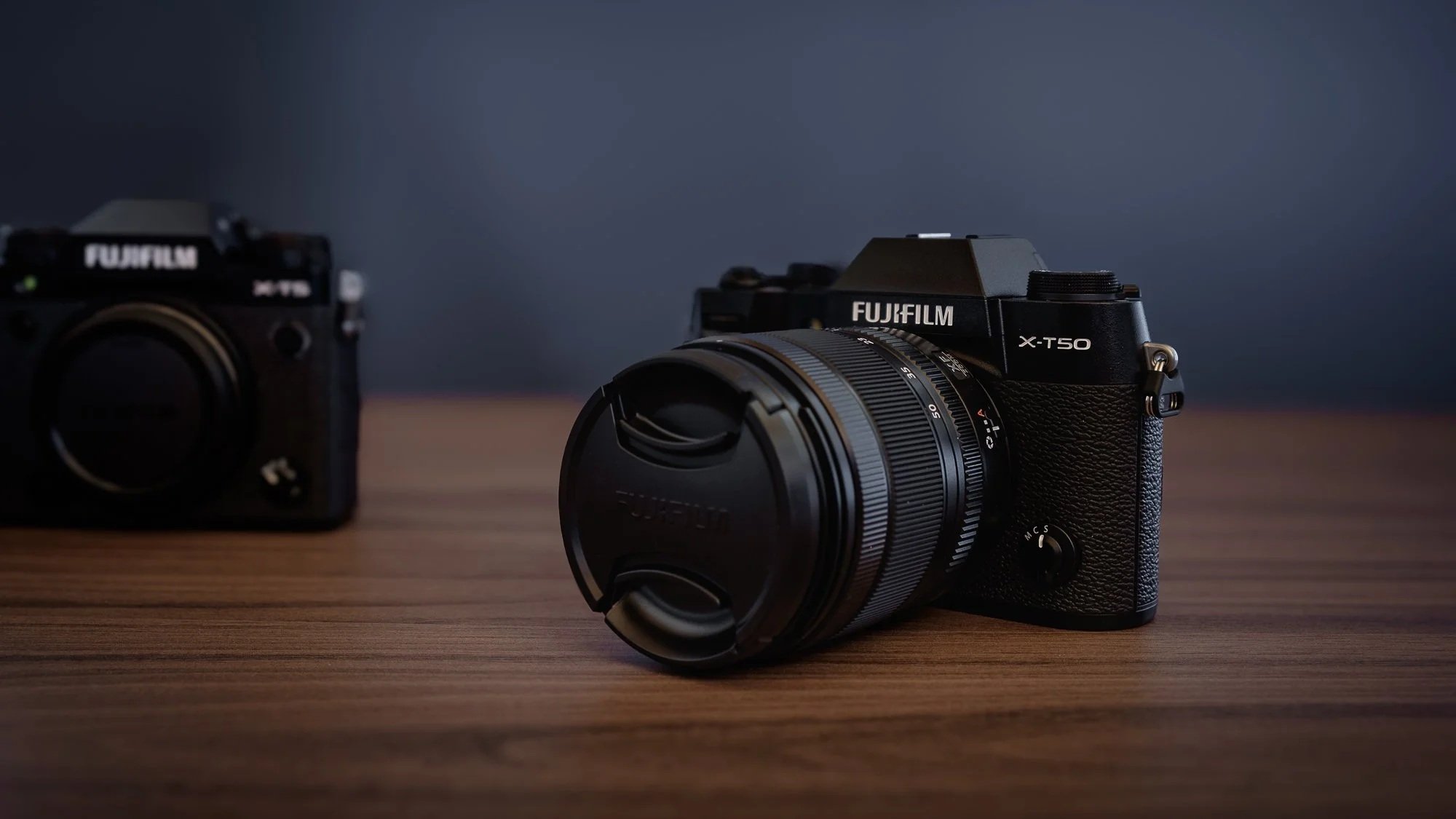
The Fujifilm X-T50 makes a great companion to the XT5
I’ve written a more detailed review of the Fujifilm X-T50 in another post called Why I Chose the Fujifilm X-T50 as a Second Camera. While that article focuses on using the X-T50 as a backup for my landscape work, it’s still a useful read for anyone wanting to learn more about this very capable camera.
Lenses
My Go-To Lenses for Urban Landscapes

My go-to lenses for cityscape photography
From most to least frequent, here are the three lenses I typically reach for when shooting my Timeless City photos, listed in order of how often I use them.
Wide-angle - XF 10-24mm F4 IOS WR
With so many tall buildings and limited space to back away, my XF10-24mm wide-angle lens is by far the lens I use most when photographing London.
For my Timeless City project, part of the look I aim for includes cloudy, moody skies. Having a wide field of view is essential — it allows me to include both the subject and plenty of sky without tilting the camera upward, keeping vertical lines straight and preserving the clean, classic feel of the scene.

Add image exif
Standard Zoom - XF16-80mm F4 IOS WR
I also include the XF16-80mm lens in my kit because, aside from the 10-24mm range covered by my wide-angle lens, it handles about 95% of my remaining focal length needs.
The 80mm reach gives me a little more flexibility compared to the more standard 16-50mm or 18-55mm zooms offered by Fujifilm. That extra reach means I rarely need to switch to a telephoto lens for the kinds of subjects I typically photograph in London.

Add image exif
Telephoto Zoom - XF70-300mm F4-5.6 R LM IOS WR
As I mentioned earlier, one of my priorities when packing my bag is keeping the weight down. While this lens is light for a telephoto with this kind of reach, I only carry it when I know I’ll need it — for example, when photographing distant rooftop views like this one.
I also own the XF50-140mm F2.8, but it’s nearly twice as heavy and doesn’t offer quite the same reach. For my style of city photography, the XF70-300mm is a better, lightweight telephoto option.

Add image exif
Accessories

The accessories I use for a day photographing London
Tripods, Filters, Batteries, and More
Tripod - 3 Legged Thing Corey tripod: Essential for taking long exposures or when the light is low. I’ve used the 3 Legged Thing Corey tripod for a few years now, and although it’s not quite the lightest travel tripod on the market, it’s a great compromise between sturdiness and weight.
Filters - Kase Wolverine magnetic filters: My filter set includes a CPL, 3-stop, 6-stop and a 10-stop filter. These magnetic filters are super quick to use and perfect for taking long exposure cityscape photos to help smooth the water in the River Thames or even blur our people from my photos.
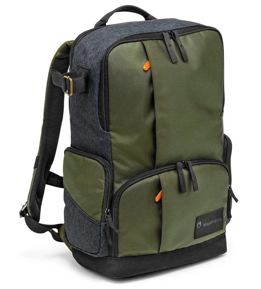
Camera Bag - Manfrotto Street: I bought the Manfrotto Street backpack 5 or 6 years ago, and although I’ve tried a few other bags since, this one has always been my go-to for carrying my lightweight cityscape gear. A small compartment for the camera and lenses, and plenty of space for holding other bits and pieces in the top compartment.
Wrist strap: I don’t typically use a neck strap, but the wrist strap stays in my bag. I might use it when walking with the camera for long periods or if I’m up high and worried about dropping my camera.
Spare batteries: As I mentioned earlier, the X-T50 still uses the smaller NP-W126S batteries. I’m fine with that if it keeps the camera compact and lightweight, but it does mean I usually carry a spare or two on my trips around the city.
Power bank: If I’m spending a full day out with my camera, I often take a portable power bank with me. The one I use, which I picked up from Amazon, can charge my iPhone, AirPods, Apple Watch — and importantly, the camera itself. It features magnetic charging and comes with both USB-C and Lightning cables built in, making it incredibly convenient for a day of city photography.
Spare memory cards: I also carry a robust metal case to store my memory cards. I always keep it with me because I’ve learned the hard way not to forget a card in the camera! Having spares in my bag ensures I’m never caught short during a day of London city photography.
A small, compact Umbrella: If rain is forecast, I make sure to dress appropriately. Since I often photograph for my Timeless City project in overcast conditions, there’s always a chance of getting caught in a shower. I actually enjoy shooting in wet weather — it adds drama and creates interesting reflection opportunities. Having an umbrella with me means I can keep photographing without getting myself or the camera wet.
Lens Hood: I picked up this lens hood for under £10 on eBay a few years ago, and it now stays in my bag for those times when I want to reduce reflections while shooting city or streetscapes through glass windows.
Workflow & Post-Processing
While the gear I choose helps me capture the shots I want in the field, I rely on consistent post-processing to ensure all my Timeless City black and white photos share a cohesive aesthetic. If you’d like to learn more about my workflow, you can check out the blog post I wrote about my post-processing approach below.

How I edit my black and white photos of London
Here’s another of my finished images, capturing a quiet, reflective street in London. The combination of gear and technique allowed me to bring out the timeless, classic aesthetic I strive for in this project.
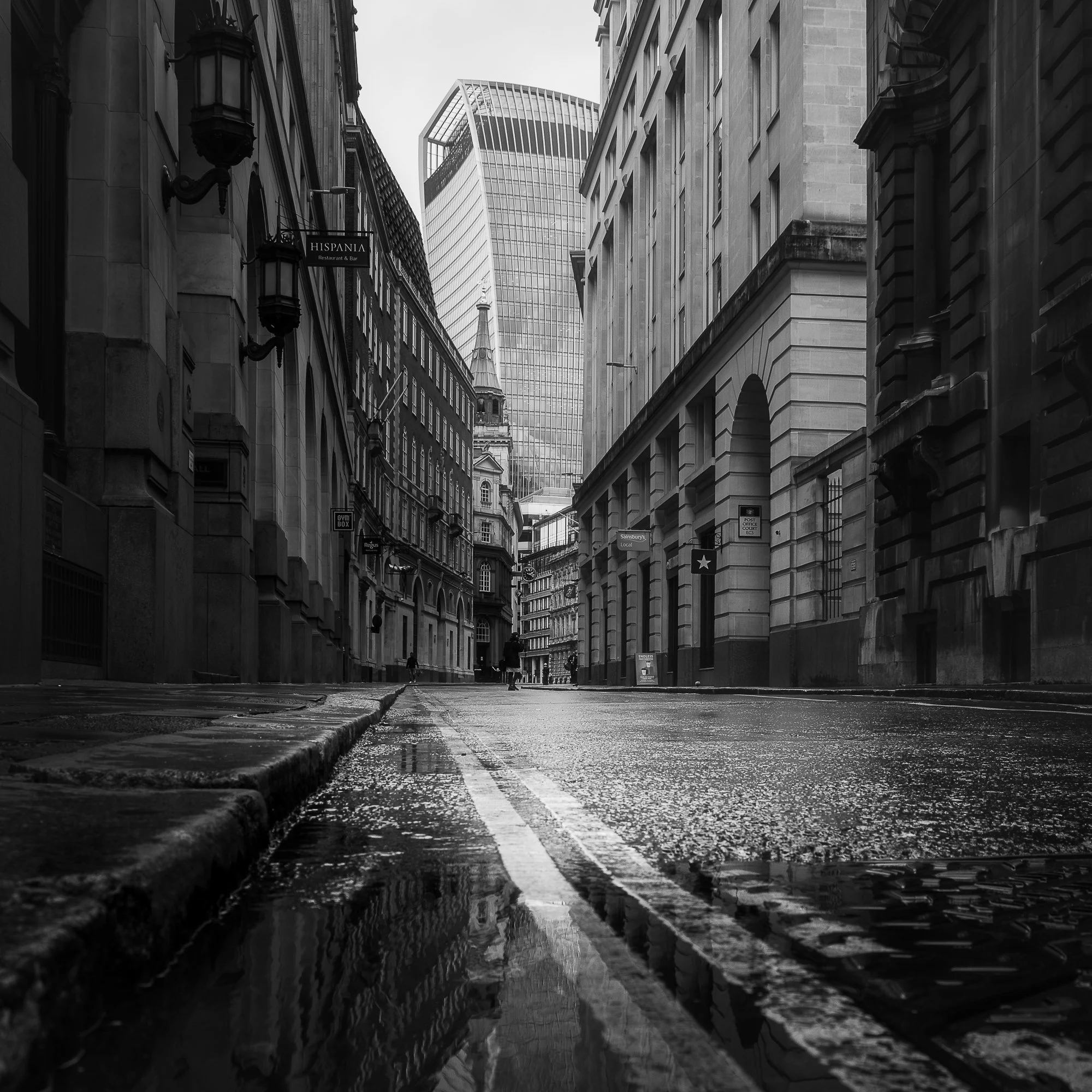
The finished image – a quiet, reflective London street captured in black and white.
The final point I want to mention about the image aesthetic is that all the photos in my Timeless City project use a square crop. From maintaining consistency to enhancing composition, there are several reasons I chose this aspect ratio, which I discuss in more detail in my post titled The Square Photo Format.

Why I use the square crop when taking my Timeless City cityscape photos of London
Ultimately, gear is only part of the story, and as I mentioned at the begining of this post, what works for me will not work for everyone but knowing why i make the choices I do could help others know what to look out for when choosing their own gear for cityscape photography. The combination of cameras, lenses, and accessories I’ve chosen helps me bring my vision for timeless cityscapes to life, allowing me to create images that reflect the look and feeling I am trying to convey.
I’d love to hear what gear you rely on for city photography, or how you capture mood in your own urban explorations. Share your thoughts in the comments below!
Until next time
Trevor

How I Edit My Black and White Photos of London
My step-by-step process for editing this black and white photo of St Paul’s Cathedral in London
Every photographer has a different approach to editing. Some prefer a straight-out-of-camera (SOOC) image, letting the camera handle all the processing. Others work with raw files in editing programs like Adobe Lightroom or Capture One, taking the time to carefully refine each image and maintain full creative control.
There’s no right or wrong way to do it—whether you skip post-processing entirely or spend minutes (or even hours) perfecting a single photo, it all comes down to personal preference. As for me, I see post-processing as a vital part of my photographic workflow. I like having full control over how the raw file is developed, and it’s not out of the question for me to spend up to an hour fine-tuning just one image.
Okay, it’s pretty rare for me to spend an hour or more on a single photo. Most of the time, I wrap things up in about 10 to 20 minutes. That might still seem like a lot to some, but post-processing is a part of the process I genuinely enjoy. It’s a chance to unwind, maybe with a drink in hand and some background music playing, while I spend some quiet time with my images. It’s a way for me to stay connected to photography even when I can’t be out in the field with my camera.
So, when I’ve carved out a little time, poured myself a glass of whatever, and I’m ready to get to work on my most recent Timeless City images, what does my process typically look like?
In this post, I’ll walk you through the editing process I used for a photo I took of St Paul’s Cathedral, titled Dual Realms.

I’ll also include a few before-and-after photos as a little peek behind the curtain. A post-processing video might explain things better, but since I don’t make videos and prefer to write, this will have to do.
One last thing to note: there’s no right or wrong way to process your work. This is simply the method I use. I’m not claiming to be an expert—just sharing my approach in case it’s helpful or interesting to anyone. And if you have any tips or suggestions to improve the workflow, feel free to share them in the comments below!
Now, let’s get started.
The applications I use to process my raw images
I’ve been a subscriber to Adobe Cloud for a few years and predominantly use Lightroom Classic and Photoshop desktop versions to process my photos. If I were to hazard a guess, the ratio I use these two would be around 95% Lightroom and 5% Photoshop. Nearly all of the heavy lifting I do happens in Lightroom, and I’ll typically export to Photoshop just to apply some finishing touches or use features not available in Lightroom.
The raw file
This is the original file, freshly imported into Adobe Lightroom. It’s a 3:2 vertical image of St Paul’s Cathedral in London, taken during the winter months—which explains the bare trees. I took the photo in a vertical format to give myself more flexibility when cropping to a square. This way, I have extra space at the top and bottom to fine-tune the cathedral’s position in the frame, allowing for more precise control over how much sky or reflection to include.

Another important consideration for me is getting the verticals straight and keeping the camera level when taking the shot. It means less correction later in post and reflects my overall approach: to get as much right as possible in-camera from the start.
When importing to Lightroom, the default Adobe Colour profile was applied, and if you’re at all interested, the exif data of the photo is as follows: Fujifilm X-T50 | XF10-24mm Lens | 10mm | ISO125 | F/10 | 1/20th Second.
Cropping and straightening the image
The first step in my process is locking in the composition. As I mentioned earlier, shooting in a vertical orientation gave me the flexibility to decide how much sky and reflection to include. This helped me create what feels, at least to my eye, like a visually balanced image.
In the previous section, I talked about making sure the photo is straight and level while in the field, but in the screenshot above, you can see I’ve made a slight rotation, which suggests it wasn’t perfectly straight. What I’ve found is that even when the camera is completely level at the time of capture, a photo can still appear slightly off if there’s no clear visual reference, like a straight horizon, to show what "level" actually looks like. In those situations, even if I know the shot was technically straight, I’ll sometimes make small adjustments to the crop, so the final image looks balanced to the eye.
Here’s the cropped image:

How I convert my photos to black and white
I don’t really feel this step needs its own section, as the process I use is so incredibly simple. When I’m ready to convert an image to black and white, I simply select the B&W option in Lightroom’s Basic Development Panel.

Once I’ve converted the image to black and white, I get stuck into the processing.
It’s worth saying at this point, the settings I apply are applicable to this photo and the final look I’m trying to achieve, and will not necessarily apply to your photos. The goal here is simply to show you my process and how I arrive at the finished result. The exact numbers aren’t all that important and likely won’t be useful beyond this specific example.
The Curves panel
With my limited experience of observing others process their photos, many will start from Lightroom’s Basic Development Panel and work their way down the options to adjust their photo. Maybe my brain’s wired slightly differently, but my approach is to first set a black/white point and add a little contrast if needed. This is what I’ve done for the image below to add a little punch and lift the black point, as the shadows were very dark.

Adding more drama to the sky (burning)
Although not too obvious in the original raw file but to the eye, there was much more interest in the sky when I took the photo, and this section is all about bringing that back while introducing a little more drama at the same time.
If I were to give anyone one piece of advice when it comes to post-processing their images, it is to make small, subtle changes and build them up over time. When changes are made using a single mask to the sky (for instance), and if those changes involve some significant slider action, this can often result in garish results and a halo around the subject. This could easily be the case in a scene like this due to the delicate masking needed around the trees and dome.

I typically take photos of London for my Timeless City project when the sky is cloudy, as I prefer a more defused light across the scene rather than the high contrast look I get when the sun is out. By bringing back some of that contrast in the sky and lowering the exposure, it provides more drama and a natural-looking vignette around the top of the frame.
As you can see from the screen grab above, I’ve used multiple masks at different stages through the edit (hence the non-sequential numbering) to subtly bring back detail, reduce the exposure and increase the clarity in the clouds. You can see the results of these changes below.

Increasing the exposure in the shadows (Dodging)
Next, I’ll be bringing a little life back into the darkest shadows. With the light well defused by the layer of cloud above, I could still see the details and textures in the darker areas while taking the photo and knowing that detail does exist in the raw file, I simply needed to increase the exposure.
For this step, I used the Radial Gradient mask. As with previous edits, I prefer to make several smaller, more precise selections rather than applying large, sweeping adjustments. For each of the masks shown below, I’ve increased the exposure by between 0.5 and 1 stop to achieve the desired effect more subtly.


Below, you can see the results of those adjustments. There’s a bit more detail in the foliage, though the effect is quite subtle. I’ll bring out even more detail from those areas a bit later in the process.

Making the reflections pop
This composition of St Paul’s Cathedral is all about the reflection, and to be sure it gets the right attention when viewing the image, it needs to stand out just a little more.
The first, larger mask shown in the screen grabs below was made with a Radial Gradient, and all I’ve done there is increase the exposure in the water by half a stop. Like before, it doesn’t need to be dramatic. Just subtle changes layering on top of each other to help gradually build towards the final result.


I used the second Linear Gradient mask above to gently lower the luminance at the very bottom of the frame. The increased exposure from the previous step extended a bit too close to the edge, and I wanted the area nearest to the camera to remain darker. You can see the results of this adjustment below.

Applying some global edits using the Basic Develop Panel
By using masks to target specific areas, most of the work is now completed, but there are some small changes I wanted to make to the entire image using the Basic Develop settings. Specifically, I plan to lift the shadows a little and add some contrast back into the image.
The changes applied were Contrast +20, Shadows +30, Whites +13 and Blacks +16. Also, to soften the overall look and feel of the image and make it a little less “crunchy”, I will typically lower the Clarity and Dehaze sliders, and in this case, I lowered both by -10.

Sharpening the image in Photoshop
A note on sharpening. Opinions vary as to when to apply it. During the edit, or only when the file is being exported for a particular use case, such as web, socials or print. This is just my approach. I will typically add some sharpening when editing, call it a “base sharpening” if you like. This is usually fine for all of my online needs, but if I feel I need to add any more sharpening for print, I will do so when preparing the file before sending it to the printer.
So far, all of the edits have been applied in Lightroom, but the next step is one made in Photoshop.
I’ve never really been a big fan of how Lightroom sharpens my raw files, and instead, I use the High Pass filter in Photoshop to sharpen my photos. It’s a great tool to detect the edges (or high contrast areas) in a frame, which, when combined with a contrast-boosting blending mode, sharpens the photo without affecting the areas with less contrast, such as the sky.
With the image exported from Lightroom to Photoshop, I create a duplicate layer and then, from the menu, select Filter - Other - High Pass. Next, I input the Radius amount, which determines how much sharpening will be added. Choosing the right number depends on the resolution of the file and how much sharpening you want to add, and I will typically stick to between 1-2 pixels at this stage, with the view that I can add more later if needed. For this image, I made the radius 2 pixels.
Next, I use the Overlay blending mode for the same layer. This blending mode will hide the grey areas and add contrast to the edges highlighted by the High Pass filter, resulting in a clean, sharper file. The image below is probably too small for you to see a difference, but trust me, it is sharper.

Although for this image I used Photoshop for adding a little sharpening, as features are being added to Lightroom, my dependency on Photoshop continues to reduce, and these days I will typically use it to sharpen with the High Pass filter, the occasional Orton effect and for more complex cloning/distraction removal. Other than that, it all pretty much happens in Lightroom.
Boosting the whites
Once back into Lightroom, I have one last edit to make. I feel the whites in the sky and reflections could do with a boost, so I’ve added a mask for the sky and radial gradient for the reflection and boosted the whites by +21.

With the whites increased and both the sky and reflection getting a little more punch, that’s the last of the processing steps complete.
Below is the final image with all the edits applied. My goal during the processing was to bring the drama back to the sky, enhance the contrast in the reflections, and ensure that St Paul’s Cathedral stood out in the scene. I’m happy to say that I’ve achieved those objectives and am pleased with the final result.

No two photos are ever the same, and each one requires its own unique approach to editing. However, I hope this article has given you a good overview of my general process and the tools I use when processing my black and white photos of London.
Below, you’ll find a few more before-and-after images that show the changes between the raw file and the final edit. It’s important to me that the cloudy skies retain as much detail as possible, so I typically expose for the sky and bring out the shadow details during the editing process.


Hopefully, you found this article useful and at the risk of repeating myself, I strongly believe there is no right or wrong in terms of how people choose to edit their photos, but if you have any comments or suggestions about my workflow, or have any questions for me to help you with yours, feel free to leave a comment below or contact me directly via my Contact Page.
Just one last point before I wrap up. The image I used for this article is part of my limited-edition Timeless City print collection and is available to buy from my store. There’s a link to the print store below.

Feel free to follow the link above to browse my Timeless City print store.
Until next time.
Trevor
Related Timeless City articles:


Creating my limited edition Timeless City prints of London
Take a peak into the process I follow when choosing, printing and sending my limited edition, Timeless City, fine art prints of London.
Taking photos can be such a creative and fulfilling process and after capturing that epic vista at sunset or carefully crafted cityscape scene, for me, viewing work on a screen does not compare to the impact I get from holding a fine-art print in my hand or seeing it mounted, framed and hanging on the wall. A physical print can bring a photo to life and transport the viewer to another time and place, evoking all kinds of emotions and memories.
With so many photos observed on social media for just a few seconds before the inevitable swipe of the screen, the physical print invites viewers to slow down and engage deeply with the work. It’s a more intentional way of experiencing photography. As Ansel Adams famously said, "The negative is the equivalent of the composer's score, and the print is the performance.” Maybe, for the modern age, you could replace the negative with the digital raw, but you get the point.

Printing my Timeless City, black and white photos of London
When my Timeless City project started to gain a little momentum and a body of work was forming, I thought about ways I could transport the photos I’ve taken from the screen into print and one of the options I’ve decided to pursue is to offer fine-art prints for those who follow the project to own.
I wrote this blog post to accompany the new print store for two reasons.
To share the attention to detail and craftsmanship that goes into producing my high-quality, archival fine-art prints.
To help photographers who are starting their own printing journey by outlining my process.
Choosing the photos for the limited edition prints
Choosing the photos I want to include in a limited edition collection is an important and (to me at least) difficult decision. On the one hand, I’m including what I subjectively consider some of my very best work, which I hope will also appeal to a potential print-buying audience. On the other hand, I have to be comfortable with the fact that those images will be limited in number and once finished, never printed in the same way again.
Once shortlisted and to ensure quality, I printed the images at their intended sizes—7x7” and 10x10”. I printed the shortlisted photos at this early stage because I’m aware that not all images translate well from screen to paper, and this step helps eliminate any that don’t quite hit the bar. This step also helped me narrow the selection to an initial 12 prints I wanted to start with.

Choosing the right paper to print my photos
There are several things to consider when printing images and paper choice is arguably the most important decision I needed to make. In my mind, I have a particular look I want to achieve, one that I feel suits the work best and here’s a brief breakdown of the process I went through when choosing the right paper for this project.
Paper Size: I want the finished work to have a more intimate look and feel. There’s a quiet subtlety to my black and white photos of London and I don’t want the prints to overwhelm the space they are displayed. I think a smaller picture with a wide mount and subtle frame suits the work better. The other benefit of printing the photos in 7”x7” and 10”10” is that I can print, sign and send the work directly, meaning I can control the entire printing process and ensure a high degree of quality control.
Paper Type: By paper type, I mean choosing between normal, photo-quality paper or acid-free, archival paper. For limited-edition, fine-art prints that will appeal to both casual buyers who appreciate my work and the serious print collector, I feel there is only one option for this project and that is acid-free, archival paper.
Paper Finish: When testing the different papers from my preferred manufacturer (Fotospeed), I found they had a range of colour temperatures and finishes, from smooth to textured, from matt to glossy and from warm to cool. I already knew I wanted a cooler, non-textured, semi-gloss finish so I purchased a test pack of papers with various options that aligned with what I wanted and got busy testing.
After extensive testing and lots of printer ink used, I found Fotospeed’s Platinum Baryta 300gsm the best paper for the job. I love how my black-and-white cityscape work looks and with a throwback to the dark room look Baryta paper provides, there is a classic, even ‘timeless’ look to the final print. Here’s a description of the paper I pulled directly from Fotospeed’s website:
Platinum Baryta 300 is 100% acid-free, Fine Art paper with a smooth unglazed gloss surface. A natural white base and state of the art micro-porous ink receiving layer delivers a high D-MAX (2.99) and wide colour gamut. Platinum Baryta 300 reveals delicate highlights and smooth transitions to shadows for both colour and B&W printing. The paper is approved by the Fine Art Trade Guild and when used in conjunction with pigment inks will ensure a print life of more than 85 years.

The process I follow for printing my Timeless City photos
As I mentioned at the start of this post, the experience of viewing pictures on screen doesn’t come close to the feeling of holding a print in your hand, but it doesn’t stop there. To get the very best print possible, a few things need to be done to adapt the image so that how it looks on screen is as close as possible to how it looks on paper.
Preparing the image file for printing
There is a big difference between viewing an image on a backlit monitor to an image on paper with only reflective light available. Ultimately this means that if I don’t tweak the image first, it will likely print dark, soft and lack contrast. So these are the main things I change for each image before printing.
I will normally boost the brightness by half a stop or more, increase contrast, and sharpen the image. Alongside these standard tweaks, I will often selectively dodge and burn (decrease or increase brightness) in specific places to ensure those areas retain detail and contrast once on paper.
Although Platinum Baryta 300gsm is on the whiter end of the fine art paper spectrum, it still prints a little warm for the look I am after, so for every photo, I adjust the white balance slightly to cool the image down meaning the printed image will appear more neutral and not to warm. This is purely to taste and not a necessary step for everyone.

Using the correct printer settings
When sending the image to the printer, certain settings must be used. I won’t list them all, but two points I feel are incredibly important to get right are using the right profile for the paper and printer combination and setting the right paper type in the printer settings.
Using the correct ICC Profile: As I mentioned before, my paper is manufactured by Fotospeed and they provide standard ICC profiles (and instructions) for all papers when printed on a Canon or Epsom printer. All I had to do was download the right profile, install it and select that profile in the print options.
Setting the paper type: The second setting I always check is choosing the right paper type from within my Canon printer’s settings. Again, Fotospeed provides a handy table on their website which matches their paper to the options available in the printer settings. For example, to get the best results when printing on Platinum Baryta, I need to select “Photo Paper Pro Lustre” from the Canon printer settings. Without setting this, I won’t get the final look I want.
Hard-proofing to make sure the print looks right
With the image prepared and printer settings set, the only real way to know I’ve made the right choices is to start printing. This is called hard proofing (or hard-copy proof) and will typically consist of smaller versions of the image or just small cropped sections at 100%. This initial method helps to get a good idea of the tones, luminance and quality while preserving paper and ink.
Creating my Artist’s proof
With the smaller or partial version looking right, the last stage in the proofing process is to print the image on the right paper, at the final 7x7'“ and 10x10” sizes. Different photographers and artists will have various ways as to how they manage and even sell their artist proofs as they’re not included in the count of limited editions sold, but if you want to read a bit more on the Artist’s Proof, you can start here at Wikipedia.

Signing and certifying my limited edition prints of London
All of my limited edition prints are signed and numbered on the white border, underneath the picture. I sign close enough to the picture so that the collector can choose to show or hide my signature when the print is mounted and framed. With the Platinum Baryta being a semi-glossy paper, I need to sign with ink as a pencil won’t work and my pen of choice right now is the Faber-Castell Pitt Artist Pen Fineliner XS India ink pen. Whatever the pen you choose, the most important thing about choosing one to sign archival prints is that they should be waterproof, permanent, acid-free and pH neutral.
If selling my prints as limited editions is to be successful, I have to instil confidence in the buyer that the print run is truly limited and I will only sell the number of copies of a given print I say I will. Once advertised and the first in a limited edition run is sold, there is no going back and nor should there be. This is where the certificate of authenticity (COA) comes in. Alongside proving the work’s provenance and authenticity, the COA is my signed contract to the buyer on which I certify the image is a genuine limited edition.
The certificate I provide with every print includes the following information;
Logo and title
Statement of authenticity
Name of the print and edition number
Date the photo was taken and printed
Dimensions of the print and image of the artwork
Medium the image is printed on
My signature and date the certificate was signed

How I pack and ship my limited edition, fine art prints
As I researched how to package and send my prints, I had four key objectives.
Secure: The way I package the prints must be tough and secure as I don’t want the print to be damaged during transit.
Sustainable and environmentally friendly: The materials used to manufacture the packaging should be sustainably sourced with minimal plastic used, and fully recyclable.
Archival: To ensure longevity, any materials that come in contact with the print must be acid-free and pH-neutral.
Presentable: I want the end-to-end experience of buying a print to be one of quality and attention to detail, and that starts with how the print is received and opened so, alongside being secure and sustainable, the packaging has to look presentable too.


So with these four objectives in mind, here’s a quick breakdown of some of the key materials I use to package and ship my print:
Black presentation box: The presentation box I use looks good, keeps the print secure and is environmentally friendly. The boxes I use are biodegradable, made from recycled materials, sustainably sourced and fully recyclable. In addition, the A4-sized box I use is compostable.
Glassine Envelope: Each print is placed in an envelope before it goes into the presentation box. I opted for Glassine envelopes as they are recyclable, compostable, biodegradable and manufactured with renewable materials. Anything that comes in contact with the print must be archival, so the glassine envelope is also acid-free and pH-neutral.
It’s important to be as transparent as possible when discussing sustainability so it should be said that the manufacturing process of glassine envelopes is quite resource-intensive but this will be minimal compared to similar petrochemical & fossil-fuel-based materials such as plastic.
White card and envelope: I use a white card to print the certificate of authenticity and place it in a white envelope. I use a white card sheet to add rigidity to the print while in the glassine envelope. The card and envelopes I use are made from 100% recycled materials.
Mailing bags: Having had many deliveries left on my doorstep, exposed to the elements, I do not want to risk the same happening to one of my prints without being adequately protected, so unfortunately this is where I feel I am forced to use plastic packaging (for now at least). Although far from ideal, I have ensured the mailing bags I use are made from fully recycled plastic and code 4 LDPE, meaning they can be recycled using most standard domestic services. I will continue to seek alternatives and update the post when I have one. All suggestions are gratefully received.
Final thoughts
Hopefully, that provides a useful insight into the process and equipment I use when producing my limited-edition, fine art prints.
Whether you're a collector considering purchasing my work or a fellow photographer beginning your fine-art printing journey, I hope this article helps you appreciate the craftsmanship behind each print I make. If you have any questions about my Timeless City project, feel free to reach out to me via my contact page and if you are interested in owning your own limited edition print of London, visit my Timeless City store using the button below.

Until next time.
Trevor

The square photo format
In this article, I delve into the square aspect ratio and explore the benefits it brings to my photography.
When I first embarked on my Timeless City photography project, I quickly decided that along with being black and white, all of the photos in the series would be presented as squares. Although I’m still certain this was the right thing to do, it was a snap decision at the time as I wanted to instil some consistency in how the work would be presented and avoid a mix of different aspect ratios.
If you want to learn a little more about why I started this Timeless City project, check out Timeless City: An Introduction.

Alongside the consistency aspect, I strongly believed that applying constraints to how my work is produced would encourage me to think (and in this case see) differently. I’ve been shooting with a 3:2 aspect ratio for years, and up until recently, I would only occasionally change this after the shoot, back in post. So, seeing and composing a square frame has forced me to think deeply about my compositional habits.
One final thought on composition: I believe there are no rigid rules in photography. You’ll hear about techniques like using the rule of thirds or leading lines, and while these can be valuable tools for learning, they should serve more as guides than strict rules. Whether you choose to follow or ignore them is entirely up to you, because ultimately, you're the one pressing the shutter. If your approach works and the image resonates, then you've succeeded in capturing something uniquely yours.
But why did I choose the square for this project?
I’ve been wanting to write this article for a while; not just to explain my decision to use the square crop, but also to help me better understand why I’m so drawn to it. As I mentioned earlier, choosing the square format was an instinctive decision that felt right for the project as a whole. However, it was only afterwards that I began to reflect on what it adds to each individual image. Ultimately, no matter how the work is presented, it's the strength of the photos themselves that will define the overall success of the project.

The points below are based on a combination of studying the photos I’ve taken for this project and researching the compositional techniques used by photographers I admire. While much of this may have been discussed before, I wanted to write this article as a way to process and understand it through my own work. These are my personal, evolving opinions, and I welcome you to share your own thoughts on the square crop in the comments at the end of the article.
With all that being said, let’s dive in.
The square creates a classic, timeless look to my photos
I want to start with this point because I feel it’s less about composition and more about style, yet it’s a key reason I chose the square format for this project. In a world dominated by 3:2 and 4:3 aspect ratios, I associate the square format with classic medium format cameras like the Rolleiflex or Hasselblad, used by legendary photographers of the past. To me, the square frame evokes a vintage, nostalgic feel. While I’m photographing the contemporary world and can’t (nor do I want to) eliminate all signs of modernity, I believe the square format helps them subtly fade into the background, if only a little, to help achieve a more timeless look.


Placing the subject anywhere in the frame with a square photo
One thing I quickly noticed when composing photos with a square crop is that I could place the subject almost anywhere in the frame without it feeling unbalanced. The square format offers more freedom, as traditional compositional guides seem to carry less weight. Whether I position the subject near the centre or closer to the edge, the image still feels balanced. This flexibility allows me to be more creative and simply have more fun when taking my photos.


A neutral shape which encourages the viewer to look around the image
Lacking a dominant direction, the square photo offers equal visual weight on all sides, encouraging the viewer to look around the frame as opposed to looking side to side or up and down. The symmetry helps prevent the viewer from feeling pulled in a particular direction, encouraging a more immersive exploration of the entire frame. This balanced approach prevents the eye from being directed by dominant shapes or lines, fostering a more comprehensive and immersive exploration of all elements within the image.

Square photos can often convey a sense of calm
Building on the point I made earlier about the square format lacking a dominant direction, I’ve noticed that square photos, both my own and those of other photographers, often convey a sense of calm. I touched on this in my project introduction, referencing the work of the great Michael Kenna and how his use of the square format contributes to the zen-like quality present in much of his photography.
Without the horizontal or vertical bias of a rectangular frame, the square format introduces a sense of stability and harmony. In the chaotic and busy environments I photograph, particularly in my London cityscape work, the square composition helps create a more peaceful, uncluttered feeling.


The square can enhance geometric shapes
Although visual tension in a photo can be a positive thing, it can sometimes detract from the feeling I’m trying to create with my images and when including strong geometric shapes in my photos like in those below, the neutrality of the square crop helps them to feel more centred and balanced within the frame.


Embrace the use of negative space and minimalism with square photos
I’ve already spoken about how the square can convey a sense of calm, but this also goes for instilling a minimalistic feeling in the photos by introducing a more balanced composition. Without the directional bias a rectangle brings to the image, it helps to make every element in the frame, including negative space, equally important, creating a harmonious visual experience.

A square photo can enhance diagonal lines
When I want to introduce visual tension in my photos, I often incorporate diagonal lines into the composition. The inherent stability of the square frame, with its equal sides, contrasts perfectly with the dynamic energy of diagonals. These lines not only add depth but also guide the viewer's eye through the image, creating a more engaging and visually compelling experience.


Symmetry with the square photo
With all sides being equal, the square aspect ratio is ideal for symmetrical compositions. It enhances both vertical and horizontal symmetry, creating a balanced frame that doesn’t favour one direction over the other. This allows symmetrical scenes to shine, amplifying their sense of order and precision. The square format also reinforces simplicity and calm, as the symmetry within the image offers a clean and visually satisfying composition. From architecture to reflections, the square format beautifully highlights the inherent harmony of symmetrical subjects.


A frame within the frame is enhanced with a square crop
I love incorporating frames within my compositions, particularly with a 1:1 aspect ratio. The equal dimensions allow the frame to be uniformly sized on all sides, enhancing the balance of the composition. This uniformity not only creates a sense of harmony but also contributes to the quieter, more relaxed atmosphere I try to portray in my work.


That being said, using frames within the frame doesn’t necessarily require a symmetrical composition. As I mentioned earlier, the square format offers compositional freedom, allowing you to place the subject or the frame itself off-centre. You can also experiment with the dynamic energy that diagonal lines can bring into the image, adding visual interest and movement while still maintaining balance.

Taking square photos and my thoughts about cropping
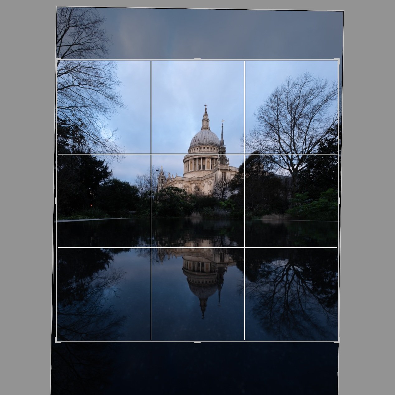
Before concluding this article, I want to discuss how I compose and capture square photos while out in the field. My Fujifilm XT5 allows me to set a 1:1 aspect ratio directly in-camera, and unlike some other brands, this setting is non-destructive, meaning I can adjust or remove the crop during post-production. Surprisingly, some cameras permanently discard the cropped-out portions of an image, so if that’s the case for you, consider adding compositional grid lines to your camera's display to guide your framing and apply the crop later when editing in your chosen software.

And please! Do not let anyone tell you cropping photos is bad. That’s just ridiculous. There is no right or wrong with photography.
This small study into square format photography and the compositional benefits it can bring has been a great opportunity to dive a little deeper into the work I’ve been creating and I hope that this newfound awareness of the impact a square crop can have on my pictures will help me in my continuous drive to develop my photographic eye. As I mentioned before, please feel free to leave any comments, sharing your own thoughts on the square photo below.
Until next time.
Trevor

Timeless City | An Introduction
An introduction to my Timeless City project. In this post, I provide a bit of background and answer a few questions such as why I take photos of London, why I chose this style for the photos and what the future might hold for the project.
London is my local city. It’s the closest city to where I grew up, a place I’ve worked for quite a few years and ever since I first picked up a camera and started taking photography more seriously, it’s a city I have spent countless hours photographing.
Why London?
Growing up in the suburbs, I didn’t visit London often as a child, when I did, it was usually a family day out or a school trip to some of the tourist hotspots such as the Tower of London or Trafalgar Square. I remember walking around the city, dwarfed by the buildings around me, in awe of the many different styles of architecture I saw. The hustle and bustle, the noise, and so many people; it was a different world to the one I was used to. This was all decades ago, when there were just a handful of buildings taller than St Paul’s Cathedral and over on the Isle of Dogs stood a solitary One Canada Square. How times have changed.
Fast forward a few years and long before I’d taken up photography, I took a job which involved travelling to London almost every day and getting to know the city much better. My work took me all over London and this is when I first started to build my own, personal connection with the city.

In 2016, photography started to evolve from an occasional hobby, photographing a bit of everything, to the passion it is for me today. After a few years of working closer to home, I was back in London most days and naturally drawn to landscape photography and given the connection I’d already built with the city, it made sense that I would feel more compelled to point my lens at London’s incredible cityscape.
Since then, I’ve spent an untold number of hours across countless visits to the city walking the streets, seeking out new compositions and like all landscape photographers, hoping for perfect conditions in a bid to take that perfect image, knowing full well that such a thing doesn’t exist.
I chose to use “Timeless” in the title because from the subject to processing style, I felt it represented a few of the important ingredients that make up this project.
London as we know it has existed for around 2000 years, from a time when Londinium was the size of Hyde Park to the megacity it is today. Throughout all that time, architectural styles have inevitably evolved, from the medieval Tower of London, English Baroque such as St Paul’s Cathedral through to post-war brutalist and the contemporary 21st-century style with plenty of glass being used today.
London’s iconic cityscape is still represented by all of these architectural styles, and this is why timeless doesn’t mean a city that never changes, embodying just a single point in history. To me, it means a city that represents all times, a place consistently evolving over hundreds of years to a point where all of the significant architectural ages London existed through are represented across its skyline. With both old and new coexisting side by side, I wanted to capture a sense of that in my work.
Although the need to develop and evolve with the times has contributed to London’s ever-changing cityscape, this somewhat mishmash of styles has by no means been solely by design. Through the many turmoils the city has faced, such as the great fire or the blitz, London has been forced to rebuild significant parts of the city over the centuries, and one of the challenges I relish is to seek out ways to represent London in my photography and how it’s many structures stand together side by side in what I can only describe as a chaotic harmony.
The goal here isn’t to produce an “old and new” series of photos and even though most of the photos I take will include more than one architectural style in the frame. The goal is to document London’s cityscape across the entire body of work from high up in the rooftops with views stretching for miles, to closer, more intimate photos where scale can be represented better by including a subject in the composition.

At the time of writing this post, the earliest photo I have included in this project was taken in 2018, which, in the grand scheme of time, isn’t very long at all, but still long enough for many changes to take shape across London’s cityscape between then and now. The rate at which new buildings are being erected, particularly in the financial districts is accelerating and as I continue to take new photos, I will be inadvertently documenting these changes as they happen. If this ends up being a very long-term project, I think it will be good to look back at how the cityscape used to look years before.
Why this aesthetic?
Something important to mention about this work is that it is intended to be more of an artistic project than a documentary one, and every photo is taken with the full intention of being edited in post-production. This will include converting the raw files to black and white (more on that later) and alongside some usual tonal and contrast adjustments, I use plenty of selective dodging and burning to achieve the final look.
I still, however, have my own views about authenticity and how I edit my images. I never swap out the sky and never add something that wasn’t in the scene at the time the picture was taken. I might clone out the odd distraction if I feel it is taking away from the aesthetic, but these are typically transient elements such as rubbish in the foreground, old chewing gum on the pavement or the odd crane in the background. I want the viewer to be confident that if they were standing next to me as the shot was taken, they would have observed the same scene I show in my final image.
Alongside those adjustments, if the dynamic range is too much or I want to illuminate certain moving elements in the scene, I will blend images. I will only do this if there is just a very short time between frames and the camera has not been moved.
Sometimes reality doesn’t quite behave as we want, and we need to find our own limit as to what we are willing to do to get the final image. There is no right or wrong answer here, but I do believe in being upfront and honest about how the photo was created. You should stand by your work and not purposely mislead the viewer.

Getting back to the point about this being more of an artistic project than a “straight out of the camera” documentary, I wanted to give the finished photos a timeless look and feel.
I felt to represent the work as a single body, I had to ensure the final look was as consistent as it could be and given the ever-changing conditions, the many different styles of architecture and the multitude of colour in the scenes I photograph, removing colour and producing only black and white work seemed the right choice.
Of course, I still love colour photography and still produce most of my landscape work this way. So, once the project was starting to take shape and I ventured out into London to deliberately take photos for this black and white project, I learned very quickly that I would have to think and see differently. I had to remove colour from being a compositional element and focus only on shape, form and light. I feel, however, that it was a necessary step to make, as in addition to a more consistent look, black and white photography has a timeless feel about it, as the process does not age the photos and although I have no intention of doing so, they are free from a style that represents any contemporary trend in my work.
Another creative decision I made for this project was to use the square format for all finished photos, and like my decision to only process the images in black and white, there are several reasons for this. The first and most obvious reason for the square is that by having a single aspect ratio for all photos, it helps when trying to obtain a consistent look across the entire body of work.
Additionally, using a square crop has other compositional advantages. For instance, it can help when placing the subject in the centre of the image. I tend to do this quite often and the square crop, with all sides equal, can further emphasise that symmetry in the frame.

For a landscape photographer, the square format may appear more restrictive than the traditional 3:2 or 4:3 aspect ratios, but that’s not the case at all. I feel I have more freedom when composing a photo as the traditional “rules” carry less weight. Having equal sides seems to reduce the need to compensate when composing the image. I’m able to place the subject close to the middle or nearer to the edge of the frame without feeling the picture lacks balance.
Michael Kenna’s work is frequently referred to as being “zen-like” and although I’m sure this has a lot to do with his photographic style and technique he uses, I think that his use of the square format and the compositional freedom it provides has a little something to do with it too.
What’s next?
It’s early days and way too soon to know where this project will go. For now, I’m enjoying heading out with my camera and shooting new images for the collection alongside my traditional landscape work.
I’m still tweaking and refining as I go and allowing the project to develop as the body of work builds.
Along with a spin-off Instagram account dedicated to the project here: https://instagram.com/_timeless.city_, I wanted to give the project a permanent home, so I created this project page. I plan to update the page now and then with newly released photos and if I publish any more “behind the lens” or general blog articles related to the project, I’ll also post them there.
I’ve started to think about how I might present the images and at the moment, I have a few themes such as views from the rooftops or from along the Thames. There are, however, other images creeping into the collection that don’t fit a specific theme just yet and as long as they align with the spirit of the project, I’m quite happy to let them lead me somewhere new.
To get the very best experience of one’s work, I truly believe photography should be printed so I will of course be printing this work. To start it will be printed just for me, but in time I would love to turn this project into a series of zines or maybe even one day, a coffee table book. Thats a little way off yet but certainly something I would like to aim for.
That’s it for this project intro. Hopefully, you found that useful, but as ever, if you have any questions and want to know more about the process or ideas for future blog posts, just drop them in the comments below.
Until next time.
Trevor