
BLOG ARCHIVE
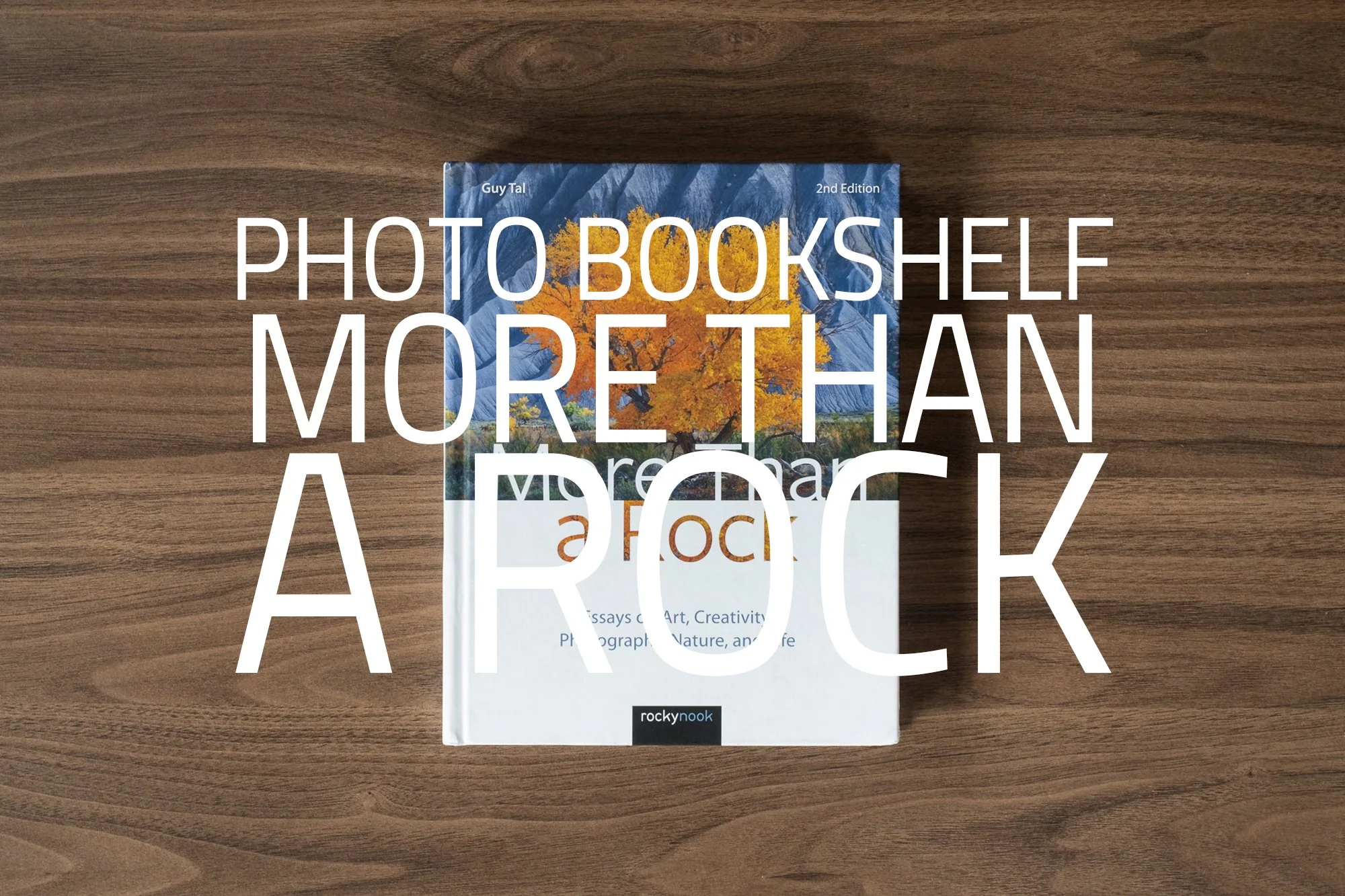
More Than A Rock by Guy Tal | My Photo Bookshelf
More Than a Rock, a collection of essays about creativity and expression.
Landscape photography books often focus on technique, locations, or the pursuit of dramatic light. More Than a Rock by Guy Tal takes a very different approach. Rather than teaching readers how to photograph landscapes, Tal explores why we photograph them in the first place. Through a series of thoughtful essays, he examines creativity, artistic intent, and the deeper meaning behind making photographs. The result is less a technical guide and more a reflective exploration of photography as a form of personal expression.
Author’s synopsis
A deeper look at the creativity, art, expression, craft, and philosophy of landscape photography. More Than a Rock, 2nd Edition is a passionate and personal book about creativity and expression. In this series of over 70 brief essays, photographer and teacher Guy Tal shares his thoughts and experiences as an artist who seeks to express more in his images than the mere appearance of the subject portrayed. Following up on the success of the first edition, this revised edition contains updated imagery, a new essay in each of the book’s four sections―Art, Craft, Experiences, and Meditations―and is presented in a beautiful hardcover format.

Tal makes an argument to consider creative landscape photography―expressing something of the photographer's conception through the use of natural aesthetics―as a form of visual art that is distinct from the mere representation of beautiful natural scenes. Tal covers topics such as the art of photography, approaches to landscape photography, and the experiences of a working photographic artist. His essays also include reflections on nature and man’s place in it, living a meaningful life, and living as an artist in today’s world.
The book is decidedly non-technical and focuses on philosophy, nature, and visual expression. It was written for those photographers with a passion and interest in creative photography. Anyone who is pursuing their work as art, is in need of inspiration, or is interested in the writings of a full-time working photographic artist will benefit from reading this book. The book is visually punctuated with Tal’s inspiring and breathtaking photography.
My thoughts about the book
“Photography is not about collecting images; it is about experiencing the world.” - Guy Tal
For those not familiar with his work, Guy Tal is a photographic artist, author, and teacher whose work blends landscape photography with thoughtful writing on creativity and artistic vision. He is based in Torrey, Utah, near the Colorado Plateau, a landscape that plays a central role in shaping both his images and his ideas.
Tal’s book, More Than a Rock, is a collection of more than 70 short essays. It occupies an important place in contemporary photography writing because it challenges the dominant culture of landscape photography, which often emphasises gear, locations, and technique. While these elements certainly have their place, Tal instead argues for introspection, personal meaning, and artistic intent.
The book begins with a foreword written by fellow landscape photographer Chuck Kimmerle, followed by Tal’s preface, in which he introduces the idea that creative photographs should not simply be “of something,” but rather “about something.” From there, the book unfolds through a carefully considered structure divided into four thematic sections—Art, Craft, Experiences, and Meditations—each exploring a different aspect of creativity and photographic practice.
The tone throughout is reflective and philosophical, yet also deeply personal, inviting readers into Tal’s own journey as an artist. Interwoven with the essays are many of his photographs, which serve not merely as illustrations but as expressions of the very philosophy he describes.
Running through all four sections are stories from Tal’s own life: leaving a conventional career, choosing a new way of living in wild and remote landscapes, and embracing the challenges and rewards of a fully creative life. These personal narratives give the book a strong sense of authenticity and lived experience, showing how a commitment to art can shape both lifestyle and perspective.
My advice to anyone about to read More Than a Rock is to pay attention to the space around you as you read. The ideas within these pages are deeply thoughtful, and taking the time to sit quietly—allowing yourself to reflect on and absorb them—greatly enhances the experience.
If you want to engage with photography on a philosophical level and enjoy reflective, deeply personal essays that may even encourage you to consider your own creative path and purpose, then I can warmly recommend this book.
Book Details
Hardcover
Size: 186mm x 237mm
Pages: 272
Availability at the time of writing: Still in print. Available from the author’s website: https://guytal.com/books/more-than-a-rock-2nd-edition and major online bookshops.
Until next time.
Trevor

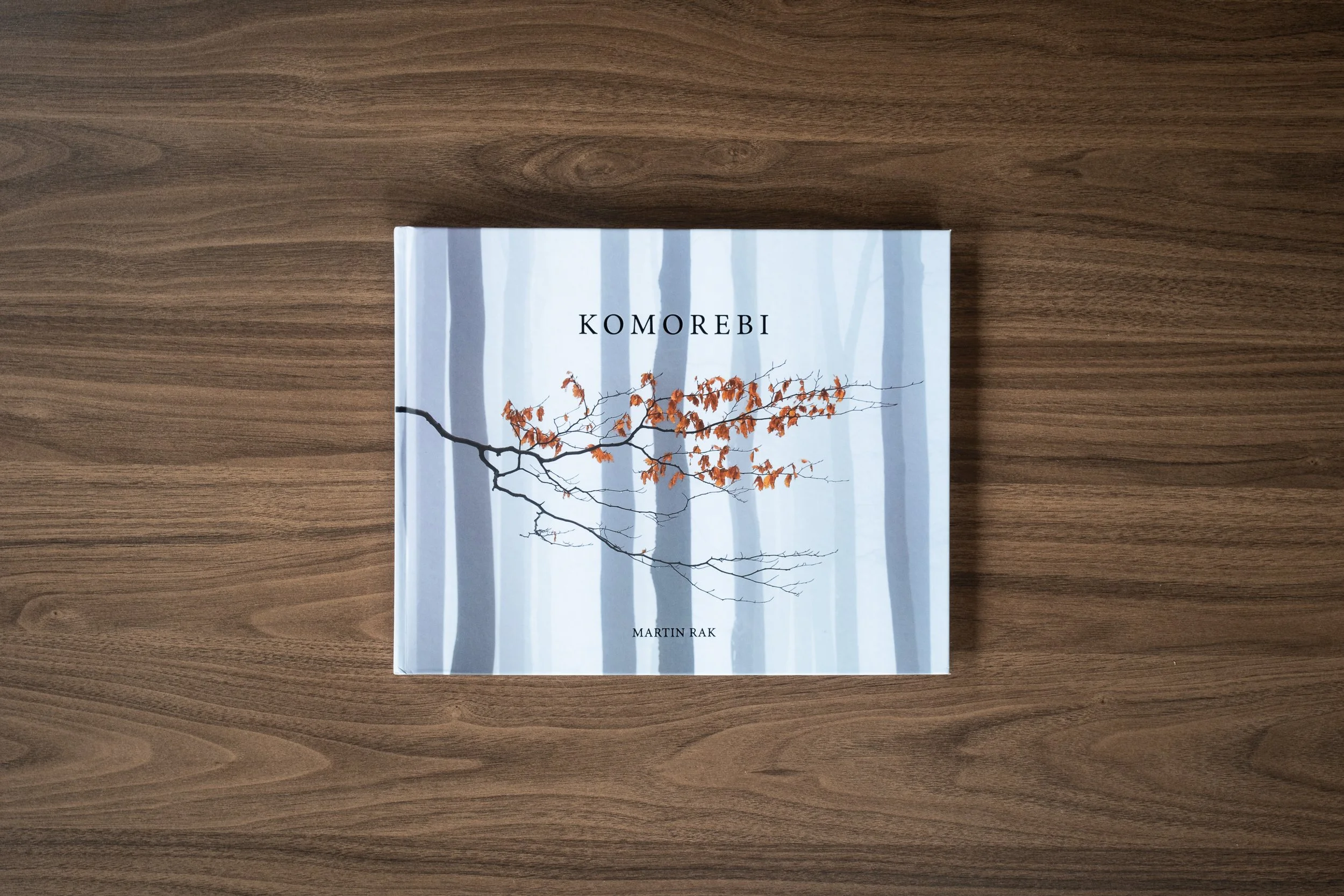
Komorebi by Martin Rak | My Photo Bookshelf
Komorebi, a book by Martin Rak, showcases stunning woodland and landscape photography, capturing light, atmosphere, and seasonal beauty.
I’m fairly sure — although not entirely certain — that I first came across Martin Rak on Instagram, and I quickly became a fan of his stunning landscape photography. Based in Prague, Martin’s work is beautifully atmospheric and often impactful, with a distinctive style that sets his images apart from his contemporaries.
As a photographer who loves to explore woodland, I am always open to adding woodland photography books to my bookshelf, and when I came across Martin’s book Komorebi, I knew this was not one to miss.
Synopsis
“Standing on a cliff above the endless sea of clouds, waiting for the first light to touch the landscape, I feel more alive than ever. In the morning silence, it is as if the whole world was holding its breath in expectation. Then, the light comes and everything bursts into life.”
KOMOREBI shows images of trees and forests that I made during the last decade. I see the collection as a tribute to trees, which have always been my favourite motive. As a name for the book, I chose a Japanese word meaning “sunlight that filters through trees”. Why? Because it pretty much sums up my passion for photographing woodland and for landscape photography as such.
My thoughts about the book
Martin Rak’s book Komorebi is published by Kozu Books, and having already bought several of their previous releases, I felt confident I wouldn’t be disappointed. Like the others I own, Komorebi is a solidly made hardback with satisfyingly thick 170gsm satin pages. It opens with a foreword by Neil Burnell, another landscape and woodland photographer whose work I admire, followed by Martin’s own introduction, in which he reflects on his love for photographing woodland — the passion that ultimately inspired this book.
The book’s title is inspired: a Japanese word composed of three parts — 木 (ko), meaning “tree”; 漏れ (more), meaning “to escape from”; and 日 (bi), meaning “sun.” Together, Komorebi loosely translates as “sunlight filtering through trees.” The title feels perfectly suited to the work, as Martin demonstrates a remarkable ability to use light as a central compositional element in his photographs.
The book’s title is inspired: a Japanese word composed of three parts — 木 (ko), meaning “tree”; 漏れ (more), meaning “to escape from”; and 日 (bi), meaning “sun.” Together, Komorebi loosely translates as “sunlight filtering through trees.” The title feels perfectly suited to the work, as Martin demonstrates a remarkable ability to use light as a central compositional element in his photographs.
The sequencing shows the care and thought that went into pairing each image. Whether aligned by colour, shape, or subject, the photographs sit comfortably side by side on each spread. Beyond the pairing, the book flows effortlessly, and one aspect that particularly impressed me is how the seasonal progression — from spring to winter, a common approach in woodland and landscape books — is rendered so subtly. There’s no abrupt change, and as I moved from one season to the next, the transition felt almost seamless. It’s a wonderful example of a perfectly sequenced body of work.
This is a well-crafted book, brimming with beautifully presented photographs. Although it’s now sold out, if you have the chance to get hold of a copy, I sincerely recommend doing so — it’s a book that rewards time spent with it.
Book Details
Hardback Foil Stamped Cover
Size: 300mm x 240mm
Pages: 88 printed on Fedrigoni Symbol Freelife Satin 170gsm
Availability at the time of writing: Sold out from the publisher’s website (https://www.kozubooks.com/). Consider buying a used copy if available.
Until next time.
Trevor
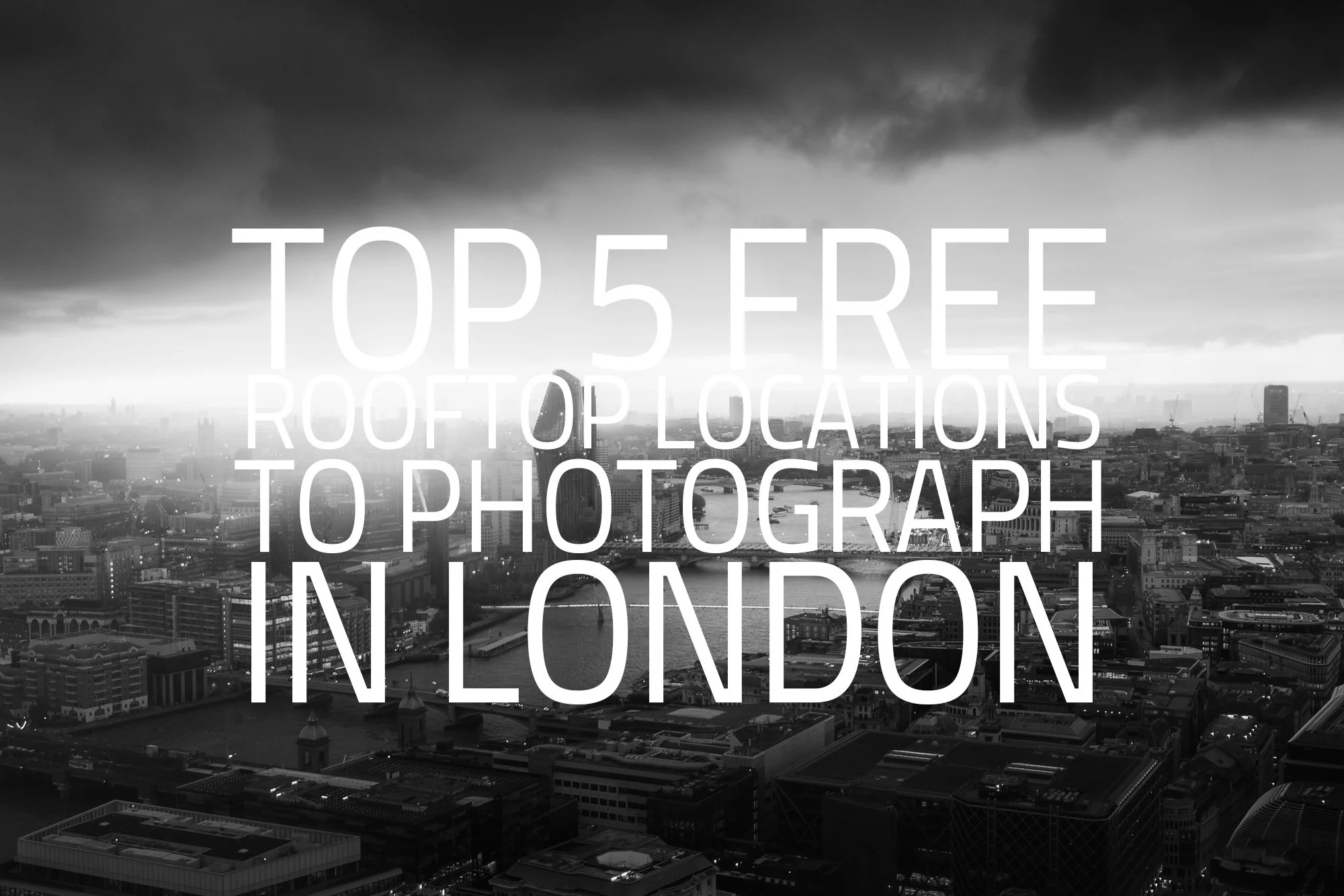
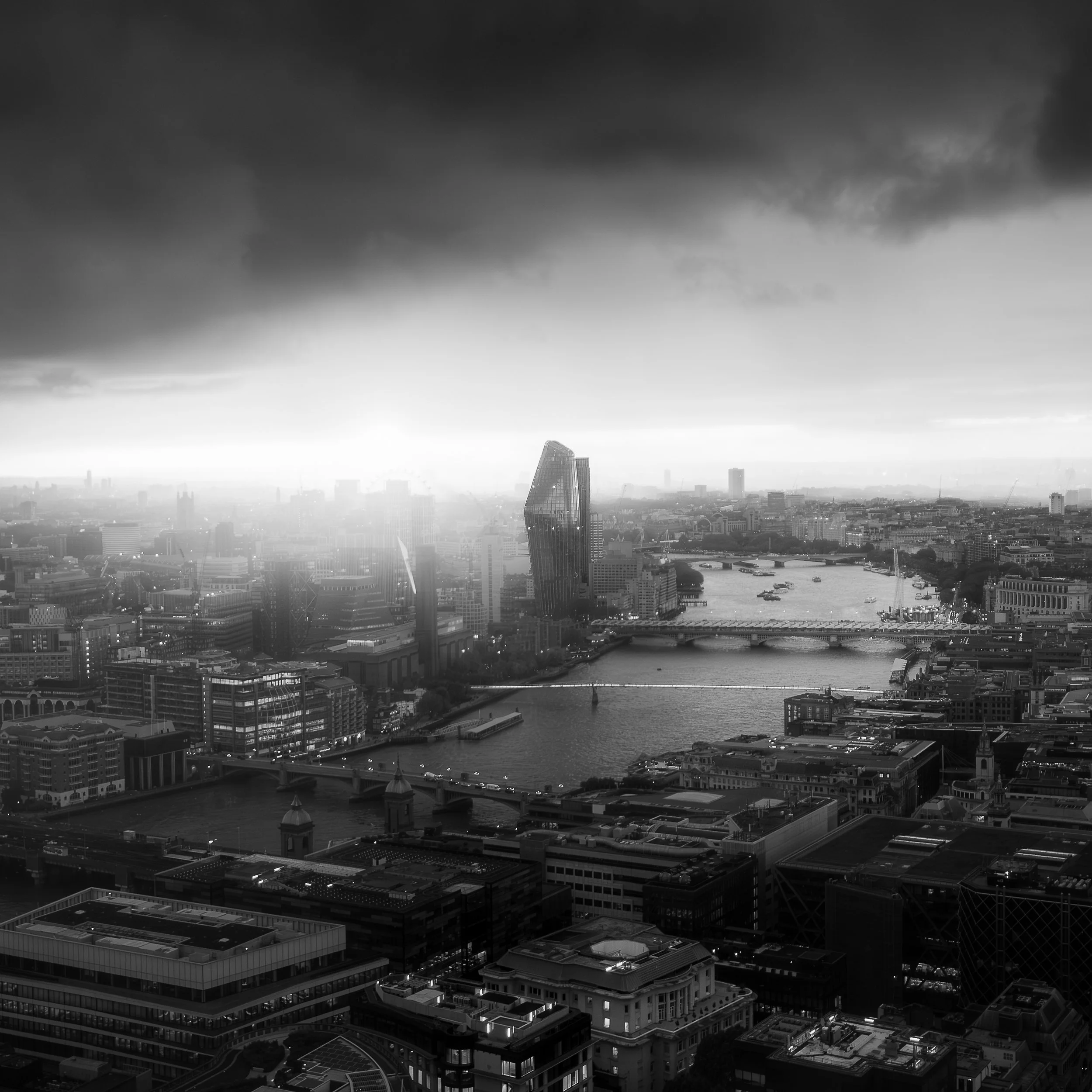
My Top 5 Free Rooftop Locations to Photograph London in 2026
My updated guide to the best free rooftop locations to photograph London in 2026
I first shared My Top 5 Free Rooftop Locations to Photograph London way back in 2020, and it’s been exciting to see how these spots continue to inspire photographers and visitors alike. Since then, the city has evolved, with new observation decks like Horizon 22 opening, offering higher, free-to-enter viewpoints and fresh perspectives on the skyline.
This updated 2026 guide is written specifically for photographers. Whether you’re capturing wide panoramas, architectural details, or dramatic sunset light, you’ll find practical advice to help plan your visit. For each rooftop, I’ve included booking requirements, tripod rules, opening times, and travel information, so you can make the most of your time above London and come away with stunning images of the city.
A quick note: the information in this guide is sourced directly from the official websites of each location and is accurate at the time of publishing. Opening hours, booking procedures, and other details may change, so I recommend checking with the venue before finalising your plans.
Timeless City Edition
For this updated guide, I’ve chosen photos from my black-and-white Timeless City project. To learn more about this project, visit the main project page here.
Quick Comparison of the Free London Rooftop Locations Featured
Before diving into the details of each location, here’s a handy comparison table showing the key information photographers need to know at a glance.
| Location | Closest Tube Station(s) | Booking Needed | Height / Floor Level | Tripods Allowed | Indoor / Outdoor |
|---|---|---|---|---|---|
| Sky Garden | Monument / Tower Hill | Yes | 34 | No | Indoor / Open-air terrace |
| The Garden at 120 | Monument / Tower Hill | No | 15 | Yes | Outdoor |
| Horizon 22 | Liverpool St / Bank / Moorgate / Monument | Yes | 58 | No | Indoor |
| Tate Modern | Southwark / Blackfriars / St Paul's | No | 10 | No | Indoor / Open-air terrace |
| One New Change | St Paul's / Bank / Mansion House | No | 6 | No | Outdoor |
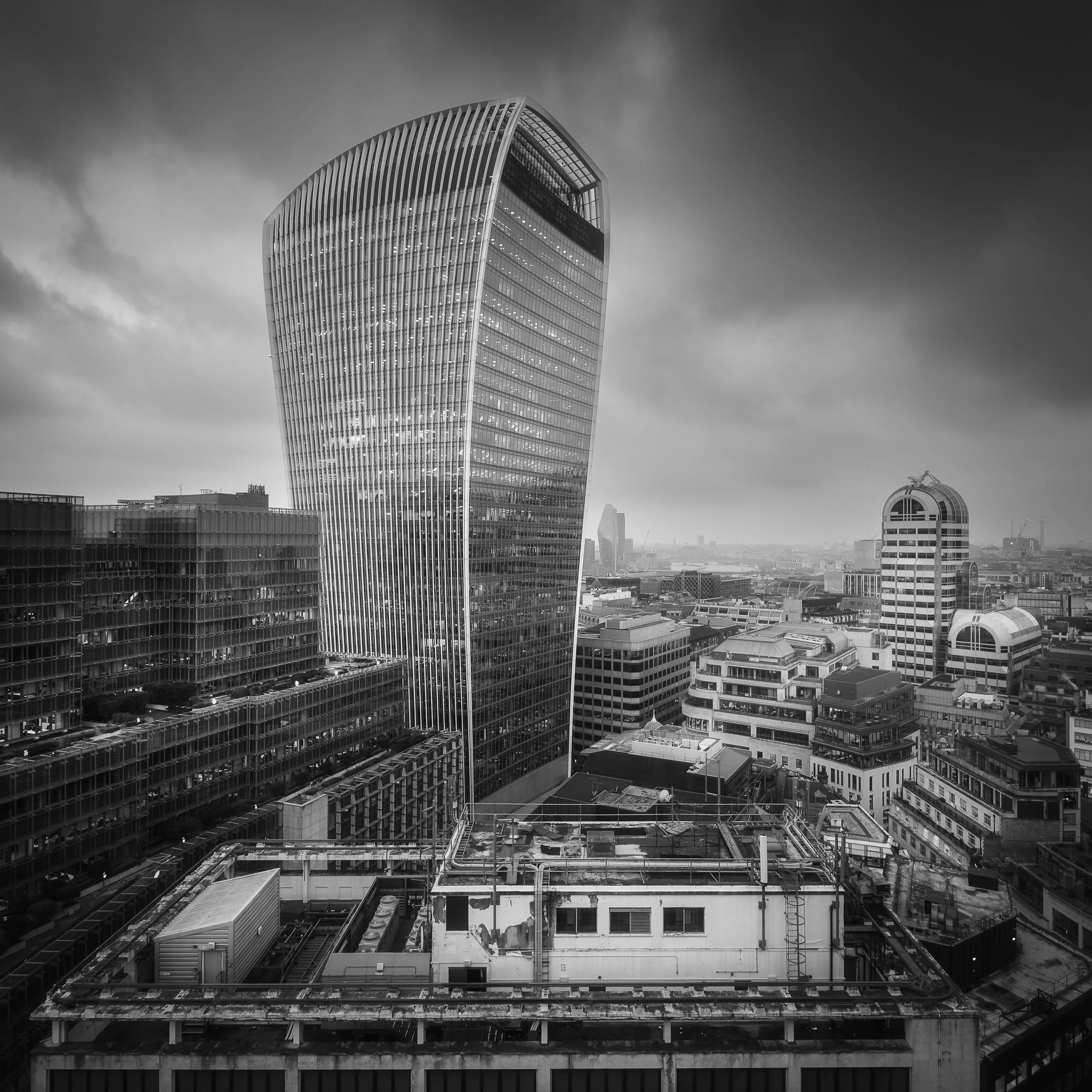
#1 Sky Garden
First up is the Sky Garden, one of my favourite places to photograph London’s rooftops. Perched above the city inside the iconic “Walkie Talkie” building, this viewing platform delivers one of the most complete 360° skyline views in the capital. From the 34th floor, you can enjoy a drink at one of two bars, book a sit-down meal at one of three resturants or simply book a free ticket and take in the spectacular views. This is one of the most popular elevated viewpoints in London, and for good reason, so be sure to book your tickets as soon as they are released.
Information for photographers visiting the Sky Garden
| Opening Hours |
Monday – Friday: 10am – 6pm | Saturday – Sunday & Bank Holidays: 11am – 9pm Bar and restaurant hours may differ. Check the official Sky Garden website for current details |
| Closest Tube Station(s) | Monument (Circle & District) / Tower Hill (Circle & District) |
| Google Map Location | Click here to open Google Maps |
| Booking Required? | Yes |
| Ticket Release Schedule | Free tickets are released every Monday morning (excluding bank holidays), three weeks in advance, covering the following week |
| Booking / Website Details | Click here to visit the venue's website |
| Height / Floor Level | Level 34 |
| Tripods Allowed? | No |
| Tripod Information | Tripods may be carried into Sky Garden, but their use is strictly prohibited. Security staff actively monitor the space and will intervene if tripods are set up |
| Indoor / Outdoor | Sky Garden is primarily an indoor venue, but it also features an outdoor terrace. Access can occasionally be weather-dependent, but when open, the terrace provides uninterrupted views toward the Thames and the surrounding City skyline |
| View Direction | 360-degree views across London |
#2 The Garden at 120
Open to the elements, The Garden at 120 may not be as high as some of the other locations on this list, but the views are no less spectacular. It offers one of the most accessible free rooftop viewpoints in London. With no advance booking needed, this location is truly fuss-free, often with short queues and plenty of space to find the best spots for photographing the surrounding buildings.
Information for photographers visiting the Garden at 120
| Opening Hours |
The Garden at 120 will be closed on Bank Holidays 1 April – 30 September: Monday to Friday 10:00 – 21:00, Saturday & Sunday 10:00 – 17:00 1 October – 31 March: Monday to Friday 10:00 – 18:30, Saturday & Sunday 10:00 – 17:00 |
| Closest Tube Station(s) | Monument (Circle & District) / Tower Hill (Circle & District) |
| Google Map Location | Click here to open Google Maps |
| Booking Required? | No |
| Booking / Website Details | Click here to visit the venue's website |
| Height / Floor Level | Level 15 |
| Tripods Allowed? | No |
| Tripod Information | Officially, tripods are not permitted at The Garden at 120. In my experience, I have used one on every visit without any problems. The staff appear relaxed about their use as long as the photographer is sensible and keeps out of the way of other visitors. Be aware that this informal approach may change at any time |
| Indoor / Outdoor | Outdoor. There is no cover, so come prepared with raincoats or umbrellas |
| View Direction | 360-degree views across London |
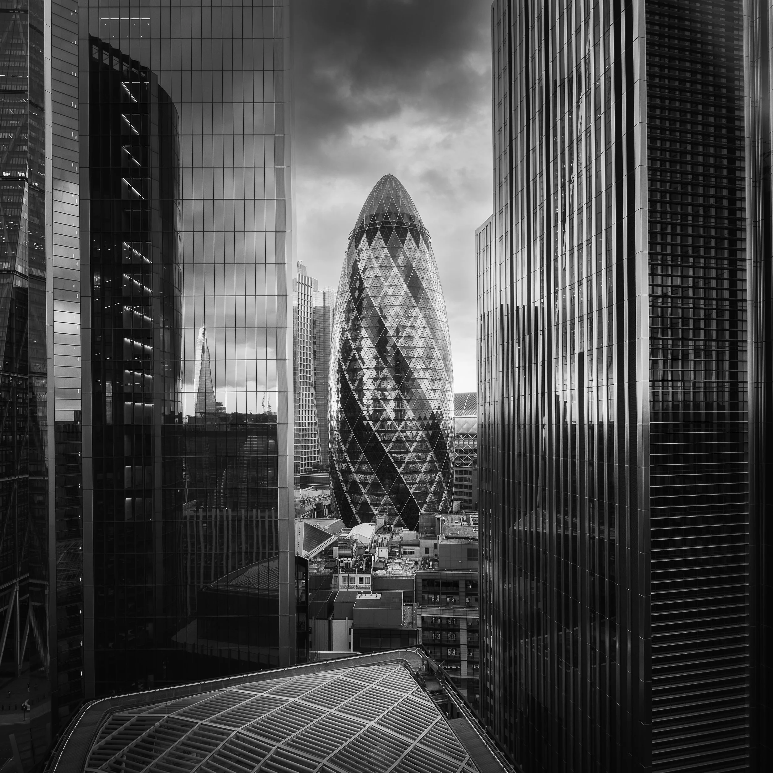
#3 Horizon 22
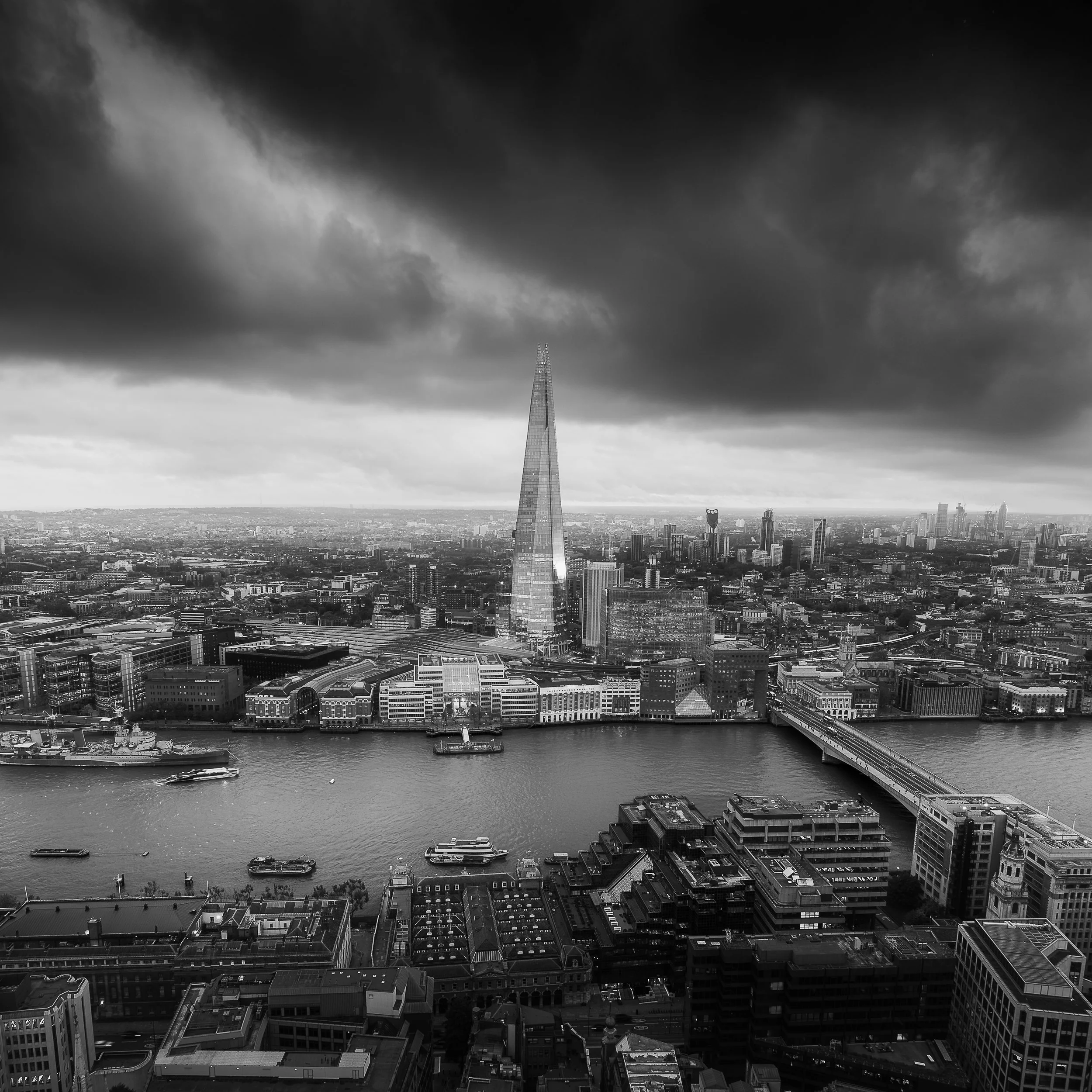
As the highest free public viewing platform in the city, Horizon 22 offers a dramatic, almost aerial perspective over London. Located on the 58th floor of 22 Bishopsgate, it presents sweeping views of some of the capital’s most iconic landmarks — from Tower Bridge and the Tower of London to St Paul’s Cathedral, and directly south toward the Walkie Talkie building and The Shard. This is a fantastic location to capture some truly unique views of London.
Information for photographers visiting Horizon 22
| Opening Hours | Weekdays 10:00 - 18:00 Saturdays 10:00 - 17:00 Sundays 10:00 - 16:00 |
| Closest Tube Station(s) | Monument (Circle & District) / Bank (Central, DLR, Northern, Waterloo & City) Liverpool Street (Elizabeth line, London Overground, Central, Circle, Hammersmith & City, Metropolitan) Moorgate (Circle, Hammersmith & City, Metropolitan, Northern) |
| Google Map Location | Click here to open Google Maps |
| Booking Required? | Yes |
| Ticket Release Schedule | Tickets are released every Monday for the following 14 days |
| Booking / Website Details | Click here to visit the venue's website |
| Height / Floor Level | Level 58 |
| Tripods Allowed? | No |
| Tripod Information | Tripods are not permitted on the viewing level and may be held by security upon entry. Any retained items can be collected when exiting |
| Indoor / Outdoor | Indoor |
| View Direction | Primarily south, east, and west-facing views |
#4 Tate Modern
Unlike the towering viewpoints found in the City, the viewing level at Tate Modern offers a different kind of rooftop experience. Located on the 10th floor of the Blavatnik Building, just beyond the main Turbine Hall, it provides a fantastic view of St Paul’s Cathedral and the City’s highrises across the Thames.
Information for photographers visiting Level 10 at Tate Modern
| Opening Hours | Sunday to Thursday 10:00 - 18:00 Friday to Saturday 10:00 - 21:00 |
| Closest Tube Station(s) | Southwark (Jubilee) / Blackfriars (Circle & District) St Paul's (Central) |
| Google Map Location | Click here to open Google Maps |
| Booking Required? | No |
| Booking / Website Details | Click here to visit the venue's website |
| Height / Floor Level | Level 10 |
| Tripods Allowed? | No |
| Tripod Information | Tripods may be brought into the venue, but security will likely remind you that they must not be used on the viewing level |
| Indoor / Outdoor | Indoor area with seating, plus a covered outdoor terrace for photography |
| View Direction | 360-degree views across London, with the most interesting perspectives to the north, east, and west |
#5 One New Change
Another of the fuss-free rooftop locations is here at One New Change. Located above a shopping centre, this six-storey-high viewing level may not be the tallest, but it offers an unrivalled close-up view of St Paul’s Cathedral. With no booking required and generally easy access, it’s a convenient spot for quick visits or capturing the changing light at sunset. The open-air terrace also means you can shoot freely without glass or barriers in the way, making it a surprisingly versatile location despite its modest height.
Information for photographers visiting One New Change
| Opening Hours | Monday to Sunday 06:00 - 00:00 |
| Closest Tube Station(s) | St Paul's (Central) / Mansion House (Circle & District) |
| Google Map Location | Click here to open Google Maps |
| Booking Required? | No |
| Booking / Website Details | Click here to visit the venue's website |
| Height / Floor Level | Level 6 |
| Tripods Allowed? | No |
| Tripod Information | There is no formal security scanning process, so tripods can be carried up to the terrace, but their use is not permitted during your visit |
| Indoor / Outdoor | Outdoor |
| View Direction | The main view looks west towards St Paul’s Cathedral, with partially restricted views to the south |
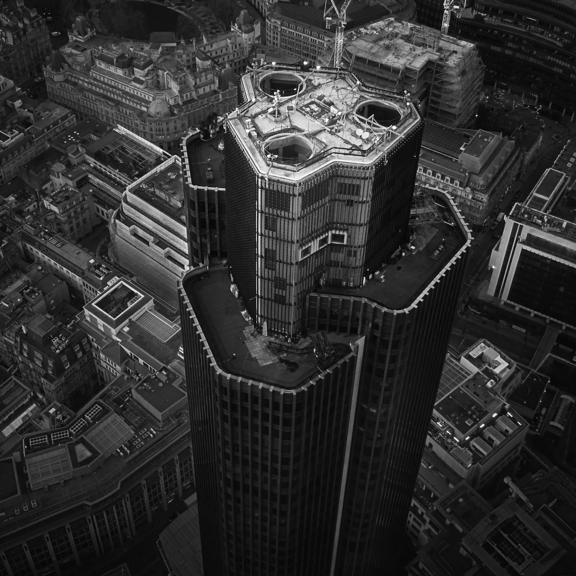
A Notable mention - The Lookout at 8 Bishopsgate
While not included in my top five, the lookout at 8 Bishopsgate is still worth a mention for photographers looking for a high vantage point in the City. Its views are very similar to Horizon 22, offering sweeping panoramas across the skyline, but the southern view toward The Shard and the Walkie Talkie building is partially blocked by One Leadenhall. For me, that small difference makes Horizon 22 the slightly better option, offering cleaner, more expansive compositions, though 8 Bishopsgate remains a solid alternative if you’re exploring the City rooftops.
Information for photographers visiting The Lookout at 8 Bishopsgate
| Opening Hours | Mondays and Fridays 12:00 - 21:00 Tuesdays to Thursdays 10:30 - 17:30 Saturdays 11:00 - 18:00 Sundays 10:00 - 17:00 |
| Closest Tube Station(s) | Monument (Circle & District) / Bank (Central, DLR, Northern, Waterloo & City) Liverpool Street (Elizabeth line, London Overground, Central, Circle, Hammersmith & City, Metropolitan) Moorgate (Circle, Hammersmith & City, Metropolitan, Northern) |
| Google Map Location | Click here to open Google Maps |
| Booking Required? | Yes |
| Ticket Release Schedule | Tickets can be booked up to two weeks in advance and are released every other Monday |
| Booking / Website Details | Click here to visit the venue's website |
| Height / Floor Level | Level 50 |
| Tripods Allowed? | No |
| Indoor / Outdoor | Indoor |
| View Direction | The lookout offers views primarily to the south and west of London |
Essential Gear for London Rooftop Photography
Apart from a camera and lens, no specialist gear is needed when photographing London’s rooftops, but for both serious photographers and hobbyists, the following items are worth considering:
CPL (Circular Polariser) filter: Useful to help reduce the reflections when photographing through glass and cutting through some of the haze often experienced when high up above the city. CPLs reduce light by around one stop, so keep an eye on your shutter speed.
Lens hood: I find lens hoods the most effective way to reduce reflections when photographing through glass. I have a slightly rigid silicon hood that fits over my lens. Most venues are not happy for items to be placed against the glass, so this style of lens hood works best in those situations.
Telephoto Lens: A good zoom lens can help to isolate those far-away compositions across the city, and is a worthwhile addition to your camera bag.
Lens cloths: Useful to clean your lens, but also useful to wipe away fingerprints and grime from the glass, helping to keep your photos as clean as possible.
5 Tips for Shooting London Rooftops Through Glass
1. Use a lens hood and/or a circular polariser filter to avoid reflections
As mentioned in the gear checklist above, a lens hood and CPL are the most effective tools for reducing reflections in glass. If you don’t have either, press the end of your lens directly against the glass to block stray reflections.
2. Look for spots without indoor lights
Rooftop locations cater mostly to casual visitors, so interior lighting can often create glare and reflections. Seek areas where indoor lights don’t interfere too much with your shot.
3. Use a wide aperture (but not too wide)
A slightly wider aperture helps reduce depth of field, keeping any dirt or smudges on the glass out of focus. However, avoid opening the aperture too much, as many lenses lose sharpness around the edges when fully wide open.
4. Clean the glass if allowed
If the location permits, give the glass a quick clean. It’s an easy way to improve image quality, but be discreet — some venues prefer that visitors don’t touch the glass.
5. Turn off your flash
This may seem obvious, but many photographers forget to switch off their camera flash when shooting through glass. Even a small flash can create harsh glare and ruin a shot.
Bonus Tip: Shoot in RAW
Not essential, but very helpful. Many rooftop glass panels have a slight tint, often greenish, and shooting in RAW gives you maximum flexibility to correct white balance and remove any unwanted colour casts in post-processing.
There you have it — my top five free rooftop locations to photograph London in 2026. I hope you found this guide useful! If you have any questions, comments, or suggestions that other readers might find helpful, please feel free to leave a message in the comments.
Until next time.
Trevor
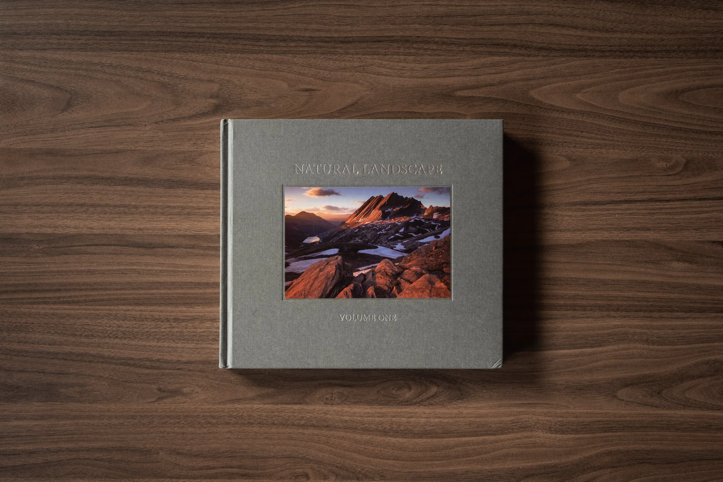
Natural Landscape: Volume One | My Photo Bookshelf
The first edition of the Natural Landscape Photography Awards photobook presenting a curated collection of authentic landscape photography.
I’ve lost count of how many competition-based photo book series there are, and being someone whose mind is wired in such a way that I can’t buy just one book in a series, for the sake of my wallet — and the space on my bookshelf — I’ve typically chosen not to buy them… well, until now.
For the last few years, I’ve been watching the Natural Landscape Photography Awards from the sidelines. I’ve never been tempted to enter, but I have admired the way the competition is run, its underlying ethos and, equally important, the calibre of work from the photographers who take part. Then, some time in 2025, after the fourth competition closed and the book was released, I decided enough was enough. I bought the first four editions, with the fifth soon to be ordered.
Having now finished the first edition, and before I get started on the second, it felt like the right time to add it to my photo bookshelf.
Synopsis
To commemorate the success of our first year running the awards, we have created what we think is one of the finest compilations of landscape photography ever printed (we’re biased, sorry). This 220 page, large-format fine art book contains the work of over 120 artists. We have also commissioned four essays which are included in the book, discussing aspects of the eyewitness tradition of photography, the idea of representing the world around us with truth and honesty.
My thoughts about the book
I wanted to start by explaining a little about the Natural Landscape Photography Awards (NLPA) and why this book series is, in my opinion, something of a game-changer for photography competition books. Run by Tim Parkin and Matt Payne, the NLPA is a landscape photography competition that values realism and authentic representations of the natural world.
In a society seemingly dominated by over-processed and, more recently, AI-generated imagery, this competition places its emphasis firmly on the beauty of the real world, accepting only work that meets a particularly strict set of editing rules. For me, it’s these submission rules that set the competition apart and give future readers of this book series the confidence that the photography they are gazing upon is a genuine view witnessed by the photographer standing there as they clicked the shutter — something I feel will become increasingly important as we move further into the AI age.First impressions were extremely positive. This book feels well-made, has a good weight to it with a cloth-bound hardcover and satisfyingly thick paper throughout. The print quality is great, with well-defined details throughout and nice handling of colour, providing punch and subtlety as and when appropriate.
The book begins with a Preface written by Tim Parkin, which explains how and why the competition started. The photos are then organised into the original competition categories, such as the grand landscape, projects, typologies and so on. Amongst the work are four essays by Eric Bennett, Tim Parkin, Joe Cornish and William Neill — quite a lineup, and all complement the book nicely.
The book concludes with a section introducing the competition judges and organisers. I think that’s a nice touch, as it provides some background and transparency about who is responsible for selecting the work and the kind of photographers they are. It really does help with the overall credibility of the competition.
This is the first in the NLPA book series I’ve read, and I thoroughly enjoyed the entire experience. The quality of the book, the essays, and, of course, the collection of beautiful photography all play a crucial role in making it one of my favourite books on my photo bookshelf.
To wrap up, I wanted to make a final point, related to what I said earlier about how this competition — and specifically the resulting books — will become increasingly important in a world dominated by overly processed and manufactured imagery. We all have to accept the inevitable: the world of photography has changed, which means that when we seek authenticity in the landscape photography we enjoy, we have to question everything, as we can no longer take an image at face value.
So when a competition comes along that does all of that heavy lifting for us — checking the raw files and validating the authenticity — I see it as something more than just a competition. It’s a service to the craft, providing lovers of natural landscape photography with a haven where the default reaction when gazing upon something beautiful isn’t immediate suspicion.
Book Details
Hardcover
Size: 300mm x 280mm
Pages: 220 pages
Availability at the time of writing: All physical book editions are sold out, but an e-book edition is available for all competition books on the Natural Landscape website: https://naturallandscapeawards.com/product-category/fine-art-photography-books.
Until next time.
Trevor
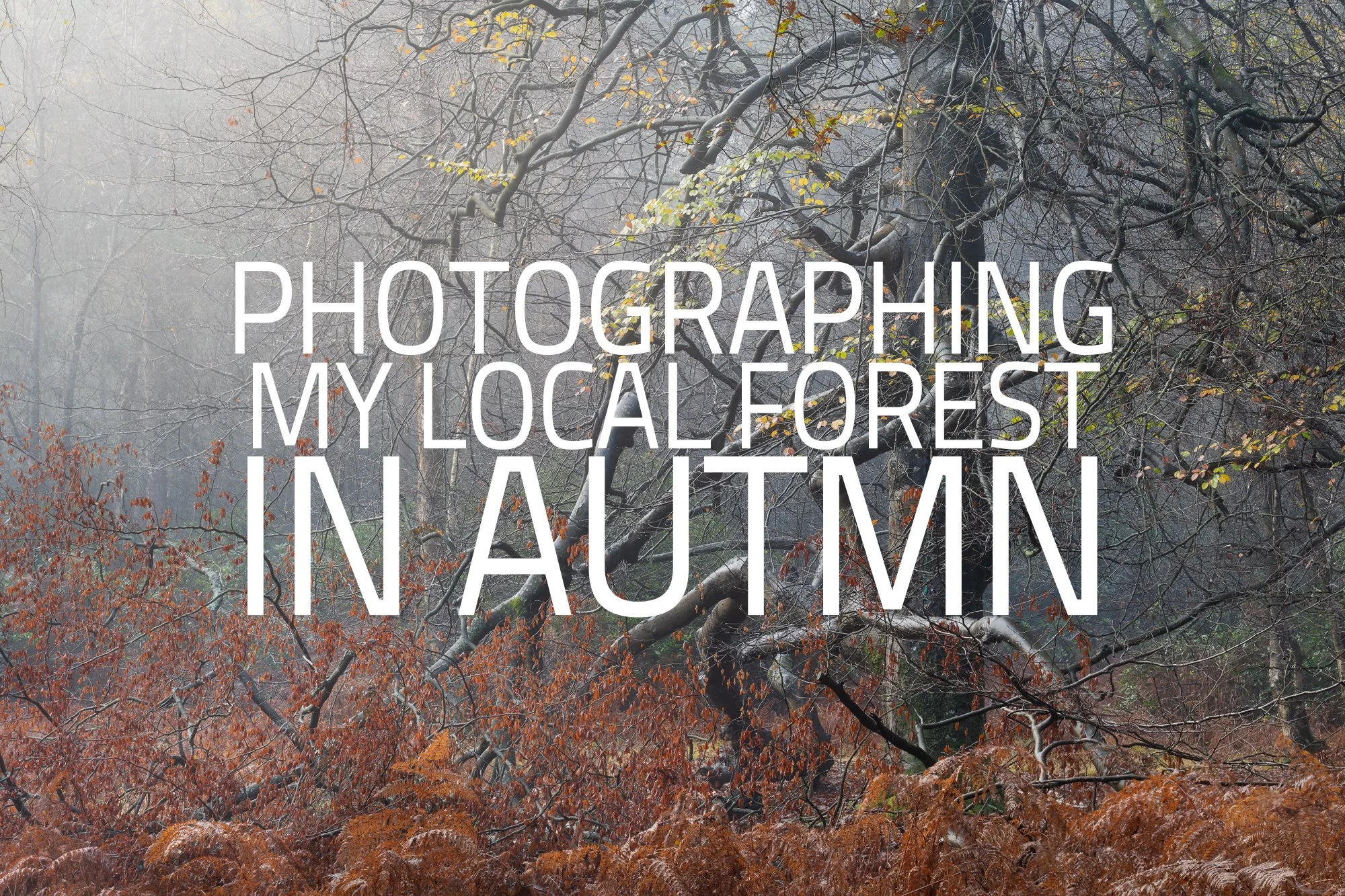
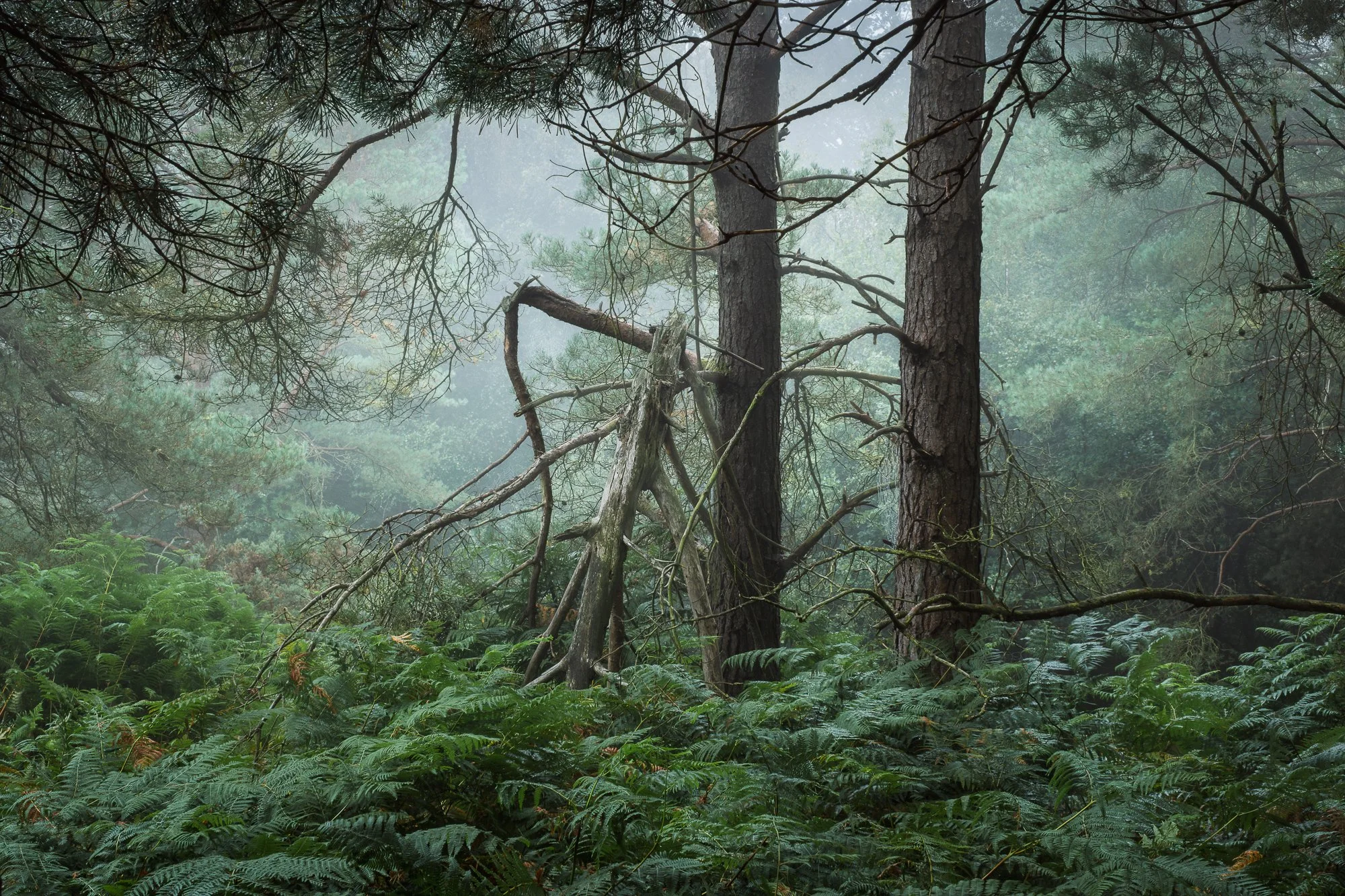
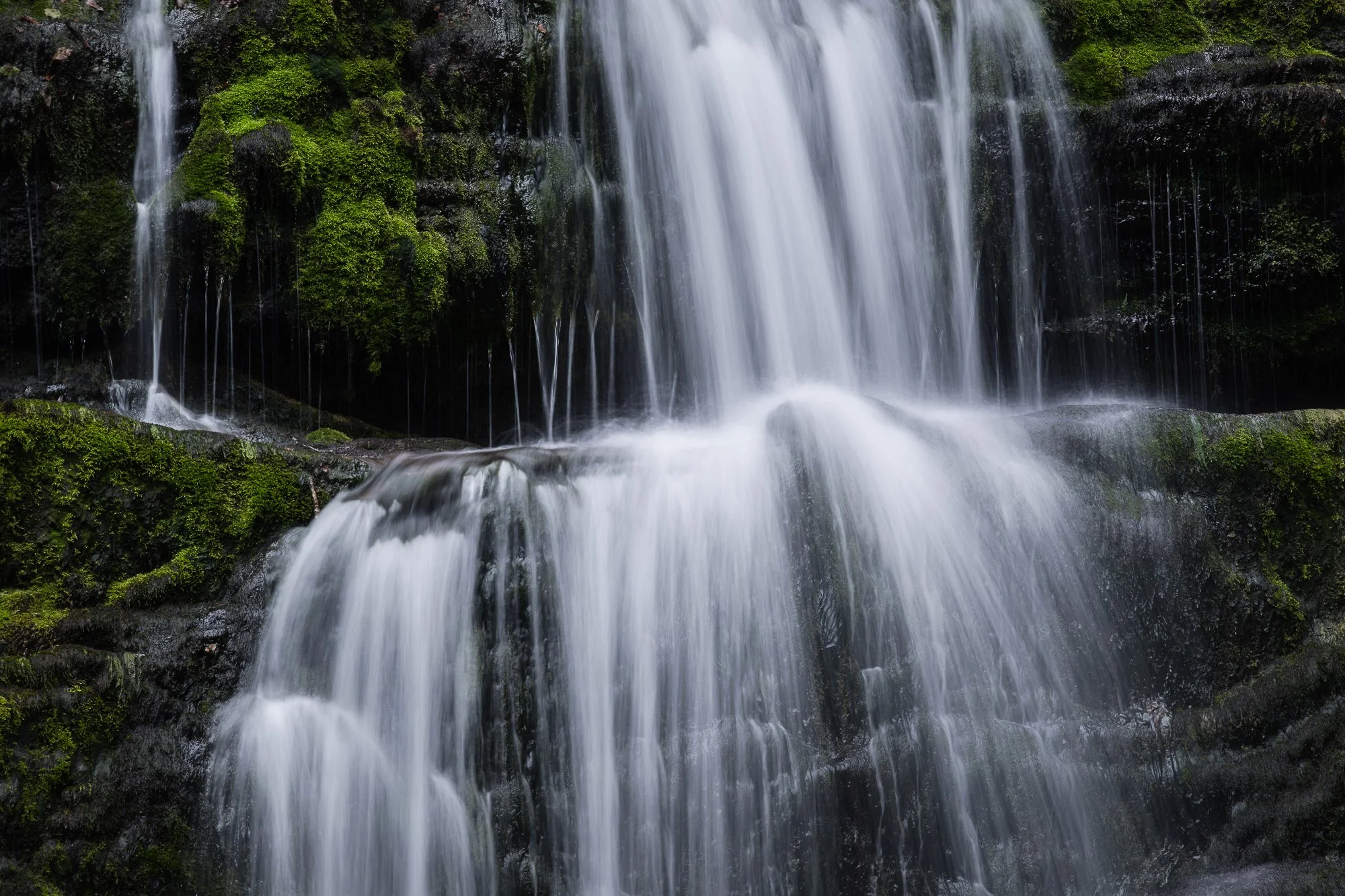
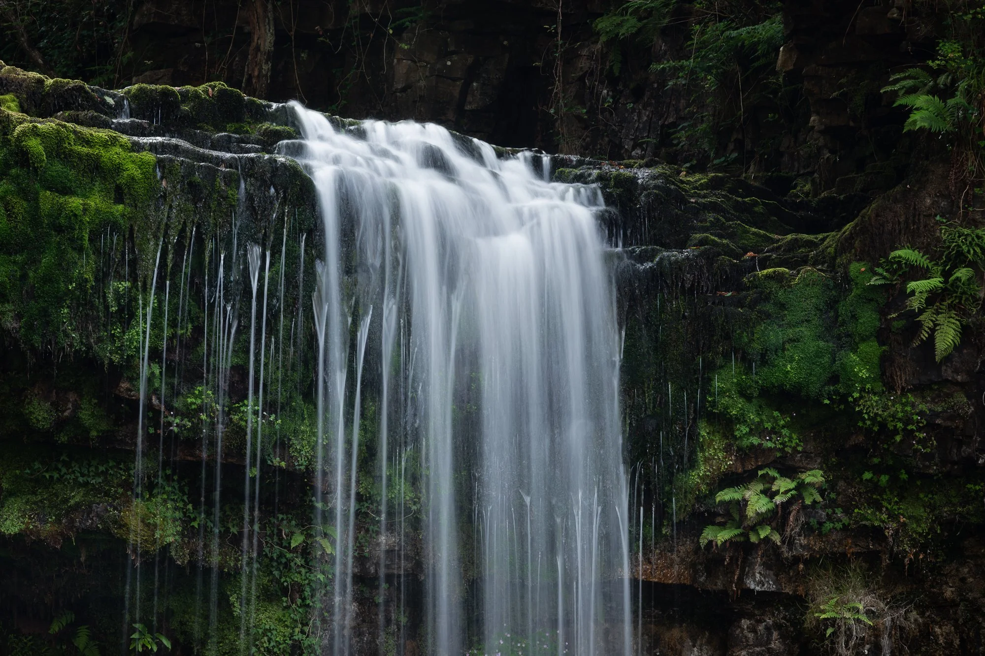
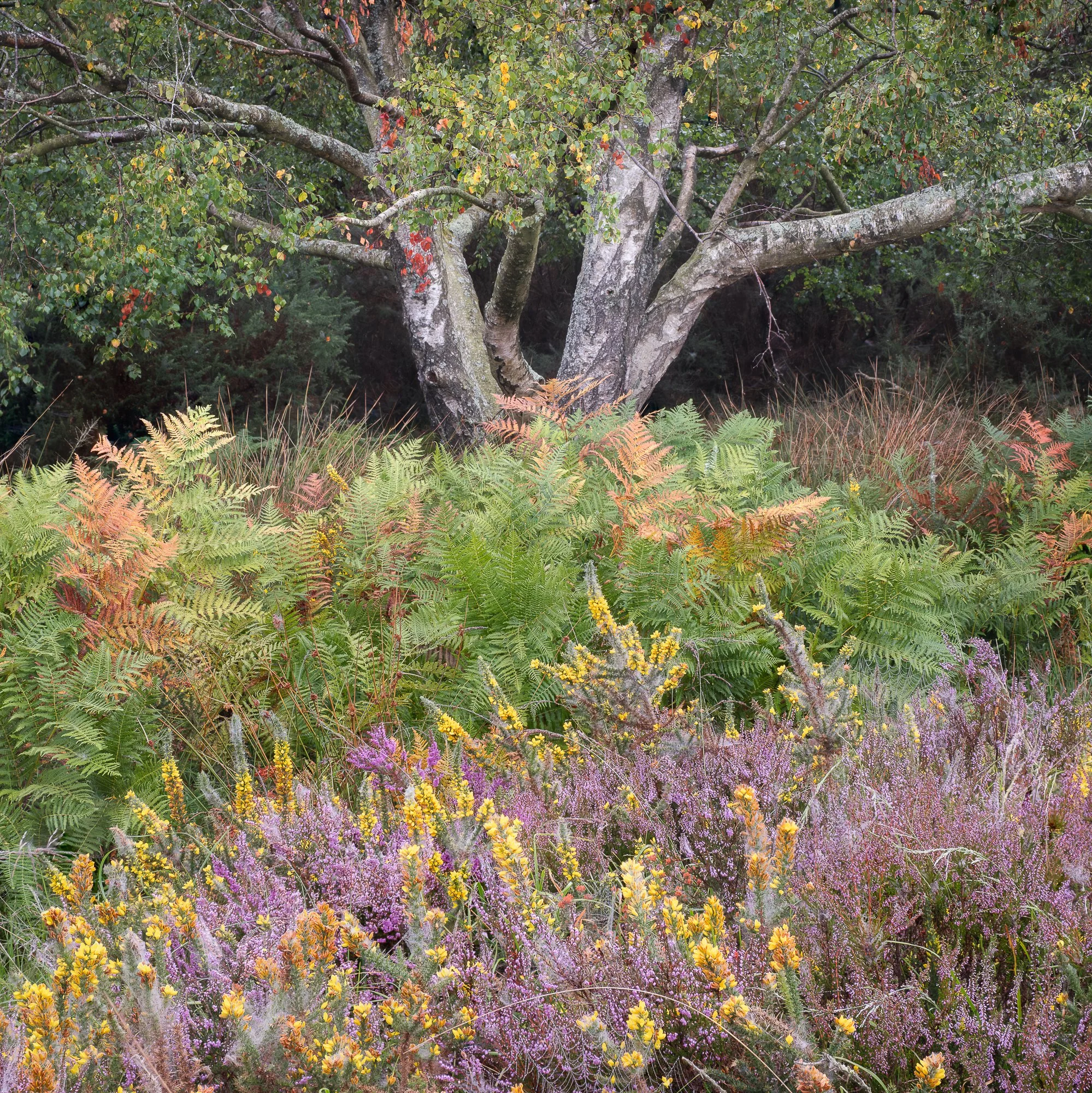
Photographing my Local Forest in Autumn
Autumn in my local forest. A collection of photos taken while exploring the woodland and open heathland between September and November 2025.
Fujifilm XT5 | XF50-140mm | 134mm | 1/10th Second | f/10 | ISO125 (3-image pano)
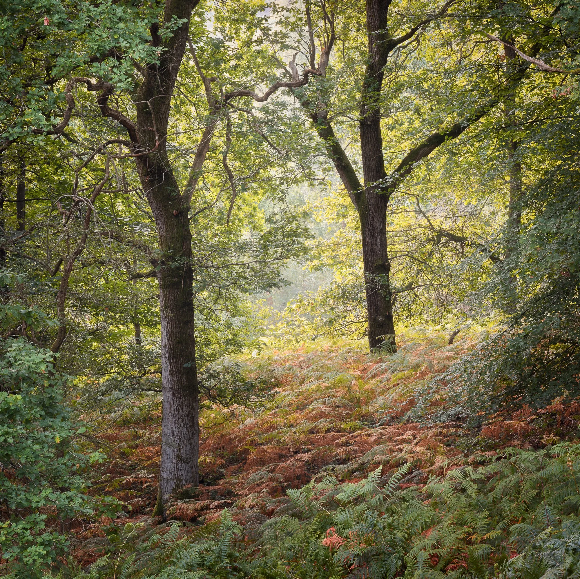
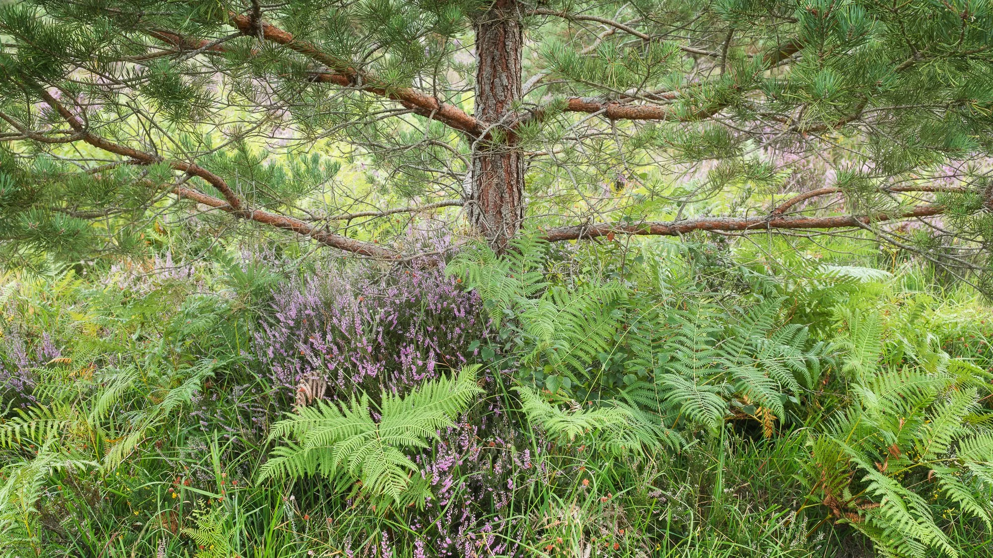
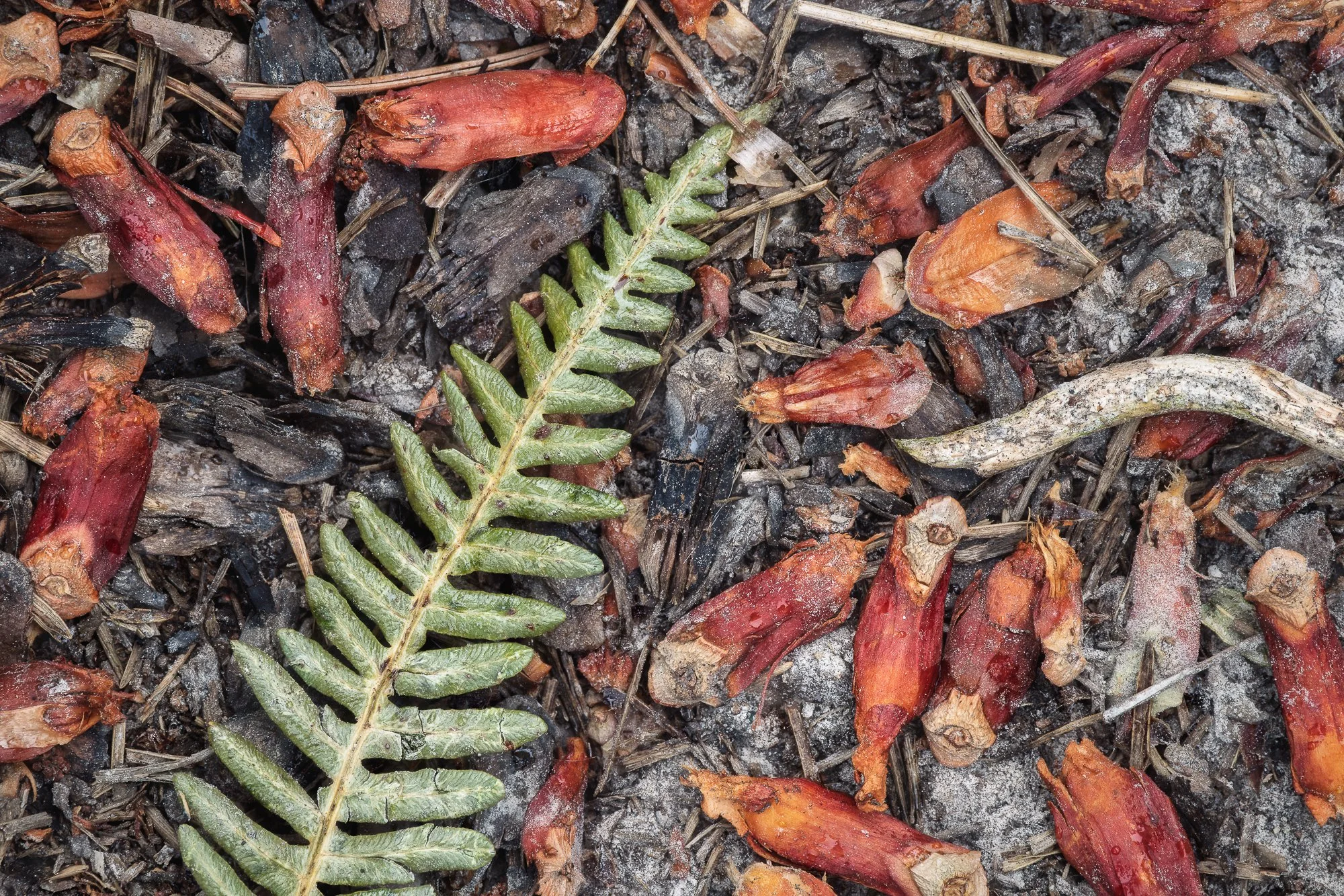
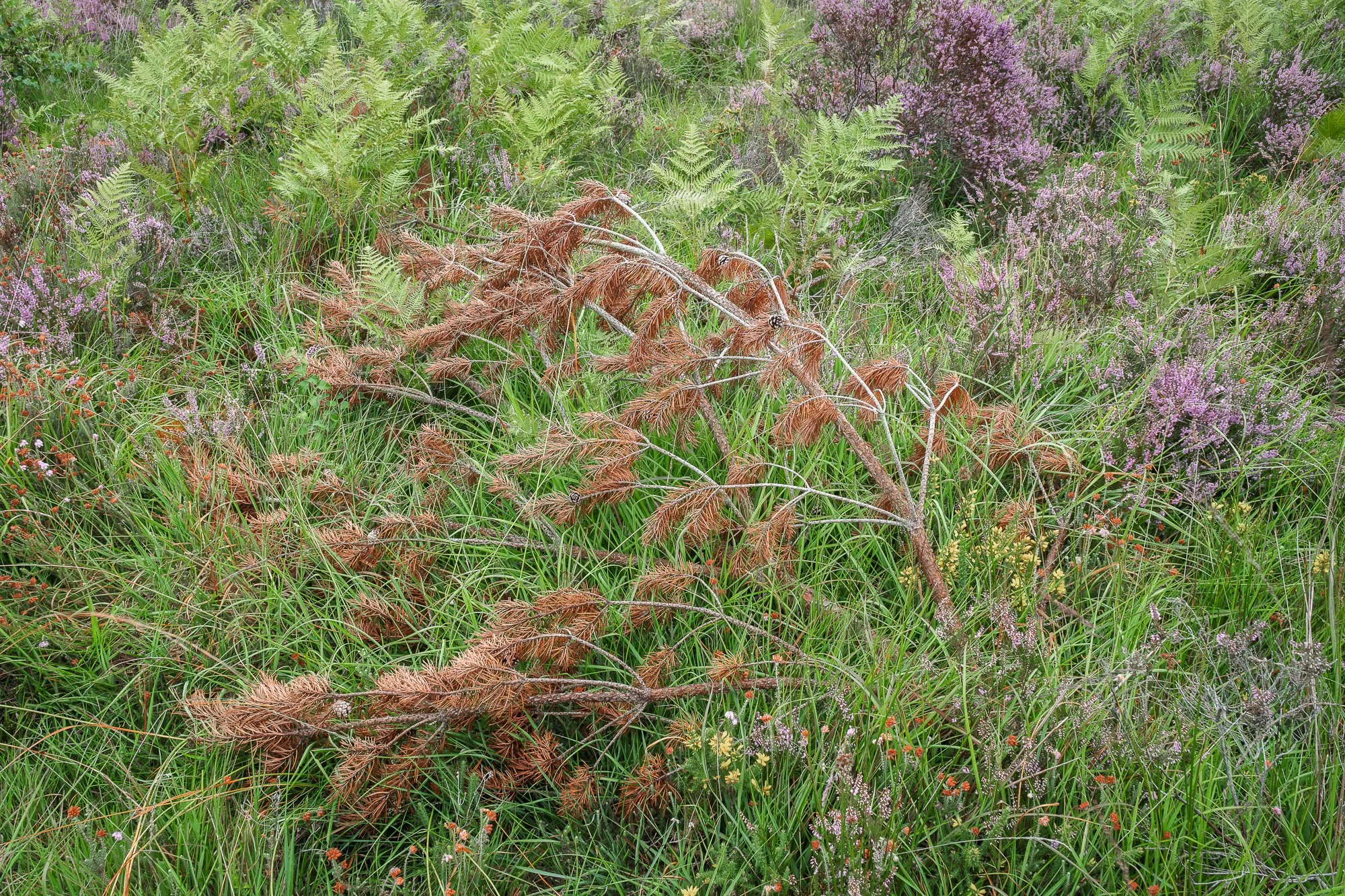
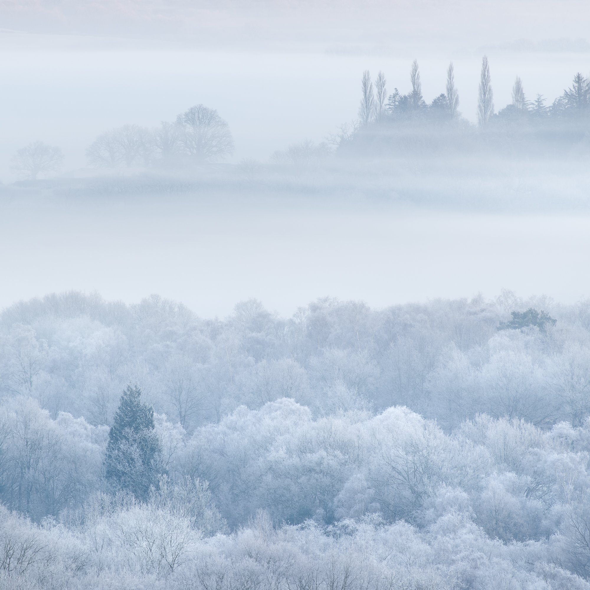
Like the start of spring, autumn marks one of the most noticeable shifts in the woodland, transforming my local forest—a mix of woodland and heathland—into something altogether different. The changes begin quietly, filtering down from the higher ground and gradually working their way into the valleys, until the landscape is immersed in amber, gold, and deep crimson tones.
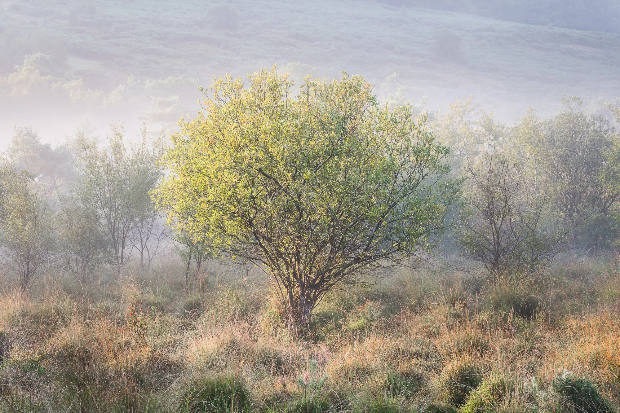
From open heathland, where the last greens of summer still lingered, to more intimate woodland scenes with trees clinging to their final leaves, this collection of photographs was taken between September and November last year. Together, they document the evolving colours, textures, and subtle transitions of my local forest as autumn took hold.
Fujifilm XT5 | XF16-55mm | 34mm | 1/3rd Second | f/9 | ISO125
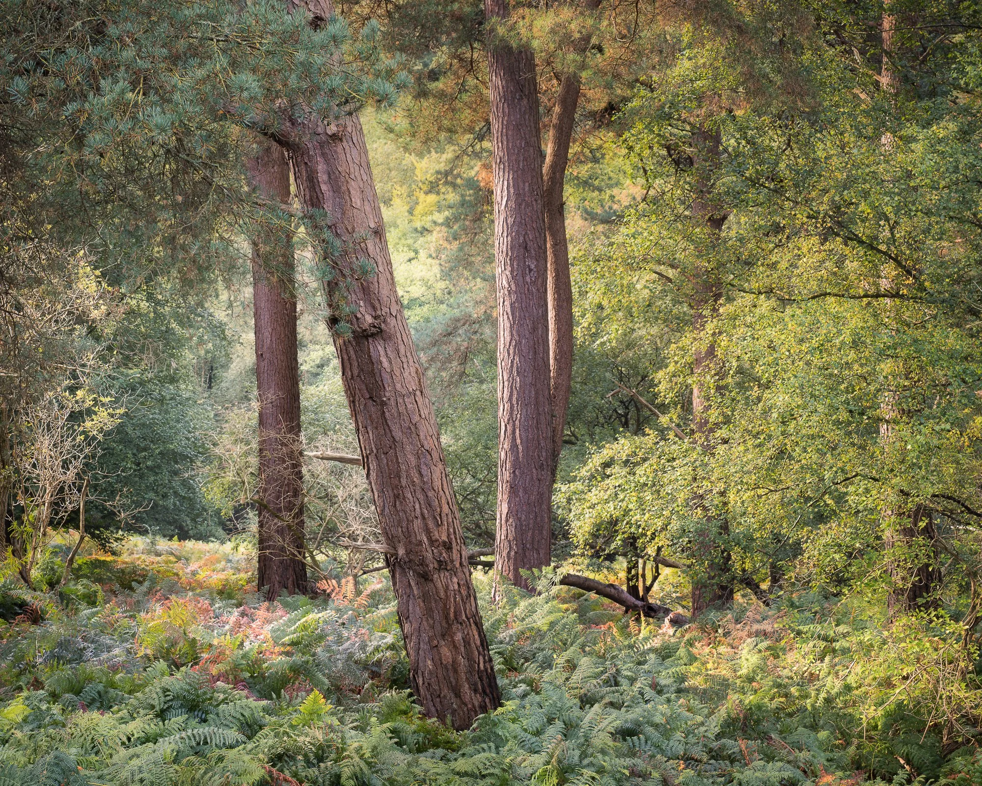
Unlike photo trips centred around a specific viewpoint or subject, my time in the forest is rarely planned. I tend to wander without any particular photograph in mind, allowing myself to slow down and become more attentive to the environment around me. If I’m lucky, a composition gradually reveals itself, and only then does the camera bag open and the tripod’s spikes press into the forest floor.
That said, I do like to revisit familiar scenes from time to time—places I’ve photographed before—to see how they’ve changed through the years or how they look in different seasons. These familiar subjects often help ease me into the process, and I’ve found that once the first image is made, others tend to follow more naturally. It’s usually enough to get the photographic gears turning.
I’m genuinely pleased with this collection, which balances new discoveries with revisited locations, featuring subjects that range from lone trees in open landscapes to richly textured woodland scenes filled with autumn colour.
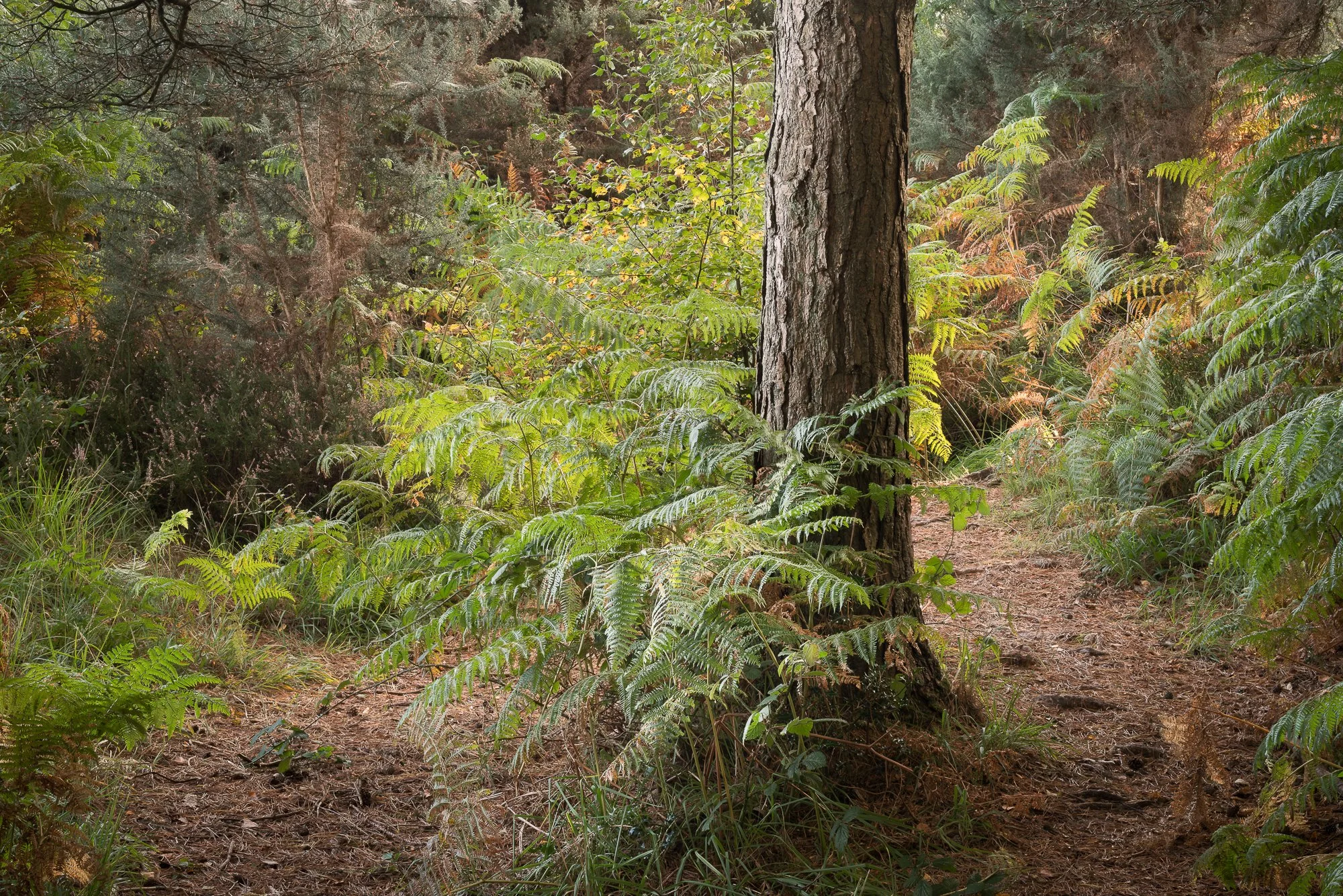
With plenty of images to explore, I’ll keep this introduction brief. I would, however, recommend viewing the photographs on a larger screen for the best experience, and don’t forget that each image can be selected to view in full screen.
Fujifilm XT5 | XF50-140mm | 61mm | 1/13th Second | f/11 | ISO125
Fujifilm XT5 | XF50-140mm | 66mm | 1/4 Second | f/11 | ISO125
Fujifilm XT5 | XF16-55mm | 55mm | 1/2 Second | f/11 | ISO125
Fujifilm XT5 | XF16-55mm | 35mm | 1.3 Seconds | f/8 | ISO125
Fujifilm XT5 | XF50-140mm | 50mm | 1/3 Second | f/11 | ISO125
Fujifilm XT5 | XF16-55mm | 32mm | 4 Seconds | f/6.4 | ISO125
Fujifilm XT5 | XF16-55mm | 55mm | 1 Second | f/10 | ISO125
Fujifilm XT5 | XF16-55mm | 27mm | 1.5 Seconds | f/10 | ISO125
Fujifilm XT5 | XF50-140mm | 56mm | 0.6 Seconds | f/10 | ISO125
Fujifilm XT5 | XF16-55mm | 27mm | 1/15th Second | f/10 | ISO400
Fujifilm XT5 | XF16-55mm | 51mm | 1 Second | f/9 | ISO125
Fujifilm XT5 | XF70-300mm | 73mm | 1/4 Second | f/10 | ISO125
Fujifilm XT5 | XF16-55mm | 55mm | 1/30th Second | f/8 | ISO400
Fujifilm XT5 | XF16-55mm | 44mm | 0.4 Seconds | f/9 | ISO500
Fujifilm XT5 | XF70-300mm | 81mm | 1/100 Seconds | f/9 | ISO320
Fujifilm XT5 | XF16-55mm | 32mm | 0.4 Seconds | f/9 | ISO400
Fujifilm XT5 | XF16-55mm | 38mm | 1/3 Second | f/10 | ISO125
Fujifilm XT5 | XF50-140mm | 72mm | 1/15th Second | f/10 | ISO125 (vertical stitched panoramic)
Fujifilm XT5 | XF50-140mm | 50mm | 1/20th Second | f/10 | ISO125
Fujifilm XT5 | XF50-140mm | 119mm | 1/15th Second | f/10 | ISO125
Fujifilm XT5 | XF50-140mm | 98mm | 1/5th Second | f/10 | ISO125
Fujifilm XT5 | XF50-140mm | 63mm | 1/10th Second | f/10 | ISO125
Fujifilm XT5 | XF50-140mm | 54mm | 0.8 Seconds | f/10 | ISO125
Fujifilm XT5 | XF16-50mm | 27mm | 1.3 Seconds | f/10 | ISO125
Fujifilm XT5 | XF50-140mm | 54mm | 1/5th Second | f/10 | ISO125
Fujifilm XT5 | XF50-140mm | 71mm | 1 Second | f/10 | ISO125
Fujifilm XT5 | XF50-140mm | 69mm | 0.8 Seconds | f/10 | ISO125
Fujifilm XT5 | XF50-140mm | 140mm | 0.4 Seconds | f/10 | ISO125
Fujifilm XT5 | XF50-140mm | 124mm | 0.4 Seconds | f/10 | ISO125
Fujifilm XT5 | XF50-140mm | 87mm | 0.4 Seconds | f/10 | ISO125
Fujifilm XT5 | XF50-140mm | 77mm | 2 Seconds | f/10 | ISO125
Fujifilm XT5 | XF16-50mm | 28mm | 1/4 Second | f/10 | ISO125
Fujifilm XT5 | XF16-50mm | 50mm | 0.6 Seconds | f/10 | ISO125
Fujifilm XT5 | XF16-50mm | 50mm | 1.5 Seconds | f/10 | ISO125
Fujifilm XT5 | XF10-24mm | 18mm | 1/3rd Second | f/10 | ISO125
Fujifilm XT5 | XF16-50mm | 34mm | 0.4 Seconds | f/10 | ISO125
Fujifilm XT5 | XF16-50mm | 46mm | 1/2 Second | f/10 | ISO125
Fujifilm XT5 | XF16-50mm | 42mm | 0.8 Seconds | f/10 | ISO125
Fujifilm XT5 | XF50-140mm | 52mm | 1/4 Second | f/10 | ISO125
Fujifilm XT5 | XF50-140mm | 77mm | 1/2 Second | f/10 | ISO125
Fujifilm XT5 | XF50-140mm | 50mm | 1/2 Second | f/10 | ISO125
If you’ve made it this far, thanks for sticking with me. I hope you’ve enjoyed the photos I’ve shared, and if you have any comments or questions about this collection—or anything else—please feel free to leave a comment below or get in touch here.
Until next time.
Trevor

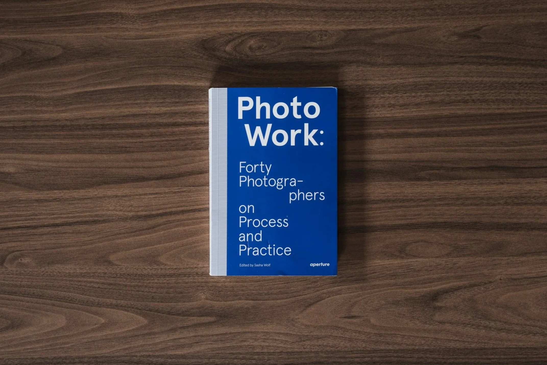
PhotoWork by Sasha Wolf | My Photo Bookshelf
PhotoWork: 40 Photographers on Process and Practice explores how established photographers share insights into their creative approach and the development of their photographic projects.
I discovered PhotoWork: 40 Photographers on Process and Practice some time ago, perhaps even a few years back. I’m not entirely sure who first introduced me to the book, but alongside my curiosity about how others approach their craft, I’ve found myself leaning more heavily towards photographing in projects and with project work being a key focal point of the book, I figured it was about time I finally picked up a copy.
Synopsis
PhotoWork is a collection of interviews by forty photographers about their approach to making photographs and, more importantly, a sustained body of work. Curator and lecturer Sasha Wolf was inspired to seek out and assemble responses to these questions after hearing from countless young photographers about how they often feel adrift in their own practice, wondering if they are doing it the “right” way. The responses, from both established and newly emerging photographers, reveal there is no single path. Their advice is wildly divergent, generous, and delightful: Justine Kurland discusses the importance of allowing a narrative to unravel; Doug DuBois reflects on the process of growing into one’s own work; Dawoud Bey evokes musicians such as Miles Davis as his inspiration for never wanting to become “my own oldies show.”
The book is structured through a Proust-like questionnaire, in which individuals are each asked the same set of questions, creating a typology of responses that allows for an intriguing compare and contrast.
My thoughts about the book
As the synopsis explains, the author, Sasha Wolf, has assembled responses to 12 specific questions sent to 40 established photographers. Coming from different backgrounds, with varying levels of experience, and practising across a range of photographic genres, the intention is to demonstrate to younger and/or less experienced photographers that there is no single way, no single approach, and most certainly no right or wrong when it comes to the craft of photography and choosing your own path.
The book opens with the list of the 12 questions asked of all the photographers, followed by an introduction from Sasha Wolf. Here, she talks about the story behind the project and her motivation to help younger, less established photographers who feel adrift in their own photographic journey. Each subsequent chapter then presents the questions alongside the responses from the 40 photographers featured in the book.
If you’re a regular reader of my Photo Bookshelf series, you’ll know that I try to inject some variety into the types of books I feature, but they typically align with my own interest in landscape photography. As a result, it may come as a slight surprise that this book is not about landscape photographers and instead leans more towards social documentary photography. That said, I feel that if you focus too much on the photographers featured and the types of images they usually make, you risk missing the entire point of the book.
Regardless of each creator’s artistic focus, this book is about how they approach their craft. It explores opinions on topics such as the single image versus a body of work, and how projects are born—whether from conceptual ideas or through inspiration drawn from existing work. It highlights the vast chasm of opinion that exists within the photographic world, and if the aim of the book is to encourage people, young and old, to understand that there are infinite paths and countless outcomes—and that, provided they remain true to their own artistic convictions, there is no right or wrong—then I think this book succeeds.
In a world where established YouTube creators with huge followings are often keen to tell us what is right and wrong, with headlines such as “pros do this” or “only amateurs do that”, it’s refreshing that this book attempts to send a different message. The message I take from it is to ignore those telling you what to do, listen instead to those who inspire you, and remember that the person with the vision—the person creating the work—is the only one who truly knows what is right for them. They just need to believe it.
Book Details
Softcover/Paperback
Size: 6x9 inches
Pages: 256 pages
Availability at the time of writing: Still in print and available from places such as Aperture’s website or by requesting a copy from your local independent bookshop.
Until next time.
Trevor
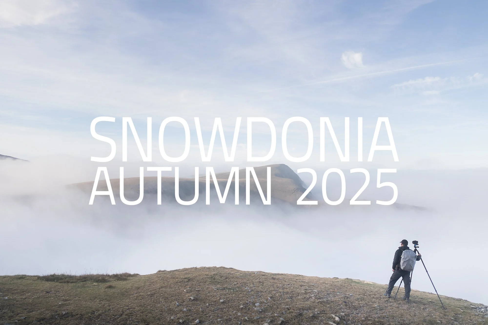
Snowdonia in Autumn | On Location
A three-day autumn journey through Snowdonia, capturing intimate woodland scenes, grand vistas, and fresh perspectives on this iconic landscape.
Snowdonia in autumn has been on my to-do list for a few years now. I’ve visited in both the colder and warmer months, but never in between. As is always the case when trying to photograph seasonal change, timing is everything. Arrive too early, and the landscape still feels like late summer; too late and much of the colour has already faded. Added to that is the challenge of localised change, where higher ground may be showing autumnal tones while the valleys below remain stubbornly green.
That uncertainty is manageable if you live nearby and can return regularly to see how the season is progressing, but when you’re a good five-hour drive away, it becomes far more of a gamble. It’s also one of the reasons I often talk about the value of photographing locally, where being able to respond quickly to subtle changes in light, weather, and season can make a real difference to the work you produce.
In the end, I settled on a mid-October weekend, booked a hotel with easy access to several areas I wanted to explore, and set off cross-country for a three-day landscape photography trip to Snowdonia.
Fujifilm XT5 | XF16-55mm | 55mm | 1/10th Second | f/11 | ISO125
Fujifilm XT5 | XF16-55mm | 41mm | 1/25th Second | f/11 | ISO400
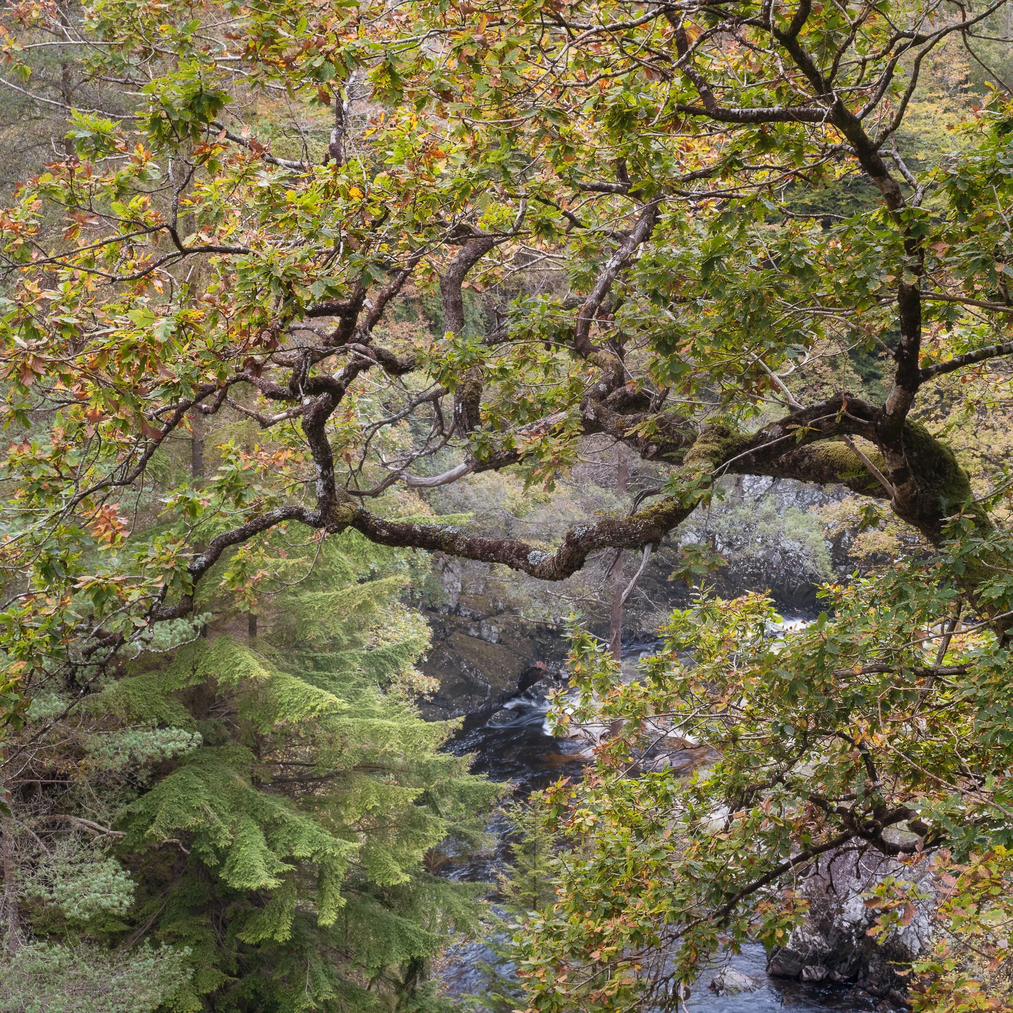
My first stop after arriving was to revisit the view of Llyn Gwynant. It’s a spot I’ve photographed a few times before, and while it requires a little more effort than the classic roadside viewpoints most people settle for, I think the extra hike is well worth it. On previous visits, I’d never been lucky enough to have favourable light, but this time, after a quick assessment of the conditions — including the sun’s position in the sky — I could see the potential, and I decided to make the short climb to the viewpoint.
One of my goals on this trip was to capture a mix of woodland scenes, intimate landscapes, and the grand vistas Snowdonia is famous for. Achieving that balance can be tricky, as it requires staying alert to opportunities even while making your way to a specific viewpoint. To give myself the best chance, I made a point of spending plenty of time at each location, slowing down, observing the environment, and letting the photos reveal themselves.
To reach the open ground above the hill, I passed through a small woodland filled with characterful trees, just starting to show the early signs of autumn. By taking my time and keeping my eyes open rather than marching head down, I was able to spot and compose the two woodland images shared above.
A small note for readers: for the best experience of these images, I recommend viewing this blog on a larger screen, as each photo can be selected to display a larger version, which doesn’t work quite as well on mobile devices.
DJI Mini 3 Pro | 24mm (effective) | 1/2500th Second | f/1.7 | ISO100
Fujifilm XT5 | XF16-55mm | 20mm | 1/60th Second | f/11 | ISO125
Fujifilm XT5 | XF16-55mm | 29mm | 1/60th Second | f/11 | ISO125
Reaching the viewpoint high above the tree line, I found a spot with uninterrupted views of Llyn Gwynant and the majestic mountains beyond. By this time, it was just after midday, and although the sun had climbed as high as it would go, the October light still fell at a gentle angle—not as low as in winter, but enough to cast soft, dappled patterns across the landscape.
I spent some time capturing images with my main camera on its tripod, and in between shots, launched the drone to gain a higher perspective and manoeuvre around the scene. This vantage point allowed me to use the trees as the main focal point, with the lake and surrounding valley forming a dramatic, almost cinematic backdrop—arguably my favourite shot from this location.
DJI Mini 3 Pro | 24mm (effective) | 1/8000th Second | f/1.7 | ISO100
After packing away the drone, I made my way back to the car, ready for the short drive over to the Ogwen Valley and keen to see what new compositions awaited me there.
Typically, when photographing in this area, I’ll hike up the north side of the valley along Afon Lloer to capture the classic view of Tryfan beside the cascades. This time, however, I wanted to explore a slightly different angle. The Ogwen Valley is such a popular spot for landscape photography in Snowdonia that truly unique compositions of the grand vistas are hard to come by. Still, I hoped that by climbing higher and keeping an open mind, I might uncover a fresh perspective—a more personal view of these familiar mountains. With that, I set off to see what the landscape would reveal.
Fujifilm XT5 | XF16-55mm | 16mm | 1/640th Second | f/10 | ISO125
It was getting on for late afternoon, and although the sunlight was still strong, I hadn’t seen anything worth photographing yet. I continued climbing the side of Pen Yr Ole Wen, thinking (or hoping) that the higher I got, the more chance I’d have of finding a good composition, and by then, the harsh light might have softened just a little more.
As I neared the top, the way the stone face of the mountain cut diagonally in front of Tryfan caught my attention. The light was softer now and still just enough to highlight the foreground. I wasn’t sure about the clouds on Tryfan’s peak as they were partly hiding the summit, but knowing how quickly conditions can change in Snowdonia, I set up the camera and took my first shot from this spot.
DJI Mini 3 Pro | 24mm (effective) | 1/8000th Second | f/1.7 | ISO100
I waited at this viewpoint for a while, hoping the light would continue to change. Eventually, the cloud atop Tryfan cleared just long enough for my vertical composition of the same scene, but before long, the cloud rolled back in and the light faded almost completely.
Before it disappeared entirely, I launched the drone. From a higher vantage point, away from Pen Yr Ole Wen, I was able to capture some central compositions of Tryfan, with Llyn Ogwen and the A5 snaking along the valley floor below.
DJI Mini 3 Pro | 24mm (effective) | 1/8000th Second | f/1.7 | ISO100
Fujifilm XT5 | XF16-55mm | 18mm | 1/320th Second | f/11 | ISO125
As the cloud rolled in and the light faded, I began my descent. I considered trying the classic composition of the waterfall with Tryfan, but the valley was now shrouded in low cloud, obscuring the mountain tops. Instead, staying true to my goal of capturing more intimate and unique scenes, I focused on a few compositions of Afon Lloer as it tumbled down the hillside. The ambient light had cooled considerably, giving the photos a softer, more neutral tone. These two square compositions are my favourites from the shots I captured on the way back down to the car.
Fujifilm XT5 | XF10-24mm | 10mm | 0.6 Seconds | f/9 | ISO125
Fujifilm XT5 | XF10-24mm | 14mm | 0.8 Seconds | f/14 | ISO125
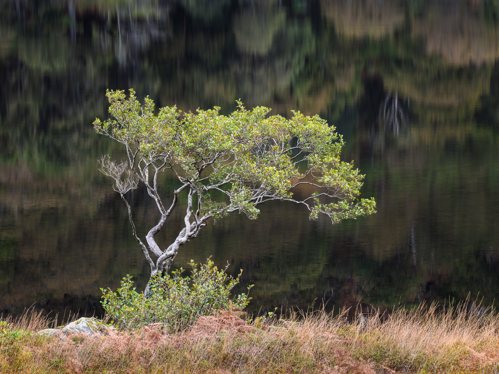
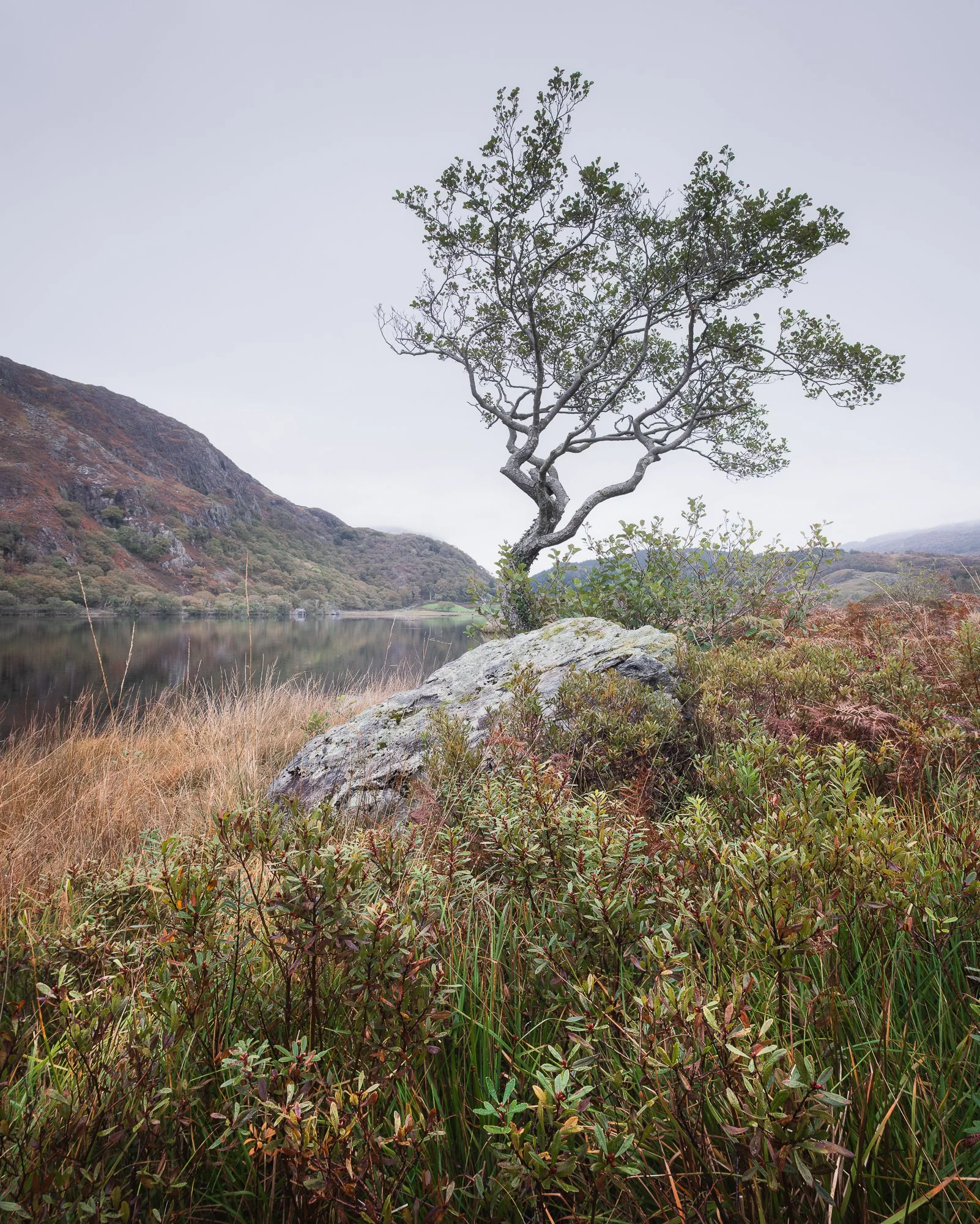
The next day, I returned to the Gwynant Valley, this time exploring further along at Llyn Dinas. There were a few spots near the lake I wanted to revisit in the hope of capturing some autumnal tones—though I think it’s fair to say I had mixed success.
My first stop on the morning hike was to revisit the lone tree by the water. It’s a subject I always enjoy photographing here, full of character and, when the conditions are right, framed beautifully by the surrounding mountains.
Once again, I wasn’t blessed with dramatic light, and overall, the conditions were rather flat. Yet the tree’s shape and form are strong enough that it still stands out against an otherwise plain sky. Clutching at straws? Perhaps. But even if I was a little early for autumn colour, I genuinely like this photo.
In my view, getting a low vantage point is essential. It ensures that the lowest branch on the right of the trunk doesn’t overlap the horizon, while also incorporating the shrubbery across the forest floor, which adds texture and depth to the foreground.
Fujifilm XT5 | XF10-24mm | 11mm | 1/20th Second | f/8 | ISO125
Not far from the lake is a stone cottage I had discovered on a previous visit, and remember wondering back then how it might look in autumn. Being close by once again, I made a point of hiking to the spot to see for myself.
When I arrived, the light remained flat, and low cloud smothered the distant peaks. Thankfully, the landscape still offered plenty of warm, autumnal tones, so all was not lost. I set up my camera to frame the cottage at an angle, nestled into the hillside while still maintaining the valley views behind, and once satisfied with the composition, I captured the image below.
For transparency's sake, I should note that the cottage is regularly occupied and features a large solar panel on the roof. While this is great for the residents, it didn’t suit the tone I wanted to create, so—as I had done on a previous visit—I removed the panel in post-processing.
Before continuing my hike, I switched to my telephoto lens and focused on a smaller section of the landscape, highlighting some trees on the hillside adorned with subtle autumnal colour.
Fujifilm XT5 | XF16-55mm | 34mm | 1/6th Second | f/10 | ISO125
Fujifilm XT5 | XF70-300mm | 114mm | 1/4th Second | f/10 | ISO125
Making my way back down from the higher, open ground, I passed through a small woodland. After experimenting with a few compositions that didn’t quite work, I stumbled across the ruins of an old stone building, hidden among the trees. The structure was heavily overgrown and brimming with character, so I spent a few minutes exploring slightly elevated ground to find the best perspective.
This shot was as much about what I left out as what I included. The area was busy, full of textures and features, and I wanted to ensure the stone building remained the focal point without being lost in the woodland. Once I found the ideal spot, I carefully composed the image, keeping enough of the surrounding environment to convey the building’s setting, while trying to avoid unnecessary clutter.
Fujifilm XT5 | XF16-55mm | 27mm | 1/4th Second | f/10 | ISO125
By now, it was around 11 am, and as I walked back alongside Llyn Dinas, the wind had dropped, allowing reflections to form on the calm surface of the lake. Passing the lone tree I’d photographed earlier that morning, I noticed how it seemed to hover gracefully over the water. The smooth, reflective surface provided a clean background, making the tree really stand out in the frame.
I can’t claim this composition has never been photographed before, but it was new to me. Once again, slowing down and taking the time to observe the environment paid off, resulting in what may well be my favourite image from the trip—a subtle reminder of why patience and attention to detail are so important when photographing the landscapes of Snowdonia.
Fujifilm XT5 | XF70-300mm | 102mm | 1/3rd Second | f/13 | ISO125
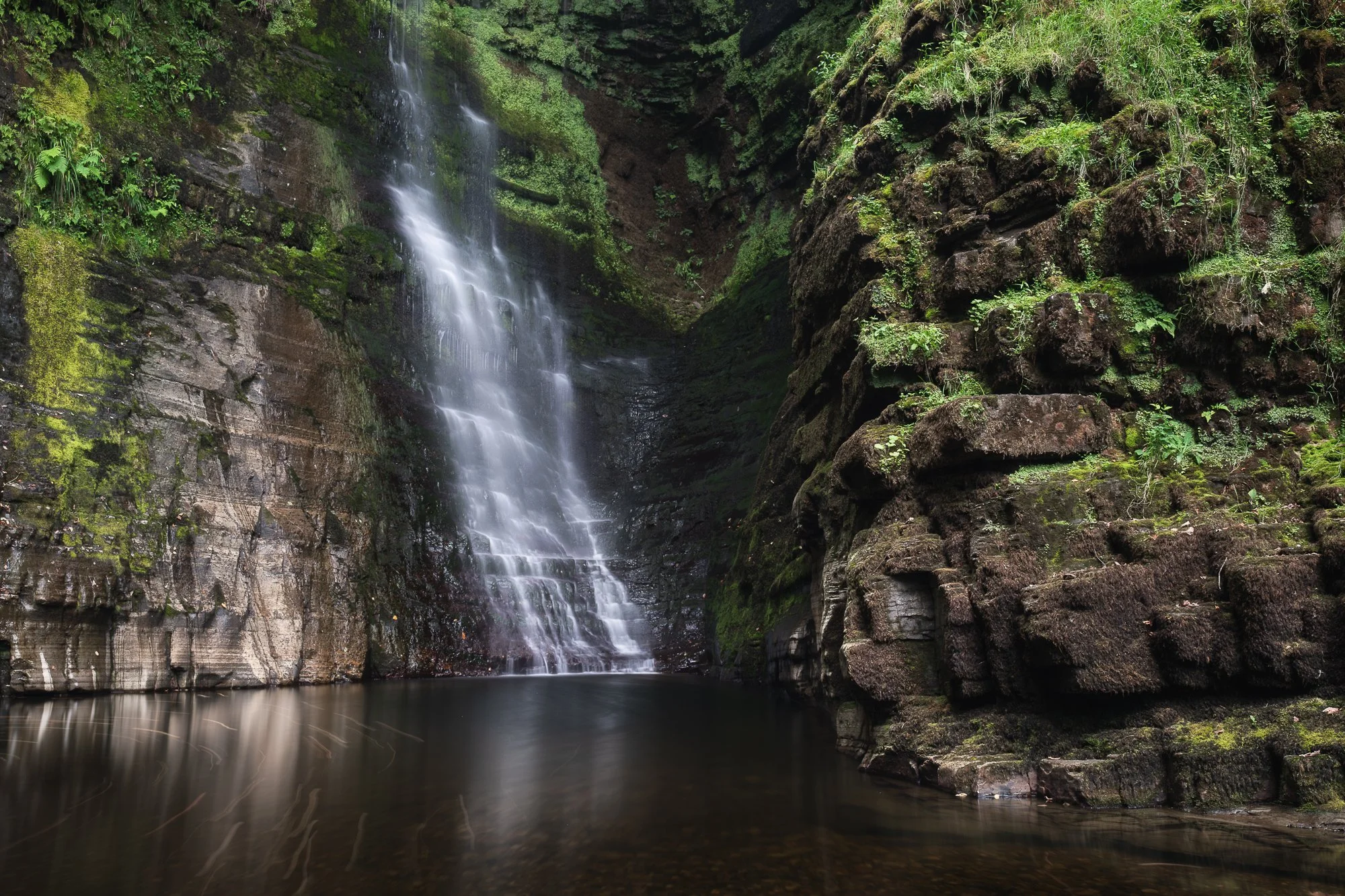
Finishing up in the Gwynant Valley and before heading back over to the Ogwen Valley later that afternoon, I paid a relatively quick visit to Conwy Falls. It’s not a place I’d visited before, and being a sucker for a good waterfall, I made my way back through Betws-y-Coed to the car park at the Conwy Falls Cafe.
At this point, you might notice a distinct lack of waterfall photos here—and there’s a reason for that. Despite the falls being truly impressive, I struggled to find a composition that worked, so I took a step back, found a comfortable spot with my coffee, and simply enjoyed the view.
It wasn’t a total loss, though. While walking along the short path between the café and the falls, I spotted a couple of trees showing early autumn colour and managed to capture a few woodland shots I’m pleased with.
Even without the perfect waterfall images, I still highly recommend visiting Conwy Falls. They are easily accessible and make for an impressive spectacle, whether you’re photographing or just taking it all in.
Finishing my coffee by the falls and after a quick pit stop in Betws-y-Coed, I drove along the A5 to continue my day in the Ogwen Valley.
Fujifilm XT5 | XF16-55mm | 38mm | 1/5th Second | f/10 | ISO125
Fujifilm XT5 | XF16-55mm | 44mm | 1/13th Second | f/10 | ISO200
By now, it was getting close to mid-afternoon, and I had considered hiking the Glyderau Circular—much like on my previous trip. But, as time was getting on, I decided it was a bit too late to complete the full hike before dark without rushing my photography along the way, which, at the very least, would have made the experience stressful. Instead, I opted to hike up towards Y Garn, aiming to capture the valley from an elevated perspective.
As I set off from the car park, passing Llyn Idwal and climbing towards Y Garn, the weather was pleasant with a few broken clouds. But gradually, the clouds thickened, and before long I found myself walking in complete clag, with visibility reduced to barely ten metres.
I pressed on, hoping the cloud might clear and reveal the views again. And while it didn’t—at least initially—I was actually pleased. Higher up, the sky began to brighten, and within a few minutes, I broke through the cloud, greeted by one of the most incredible scenes I’ve ever witnessed.
Beneath me stretched a vast carpet of cloud, a vast cloud inversion, with only the tallest mountain peaks piercing through. For several minutes, I simply stood there, taking it all in, knowing I might never see such a sight again.
Eventually, I returned to photography mode, setting up my camera to capture the peaks that emerged above the clouds.
The photo here shows the view looking back down Y Garn towards the Ogwen Valley, highlighting the route I took up the mountain and the spot where I broke through the cloud. In the distance, the tips of Pen Yr Ole Wen and Carnedd Dafydd rise from the Carneddau range. I used the path along the ridge to lead the eye down towards the clouds below and the distant peaks—subtle, but hopefully effective.
Fujifilm XT5 | XF10-24mm | 17mm | 1/50th Second | f/11 | ISO125
Alongside taking photos with my main camera, I also sent the drone up to take in the view from an even higher vantage point and managed to take a couple of photos while doing so. My favourite is the one shown below, as the sun is behind the drone, illuminating the scene in front of the camera. It’s amazing to think there is an entire world underneath that thick layer of cloud, all probably existing in dark and gloomy conditions, and oblivious to the spectacular views being observed by people like me above the clouds.
also turned the drone towards the Snowdon range to the south, but the harsh sunlight created too much contrast, and the drone struggled to capture it cleanly, so I chose not to keep any of those shots.
DJI Mini 3 Pro | 24mm (effective) | 1/2000th Second | f/1.7 | ISO100
Fujifilm XT5 | XF16-55mm | 45mm | 1/50th Second | f/9 | ISO125
Fujifilm XT5 | XF16-55mm | 55mm | 1/125th Second | f/10 | ISO125
Fujifilm XT5 | XF16-55mm | 34mm | 1/80th Second | f/9 | ISO125
DJI Mini 3 Pro | 24mm (effective) | 1/2000th Second | f/1.7 | ISO100
Fujifilm XT5 | XF16-55mm | 47mm | 1/50th Second | f/10 | ISO125
After a truly memorable 90 minutes near the top of Y Garn, having experienced the best of the conditions up there, I packed my camera away and began the descent back towards Llyn Idwal. By now, the cloud had thickened considerably, and conditions down in the valley were gloomy. Even without dramatic light, I knew there was still the opportunity to create a few photos beside the lake, using the low cloud and cool tones to add atmosphere and mood.
For the shot below, I focused on making the large rocks a prominent foreground element, with the stone wall subtly leading the eye towards the mountainous walls of Cwm Idwal, forming a striking backdrop. I used an exposure of 0.8 seconds to introduce just a touch of movement in the flowing water, simplifying the areas between the rocks and helping them stand out. Overall, I’m really pleased with how this image turned out.
Fujifilm XT5 | XF10-24mm | 10mm | 0.8 Seconds | f/11 | ISO125
On the way back from climbing Y Garn, and before taking the previous photo, I had spotted this collection of partly submerged stones in the water. They seemed to line up, potentially usable as foreground interest, helping to lead the eye out, towards the imposing mountain range across the lake.
I used my circular polarising filter (CPL) to take some of the glare off the rocks, revealing some of the textures under the water, and with the winds calm, there were some nice reflections of the mountains on the lake’s surface. It all seemed to come together for me in that moment. Given how many people visit this lake, I’m certain I’m not the only one to photograph this composition, but it was genuinely new to me, so I’m pleased to have spotted it.
The last stop of the day was close to the car park, where I paused briefly to photograph this section of Afon Idwal as it tumbled down the hill towards me. I know this is a well-photographed cascade, but it’s such an accessible and easy photo to take that I will typically take a photo whenever I pass.
Without the low cloud, this composition can offer slightly better views of the Glyderau in the background, but unfortunately not today; however, with some nice contrast between the dark rock and white water and with a little tweaking of the shutter speed to achieve this look in the water, I still walked away with a photo I like.
Fujifilm XT5 | XF10-24mm | 10mm | 1/6th Second | f/10 | ISO125
Fujifilm XT5 | XF10-24mm | 10mm | 0.8 Seconds | f/11 | ISO125
Fujifilm XT5 | XF10-24mm | 13mm | 0.6 Seconds | f/8 | ISO400
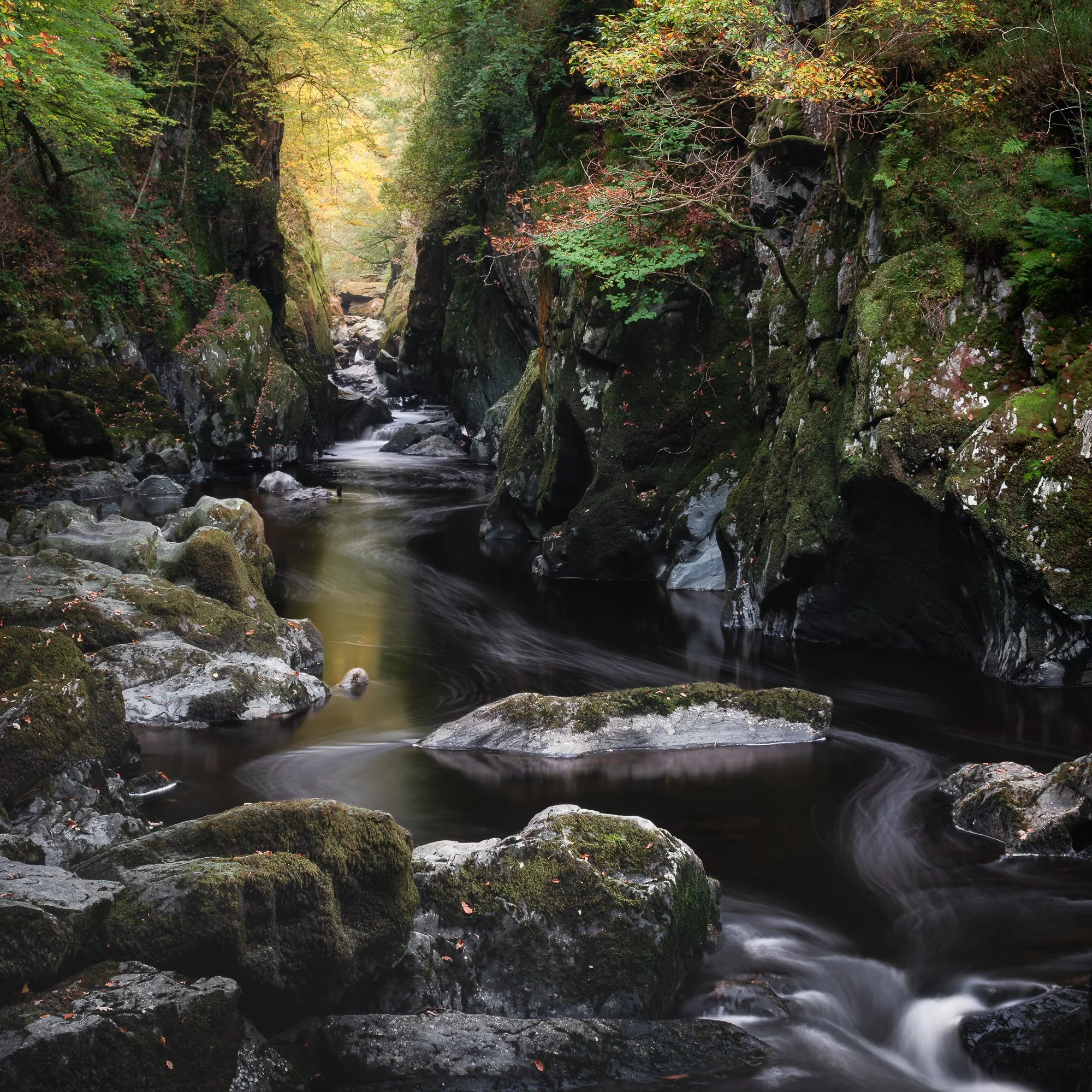
For the first stop on my third and final day in North Wales, I visited Ffos Anoddun—better known to most as Fairy Glen, near Betws-y-Coed. The Welsh name, Ffos Anoddun, translates as “Deep Ditch,” though the location is far more enchanting than the name suggests. Fairy Glen (as I’ll call it from here on) is a narrow, tree-lined ravine, with the River Conwy flowing gracefully through it. I first visited this spot in late summer 2024 and had always planned to return, hoping to capture it adorned with autumnal colour.
You can see the original, summertime version I took in a previous post here, and I liked that composition, so I tried to recreate it. For a place like this, that might sound easy. But for some reason, I struggled to find the spot I took the photo from, but after a little trial and error, I got there and had my composition lined up.
As with a few other locations on this trip, the autumn colour hadn’t fully arrived, though there were subtle hints of the seasonal transition along the edges of the ravine. Not quite what I had hoped for, but enough to work with.
The long exposure works particularly well in this spot, as the foam created by the water cascading over the rocks forms interesting lines and textures as it travels downstream. Once in position, I mounted my Kase neutral density filter (10 or 6-stop—I can’t remember exactly) and began capturing the scene.
In the final versions shared further below, I also included a shorter exposure. While I slightly prefer the creative effect of the long exposure, the quicker shutter speed produces a more realistic view, and both work well. Photography is subjective, after all—and that’s exactly how it should be.
Fujifilm XT5 | XF50-140mm | 50mm | 8 Seconds | f/10 | ISO125
Having captured the composition I was after, I also experimented with a few different focal lengths. I’m particularly pleased with the result in the square crop below, where I went a little wider and arranged the river to flow diagonally through the frame, exiting towards the bottom right-hand corner. It’s a different take on this popular scene, and I’m quite pleased with the photo.
Fujifilm XT5 | XF16-55mm | 30mm | 8 Seconds | f/9 | ISO125
Fujifilm XT5 | XF50-140mm | 50mm | 60 Seconds | f/11 | ISO125
Fujifilm XT5 | XF50-140mm | 50mm | 1/10th Second | f/6.4 | ISO400
Fujifilm XT5 | XF16-55mm | 43mm | 1/3rd Second | f/16 | ISO125
Taking the slightly longer route along the river back to the car, I spotted this scene, which was interesting with the large rock, fallen tree and splash of seasonal colour in the trees.
I experimented with a few different focal lengths, taking in the wider scene as well as zooming in and isolating those autumnal colours with a closer crop. These were not necessarily up there with my favourite photos of the trip, but I still like them enough to share with you here.
My final stop of the day was at the Dinorwig Slate Quarry near Llanberis. I had planned to wander down to the Barics Dre Newydd (Anglesey Barracks), take a few photos there, and then explore the quarry before heading back to the car for the long drive home. However, the weather had other ideas.
The cloud cover that had been providing some soft, diffused light earlier quickly cleared after I arrived, leaving a bright, clear sky and harsh contrast—conditions that are far from ideal for the kind of photography I enjoy.
Fujifilm XT5 | XF50-140mm | 102mm | 1/6th Second | f/9 | ISO125
Before the cloud completely cleared, there were still occasional patches passing by, softening the light for brief moments. Wandering down the track towards the barracks, I noticed the trees showing much more autumnal colour than earlier, and I managed to stop and compose a couple of intimate woodland photos.
Once the sun broke through, I spent an hour or so exploring the quarry. It’s such an incredible place to roam, rich with history, and I thoroughly enjoyed my time there. Unfortunately, with the weather no longer cooperating, I didn’t take any more photos.
Fujifilm XT5 | XF16-55mm | 55mm | 0.4 Seconds | f/11 | ISO125
Fujifilm XT5 | XF16-55mm | 41mm | 1/4th Second | f/11 | ISO125
Overall, this was another successful trip, and I had an amazing time in such a stunningly epic landscape. Of course, things could have been better—more autumn colour on the trees, kinder light at Dinorwig Quarry, or improved conditions when photographing Tryfan on the first evening—but it would be unrealistic to expect everything to go perfectly. Let’s be honest, it could have been far worse; I could have battled strong winds and sideways rain, so I’m grateful for the conditions I did have.
As I mentioned at the start of this article, alongside revisiting some of my favourite spots in Snowdonia, my goal was to capture a mix of woodland, intimate landscapes, and wide vistas. To achieve this, I needed to slow down and give myself time to really observe the landscape and let the compositions reveal themselves. By doing so, I discovered some new, fresh perspectives and captured images I might have otherwise missed if I had been rushing around.
Thanks, as always, for sticking with these longer-form on-location articles. If you have any comments or questions, please feel free to leave them below.
Until next time,
Trevor
If you’ve enjoyed following this Snowdonia trip, you’ll find plenty more inspiration on my blog, where I share tips, insights, and photographs from across the region. From woodland scenes and intimate compositions to sweeping mountain vistas, it’s a celebration of the beauty and variety of landscape photography in Snowdonia.


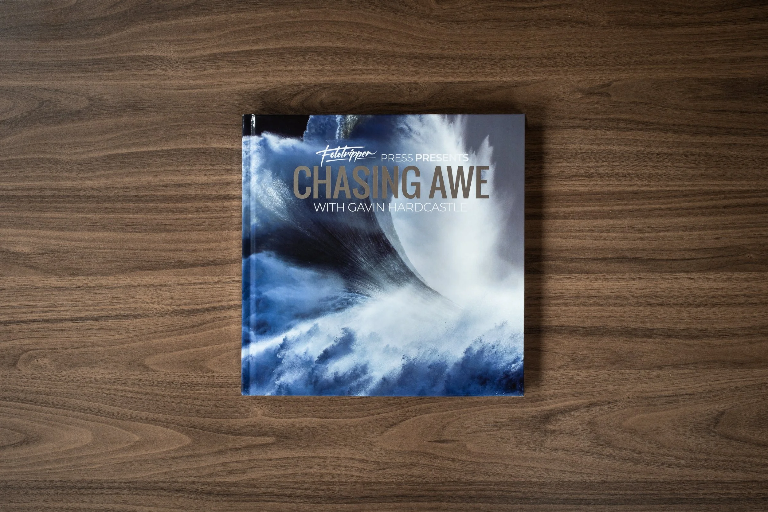
Chasing Awe with Gavin Hardcastle | My Photo Bookshelf
Chasing Awe by Gavin Hardcastle, a landscape photography book that blends stunning images and behind-the-scenes stories.
Gavin Hardcastle is a British landscape photographer based in Canada and someone I’ve been following on YouTube for a few years. He has a unique, fun approach to his videos with a great mix of landscape photography adventures and comedic sketches which provide a welcome alternative to some of the other, more serious videos on my watchlist.
Although known on YouTube for his fun and sometimes silly videos, Gavin is still primariily a serious landscape photogtraher and he consistetly shares some quite beautiful landscape photography during his videas and that appreciation for his work resulted in my purchasing a copy of Chasing Awe with Gavin Hardcastle for my bookshelf.
Synopsis
When I was just starting out in landscape photography, I read a lot of photography books. While many of them had beautiful images, I did feel somewhat disconnected from the authors because many of the accompanying stories lacked both a personal touch and offered no technical insights. With ‘Chasing Awe with Gavin Hardcastle‘, I wanted to break that format and offer you a front-row seat to the experience of being a professional landscape photographer – warts and all.
The life of a landscape photographer isn’t always filled with rainbows and unicorns, in fact, the reality is a lot less glamorous. This book takes you into the deep and murky waters of a challenging and often dangerous obsession with the more extreme moments that Mother Nature has to offer.
My thoughts about the book
Chasing Awe has a hard, glossy cover and a reassuringly tough feel to it, which it would need, judging by Gavin’s videos, where he takes a copy along on many of his adventures across a wide range of landscapes and conditions to promote it in his usual fun, light-hearted way. It makes a great first impression.
The book opens with a foreword by Gavin’s friend and fellow landscape photographer, Adam Gibbs. That connection feels particularly fitting for me, as it was through Adam’s YouTube videos that I was first introduced to Gavin, back when they regularly travelled and photographed together before Gavin moved across the country to Canada’s east coast. I certainly miss those collaborations. The foreword touches on how they originally connected, and their close friendship comes through clearly in Adam’s playful remarks — British mickey-taking humour at its best, and very much in keeping with the overall tone of the book.
Following Adam’s foreword is a brief introduction from Gavin himself before the book dives straight into the images. Each photograph is accompanied by a backstory, all written in Gavin’s familiar, approachable style. Photo books like this work particularly well for me, as I’m always drawn to the context and stories behind the image. In this case, Gavin’s ability to convey someone who is clearly serious about their craft through these entertaining, warts-and-all tales makes reading the book a genuinely enjoyable experience.
Throughout the book, Gavin shares the highs and lows of his adventures and, where appropriate, introduces some of the advanced techniques he used to capture the final images. Even with the technical information included, I feel the balance is just right, and there’s still plenty for readers who are less interested in the technical side of photography.
I particularly appreciate the variety of landscapes Gavin presents in the book. The images span locations all over the world, from picturesque cabins nestled in snowy forests to powerful waves crashing against rugged cliffs, and majestic Canadian mountains bathed in warm golden-hour light. With such diversity, there is genuinely something to enjoy on every page.
For anyone able to get hold of a copy, I would highly recommend doing so. While the physical edition is now sold out, Chasing Awe is still available as an ebook via Gavin’s website — the link is provided below.
Book Details
Hardback Foil Stamped Cover
Size: 10.5 x 10.5 inches
Pages: 120
Availability at the time of writing: All editions of the physical book are sold out, but an e-book edition is available from Gavin Hardcastle’s website https://www.fototripper.com/store/chasing-awe-with-gavin-hardcastle-photography-ebook/
Until next time.
Trevor
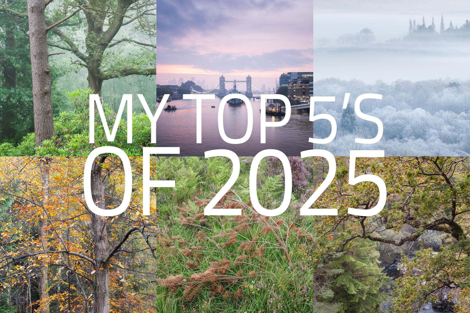
My Top 5’s of 2025
A 2025 photographic retrospective, highlighting my favourite cityscape, woodland, and landscape photos, reflecting on the year’s creative journey and looking ahead to 2026.
It’s the end of another year, and in keeping with a tradition I’ve mostly stuck to over the last few years, I wanted to take a moment to reflect on the year I’ve had and share a small selection of my favourite photos. It’s an opportunity to look back, review and curate the work with fresh eyes, now that some time has passed since I took it, and consider what still resonates with me — whether because of the experience, the conditions, or the subject.
So, how did 2025 go for me photographically?
I felt a real shift in my photographic motivations during 2025. Subjects and locations that previously pushed me to head out with my camera no longer do — the wide vista, for instance. I did very little in the way of what some might call traditional landscape photography.
I think this has more to do with my lack of motivation for the vistas close to where I live, rather than landscapes in general. I still enjoyed landscape photography when I travelled to North Wales a couple of times during the year. Living in the rather flat and geographically uneventful South East of England means there’s little real drama — no mountains, no waterfalls — and any grand vista worth photographing has already been done a thousand times over.
I’ve come to realise that I need a place with enough variability and interest that, even if it’s familiar, it can still offer a sense of novelty. That sense of novelty feeds my creativity and motivates me to make something that feels, even if only slightly, different from what I’ve already seen. It doesn’t feel like a loss of interest so much as a narrowing of focus.
With that said, while the lack of motivation for those local vistas was very real, the assumed cause might seem slightly contradicted by the fact that I’ve still really enjoyed exploring the familiar and well-photographed London cityscape. So if you’re curious as to why my motivation hasn’t waned when it comes to photographing London, read on — I’ll try to explain that in the next section.
What was my key photographic takeaway for 2025?
If I had one word to describe 2025 photographically, it would be PROJECTS. Throughout the year, I’ve continued with existing projects and started new ones, and it’s these that have motivated me the most to grab my camera and head out. I have several on the go — some I’ve shared already, such as my city and streetscape work in London — but I also have a few others, mostly woodland-based, that I’ve not yet detailed, as I’m still figuring them out.
Whatever the subject, these projects have provided me with greater focus and intent, a deeper connection to the place or subject, and — with any luck — take me on a journey to refine and mature my photographic voice. Perhaps a topic to explore in more depth in its own article one day.
Who knows — with the added motivation and focus that projects have given me this year, this might be the spark I need to one day find the fire in my belly to photograph my local grand landscape once again.
My top 5s of 2025
From the mountains of North Wales, the high-rise cityscapes of London, to the quiet intimacy of my local woodland, it might seem that I’ve spread myself quite thin with the time I have to take photos. But I love photographing all of these places. For this article, I’ve decided to organise the images by subject or location and share a few of my top five photos from each. Each series tells its own quiet story of the year, capturing moments of mood, atmosphere, and the things that still resonate with me.
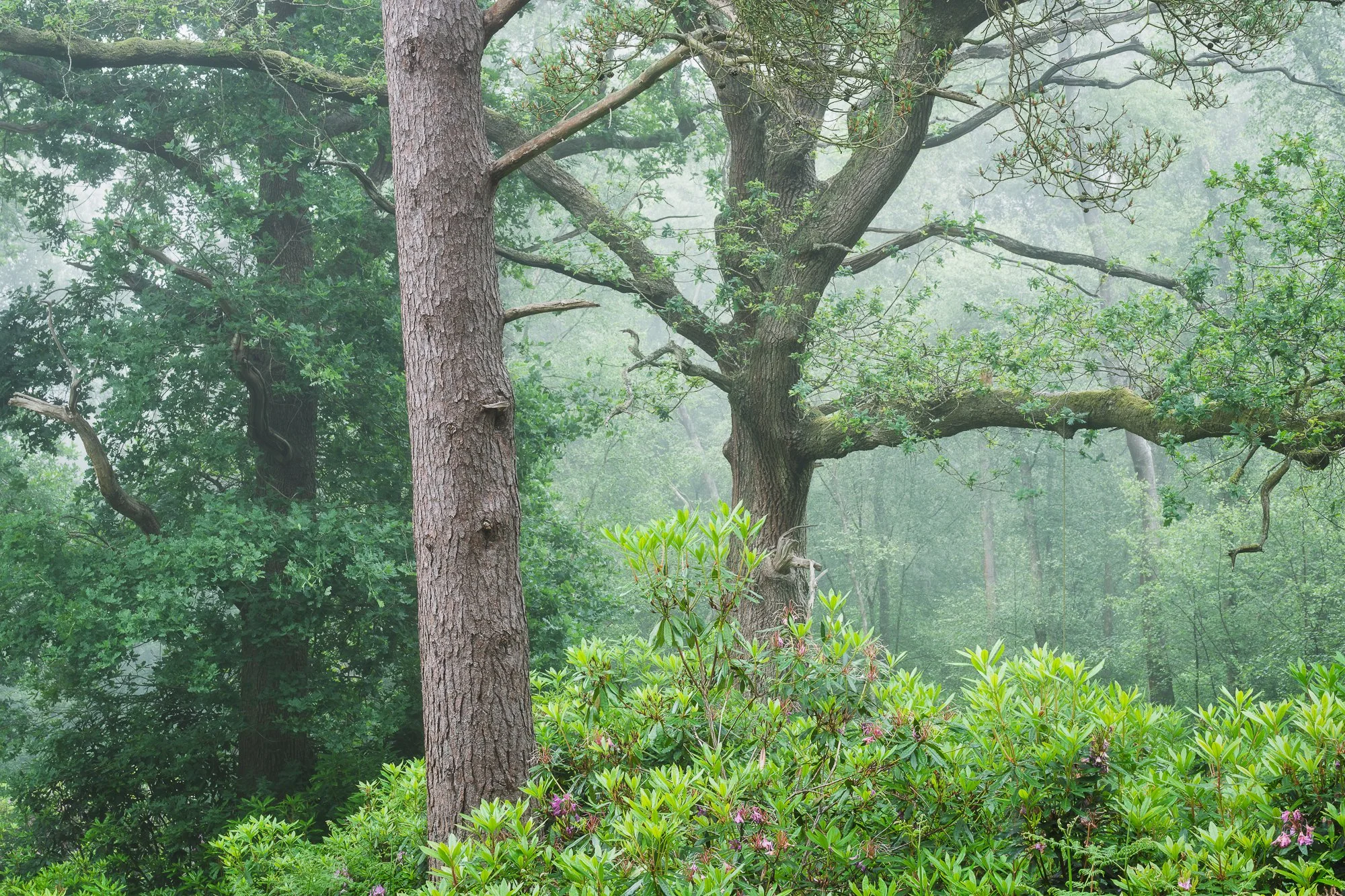
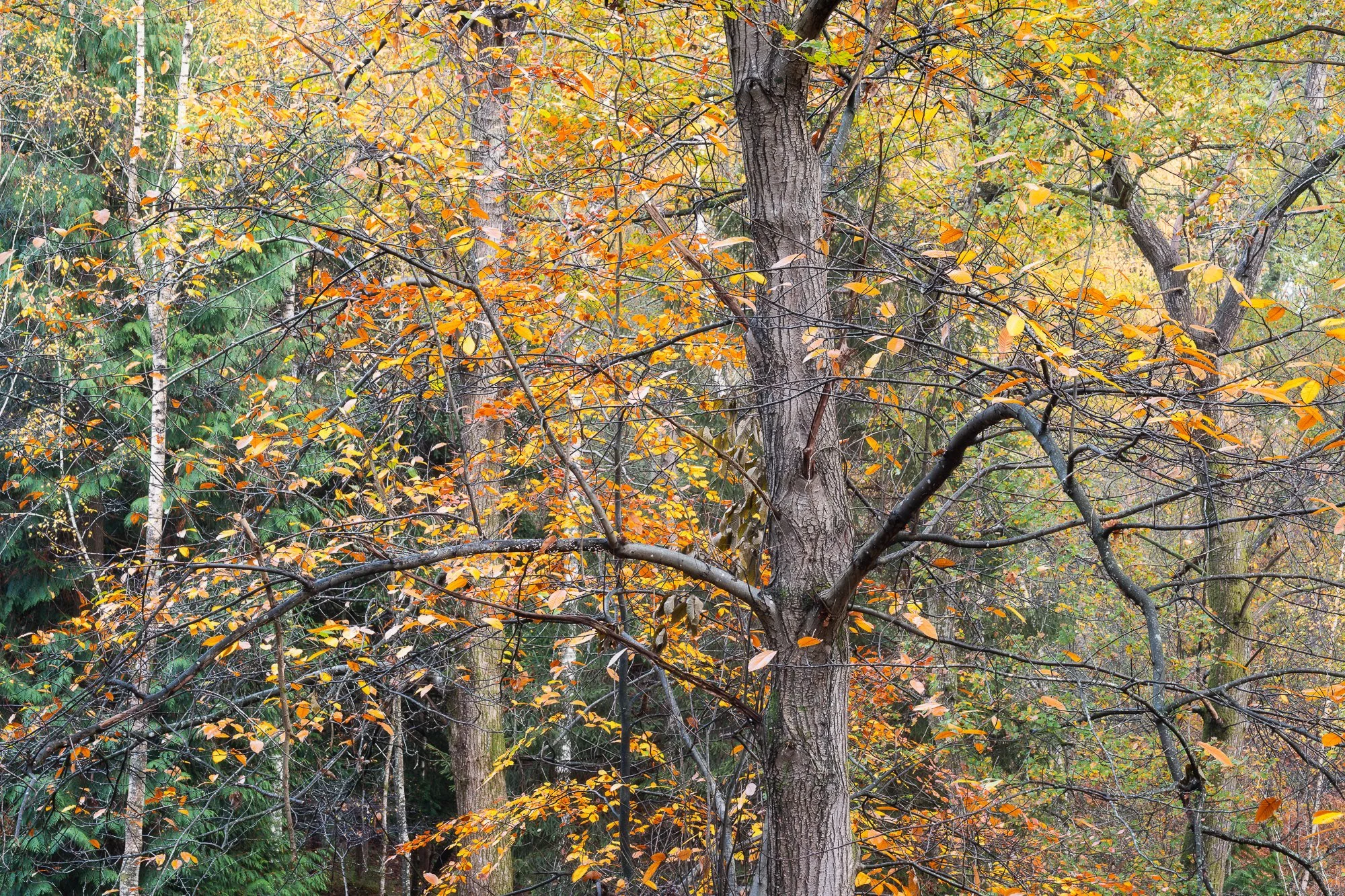
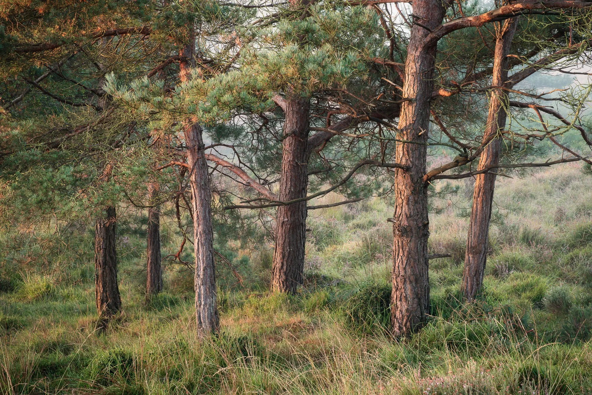
My top 5 local woodland photos of 2025
I’ve spoken before about the need to find places where I can explore the landscape and make unique photographs. The local landscapes near me haven’t quite fulfilled that need lately, but one place where I can still create new work and experiment with light, colour, and composition is the woodland. It’s a constantly changing environment, and although I have returned to the same forest for most of 2025, I’ve still been able to produce fresh and unique work. The five photos below are some of the ones that stood out to me as I reviewed my woodland photography from the year. Each visit offered a slightly different story, a new way of seeing the familiar.

My top 5 photos taken in North Wales in 2025
I usually make one or two trips to North Wales each year, and with its waterfalls, wooded valleys, and epic mountains, there’s always something to capture. I visited in both March and October 2025, and here are five of my favourite photos from those trips.

If you want to see more of the work I made during these and other trips to Snowdonia, then check out my blog for more on-location trip reports.
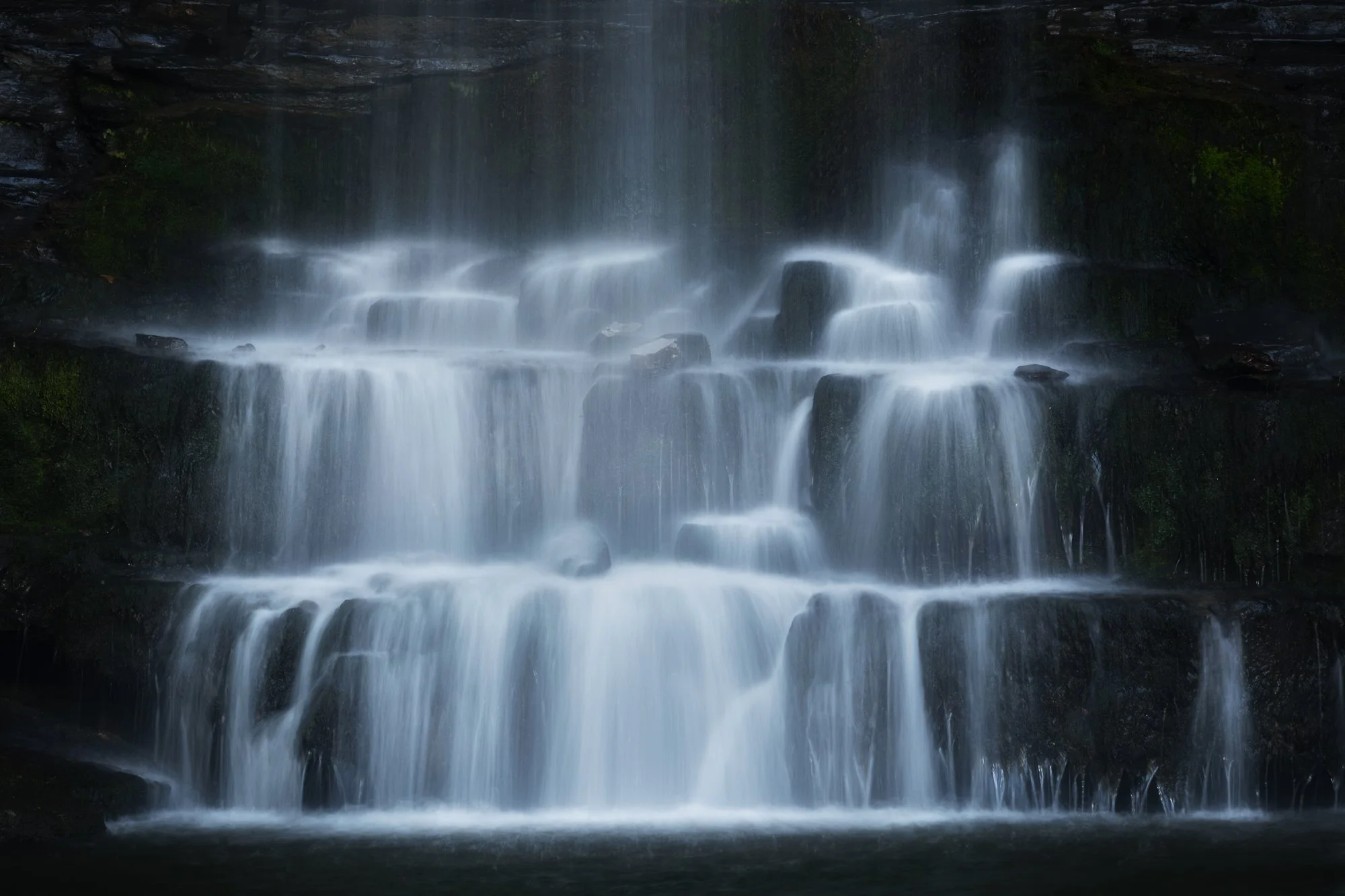
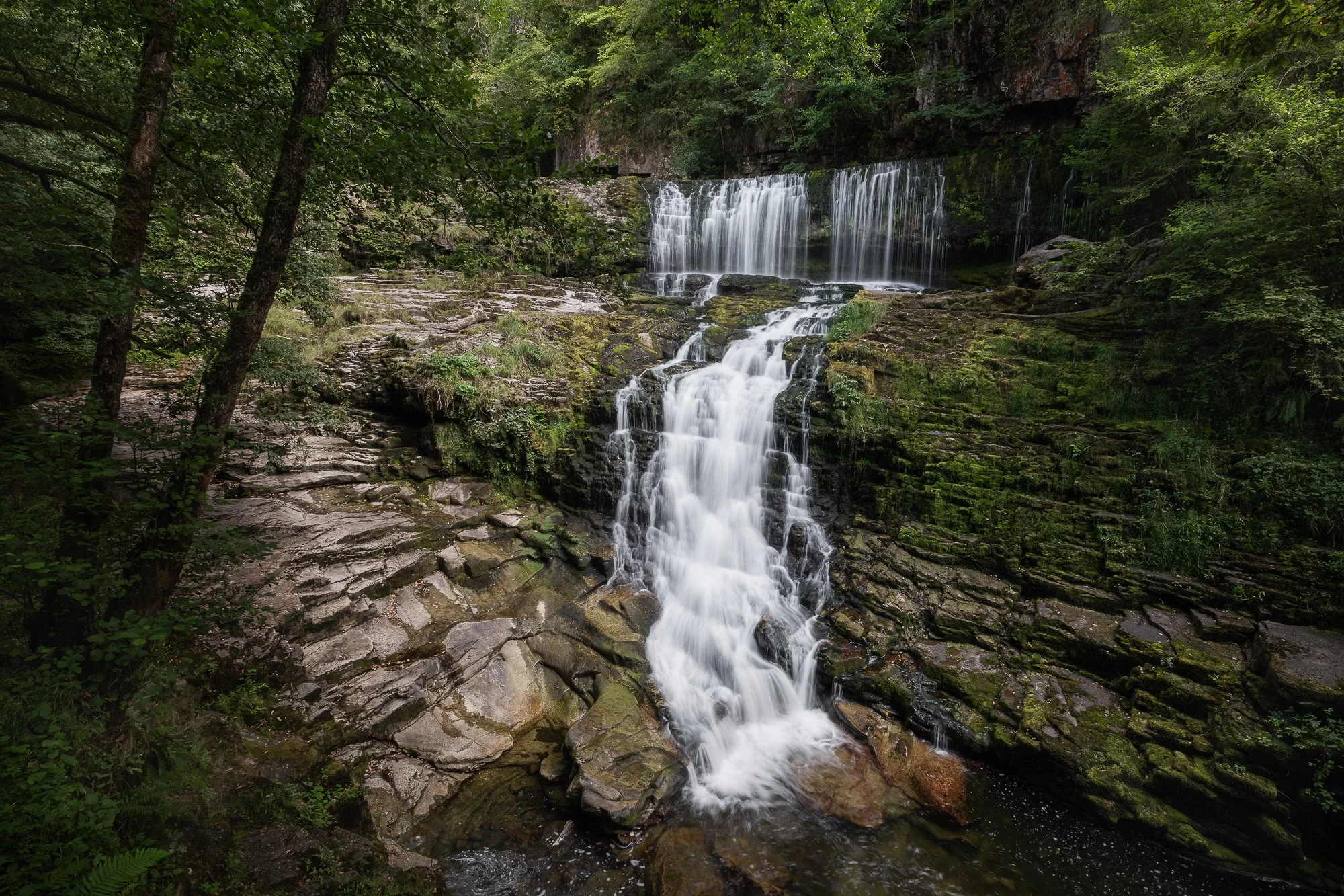
My top 5 waterfall photos of 2025
Like my regular trips to North Wales, I also make it a point to visit the Brecon Beacons once a year or so, hiking and photographing along the waterfall trails. This year I went in late summer, when the leaves were still green but the water flow was modest. I made the most of it and captured a few images I’m happy with, some of which I’ve shared below.
My top 5 small and intimate scenes in 2025
Although I rarely go out with the explicit intention of photographing small scenes, when one catches my eye, I make a point of capturing it because I love getting close and revealing nature’s finer details. Here are a few of my favourite small scenes and intimate landscapes from 2025.
My top 5 London cityscape photos of 2025
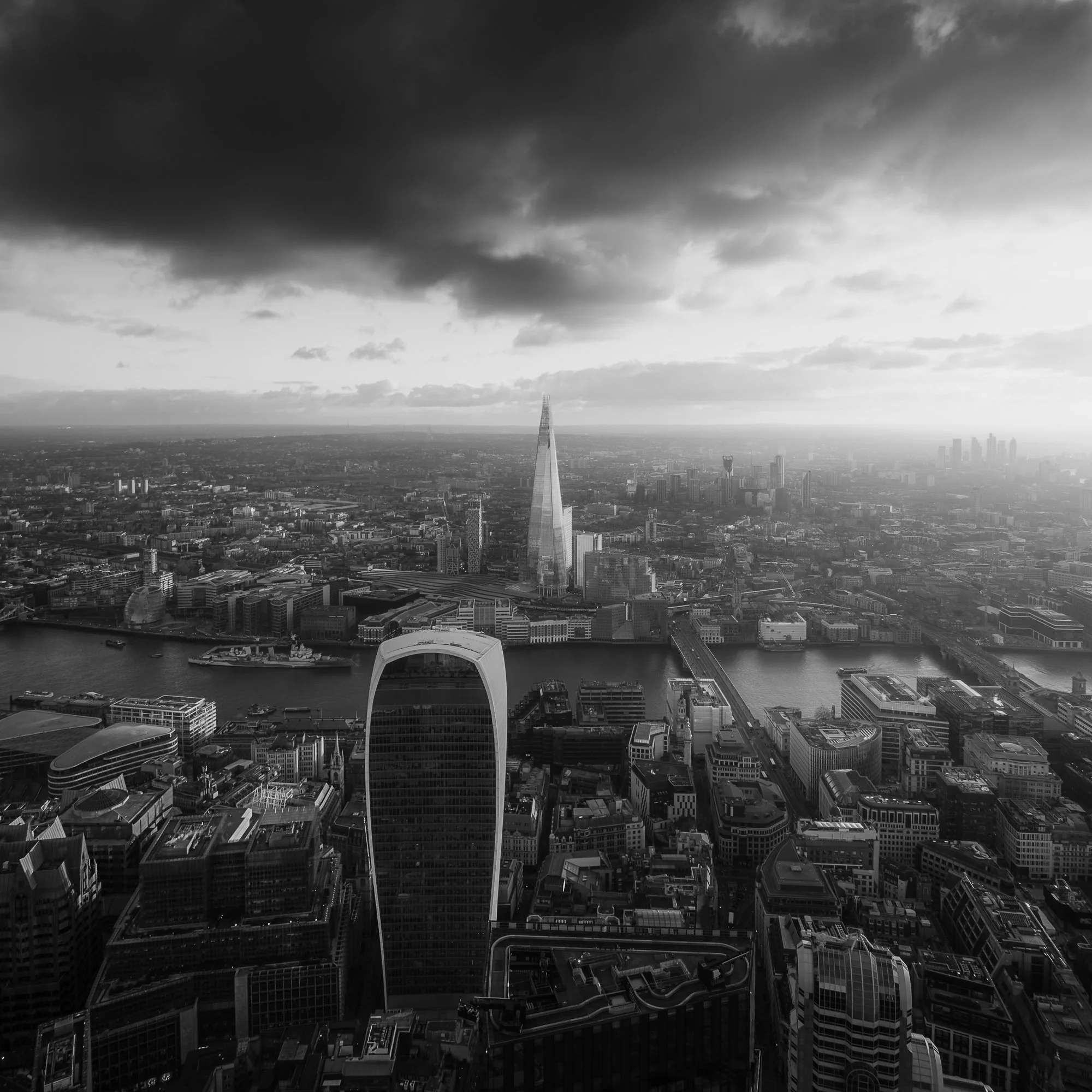
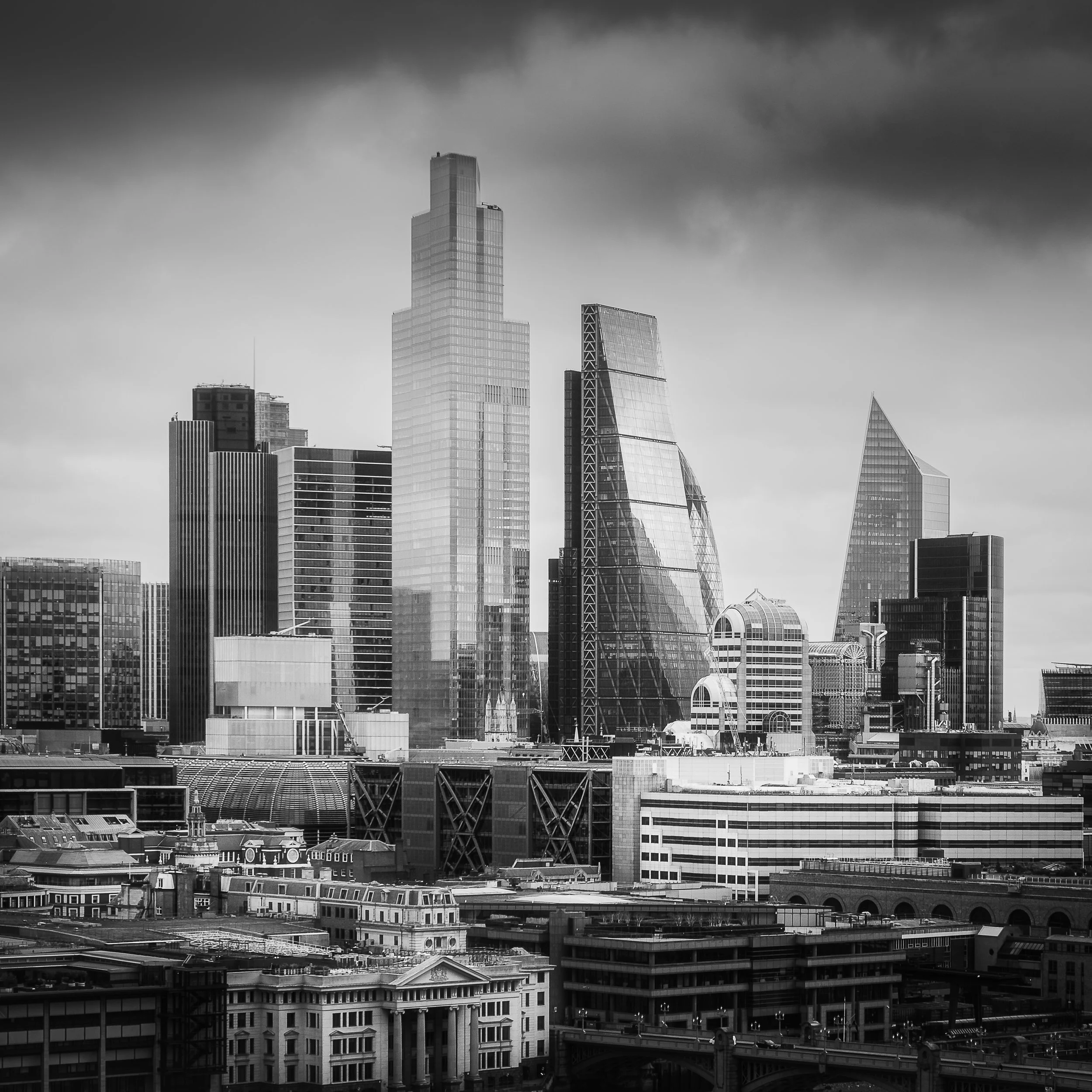
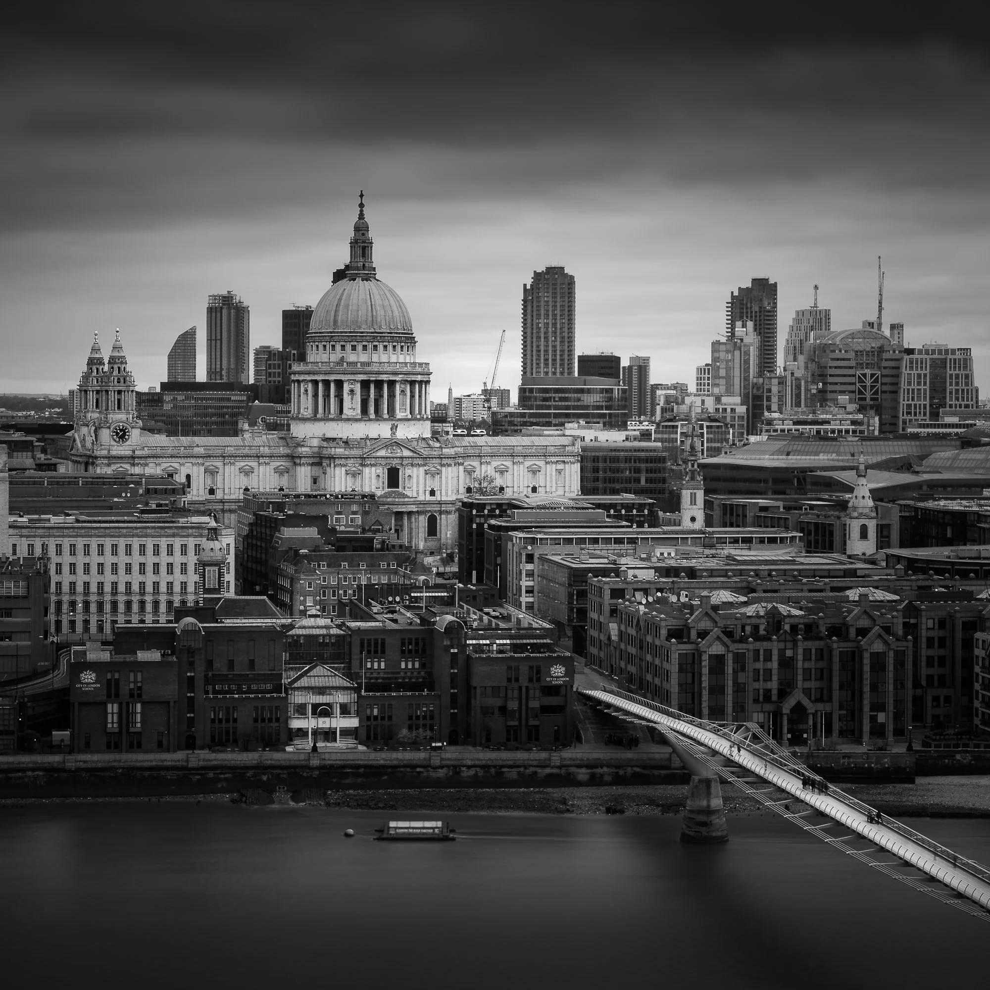
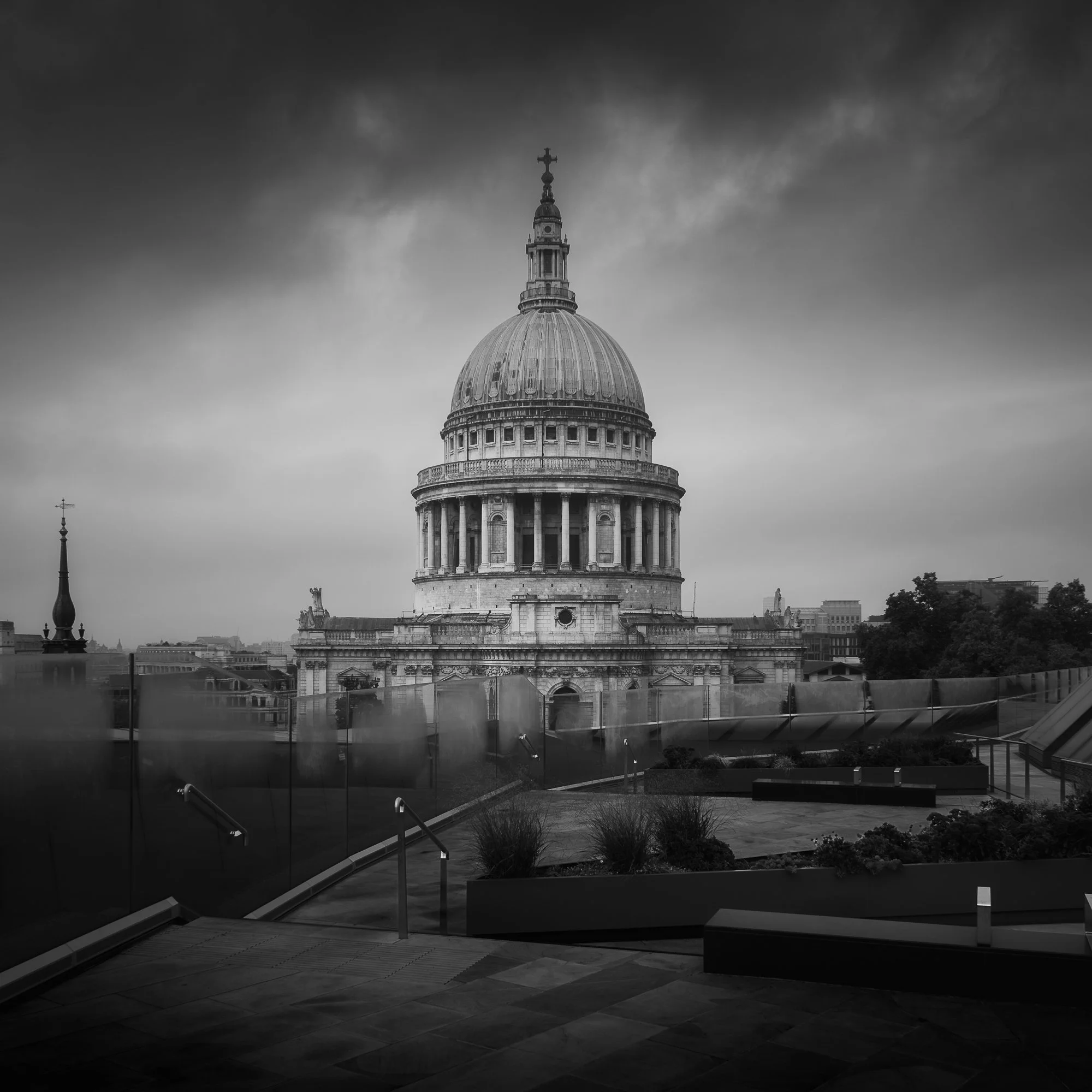
With the creative spark from the projects I’ve been working on, I spent much more time in London photographing its city and streetscapes during 2025 than in recent years. I continued taking square, black and white photos for my Timeless City work and, often in the early mornings, captured images for City Stille. Here are a few of the colour photos I took, but if you’d like to see more of my black and white cityscapes, you can pop by [here] to view them.

My top landscape photos of 2025
Although I didn’t take many wide vistas in 2025, I still captured some scenes I would consider traditional landscapes. Most of my work this year is on the intimate side, offering something more unique and less recognisable — something I’ve been intentionally working towards. Alongside these intimate scenes, I’ve also shared a couple of wider views from my local area below.
Hopefully, you’ve enjoyed this glimpse of the work I’ve created in 2025. With the variety of subjects on show, I hope it offers a small window into the different places, moods, and stories that have captured my attention over the year.
Looking forward to 2026
With my photographic tastes and motivations evolving somewhat in 2025, I’ll refrain from trying to predict where things might head in 2026 and simply let them unfold. That might mean spending more time in the city, or satisfying that creative itch by exploring and photographing my local woodland. I have a couple of project ideas I want to explore further — something featuring trees or natural landscapes, but I also want to be mindful of the time I have to devote to these various projects.
At this stage, all I would say is to expect more urban city and streetscapes, as well as plenty more woodland photography, over the next 12 months.
I also want to work harder at adding content to my website, as I didn’t feel as motivated as before to write new articles. And lastly, I hope to self-publish a Timeless City project zine. I won’t put pressure on myself — my photography remains a hobby and does not need to generate an income — so above all else, it must stay fun and creatively fulfilling.
This will be my last article of 2025, so whatever you do and whatever you have planned, I wish you all a happy and successful 2026.
Until next year.
Trevor
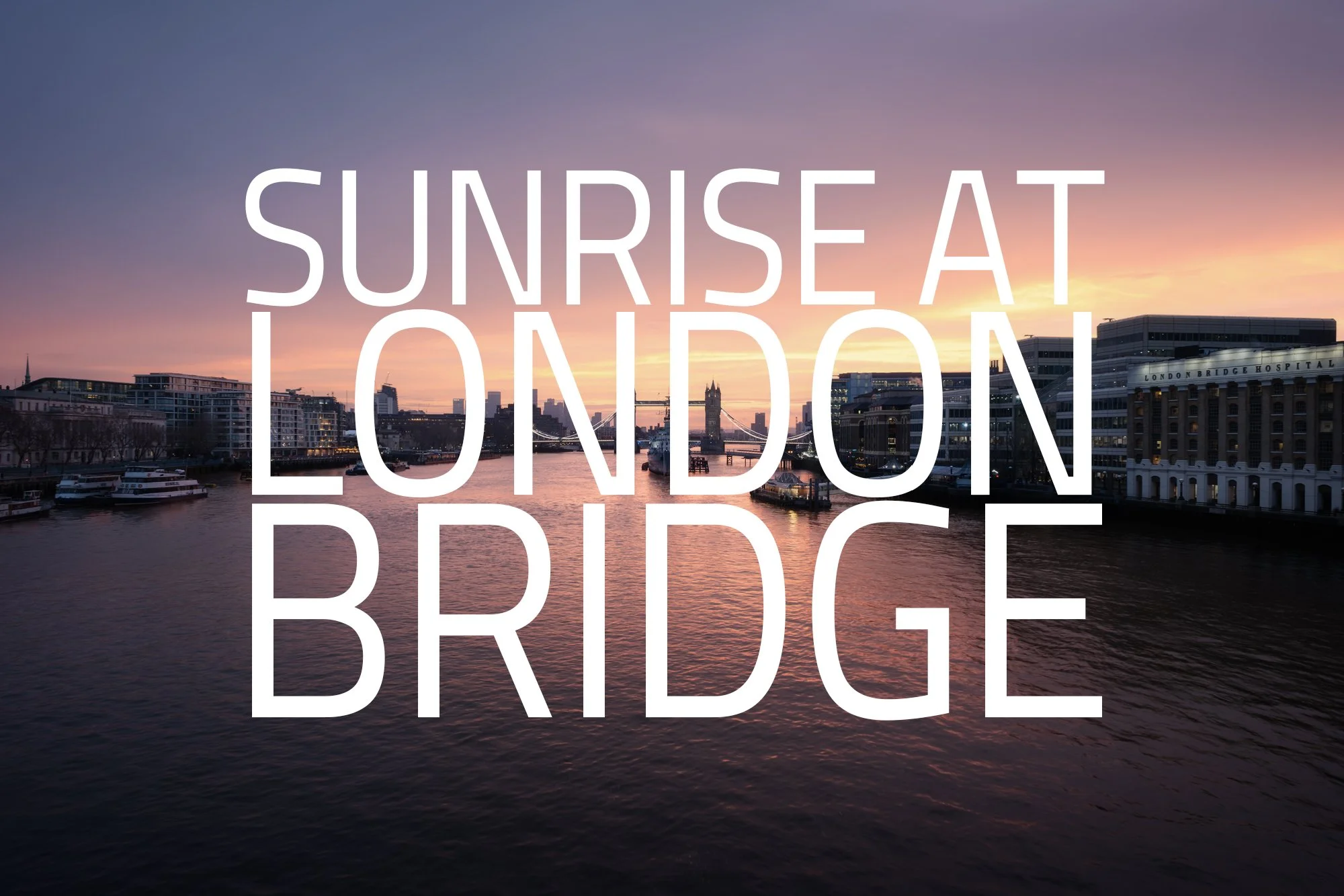
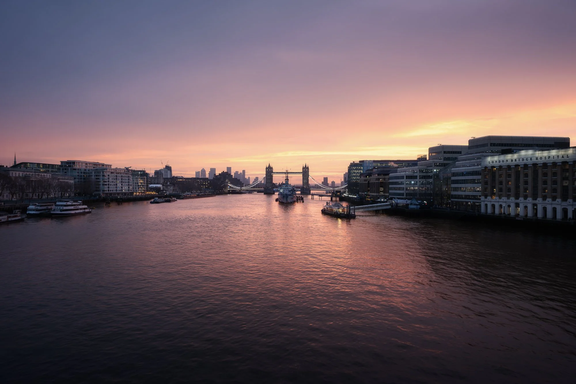
A Winter Sunrise at London Bridge
A winter sunrise wander around the London Bridge area, capturing HMS Belfast, Tower Bridge, and The Shard as they are bathed in soft early morning light.
I often wander around this area of London. It’s popular with tourists for good reason, with so many of the city’s iconic landmarks close by. As my train into the city terminates at London Bridge Station, it has become a natural starting point for many of my morning photo walks.
I’ve spoken many times about photographing London early in the morning, when the city is just waking up and the usually busy streets have a little more room to wander. I enjoy taking the time to explore, to appreciate the architecture and the photographic opportunities it offers, and to try and capture the sense of calm I feel when all I can hear are my own footsteps. It’s a similar feeling of familiarity and quiet I experience when wandering my local forest, and one that sits at the heart of my London-based photography project, City Stille.
After leaving the station, I made my way towards the river. It’s here that the space opens up, allowing me to get a sense of the conditions and the potential for light. With so much light pollution around, it isn’t always easy to read the sky until the light levels begin to lift, but looking east, I could just make out some pre-dawn colour starting to filter through. It felt like a long time since one of my early morning trips into the city had coincided with a good sunrise, and if there was even the smallest chance of colour, I wanted to be in one of the best spots to witness it — slightly upstream on London Bridge.
As I walked along the Thames, I had around twenty minutes before any significant colour might appear. I stopped to photograph this view of HMS Belfast and Tower Bridge. I’ve photographed this spot a few times before, but never at night, so mindful not to miss any potential colour, I quickly set up the camera and composed the image below.
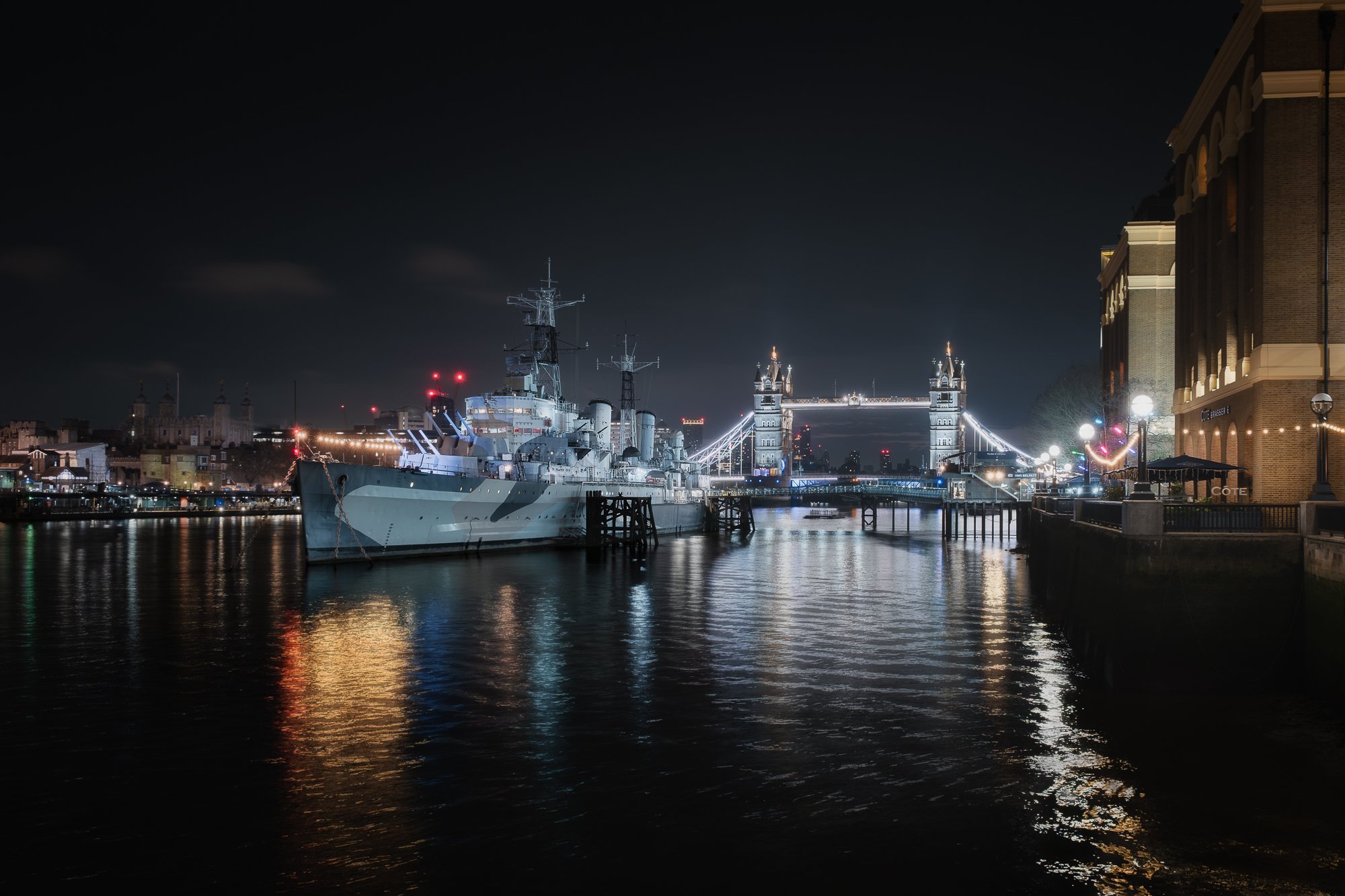
Fujifilm X-T50 | XF16-80mm | 20mm | 1/8th Second | f/5.6 | ISO800
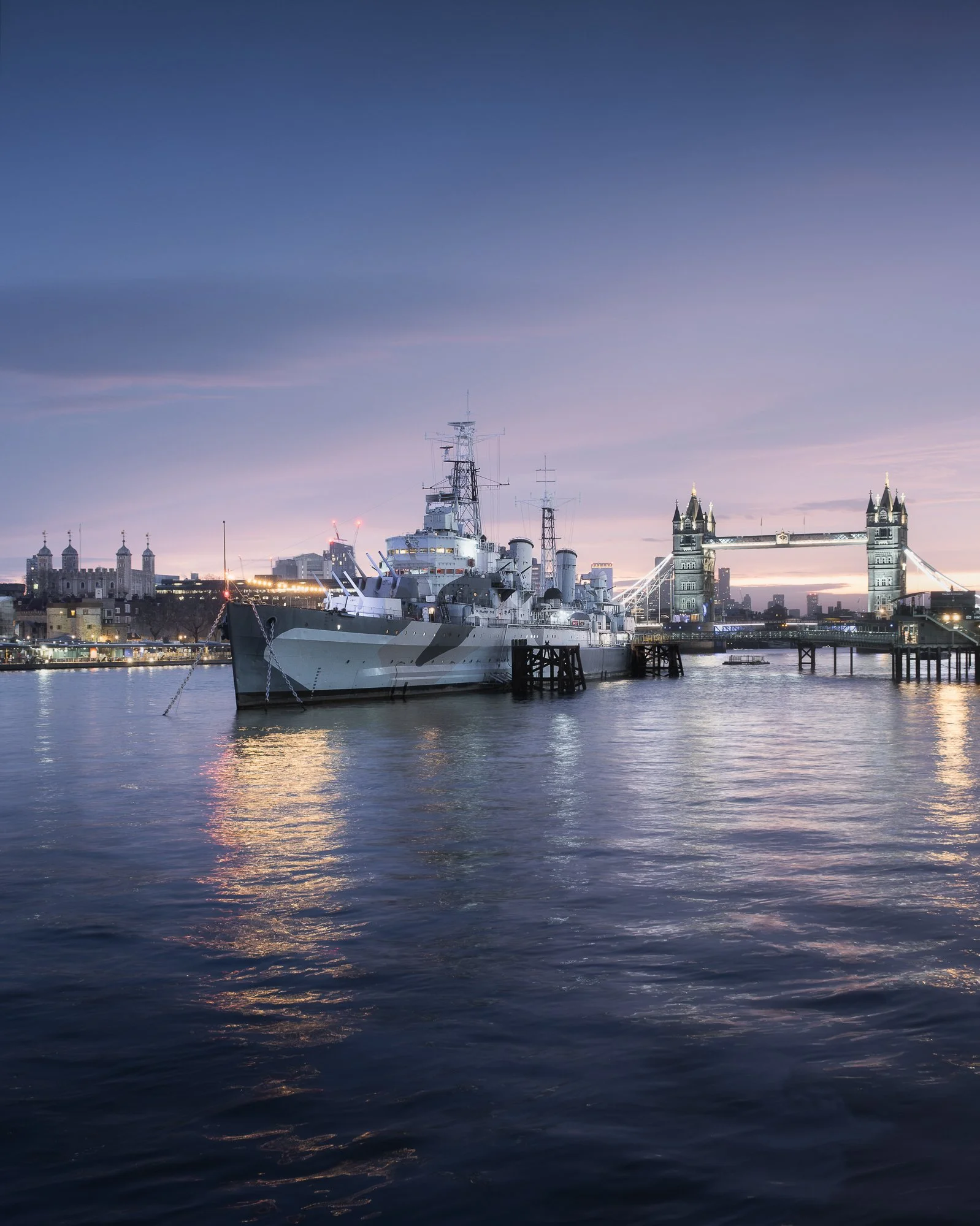
As the sliver of light near the horizon began to glow, subtle pre-dawn colour started to emerge. I stayed just long enough to take a few variations, experimenting with different shutter speeds and focal lengths. Many who read this will know I tend to lean towards a more restrained colour palette, and the soft blues and magentas in the sky provided a fitting backdrop for this familiar London view.

Fujifilm X-T50 | XF16-80mm | 32mm | 30 Seconds | f/16 | ISO125

Fujifilm X-T50 | XF16-80mm | 32mm | 30 Seconds | f/16 | ISO125
Fujifilm X-T50 | XF16-80mm | 21mm | 0.8 Seconds | f/6.4 | ISO400
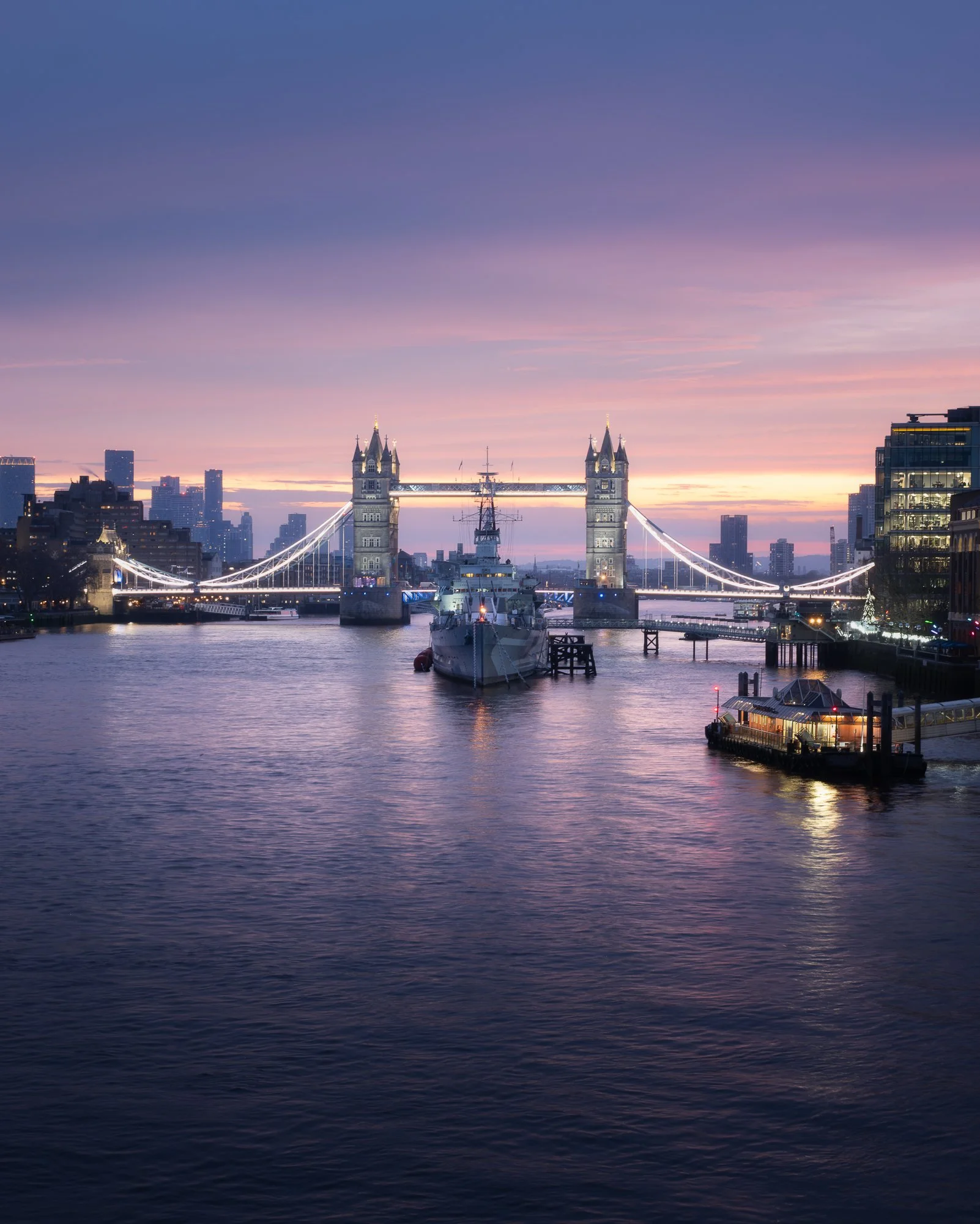
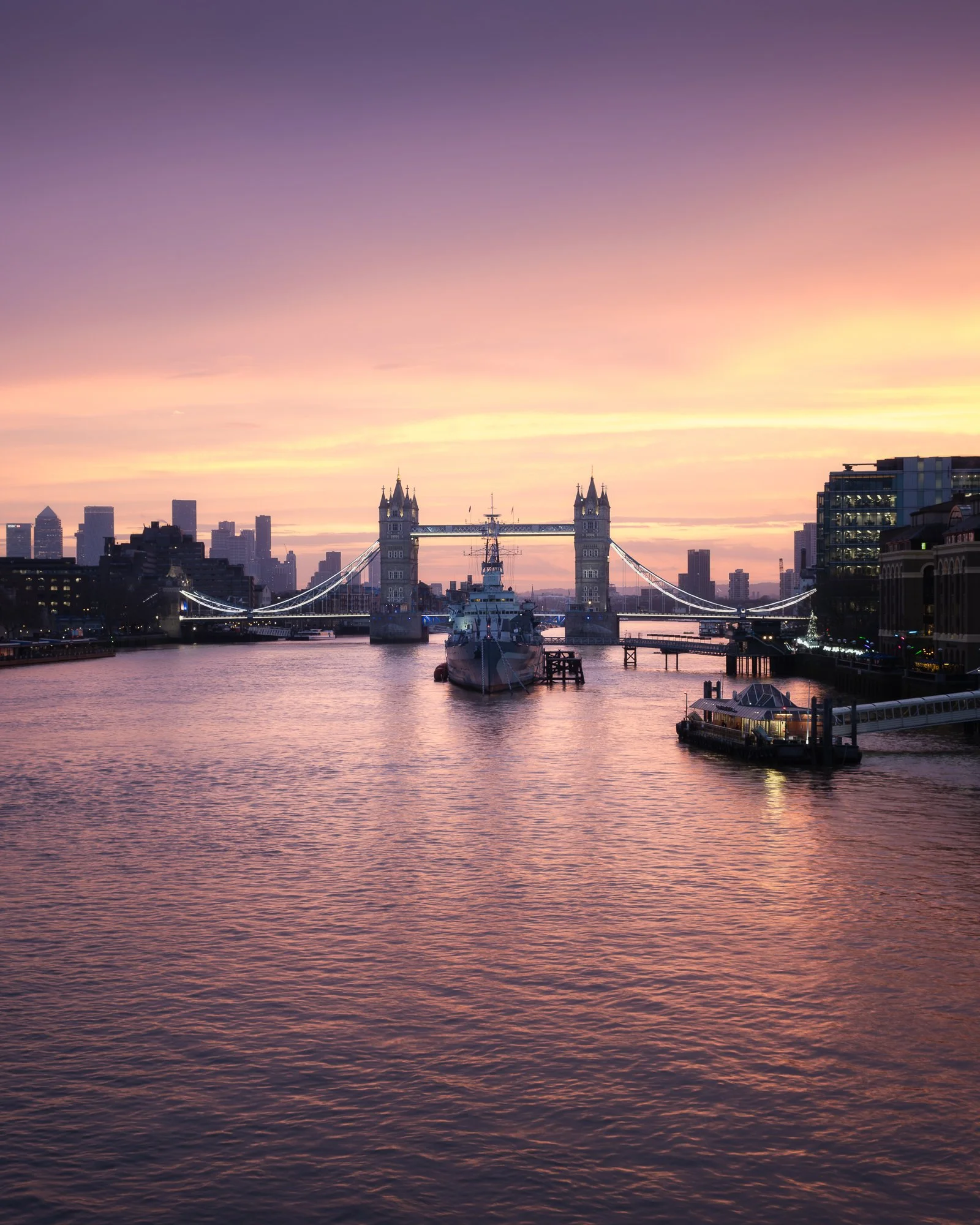
Finishing up near HMS Belfast, I made the short walk up to London Bridge, settling in where the ship lines up centrally with Tower Bridge (as you may have guessed, I have a fondness for symmetry in my cityscape compositions). The sun had not yet risen, but the colour was growing stronger. Once the tripod was set up and the camera mounted, I began capturing the scene as warm tones gradually intensified.
Below is a selection of the photos I took from this spot over the course of thirty minutes.
Fujifilm X-T50 | XF16-80mm | 38mm | 0.8 Seconds | f/8 | ISO125
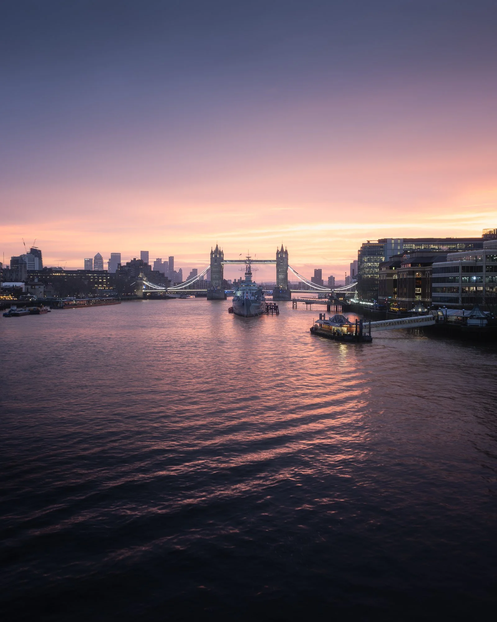
Fujifilm X-T50 | XF16-80mm | 20mm | 1/3rd Second | f/8 | ISO125
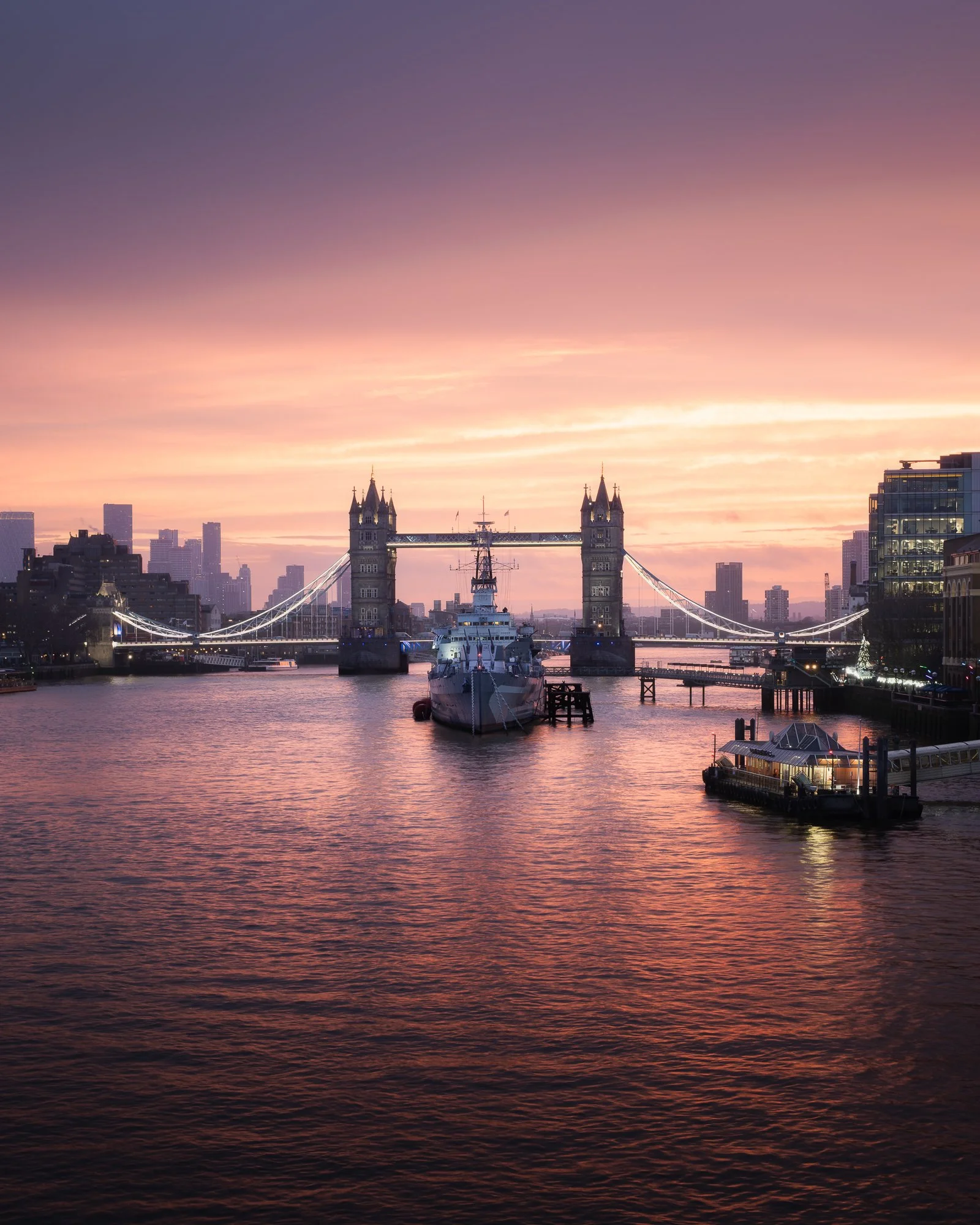
Fujifilm X-T50 | XF16-80mm | 36mm | 1/3rd Second | f/8 | ISO125
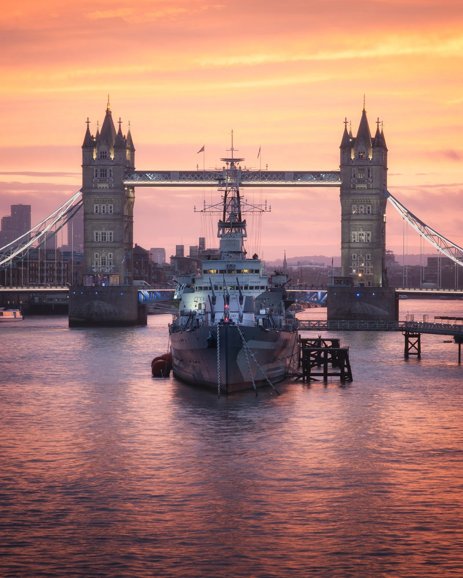
Fujifilm X-T50 | XF16-80mm | 74mm | 1/3rd Second | f/8 | ISO125
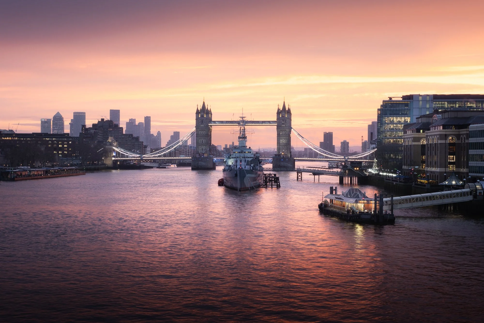
Fujifilm X-T50 | XF16-80mm | 39mm | 1/3rd Second | f/8 | ISO125

Fujifilm X-T50 | XF16-80mm | 16mm | 1/3rd Second | f/8 | ISO125
Fujifilm X-T50 | XF16-80mm | 31mm | 1/3rd Second | f/8 | ISO125
One photo I had never successfully captured was this framed composition of the Shard from beneath London Bridge at sunrise. It works best in winter, when the sun rises in the south-east, and although I’ve photographed from here many times, I had never managed to time it right with the backdrop of sunrise colour. Before the light faded, I crossed to the north side of the river and descended the stairs just in time to take this shot before the colours fully retreated.
That’s what I enjoy about photographing sunrise here: the compositions are so close together that it’s possible to capture several in a matter of minutes without feeling rushed.
As the colour faded, I packed the tripod away and, with my camera in hand, wandered west along the north bank of the Thames towards St Paul’s Cathedral, where I would finish the morning shoot and catch the Tube. The morning light had a soft, subtle quality, and along the way I stopped to take a distant framed view of the Shard. I had discovered this composition a year or two earlier but had only photographed it for my black and white Timeless City project, so I took the opportunity to capture it in colour — however muted the tones were.
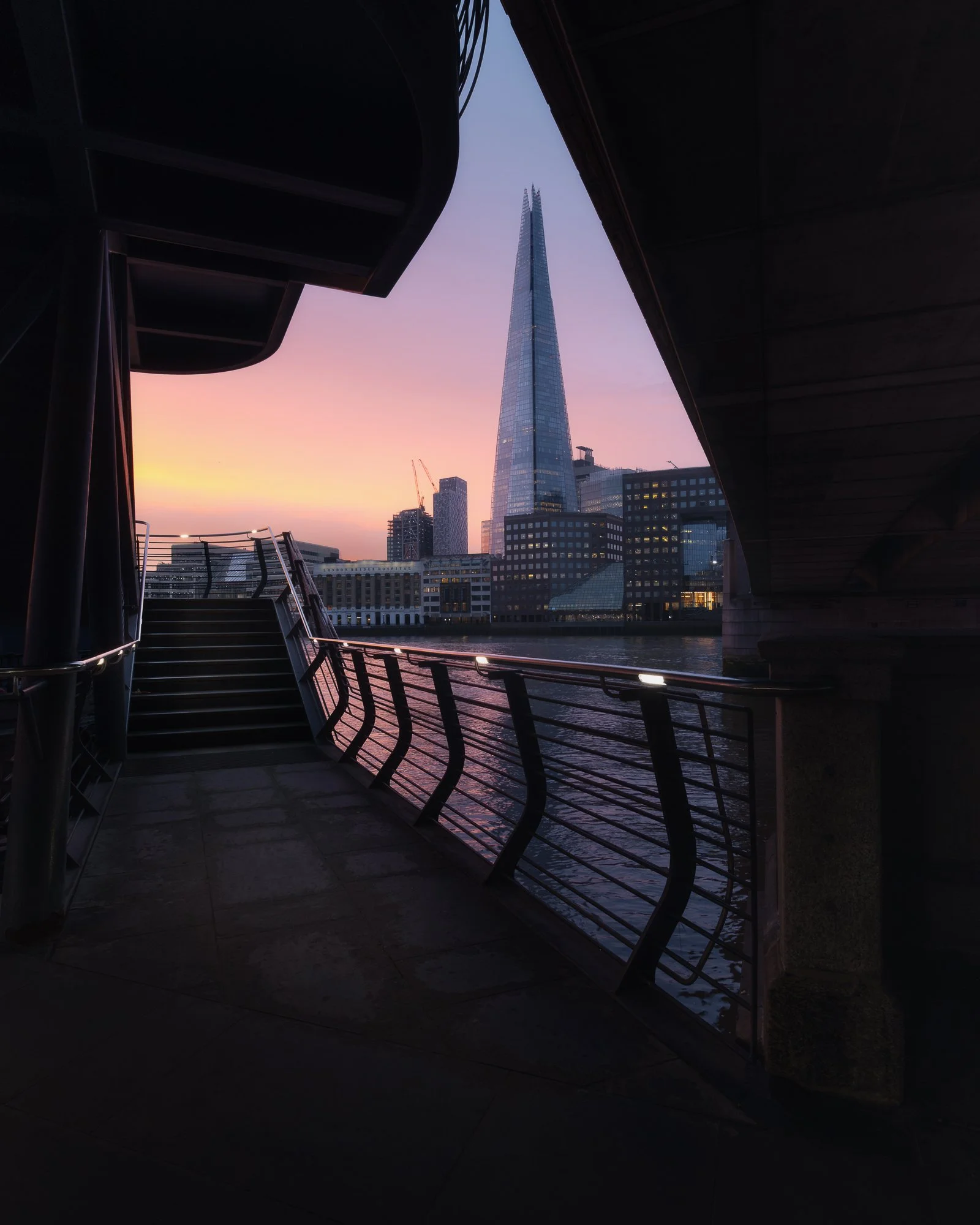
Fujifilm X-T50 | XF10-24mm | 11.5mm | 1/13th Second | f/10 | ISO400
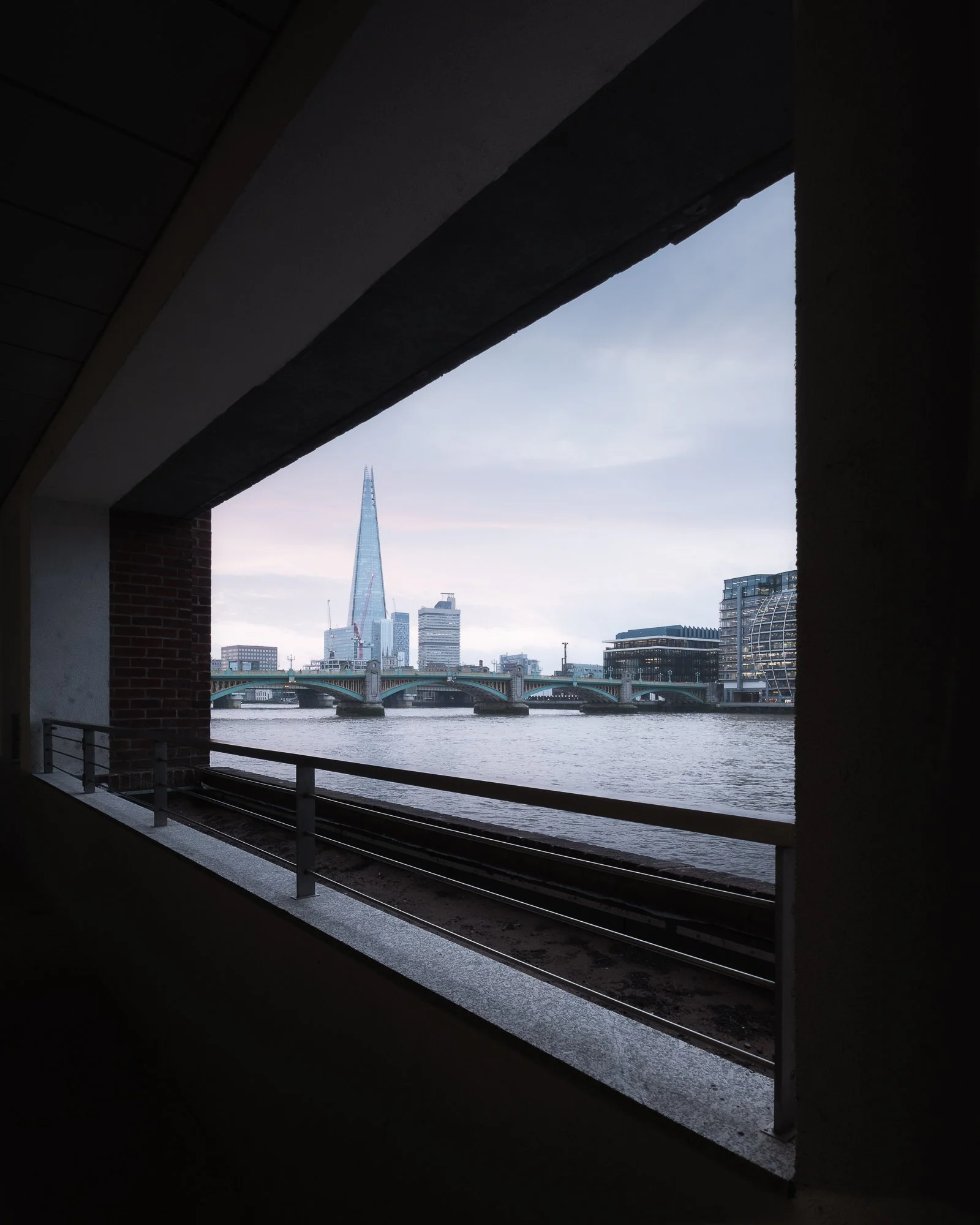
Fujifilm X-T50 | XF10-24mm | 10.5mm | 1/30th Second | f/9 | ISO400
Arriving at St Paul’s, and with it still being early, there weren’t too many people around, so I took the opportunity to photograph the cathedral in the soft, cool ambient light. I couldn’t avoid people entirely, so one technique I use in situations like this to create cityscape images free of other figures is a long exposure. Using the steps as a foreground and an ND filter mounted on my lens, I took a long exposure to blur the movement of people as they passed through the frame.
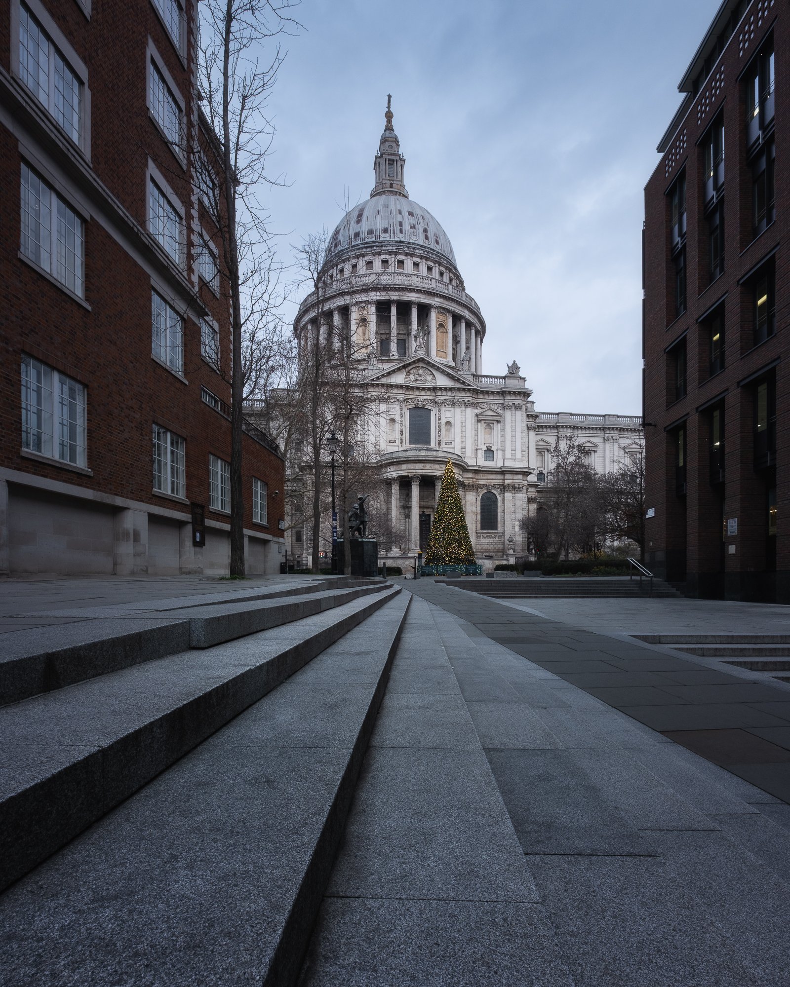
Fujifilm X-T50 | XF10-24mm | 10.5mm | 40 Seconds | f/11 | ISO125
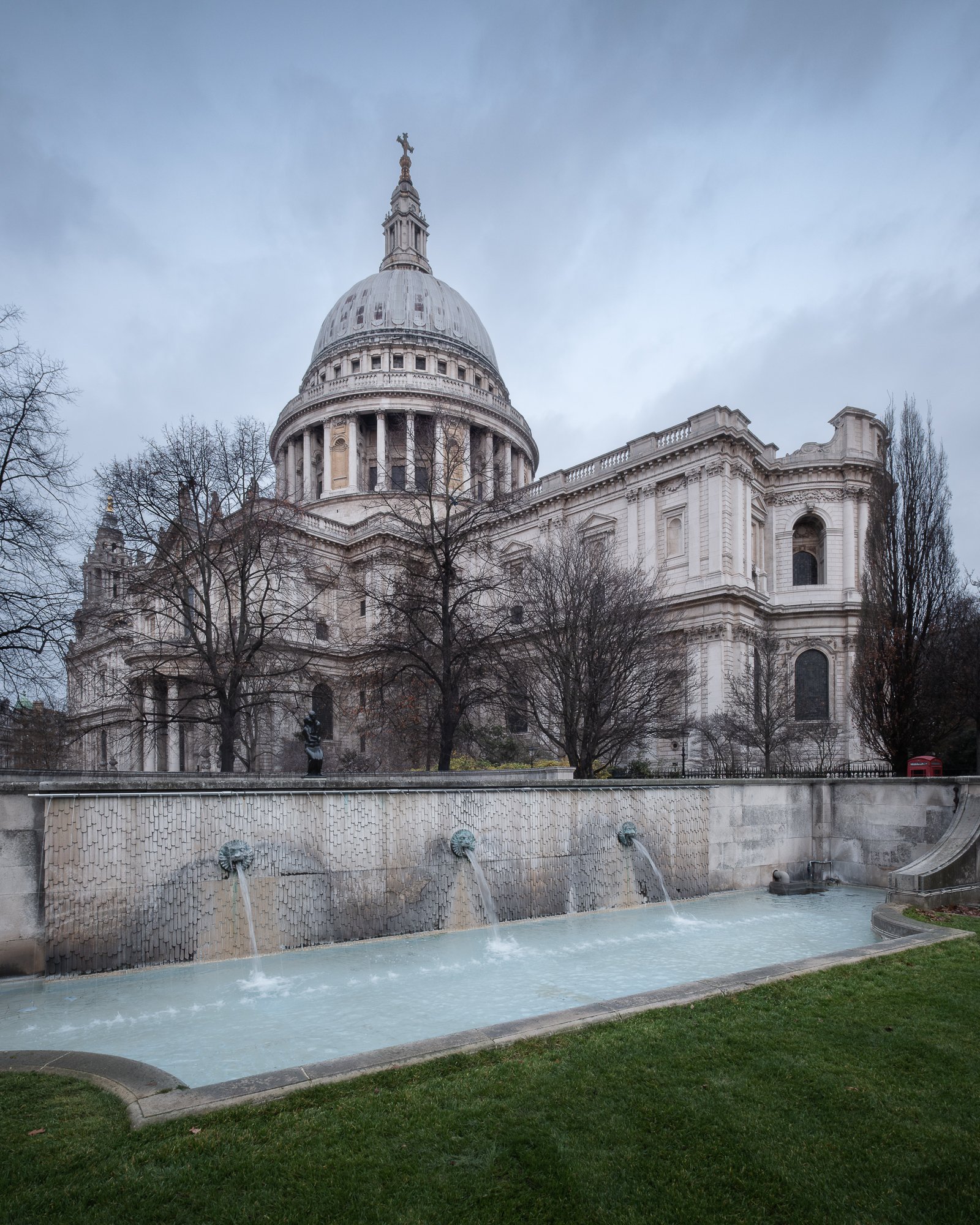
Fujifilm X-T50 | XF10-24mm | 10.5mm | 1/30th Second | f/11 | ISO400
I’m sure — actually, no, I’m certain — there are many who could not imagine anything worse than spending time in a busy city like London. To those people, I would say: before making up your mind, try a sunrise walk in your nearest town or city. The silence and stillness can be intoxicating. For someone like me, who appreciates the history and architecture a city like London offers but doesn’t particularly enjoy the crowds, waking up early and heading out before sunrise is truly the best time of day to experience this great city.
I now have two London city and streetscape projects on the go: my black and white project, Timeless City, and another aligned with the photos in this post, called City Stille. Feel free to check them out and follow along as they progress.
Until next time.
Trevor

Oak by Simon Baxter | My Photo Bookshelf
Oak combines stunning woodland images with insightful essays, revealing the depth of Simon Baxter’s connection to this iconic tree.
To many, woodland photography is one of the trickiest landscape genres to master, and in many ways, I’d probably agree. It demands patience, vision and a genuine passion for the subject to create compelling photographs of the woodland. It’s not simply a case of being in the right place in the right conditions; it’s about an internal moment—being in the right frame of mind to notice something beautiful at a particular point in time, when on any other day you might simply walk past without a second glance.
Simon Baxter’s love for the woodland is infectious, and I have to admit that his photography was a major influence on me when I first began turning my own lens towards the trees back in 2019. I bought his first book, Gathering Time, and more recently Woodland Sanctuary, which accompanied an exhibition he created with Joe Cornish. So, when Simon announced he would be releasing Oak earlier this year, I didn’t hesitate—I pre-ordered a copy straight away.
Synopsis
OAK celebrates a very special species of tree that captured Simon’s heart and imagination as he explored his local countryside in North Yorkshire. Captivated by their beauty and richness of life, Simon has discovered and immersed himself in some of the very best oak woodlands his local area has to offer. OAK includes 38 beautiful images that were all made close to home and haven’t appeared in previous publications.

My thoughts about the book
Oak represents a personal photographic study of a single tree species and opens with a brief but engaging history lesson, taking the reader back to the first forests 56 million years ago, followed by an overview of the life of an oak tree. It’s mind-boggling to consider how long an oak can live and the span of historic events that may have unfolded during the lifetime of just one tree.
The book itself is a high-quality 11 x 8.5-inch softcover zine, printed on 150gsm silk paper. It’s an excellent paper choice, complementing the work beautifully, with enough weight and subtle sheen to bring the images to life without becoming distracting.
After reading about the oak’s origins, the book flows seamlessly into Simon’s photographs—a beautiful collection showcasing this woodland icon in a variety of conditions and across all seasons. Simon chose not to group the images by season, which is a common approach and one that can work well, but I’m glad he decided against it here. As I turned the pages, not knowing what mood, colour or feeling awaited me, the experience felt more varied and engaging. It kept the book fresh and surprising throughout. This approach undoubtedly made the sequencing more challenging, but it was certainly worth the effort in my opinion.
Intertwined among the beautiful photographs of the oak tree is a captivating personal thread, shared through a handful of essays in which Simon reflects on discovering the importance of composition, his own connection with the oak, and how being curious about the subject—rather than prioritising the act of photography itself—can ultimately lead to stronger, more meaningful work.
That last point about creating stronger, more meaningful work struck a particular chord with me. If Simon has taught me anything about making the very best woodland photographs, it’s the importance of looking deeper—studying the subject, noticing its subtle shifts in character and the way it interacts with its surroundings.
This beautifully crafted project is a highlight on my bookshelf, offering inspiration and insight for anyone passionate about woodland photography.
Book Details
Softcover Zine
Size: 11 x 8.5 inches
Pages: 55 pages and photos printed on 150gsm silk paper
Availability at the time of writing: Purchase directly from Simon Baxter’s website https://baxter.photos/shop/oak-zine.
Until next time.
Trevor

My Essential Gear for Timeless City Photography
The equipment I use for Timeless City photography in London, from cameras and lenses to tripods and filters
I’ve spoken before about what motivated me to start my Timeless City project in an article I wrote to introduce the project called Timeless City - An Introduction, but I’ve yet to speak in detail about the gear I use while wandering the historic streets of this city I am so fond of. So, in this post, I want to share the gear I rely on, how I use it, and why it’s become integral to my workflow.
Whether you’re exploring London’s streets for the first time or looking to refine your own cityscape photography, this guide will give you insight into what works for me.

Behind the camera taking a black and white cityscape photo of London
Key Priorities When Choosing My Gear for London Cityscape Photography
There are endless options when it comes to photography gear, and I should say upfront that what works for me might not work for you. I’m not suggesting you rush out and buy the same camera body or lenses I use — this post simply offers a bit of insight into the gear I rely on and why it suits my Timeless City work.
When choosing my camera gear for photographing London’s cityscape, a few key priorities guide my decisions:
1. Compatibility with my landscape setup.
My city and landscape work often overlap, so I prefer gear that’s compatible across both. This gives me backup camera bodies and lenses when needed, and keeps me familiar with the same menu system and controls — no matter what I’m photographing.
2. Lightweight and portable.
I hand-hold the camera for long periods and rarely use a neck strap, so lighter gear makes a huge difference. Compact equipment also helps keep my camera bag manageable, which is essential when walking around London for hours.
3. Minimal and fuss-free.
I like to keep things simple. The less I have to think about switching lenses or adjusting accessories, the more I can focus on composition and atmosphere — the parts of photography I care most about.
The Gear That Helps Me Create My Black and White Cityscape Photos of London

The essential gear I use for taking black and white photos of London
Camera Bodies
The camera I use for taking my black and white London photography is the Fujifilm X-T50
For my black and white London photography, I use the Fujifilm X-T50. Many of you might already know that I’ve been shooting with Fujifilm X Series cameras for nearly 10 years, starting with the X-T10 back in 2016. Over the years, I’ve upgraded a few times, and the X-T50 is now my go-to for city and streetscape work.
Pros:
Small, lightweight body
Same high performance and image quality as the XT5
Familiar menu system and compatible with all of the lenses I own
Cons
No weather sealing
Smaller battery with fewer pictures per charge
Single memory card slot

Fujifilm X-T50 - my trusted body for black and white city photography
The X-T50 has the same processor and stills-making capabilities as the X-T5, which I use for landscape work, but packed into a smaller, lighter body. This makes it perfect for carrying around for hours while roaming London’s streets.
While the X-T50 ticks most of the boxes for my city photography, it does have a few drawbacks compared to its bigger sibling, the X-T5 — though none are deal-breakers. The smaller battery means fewer shots per charge, but that also contributes to a lighter, more portable camera. Similarly, the single memory card slot is a minor compromise. And yes, there’s no weather sealing, but a little damp or drizzly weather is usually fine. On days with heavy rain, I can always switch to the XT5 if needed.

The Fujifilm X-T50 makes a great companion to the XT5
I’ve written a more detailed review of the Fujifilm X-T50 in another post called Why I Chose the Fujifilm X-T50 as a Second Camera. While that article focuses on using the X-T50 as a backup for my landscape work, it’s still a useful read for anyone wanting to learn more about this very capable camera.
Lenses
My Go-To Lenses for Urban Landscapes

My go-to lenses for cityscape photography
From most to least frequent, here are the three lenses I typically reach for when shooting my Timeless City photos, listed in order of how often I use them.
Wide-angle - XF 10-24mm F4 IOS WR
With so many tall buildings and limited space to back away, my XF10-24mm wide-angle lens is by far the lens I use most when photographing London.
For my Timeless City project, part of the look I aim for includes cloudy, moody skies. Having a wide field of view is essential — it allows me to include both the subject and plenty of sky without tilting the camera upward, keeping vertical lines straight and preserving the clean, classic feel of the scene.

Add image exif
Standard Zoom - XF16-80mm F4 IOS WR
I also include the XF16-80mm lens in my kit because, aside from the 10-24mm range covered by my wide-angle lens, it handles about 95% of my remaining focal length needs.
The 80mm reach gives me a little more flexibility compared to the more standard 16-50mm or 18-55mm zooms offered by Fujifilm. That extra reach means I rarely need to switch to a telephoto lens for the kinds of subjects I typically photograph in London.

Add image exif
Telephoto Zoom - XF70-300mm F4-5.6 R LM IOS WR
As I mentioned earlier, one of my priorities when packing my bag is keeping the weight down. While this lens is light for a telephoto with this kind of reach, I only carry it when I know I’ll need it — for example, when photographing distant rooftop views like this one.
I also own the XF50-140mm F2.8, but it’s nearly twice as heavy and doesn’t offer quite the same reach. For my style of city photography, the XF70-300mm is a better, lightweight telephoto option.

Add image exif
Accessories

The accessories I use for a day photographing London
Tripods, Filters, Batteries, and More
Tripod - 3 Legged Thing Corey tripod: Essential for taking long exposures or when the light is low. I’ve used the 3 Legged Thing Corey tripod for a few years now, and although it’s not quite the lightest travel tripod on the market, it’s a great compromise between sturdiness and weight.
Filters - Kase Wolverine magnetic filters: My filter set includes a CPL, 3-stop, 6-stop and a 10-stop filter. These magnetic filters are super quick to use and perfect for taking long exposure cityscape photos to help smooth the water in the River Thames or even blur our people from my photos.
Camera Bag - Manfrotto Street: I bought the Manfrotto Street backpack 5 or 6 years ago, and although I’ve tried a few other bags since, this one has always been my go-to for carrying my lightweight cityscape gear. A small compartment for the camera and lenses, and plenty of space for holding other bits and pieces in the top compartment.
Wrist strap: I don’t typically use a neck strap, but the wrist strap stays in my bag. I might use it when walking with the camera for long periods or if I’m up high and worried about dropping my camera.

Spare batteries: As I mentioned earlier, the X-T50 still uses the smaller NP-W126S batteries. I’m fine with that if it keeps the camera compact and lightweight, but it does mean I usually carry a spare or two on my trips around the city.
Power bank: If I’m spending a full day out with my camera, I often take a portable power bank with me. The one I use, which I picked up from Amazon, can charge my iPhone, AirPods, Apple Watch — and importantly, the camera itself. It features magnetic charging and comes with both USB-C and Lightning cables built in, making it incredibly convenient for a day of city photography.
Spare memory cards: I also carry a robust metal case to store my memory cards. I always keep it with me because I’ve learned the hard way not to forget a card in the camera! Having spares in my bag ensures I’m never caught short during a day of London city photography.
A small, compact Umbrella: If rain is forecast, I make sure to dress appropriately. Since I often photograph for my Timeless City project in overcast conditions, there’s always a chance of getting caught in a shower. I actually enjoy shooting in wet weather — it adds drama and creates interesting reflection opportunities. Having an umbrella with me means I can keep photographing without getting myself or the camera wet.
Lens Hood: I picked up this lens hood for under £10 on eBay a few years ago, and it now stays in my bag for those times when I want to reduce reflections while shooting city or streetscapes through glass windows.
Workflow & Post-Processing
While the gear I choose helps me capture the shots I want in the field, I rely on consistent post-processing to ensure all my Timeless City black and white photos share a cohesive aesthetic. If you’d like to learn more about my workflow, you can check out the blog post I wrote about my post-processing approach below.

How I edit my black and white photos of London
Here’s another of my finished images, capturing a quiet, reflective street in London. The combination of gear and technique allowed me to bring out the timeless, classic aesthetic I strive for in this project.
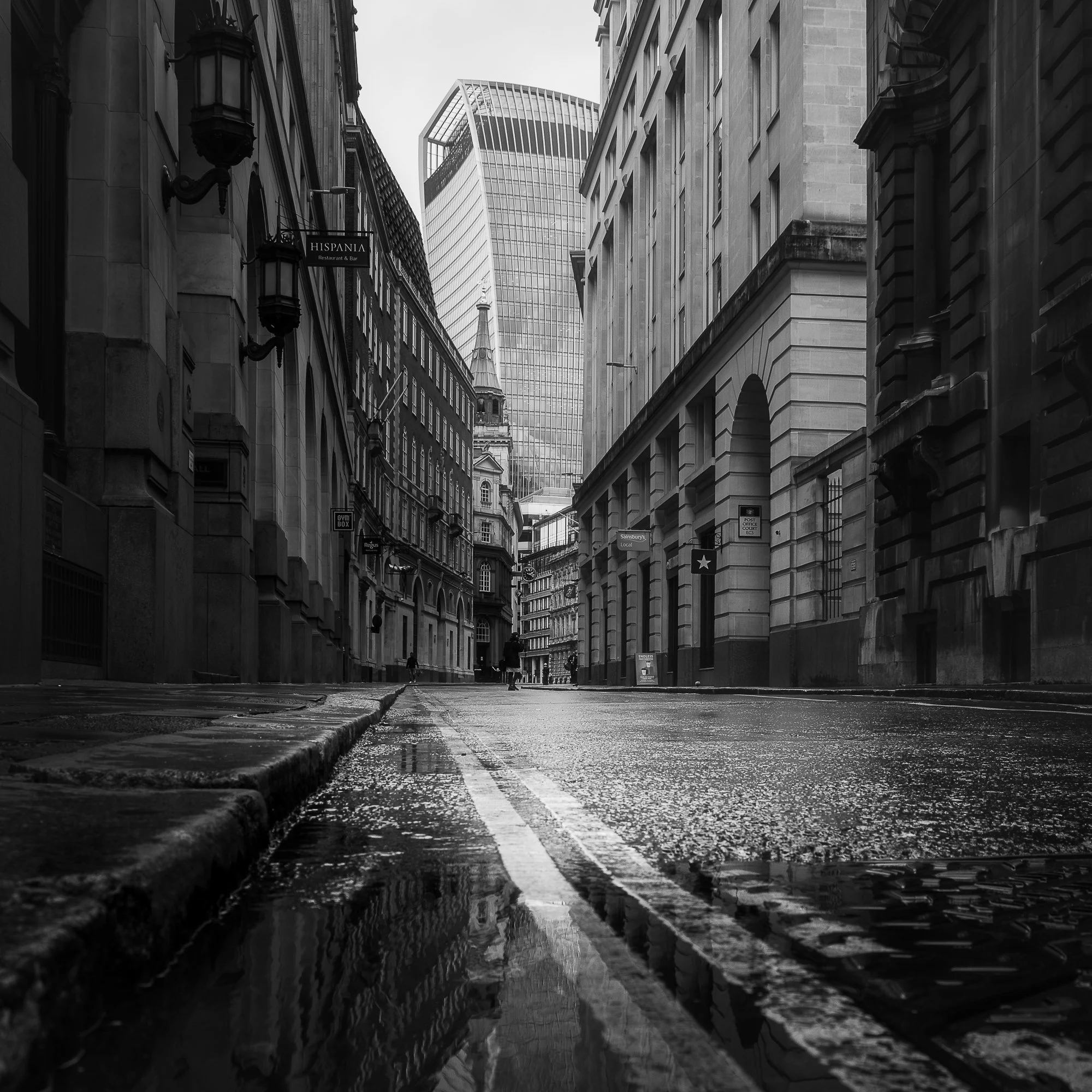
The finished image – a quiet, reflective London street captured in black and white.
The final point I want to mention about the image aesthetic is that all the photos in my Timeless City project use a square crop. From maintaining consistency to enhancing composition, there are several reasons I chose this aspect ratio, which I discuss in more detail in my post titled The Square Photo Format.

Why I use the square crop when taking my Timeless City cityscape photos of London
Ultimately, gear is only part of the story, and as I mentioned at the begining of this post, what works for me will not work for everyone but knowing why i make the choices I do could help others know what to look out for when choosing their own gear for cityscape photography. The combination of cameras, lenses, and accessories I’ve chosen helps me bring my vision for timeless cityscapes to life, allowing me to create images that reflect the look and feeling I am trying to convey.
I’d love to hear what gear you rely on for city photography, or how you capture mood in your own urban explorations. Share your thoughts in the comments below!
Until next time
Trevor

The World’s Top Photographers - Landscape | My Photo Bookshelf
The World’s Top Photographers – Landscape showcases 38 influential photographers and the stories behind their most iconic and timeless landscape images.
If you’ve browsed my Inspiration page, you’ll know I often look to photographers like Joe Cornish, David Ward and Christopher Burkett for guidance and inspiration. So, when I stumbled across The World’s Top Photographers and the Stories Behind their Greatest Images – Landscape, I knew immediately that it was a book I had to own.
Synopsis
Bringing together landscape shots by the world's most acclaimed professionals, this collection features the work of such luminaries as Charlie Waite, Galen Rowell, Yann Arthus-Bertrand and other top photographers. It reveals the stories behind some of their favourite images, with anecdotes, tips and technical details, providing an insight into the creative process behind the world's most stunning landscape photographs. There is also a brief biography of each photographer, including a bibliography of his or her published work.

My thoughts about the book
The full title of this book is The World’s Top Photographers and the Stories Behind their Greatest Images – Landscape. Too long for the title of this blog, perhaps, but it perfectly describes the book’s content. I have a fondness for books like this, where accomplished photographers share not only their images but also the stories behind them. It’s a wonderful resource for both appreciating expertly crafted photography and gaining insight into the process behind the work—often offering lessons along the way.
The book opens with an introduction by the author, Terry Hope, followed by 38 chapters, each dedicated to a single landscape photographer and their work. Each chapter follows a consistent format: a headshot and short introduction offer a glimpse into the photographer’s background, followed by a collection of images accompanied by brief narratives and camera settings.
As you might expect, some of the work resonated with me more than others. Even so, I could appreciate the skill, dedication, and vision each photographer invested in their craft. Landscape photography, after all, is a highly subjective pursuit, as is the selection of contributors to this book. What does “Top” really mean—best of the rest, at the peak of their career, or simply the most recognised? My advice is not to dwell on whether these photographers were truly the “top” back in 2003, but to enjoy the work for what it is and connect with the images that speak to you personally. That’s the approach I took.
Despite being published in 2003, this book feels remarkably timeless. Many of the photographs still hold up against contemporary work created with today’s gear and techniques. Age has not diminished the artistry, and in some ways, it adds a sense of history and context that modern publications often lack.
If you ever find a copy of this book, I would wholeheartedly recommend picking it up. For anyone practising landscape photography today, it’s not just a collection of beautiful images—it’s a window into the dedication, vision, and storytelling that define this craft.
Book Details
Hardcover
Size: 26cm x 26cm
Pages: 176
Availability at the time of writing: Unavailable from the usual UK booksellers. Consider buying a used copy.
Until next time.
Trevor
Summertime Waterfall Photography in the Brecon Beacons
Join me for a 2 day summertime trip to photograph the waterfalls in the beautiful Brecon Beacons National Park
To date, I’ve made quite a few trips to photograph the waterfalls in the Brecon Beacons, and I’ve typically chosen to visit this area of Wales during spring and autumn to take advantage of the vibrant greens or autumnal colours provided by the woodlands at those times. This year, to mix things up a bit, I decided to schedule a visit towards the end of summer. Unlike many landscape photographers, I actually enjoy photographing the summer woodland and relish the challenge of seeking interesting images in a relatively difficult environment. With the fuller foliage helping to keep the bright skies out of my compositions, I set off on the 3–4 hour drive to the Brecon Beacons National Park in South Wales.
It’s worth noting that this summer has been quite a dry one, so I was expecting a light flow of water along the Afon Hepste—and as you can see from the photo of me standing in front of the upper section of Sgwd Isaf Clun-Gwyn, this was indeed the case. Typically, where I’m standing has gushing water falling over it, but with it being so dry I was able to climb down and stand in a spot that’s not often reachable.

Fujifilm XT5 | XF10-24mm | 10mm | 1/6th Second | f/10 | ISO125
Photographing the details
The day I arrived, there was very little cloud and plenty of high-contrast sunlight filtering into the valley, which made it difficult for me to take the style of photo I prefer. So, instead of fighting those specular highlights in the scene, I mounted the telephoto lens and spent the first part of the day zooming in on the falls and photographing smaller, more intimate compositions.

Fujifilm XT5 | XF50-140mm | 111mm | 0.6 Seconds | f/11 | ISO125

Fujifilm XT5 | XF50-140mm | 111mm | 0.6 Seconds | f/11 | ISO125
I spent a fun couple of hours with the telephoto lens, experimenting with different shutter speeds to create various effects in the water. The longer the shutter speed, the silkier the water became, and you can see the different settings I used directly beneath each photo in this article.

Fujifilm XT5 | XF50-140mm | 111mm | 0.6 Seconds | f/14 | ISO125
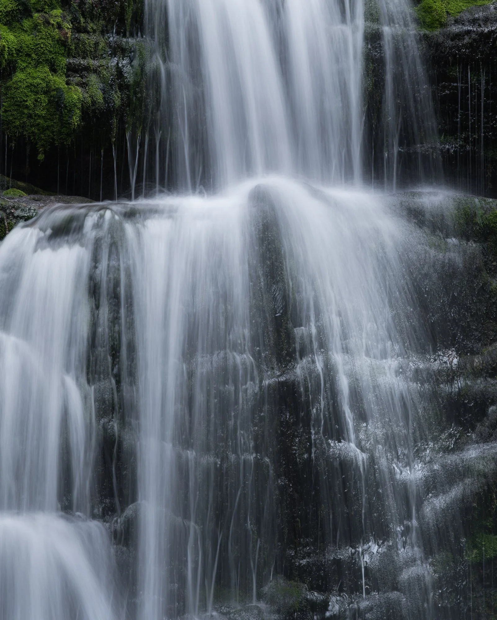
Fujifilm XT5 | XF50-140mm | 140mm | 1/2 Second | f/9 | ISO125

Fujifilm XT5 | XF50-140mm | 111mm | 1 Second | f/14 | ISO125

Fujifilm XT5 | XF50-140mm | 140mm | 1/2 Second | f/9 | ISO125
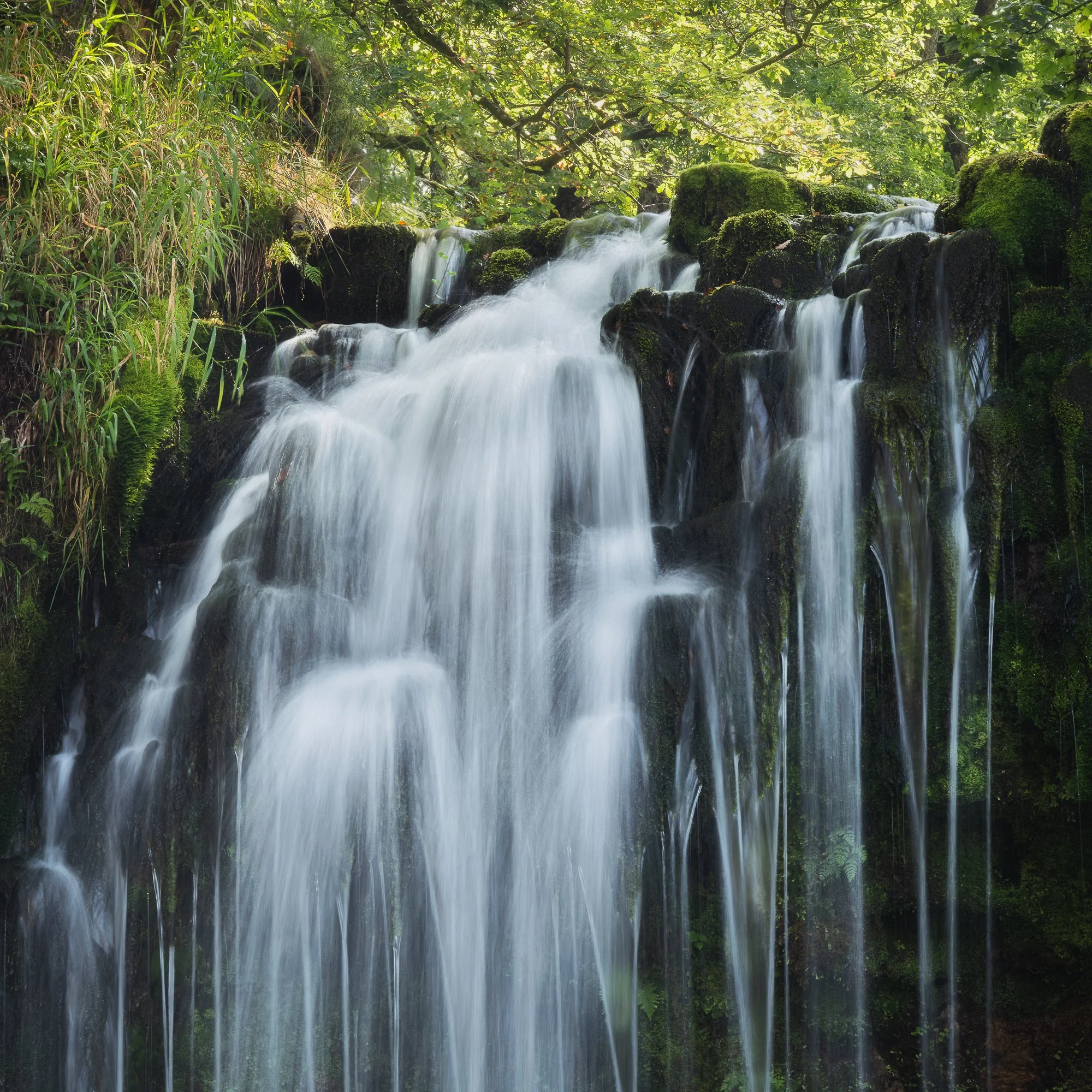
Fujifilm XT5 | XF50-140mm | 124mm | 1/3rd Second | f/11 | ISO125
Photographing Sgwd y Pannwr
When the cloud cover finally increased, it became easier to use a wider focal length and capture the entire waterfall in one frame without contending with harsh light on the landscape. At Sgwd y Pannwr, I climbed down to the plunge pool beneath the main falls to see if I could find something to use as foreground interest. After a few minutes of hunting around and testing different compositions, I settled on a couple of options—using either the rocks on the edge of the water or the green ferns further back. Both of these are posted below.

Fujifilm XT5 | XF10-24mm | 14mm | 1/6th Second | f/14 | ISO125

Fujifilm XT5 | XF50-140mm | 52mm | 1/2 Second | f/9 | ISO125

Fujifilm XT5 | XF10-24mm | 10mm | 1/3rd Second | f/11 | ISO125

Fujifilm XT5 | XF50-140mm | 140mm | 1/2 Second | f/9 | ISO125
Photographing Sgwd Isaf Clun-Gwyn
During the two-day trip, I spent a little time at Sgwd Isaf Clun-Gwyn, my favourite of all the falls along the Four Falls Trail. This waterfall is made up of multiple drops, offering many different photographic opportunities, but what I really like is how, beyond the obvious compositions, it challenges you to work harder to find interesting shots.
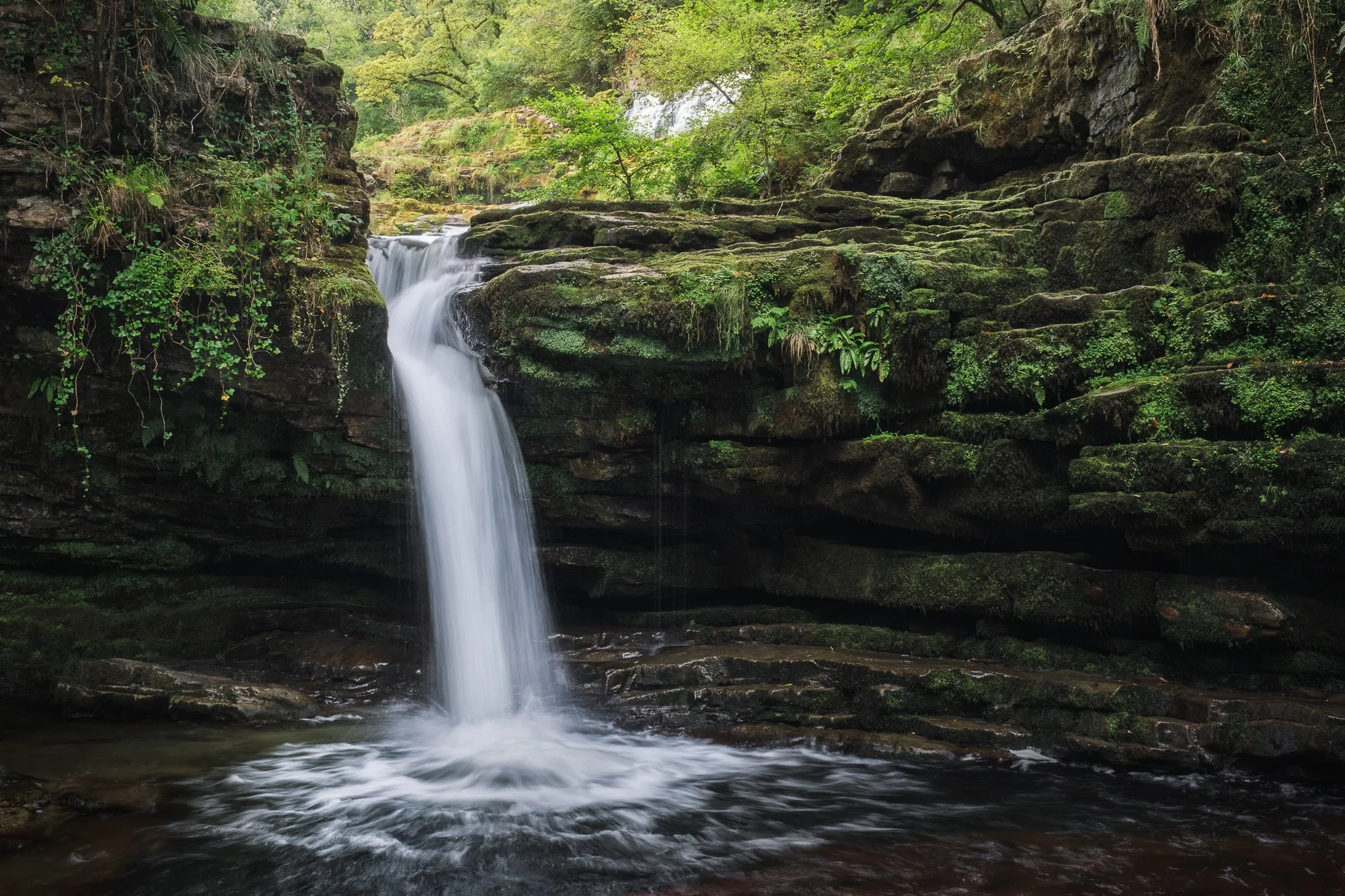
Fujifilm XT5 | XF16-55mm | 25mm | 1/4th Second | f/11 | ISO125

Fujifilm XT5 | XF10-24mm | 17mm | 1/4th Second | f/7.1 | ISO125

Fujifilm XT5 | XF10-24mm | 17mm | 1/6th Second | f/6.4 | ISO125
I’ve mentioned in previous blog posts that this view of Sgwd Isaf Clun-Gwyn is by far my favourite. Reaching it isn’t easy, and I mean that literally—this waterfall really makes you work for your shots. There are a couple of ways to get here: one involves scrambling down an almost vertical rock face (not for the faint-hearted), while the other is an easier stroll along the edge of the river—but only when water levels are low enough. Once you arrive, the effort feels worth it: the trees naturally frame the falls, highlighting the cascading water as it tumbles down the rocks into the plunge pool below.

Fujifilm XT5 | XF10-24mm | 11mm | 1/3rd Second | f/8 | ISO125
Photographing Sgwd Einion Gam
During previous visits to the Brecon Beacons, I’ve hiked along the Elidir Trail a couple of times, but I’ve never managed to reach Sgwd Einion Gam. It’s nicely tucked away upstream from Sgwd Gwladys, but to get there, you need to cross the river a couple of times—and on previous visits, the water levels have been too high.
As I wandered along the Elidir Trail this time, I could see that the water levels were far too low to make interesting waterfall photos, so I decided to hike up the river to Sgwd Einion Gam and use the opportunity to familiarise myself with the route for a future visit when conditions might be a little better.

Fujifilm XT5 | XF16-55mm | 26mm | 40 Seconds | f/9 | ISO125
As I suspected, the waterfall itself was underwhelming due to the lack of water, but it was still an impressive space to experience. Even though I wasn’t expecting much, I managed to capture a couple of long-exposure photos, making the most of the time I had there.
The image below is the result of being drawn to how the reflective light was falling on the rockface, making it appear almost metallic to the eye. With the help of an ND filter, I made a long exposure, smoothing out the water, leaving just a few trails of fallen leaves and enabling the texture of the rocks to stand out in the composition.
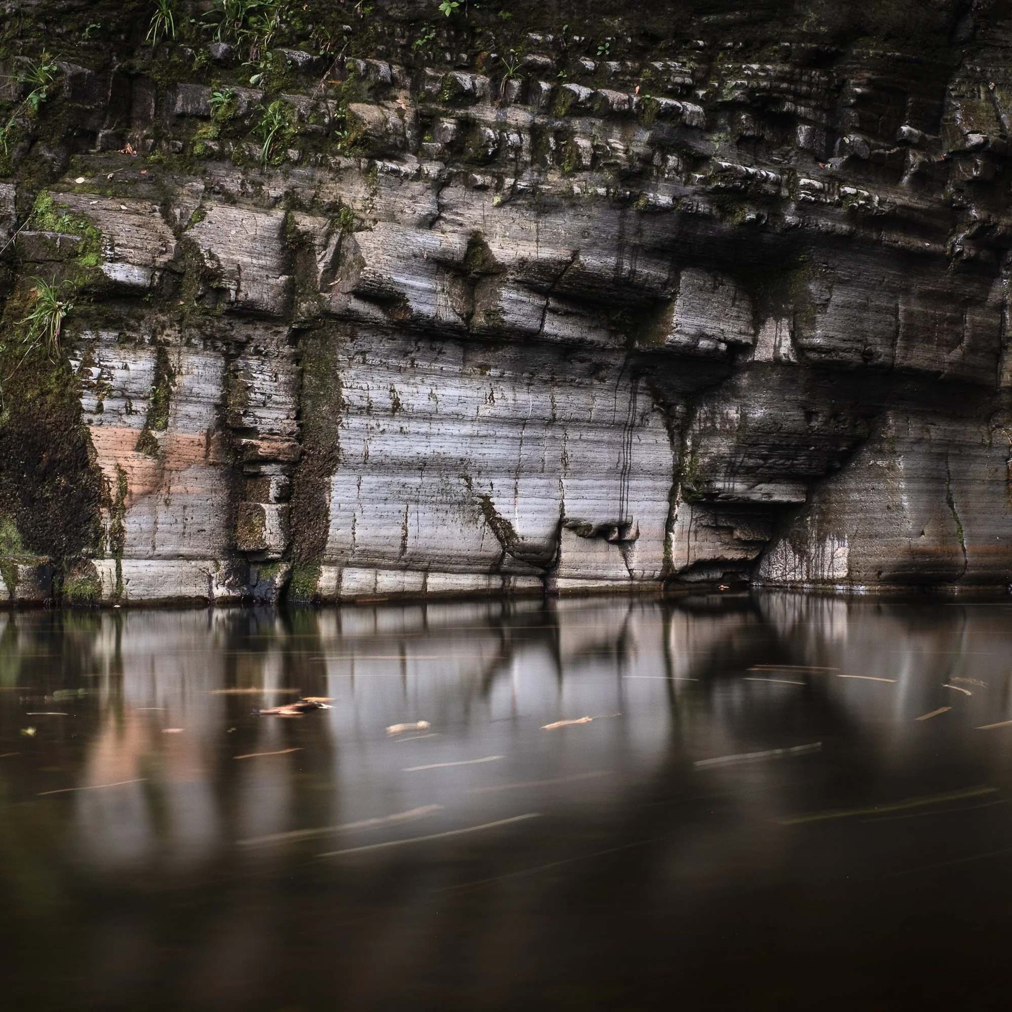
Fujifilm XT5 | XF16-55mm | 39mm | 25 Seconds | f/9 | ISO125
Photographing Sgwd Yr Eira
No trip to the Four Falls trail would be complete without photographing the famous Sgwd Yr Eira waterfall. Due to its popularity along the trail, I always make a point to arrive early in the morning, as that’s the only time you can take photos free of other people, so the next morning, I woke up and headed straight here.
Having spent some time here the day before photographing the details with my telephoto lens, I wanted to take a few wider compositions to feature the summer foliage, and by getting my camera lower to the ground, I could use the rocks and small cascades to add some foreground interest.

Fujifilm XT5 | XF10-24mm | 17mm | 0.6 Seconds | f/13 | ISO125

Fujifilm XT5 | XF10-24mm | 10mm | 1/4th Second | f/6.4 | ISO125
Shortly after taking the photos of Sgwd Yr Eira above, I noticed an impressive fern on the other side of the water. I stopped what I was doing, mounted my telephoto lens to gain a little more reach, and composed the shot so the fern would fill the entire frame. I think it’s important to keep an open mind while out in the field, as I’ve certainly been guilty many times of focusing on a single subject or composition and potentially missing out on others.

Fujifilm XT5 | XF50-140mm | 129mm | 1/4th Second | f/9 | ISO125
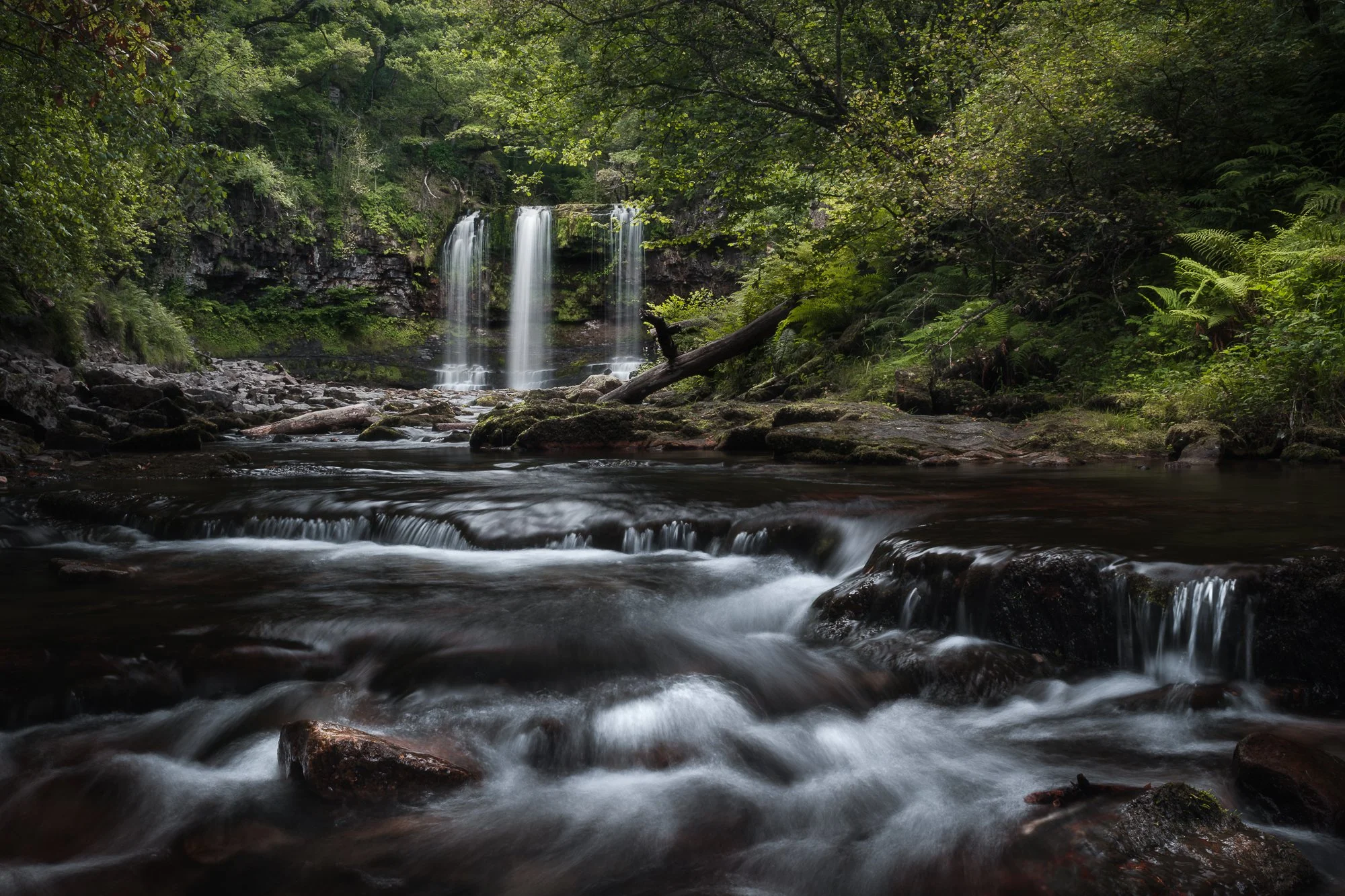
Fujifilm XT5 | XF16-55mm | 23mm | 0.8 Seconds | f/16 | ISO125
A quick stop at Blaen-y-glyn Falls
Before heading home, I made one last stop at the Blaen-y-glyn Falls. My expectations for waterfall photography were quite low, as the flow was just as light here as it had been along the Elidir Trail. Still, I made a point of visiting, wanting to explore and see how the place looked in summer. I did get my camera out a couple of times and took a few scouting shots, but only one made the cut to be featured below.
This composition is similar to one I photographed on a previous visit, though back then the greens were more subdued and there was more water falling onto the log wedged solidly at the base of the waterfall. I like the subtlety of the water as it falls, framed by a wall of green moss and plant life, and I find it interesting how the fallen branch has come to rest exactly where the water lands, sticking out from the wall at an almost perfect 90-degree angle. Using a similar composition to the one I captured the previous year, I took this final photo of the trip.
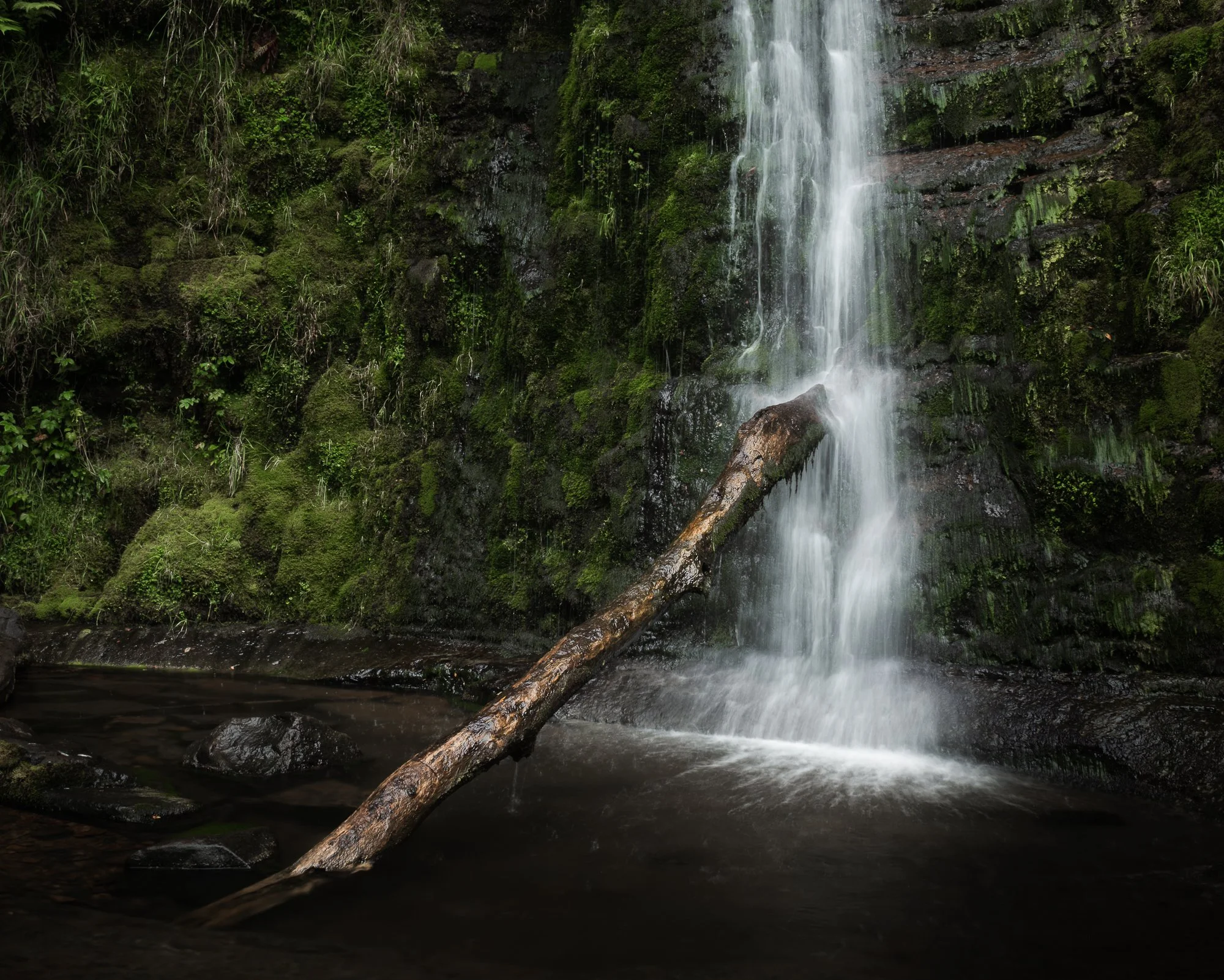
Fujifilm XT5 | XF16-55mm | 25mm | 0.4 Seconds | f/14 | ISO125
That’s it for another trip to this beautiful location in the Brecon Beacons, Wales. If you want to read about some of my previous trips photographing the falls in the spring and autumn months, check out the links below.
Until next time,
Trevor


Examples: The Making of 40 Photographs by Ansel Adams | My Photo Bookshelf
Examples: The Making of 40 Photographs reveals the stories, techniques, and creative vision behind Ansel Adams’s most iconic images.
To most landscape photographers — or photographers in general — Ansel Adams needs no introduction. Considered by many to be one of the greats and an early pioneer of the craft, he was, I must admit, someone I knew very little about before owning this book. I had watched a few videos and heard plenty of discussion about him and his photography, but to truly understand his work, I needed to explore it more closely. After reviewing the options available, I felt The Making of 40 Photographs was the best choice to do so.
Synopsis
"How did you make this photograph?" This is the question that Ansel Adams was asked repeatedly during his lifetime. In this book, Adams shares the circumstances surrounding the making of many of his most celebrated photographs. Each of the 40 photographs are superbly reproduced in duotone, is accompanied by an entertaining and informative narrative that combines reminscence of people and places with precise recall of technical details and aesthetics considerations.
The specific technical information on camera and lens, filters, exposure times, developing, and printing provided in each example illustrates his approach and methods and will assist amateur and professional photographers alike in learning the craft. Through this case study approach, Adams' philosophy of craft and creativity unfolds: his credos of visualisation, image management, and the Zone System are demonstrated: and the colour story of a lifetime devoted to photography is revealed.

My thoughts about the book
The premise of this book — and the reason I bought it — is that it showcases forty photographs taken by Ansel Adams throughout his career, each accompanied by his own words describing the story behind the image. He shares the physical experience of making the photograph, why and how it was taken, and, of course, the technical details such as the camera, film, and settings used.
The book opens with an introduction by Adams, followed by forty chapters, each featuring one image and a short essay. Some may assume the book focuses solely on landscapes, and although that genre does dominate, I was pleasantly surprised by the variety of work included — from still life to portraiture. It reminded me how little I actually knew about the full range of his photography. Some images resonated with me more than others — particularly those classic vistas or more intimate scenes — but that didn’t detract from the enjoyment of reading the stories behind each one.
Being Ansel, he never shied away from discussing the technical side of his work. That’s probably the part I found hardest to connect with, as I’ve never photographed using large-format film cameras. At times he delves into great technical depth, and I found myself skimming through those sections. I’m far more interested in the personal stories — and thankfully, there’s plenty of that to keep the reader engaged.
As I mentioned above, before reading this book, I knew an embarrassingly small amount about Ansel Adams, and buying it was my attempt to change that. If, like me, you’re curious to look deeper into his work, Examples: The Making of 40 Photographs is a great introduction to Ansel Adams’s photography and a worthy addition to any bookshelf.
Book Details
Softcover
Size: 231mm x 266mm
Pages: 192
Availability at the time of writing: Although I purchased a used copy, this book is still in print. Available from Amazon.

Photographing the Snowdonia Mountains by Nick Livesey | My Photo Bookshelf
Photographing the Snowdonia Mountains. A comprehensive guide combining striking photography with practical information for those looking to explore this inspiring landscape.
Before my first dedicated trip to photograph Snowdonia a few years ago, I was searching for information and inspiration. That’s when I came across Nick Livesey’s book, Photographing the Snowdonia Mountains, published by Fotovue, a book dedicated to landscape photography, packed with location tips, tricks, practical information, and inspiration.
Synopsis
Snowdonia is one of the most accessible mountain areas in the UK and photographer Nick Livesey knows it better than most. Having lived in the heart of Snowdonia for the last five years, Nick walks these hills and mountains with his camera most days.
In Photographing The Snowdonia Mountains, Nick shares his knowledge guiding us around the best mountain walks, short walks and roadside locations for mountain photography.

My thoughts about the book
Like most of Fotovue’s titles, Photographing the Snowdonia Mountains is as much a showcase of superb landscape photography as it is a location guide, and that’s precisely why I chose it over other books on offer. When researching a location, I tend to look for visual inspiration, not to place my tripod in the same holes as Nick, but to get a sense of what might be possible. I want to know whether that long slog up a particular mountain could reward me with the kind of photographic opportunity I’m after.
The book begins with some acknowledgements, followed by an engaging foreword by British mountaineer Sir Chris Bonington and an introduction by Nick himself.
Alongside the photography, Nick has assembled a wealth of information to help anyone new to hiking around Snowdonia get off to the best possible start. Even before he gets into the locations, he covers important topics such as:
An overview of the book
The equipment he uses
Weather, climate and seasonal advice
Sunrise and sunset information
Places to stay, eat and drink
Clothing and gear for surviving harsh mountain conditions
Safety and camping tips
Planning your own trip
A few pointers on the Welsh language
That section alone feels like a book’s worth of content.
From there, the main body of the book contains 15 chapters, each dedicated to a specific mountain walk. Every chapter provides clear, detailed information — written directions, route maps, viewpoints, elevation, accessibility, parking, and the best time to visit. Alongside all that practical guidance, Nick includes some beautiful photographs from the viewpoints described, helping the reader to visualise what awaits them.
For those without the desire or ability to hike up the mountains, there’s also a thoughtful section at the end dedicated to photographic locations accessible from the roadside or within a short walk from a car park. These easier spots are presented with the same level of care and detail as the main routes, making the book useful to any landscape photographer visiting Snowdonia.
Ultimately, this book serves as both an inspiring collection of work by an accomplished landscape photographer and a reliable guide for anyone planning to explore the region. Even now, before setting off on any trip to Snowdonia, I often find myself flicking through its pages for inspiration — which, I think, speaks volumes about its value. For that reason, I’d happily recommend it to anyone planning their first (or 50th!) photographic adventure in Snowdonia.
Book Details
Softcover
Size: 189mm x 246mm
Pages: 288
Availability at the time of writing: New copies are out of stock, but there are plenty of used copies available at the time of writing.
Until next time.
Trevor

I Can’t See the Wood for the Trees by Eddie Hyde | My Photo Bookshelf
A woodland photography book by Eddie Hyde, featuring beautiful images of the Surrey woodland
Eddie Hyde is a photographer based in Surrey, and UK. In 2024, I attended an exhibition he co-hosted with Vanda Ralevska, showcasing some of their beautiful landscape photography. While there, I picked up this self-published photobook by Eddie titled I Can’t See the Wood for the Trees, which features a selection of his beautiful woodland images.
Author’s Synopsis
Just to note, I couldn’t find this book on Eddie Hyde’s website, so this is an extract from the book’s introduction.
I have always had a strong affinity for nature and woodland. The range of sensations within a wood brings a sense of wonder, comfort and peace. In Japan, they call it Shinrin-Yoku: taking in the forest atmosphere or “forest bathing”.
Living in Surrey, which has the most trees of any county in England, I am in easy reach of many of these woodland areas and visit them almost daily, most often in the early morning or late afternoon when the light is at its best. For me, being amongst the trees is calming, invigorating and therapeutic. I love to search for order in the chaos.
In this booklet, I hope to share with you this experience and to show the beauty to be found in my local woods.
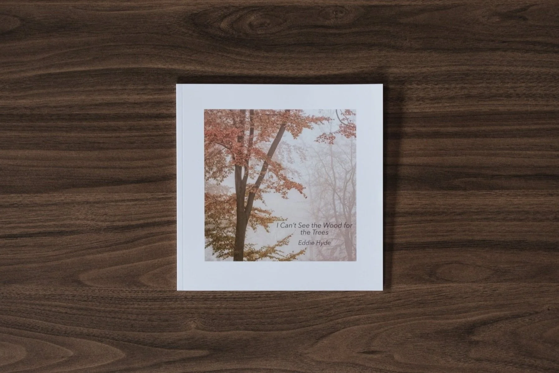
My thoughts about the book
This modestly sized softback book opens with an introduction by Eddie Hyde, in which he explains his interest in landscape photography and his connection to woodland, particularly in Surrey. When you turn the page, the first woodland photograph appears, setting the focus for the rest of the book.
There’s something deeply satisfying about focused photobooks that explore a single subject or theme in depth. Showcasing the beauty of the Surrey woodland (home to more trees than any other county in England), these smaller, carefully crafted monographs allow the photographer to immerse themselves fully in their subject. I especially appreciate this approach because it gives the author space to reveal what truly draws them to the subject, capturing nuances and moods that broader collections might overlook. For me, such books offer a richer, more intimate connection to the place and the artist’s vision.
Regarding the design, I appreciated the sequencing, which helps the eye flow effortlessly between the pages, and the use of a square crop on each page suits the individual compositions well, giving the book a consistent and balanced look. The images, mostly taken during autumn and winter, are stunning. While including spring and summer scenes might have added a little more variety, leaving those seasons out perhaps opens the possibility for a future volume.
I’m not entirely sure of the paper specification, but each page has a pleasing weight and appears to use a soft-sheen, lustre-like finish, which I feel suits the mood of the work perfectly.
I’m pleased to have discovered Eddie’s book while visiting the exhibition. If you’d like to own a copy, I recommend contacting Eddie via his website to check availability.
Book Details
Soft cover book
Size: 21cm x 21cm
Pages: 46 pages
Availability at the time of writing: I looked on the author’s website to find out more about this book’s availability, but it was not mentioned. I recommend contacting Eddie via his website to check availability. https://eddiehydephotography.zenfolio.com
Until next time.
Trevor
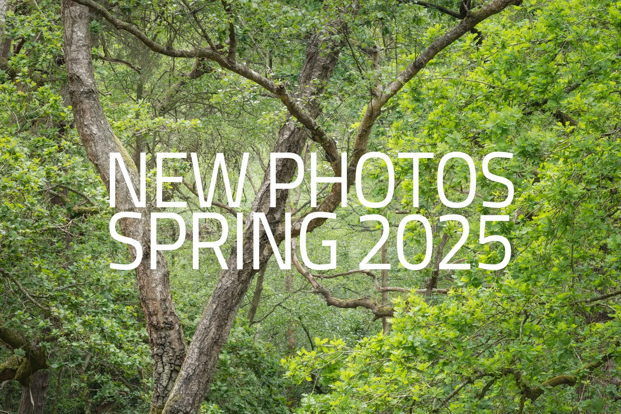
New Photos | Spring 2025
A collection of photos taken during Spring 2025.
One reason I like to write these quarterly retrospectives is that they give me a chance to look back at the photos I’ve taken and reflect on them — and sometimes even relive those moments. Not every picture is what I’d call portfolio-worthy, but if I share it here, it’s because it connects with me in some way. Without these seasonal posts, many of these photos would at best have a brief moment on social media, or at worst, never see the light of day at all.
Welcome to the sixth post in my “New Photos” series, this time featuring some of the images I took in spring 2025. Alongside a couple of short trips to the Welsh mountains and the Cornish coast, I spent a lot of time working on my woodland photography. I wanted to teach myself to look deeper, building interesting compositions from the shapes and patterns in and around the canopy, rather than just taking tree portraits or relying on fog to create atmosphere and depth.
March to May 2025 - Spring 2025 collection.
Before getting to my woodland images, I thought I’d start with my early spring visit to Eryri (Snowdonia). Because of scheduling challenges, I ended up wandering these majestic mountains in that seasonal no-man’s land where it’s too warm for winter conditions but still too early for any real spring colour. Even so, I made the most of it and had a great time exploring the landscape, hiking the hills, and photographing this stunning national park.
I’ve shared just a handful of the photos I took here, but if you’d like to see more from this trip, I put together a dedicated post covering my time there. You can find it below.
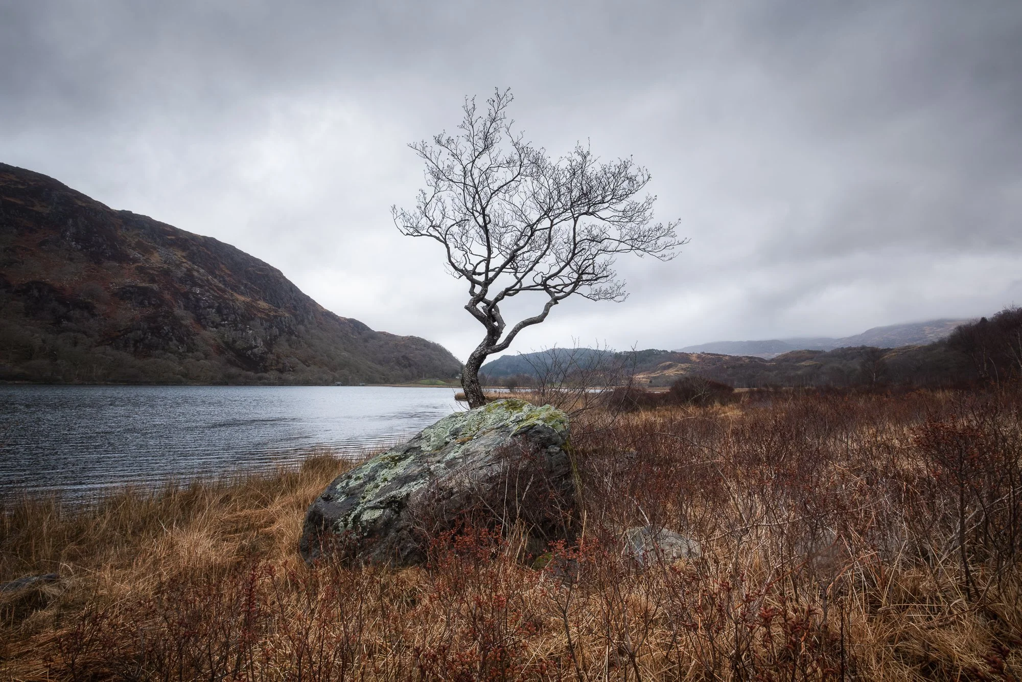
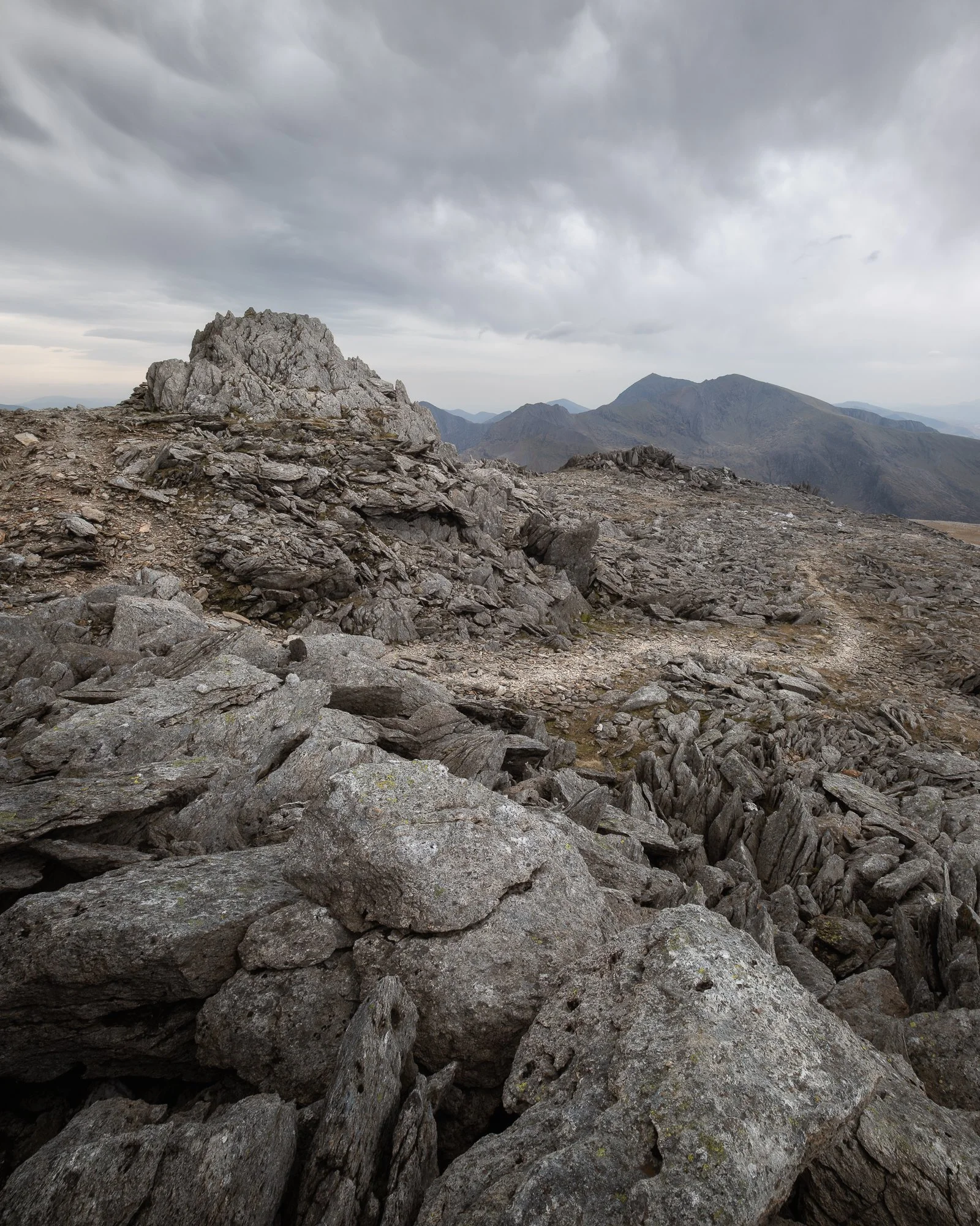


Photographing the woodland in Spring
As I mentioned earlier, alongside looking for more traditional woodland scenes, I also made a point to seek out interesting shapes and textures in and around the trees, especially up in the canopy. The forest I spend most of my time photographing is home to both older, gnarled trees and tall Scots pines with their straight trunks, so it offers a good variety of subjects and compositions. The tough part, as always with woodland photography, is actually finding them.
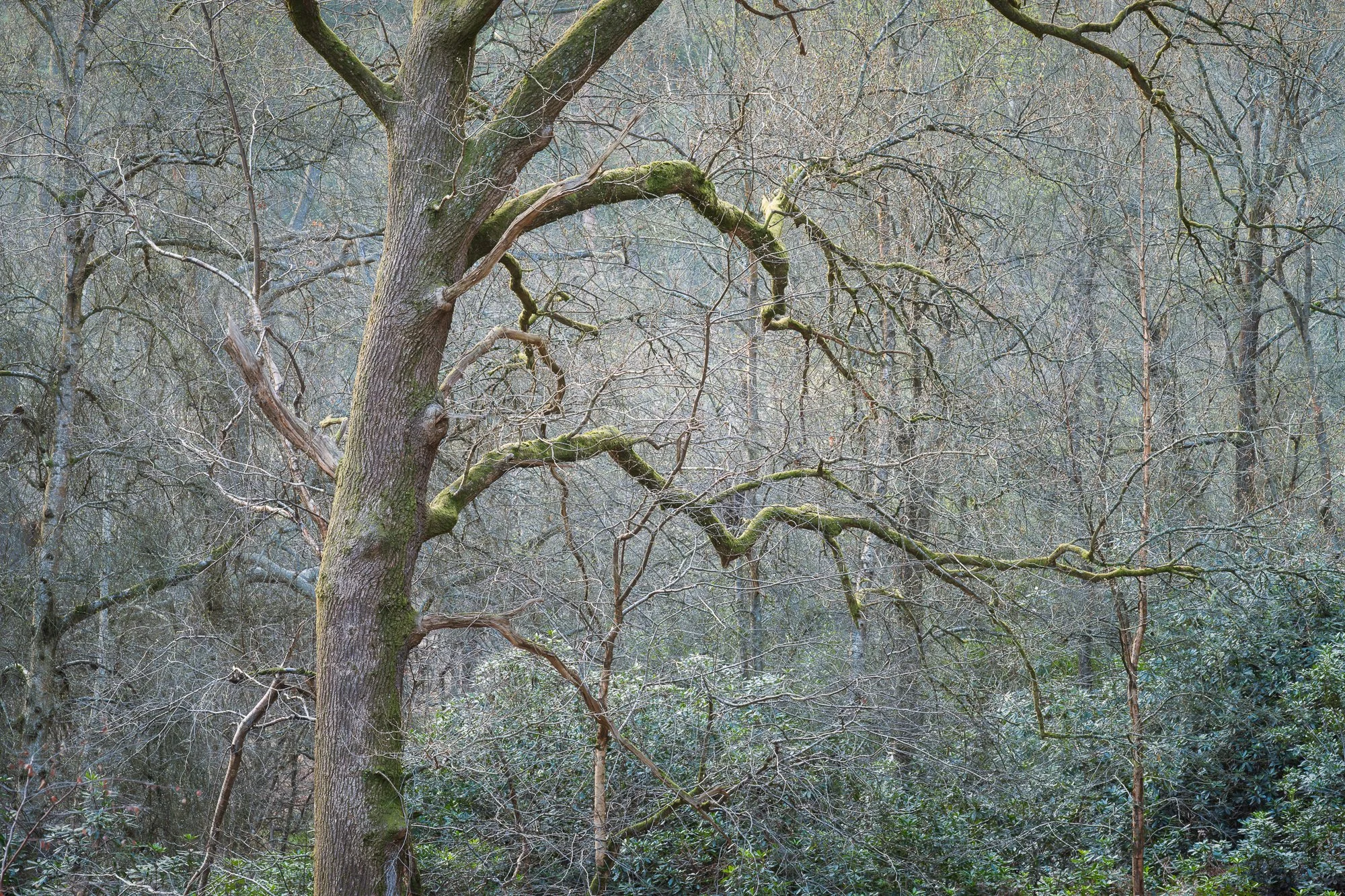


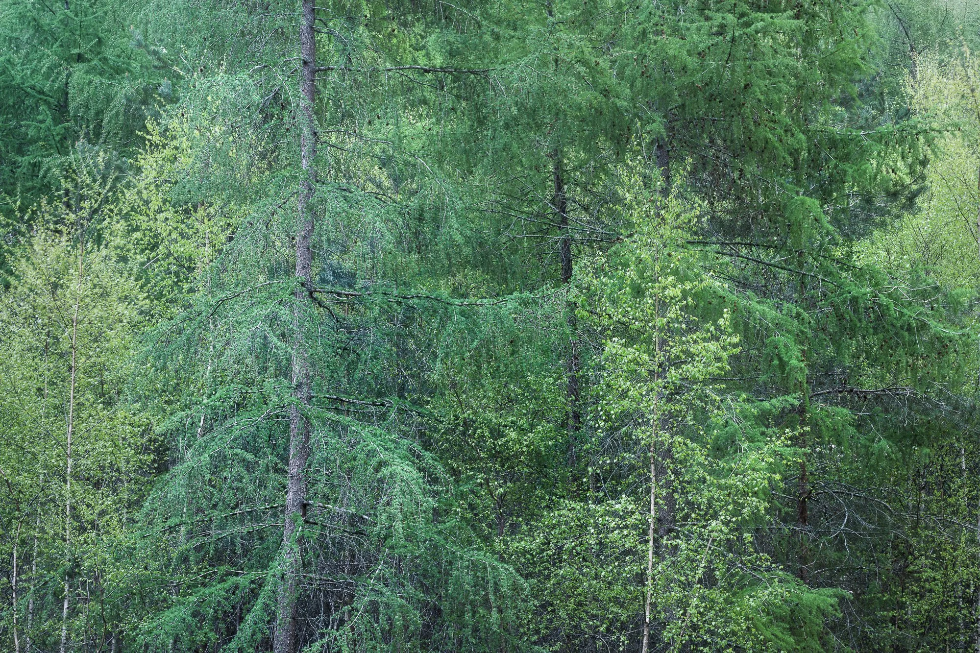

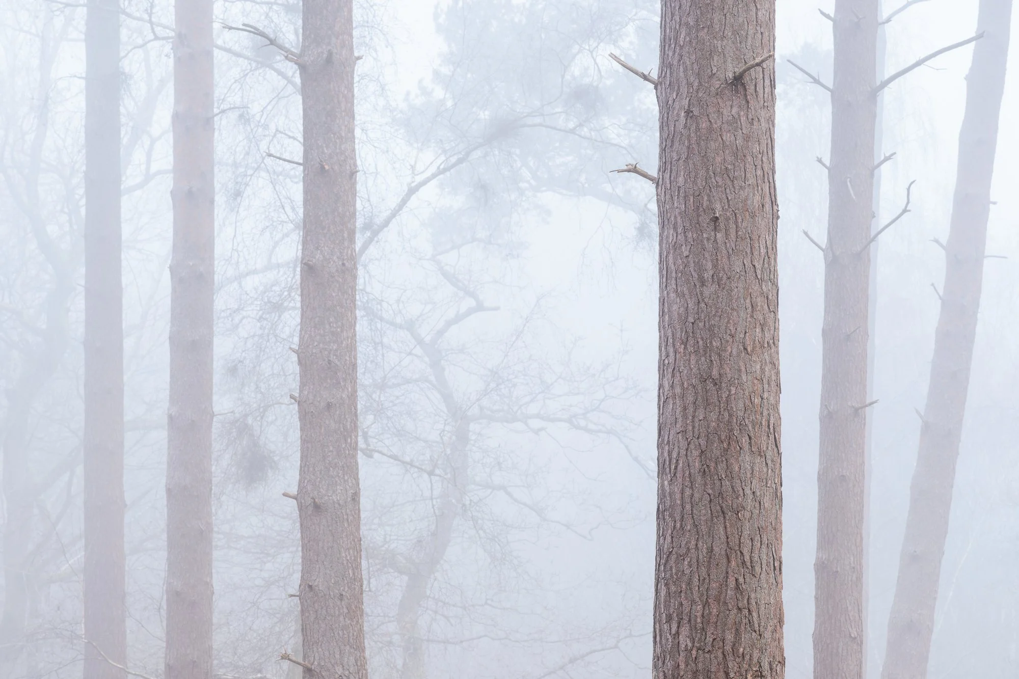
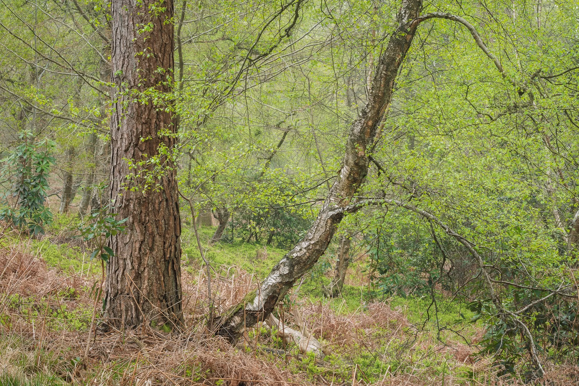


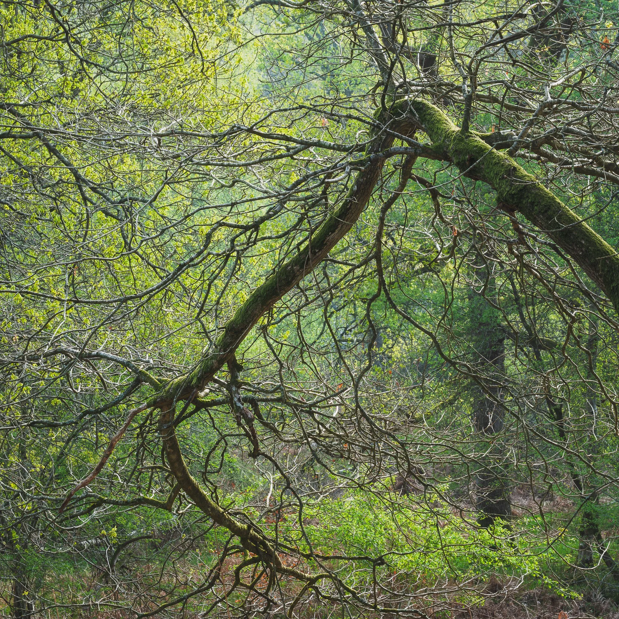
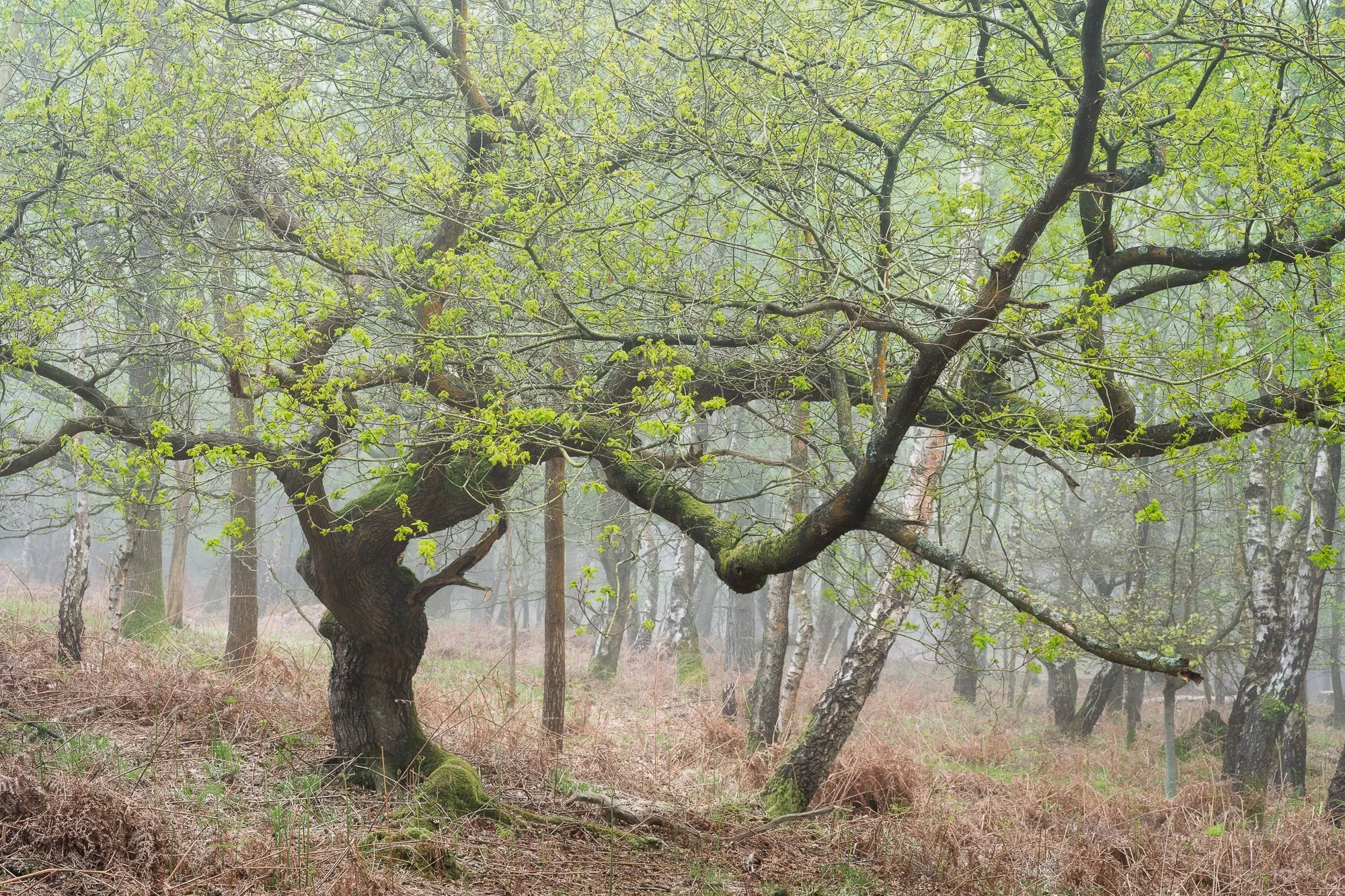
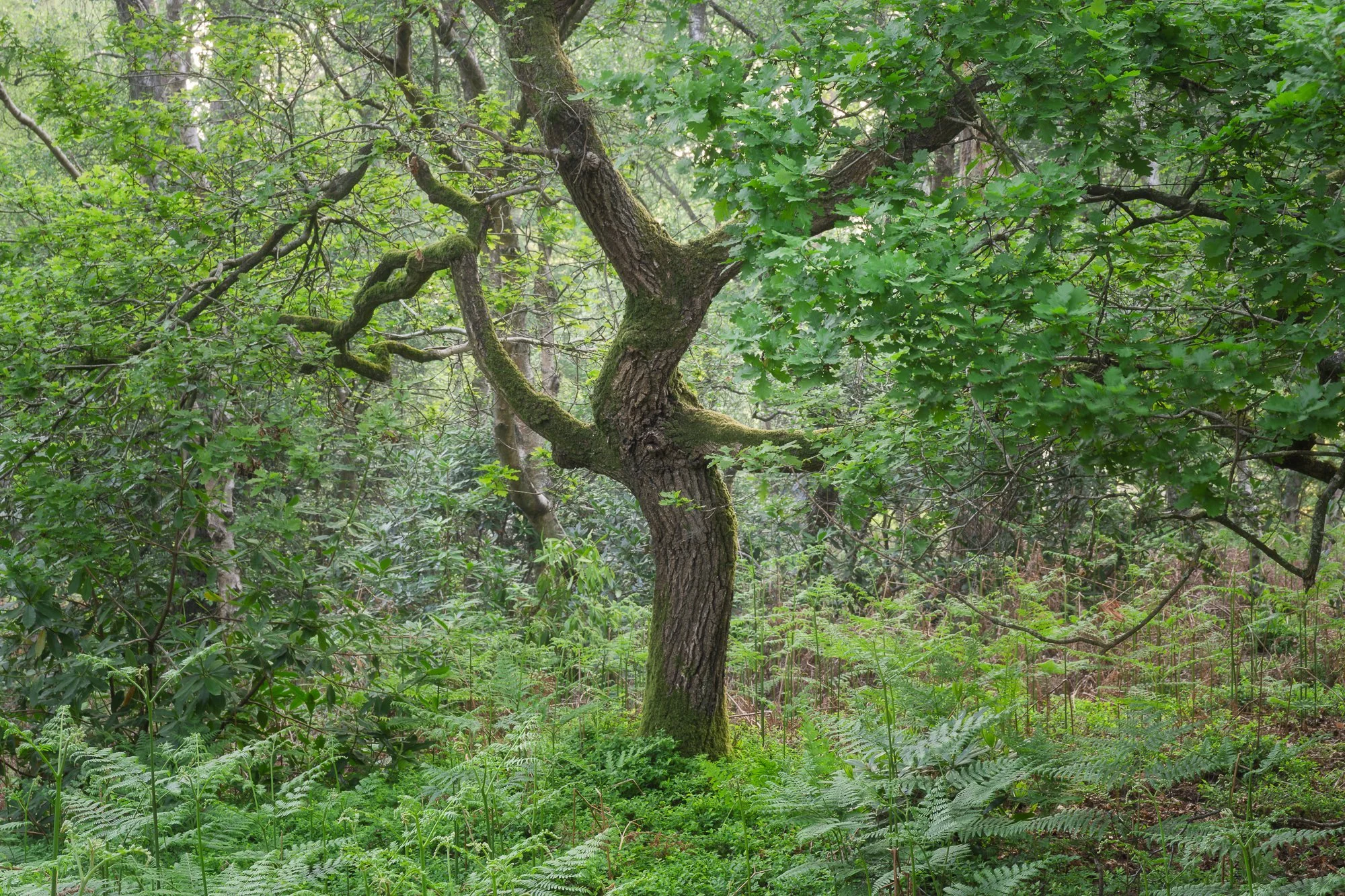
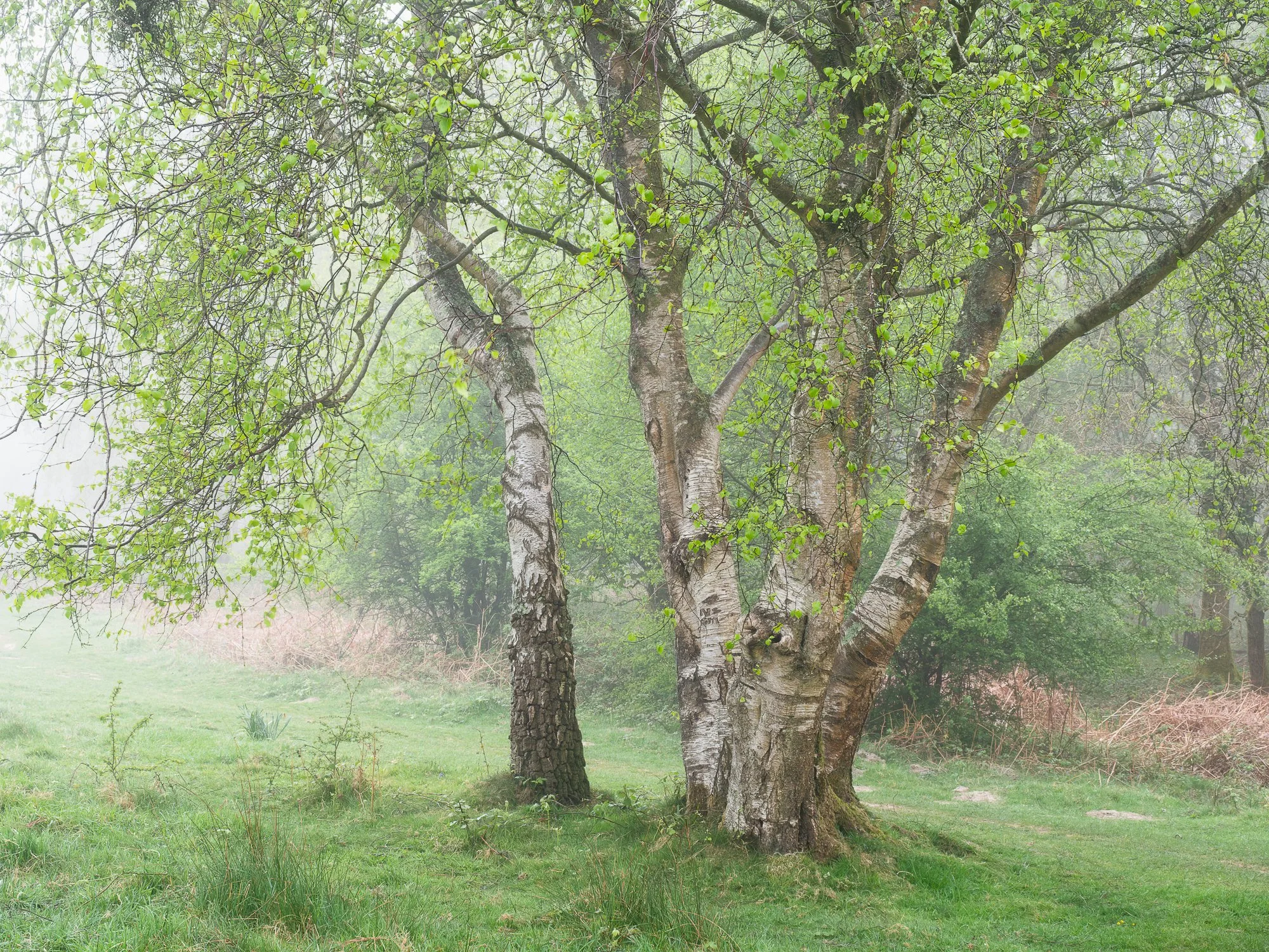


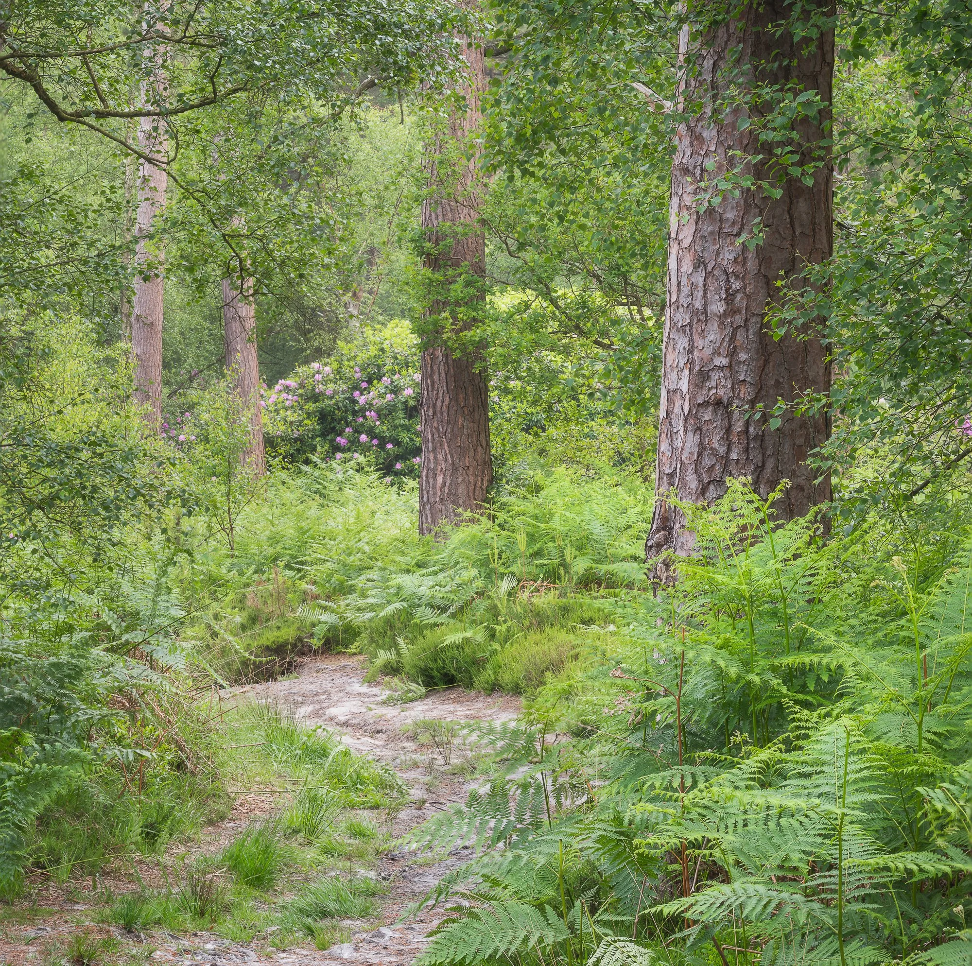
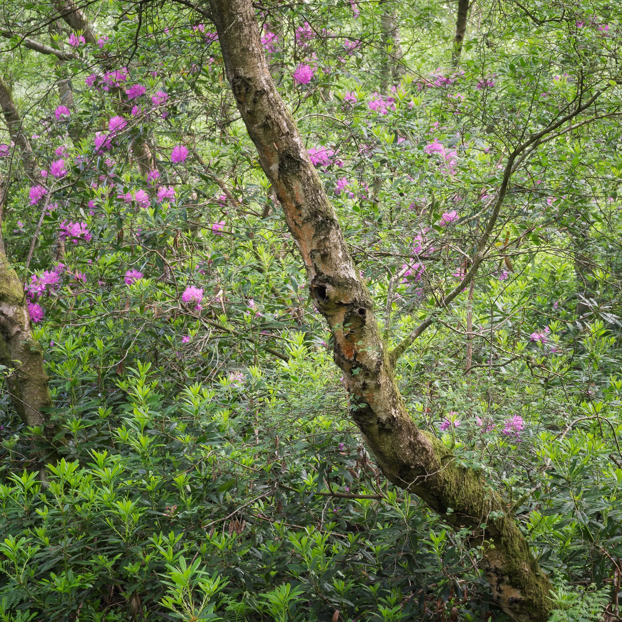
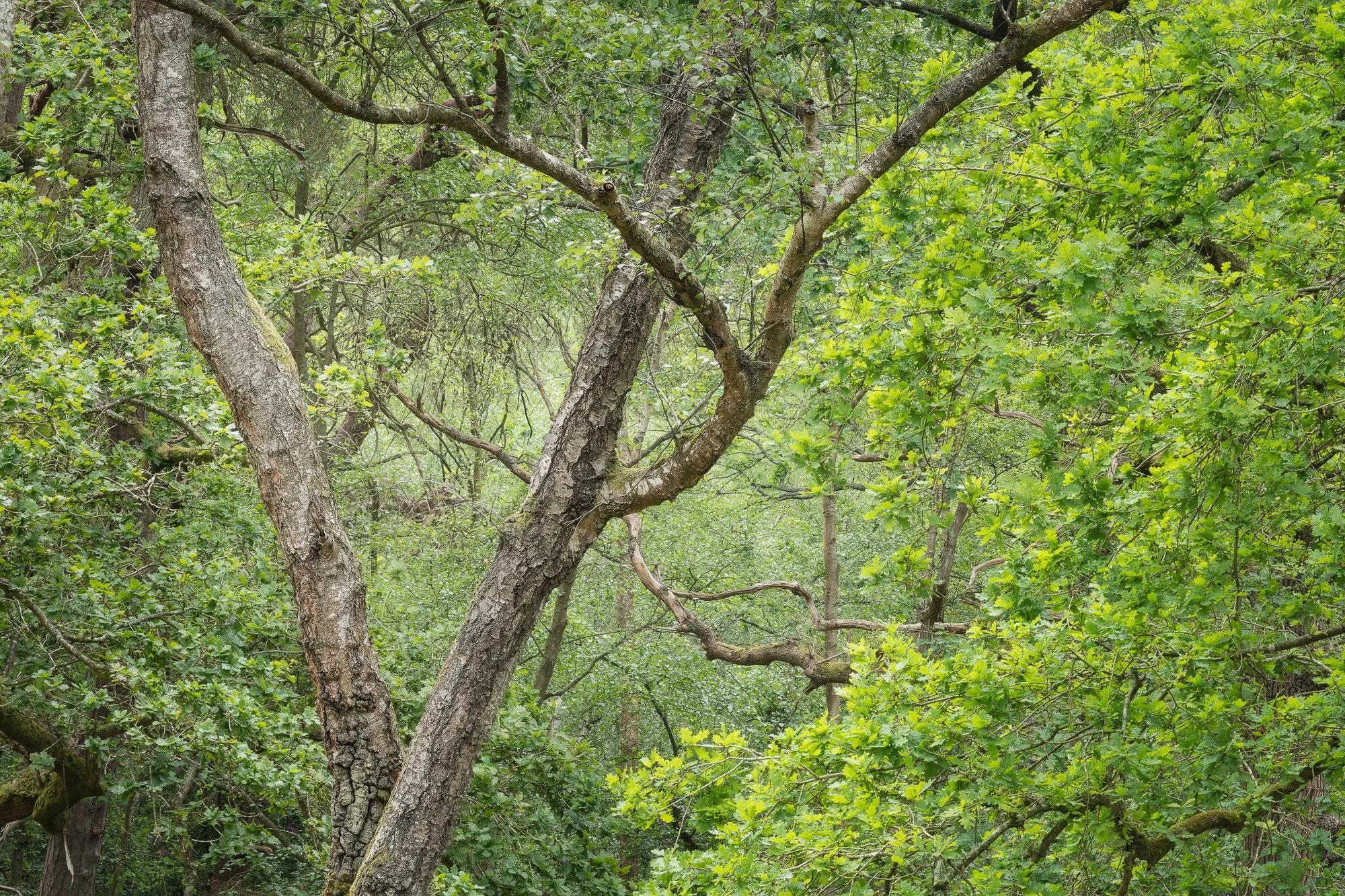
Seascapes in Cornwall
Back in April, I spent a few days on Cornwall’s south coast. It was a last-minute family getaway for some much-needed R&R in Polperro. Being early in the season — and with some pretty miserable weather (the colour in the sky in the first image was definitely the exception) — this small but usually popular fishing village was blissfully quiet during our stay.
I wasn’t there to spend loads of time with my camera, but I did pop out a couple of times and spent a few hours by the water taking pictures. I’ve posted a few of my favourites below.
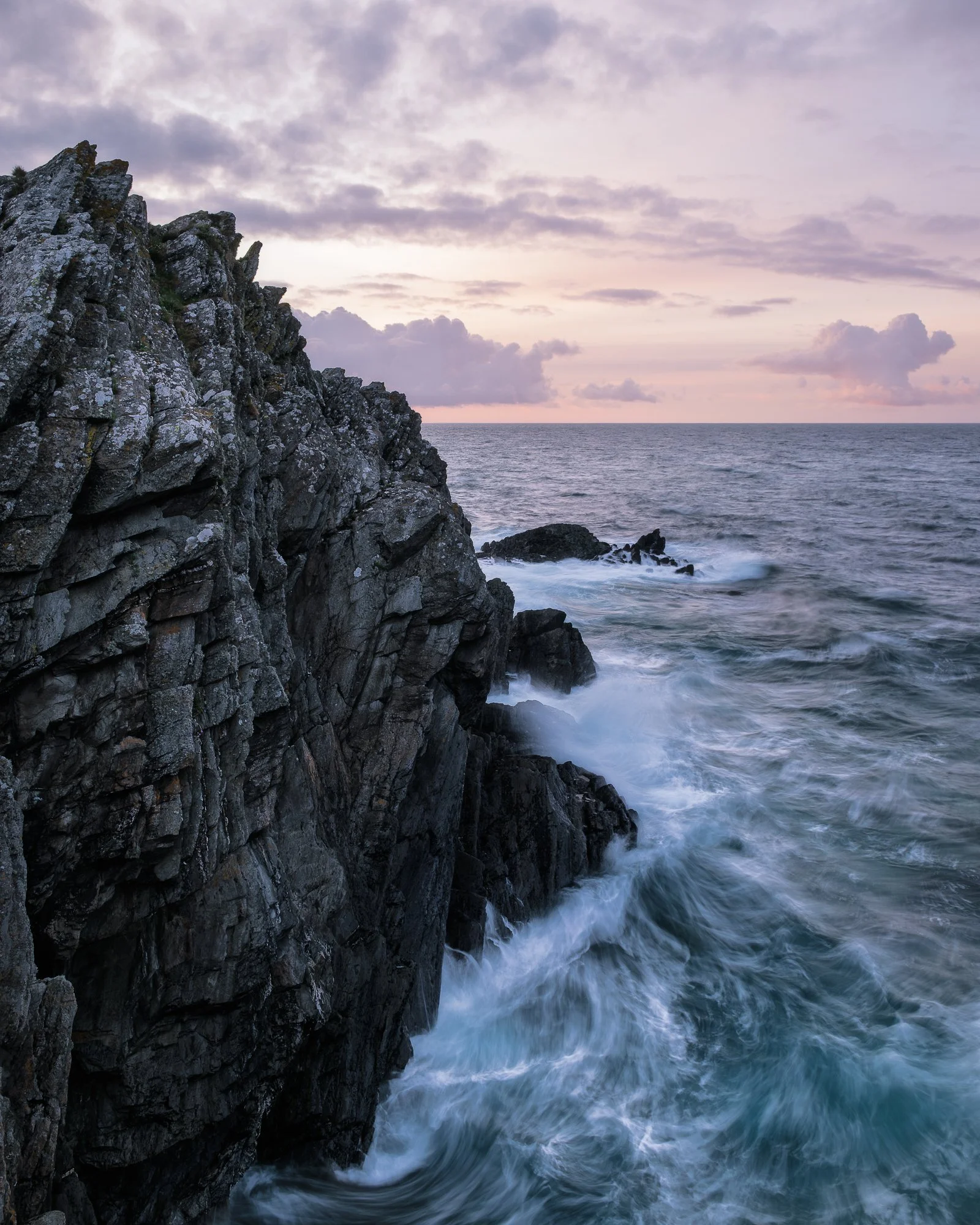
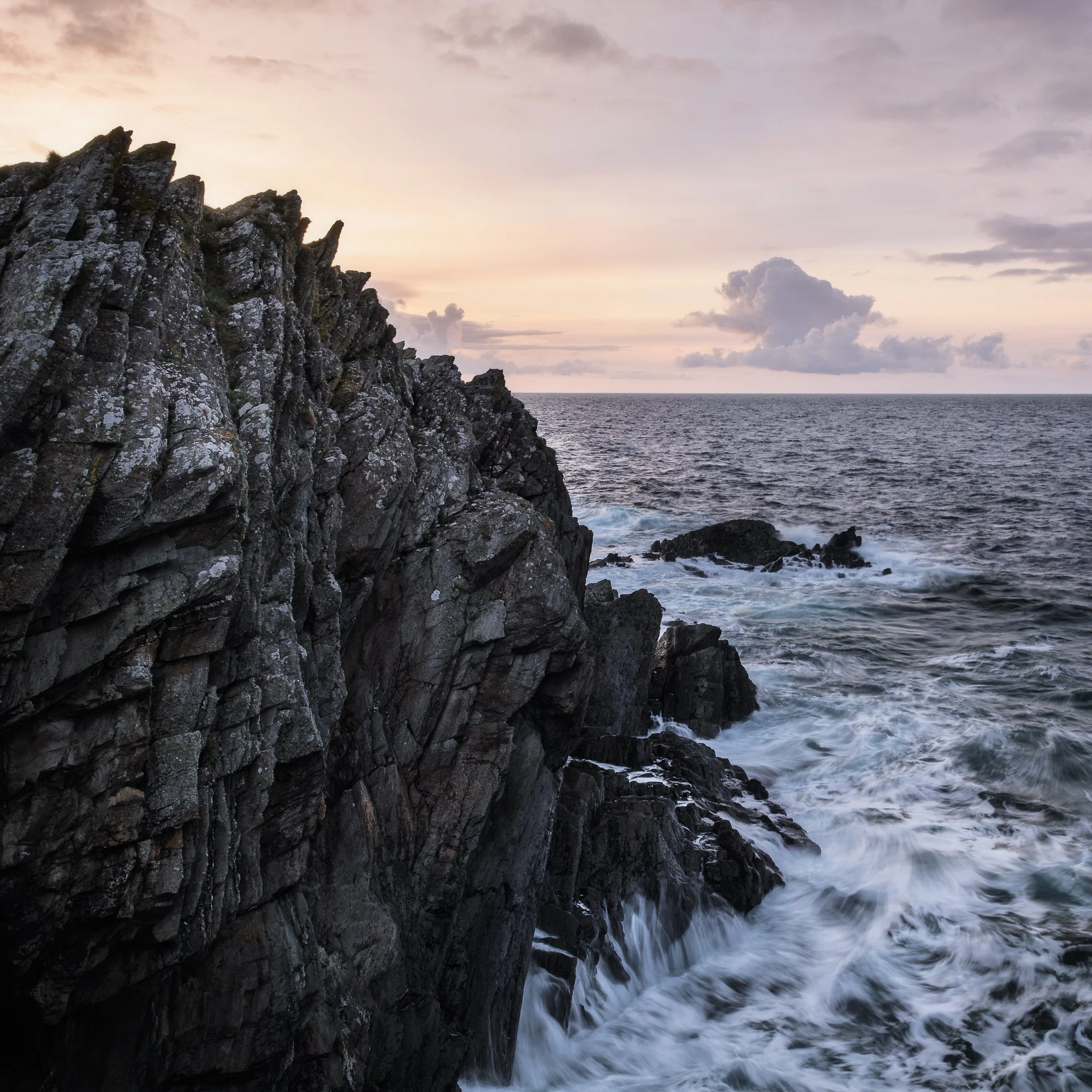

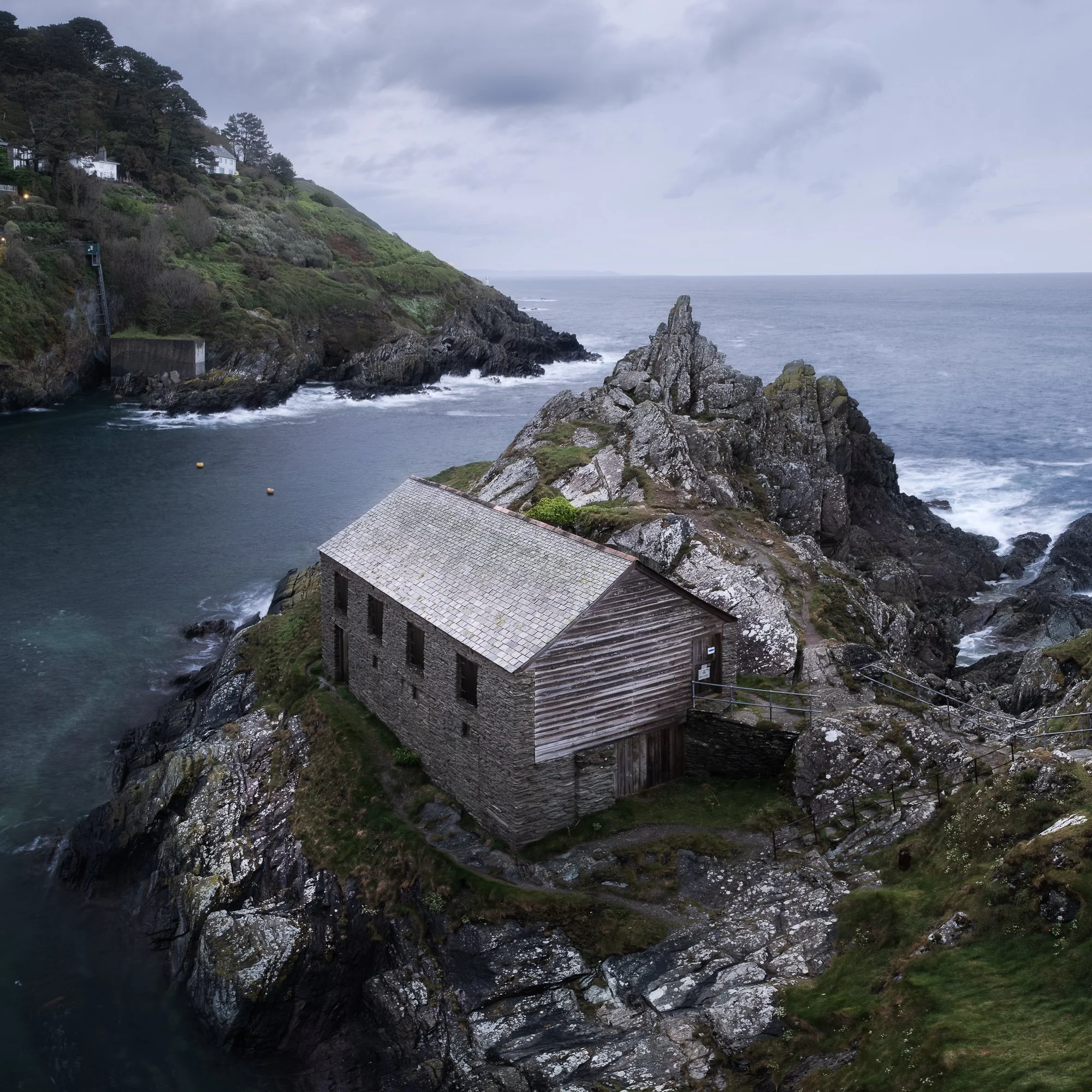
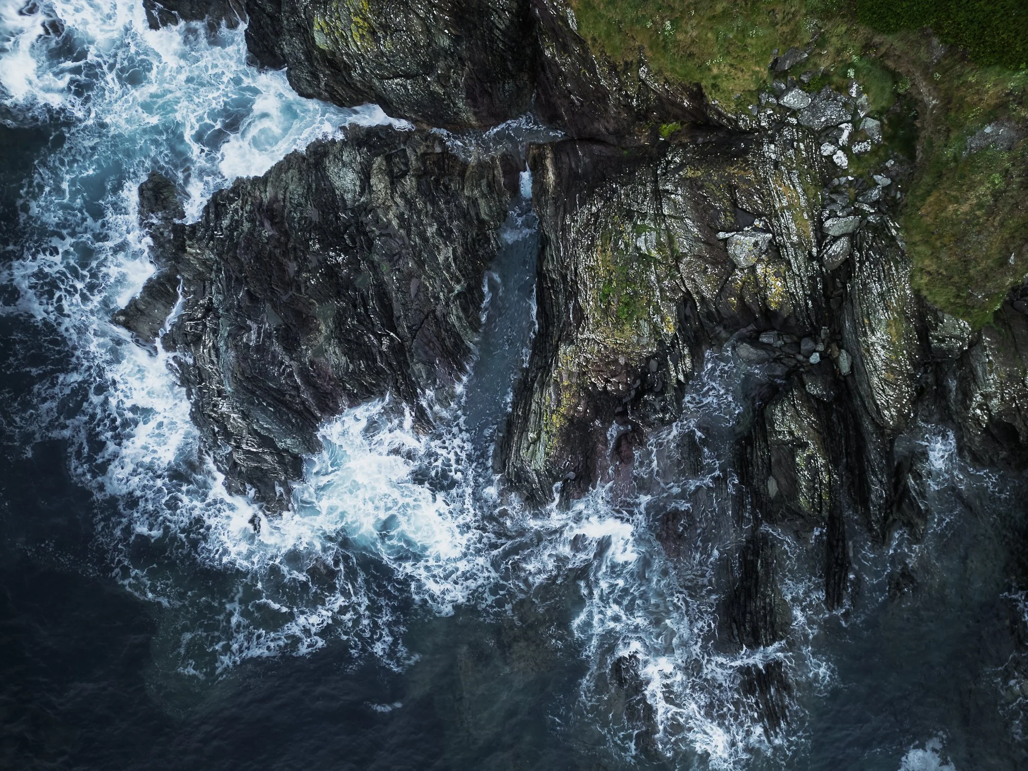

Photographing the Landscape
Apart from my trip to Snowdonia, I didn’t really spend much time photographing the wider vistas or more “traditional” landscapes this spring (and so far, the same could be said for summer too!). I’m not entirely sure why, other than splitting my time between photographing London for my Timeless City project and exploring the woodland, which hasn’t left much room for anything else.
I did, however, manage to take an aerial photo with my drone in Sussex that I quite like. It was captured early one morning during a stunning cloud inversion. Underneath that drone photo, you’ll also find a few shots from a morning spent wandering the open heathland near my local woodland.
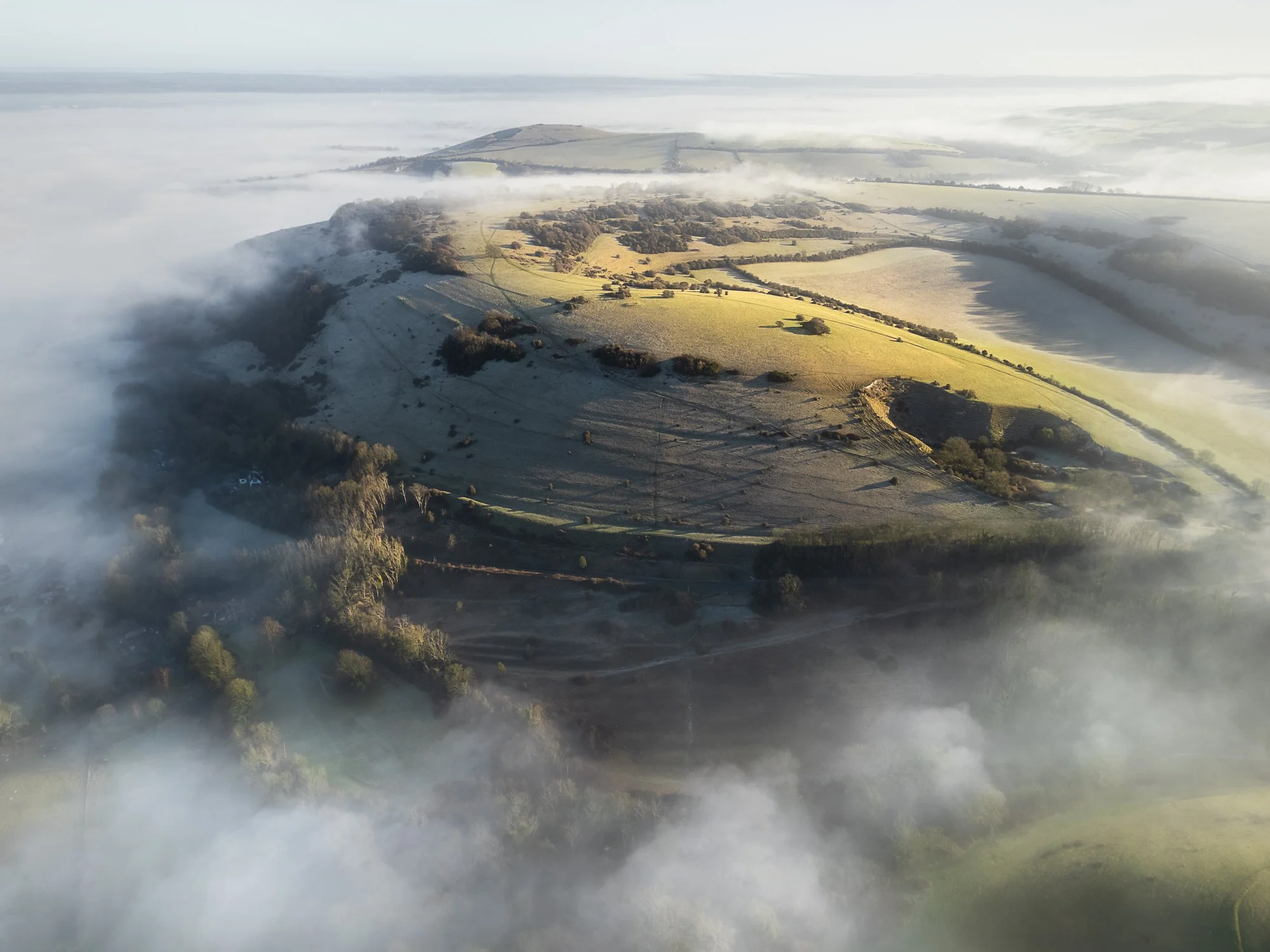

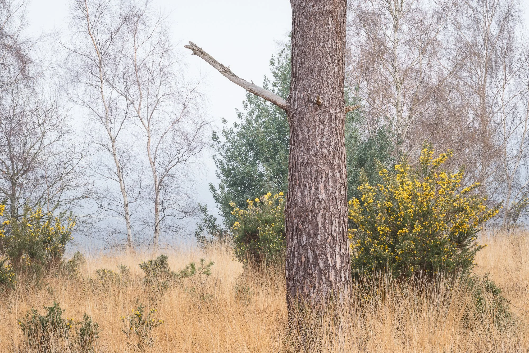
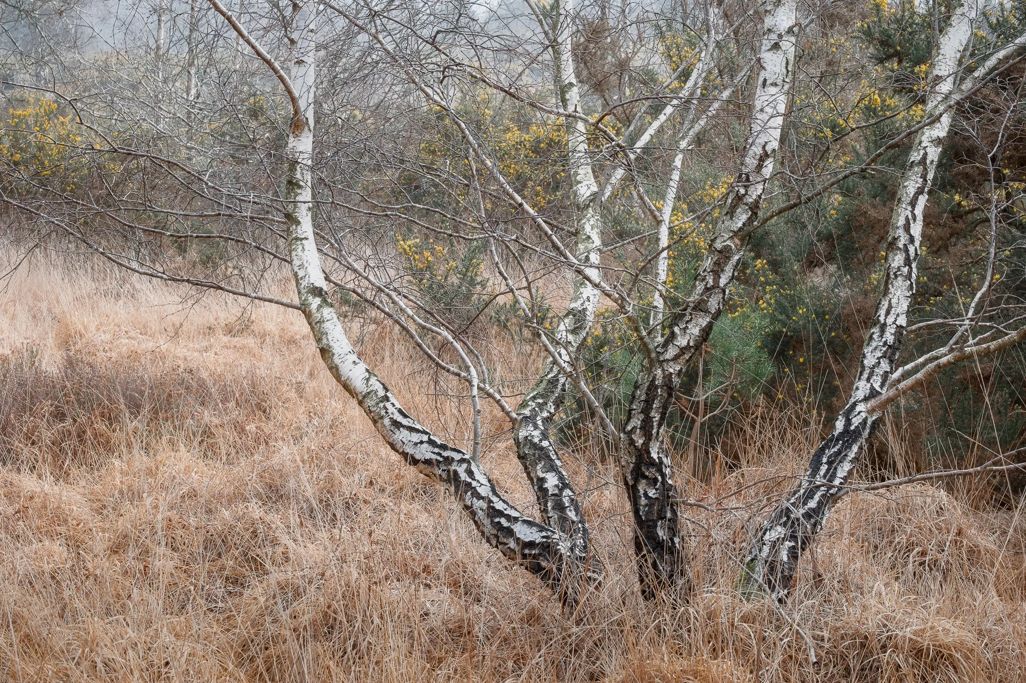
Just a quick note about the next few landscape photos. It’s a scene I photograph regularly, and it’s turned into a bit of a personal project to capture it in all seasons. I know I’ve shared similar versions many times before, but it doesn’t hurt to explain why, as it might seem a little odd to keep photographing this nice, but hardly “epic,” view.
This spot is right next to the woodland where I often shoot. Since I usually arrive before sunrise, with the woodland still dark, I’ll typically stop here for my morning coffee. Over the years, I’ve grown particularly fond of this view — sipping coffee, contemplating the world while the sun comes up. Visiting so often, through different seasons and changing conditions, I’ve built a small collection of photos of this single view. I’ve taken wide panoramas, distant layers (like the one further below), and close-up shots of the treeline. I may one day post them here as a dedicated project, but for now, here’s the handful I captured this spring.

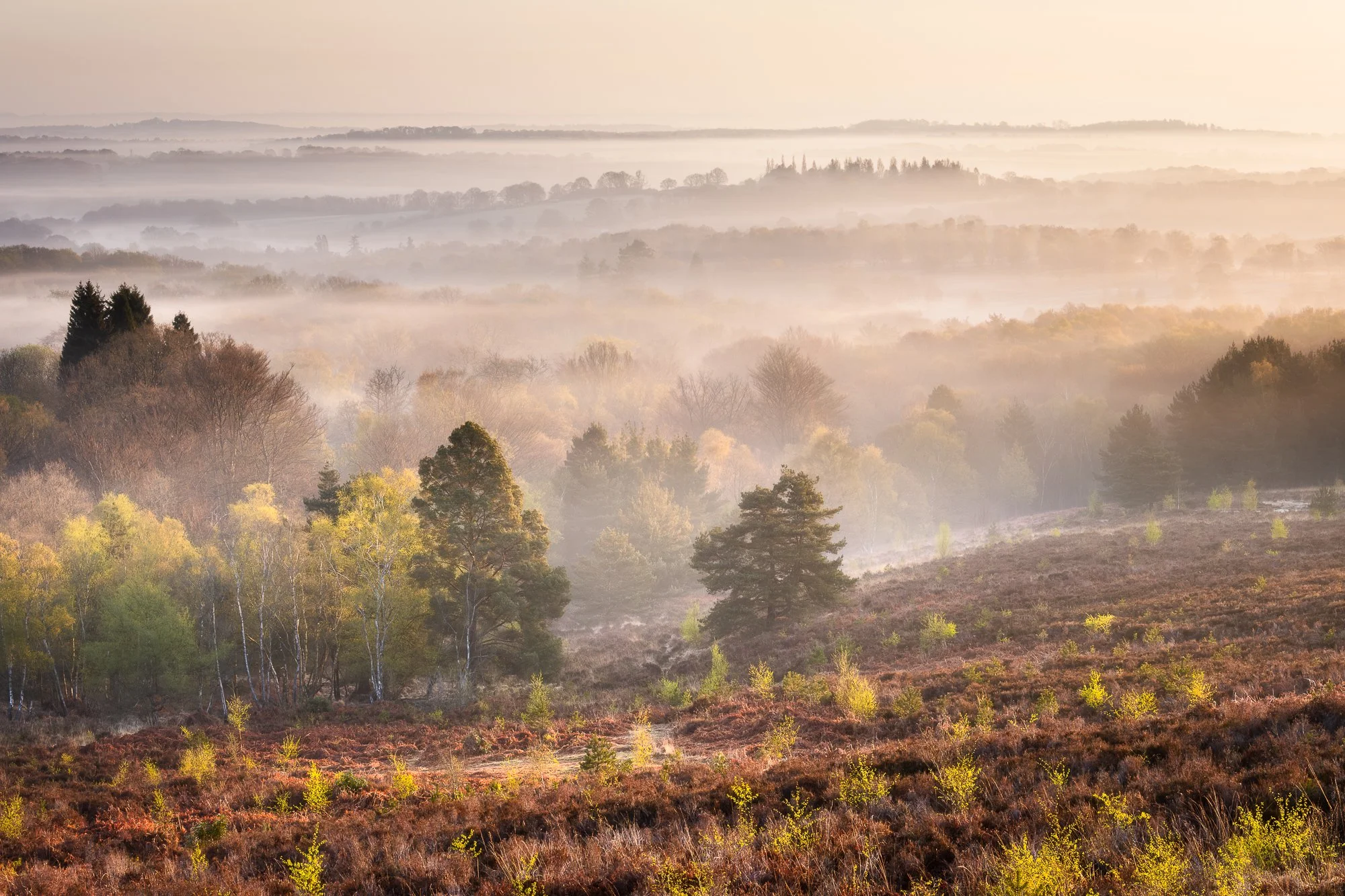


The London Cityscape
I purposely choose not to share new Timeless City work in these “new photo” blog posts. I think it’s because I see that project as something separate from my usual colour work, and I want to give it its own space on my website. During the spring months, I spent a lot of time in London photographing for this series, but still managed to take a few colour cityscape images as well.
The view of St Paul’s and the Millennium Bridge is by no means unique — it’s a composition I’ve shot countless times over the years and never really been happy with. Until now. I’m incredibly pleased with the photo below. The texture in the sky and water, and the subtle light across the scene, all work together to complement the dominant front-to-back architectural subject.

Another common theme running through much of my cityscape work is the use of the 5x4 portrait aspect ratio. It’s something I started experimenting with a year or two ago, and now I’ve built up a growing collection of London cityscape photos shot this way.


As I mentioned earlier, this is the sixth edition of my New Photos series. It probably deserves a dedicated home on my site someday, but for now, you can browse the previous releases by clicking the thumbnails below.


As ever, feel free to drop a comment below, as it’s always good to hear your thoughts about the pictures I take and how they might resonate with you.
Until next time,
Trevor

Reflected Light - Volume One by Ben Horne | My Photo Bookshelf
The first in Ben Horne’s Reflected Light zine series features large-format film photographs from one of his seasonal outings to Zion, Death Valley, and southern Utah.
If you weren’t already aware, Ben Horne is a large format landscape photographer from the United States, best known for his beautifully composed, carefully crafted images captured on 8x10 film.
I’ve followed Ben’s work for a few years now, primarily through his YouTube channel and website, and I’m a big fan of both his photography and how he approaches his craft. I’ve already bought one of his books with my own hard-earned cash — Between the Wind, published by Kozu Books, but, Just to be fully transparent, I received volume one of his Reflected Light series as a gift, along with a book by Guy Tal (another one to read and review here), as a competition prize from a podcast Ben used to host called Creative Banter.
Author’s Synopsis
Included in this zine is my favorite work from 2023, spanning my two winter trips, my spring trip, and my fall trip. Each photo is accompanied by text, along with information about the film, camera, and lens used.
My thoughts about the book
First of all, the zine itself. Printed on satisfyingly heavy, uncoated recycled paper, it feels great to flick through, and the photos, with their matte finish, look fantastic on the page. It’s a perfect example for anyone who doubts the quality of lower-cost zines compared to traditional photo books.
Inside, the zine opens with a short introduction by Ben and then goes straight into the images. Presented in various orientations and sizes, he’s done a great job adding variety to how the photos appear on the page, which makes the book flow beautifully. I particularly like the full-bleed portrait images; printed at 8x10 inches, they’re shown at their native size, so I get to experience them much like viewing the original film.
Alongside each photo are technical details like the film used and exposure settings, and nearly all are paired with a “behind the lens” story. These add great context, offering insight into what drew Ben to the scene, how repeated visits paid off, and the subtle compositional choices that made the final image work.
I mentioned above that I received this zine as a gift from Ben, but I strongly believe that artists should be supported, and alongside buying his first book, Between the Wind, I have since purchased a copy of the sequel to this Reflected Light zine, and will post my thoughts on that one at a future time.
This edition is now sold out, but if you’re only just discovering Ben’s work or this zine series, I’d recommend subscribing to his newsletter and keeping an eye out for the next release.
Book Details
Soft cover zine
Size: 8” x 10”
Pages: 32 (18 images) - 100% recycled uncoated paper stock
Availability at the time of writing: Out of stock, but in the unlikely event this zine is reprinted, it will be available on Ben Horne’s website here: https://www.benhorne.com/store
Until next time.
Trevor

Photographing a Summer Woodland
I enjoy a fantastic morning in early June photographing a local woodland
Photographing the woodland in summer can be a bit of a challenge. The overwhelming green tones and lack of contrast between the trees often make it harder to pick out strong compositions. Dense foliage — particularly the ferns in my local woodland — also makes it more difficult to stray from the established paths, so exploring new areas can be tough going. On top of that, I prefer to photograph the woodland before sunrise, taking advantage of the softer, diffused light. But those early alarm calls definitely take some of the fun out of it. So it begs the question: why do I even bother?
Despite the difficulties, the summer woodland can be an incredibly rewarding place to be. The vibrant colours, the sounds of wildlife, and the cool early morning temperatures often lift my mood and set a positive tone for the rest of the day. And when the forecast calls for high humidity and little to no wind — the perfect conditions for mist or fog — that's all the encouragement I need to charge the batteries, pack my bag, and set the alarm for another early start.
Even when all the signs point to great conditions for woodland photography, it often doesn’t go the way I’d hoped. But one thing’s for sure: I never regret an early morning walk through the forest — even if the camera stays in the bag the whole time. As I mentioned, whether I take a photo or not, getting out early always gets my day off to the best possible start.
That said, it all comes together now and then — and that’s exactly what happened in early June, when I had a fantastic morning photographing my local woodland in misty conditions.

Fujifilm XT5 | XF50-140mm | 50mm | 1.5 Seconds | f/9 | ISO400

Fujifilm XT5 | XF50-140mm | 73mm | 1.5 Seconds | f/9 | ISO400

Fujifilm XT5 | XF50-140mm | 50mm | 0.8 Seconds | f/9 | ISO400
The photo above is probably my favourite from the day. This woodland has a mix of trees — from the mighty English oak, the delicate silver birch, to the tall Scots pine. When composing images, I’m often looking to combine different species, as they tend to create interesting contrasts while also complementing each other.
Take the Scots pine in the photo above: it doesn’t have much in the way of gnarly character, but its tall, straight trunk contrasts nicely with the more irregular shapes of the other trees, helping it to stand out, building a stronger, more varied composition.

Fujifilm XT5 | XF50-140mm | 50mm | 0.8 Seconds | f/9 | ISO400

Fujifilm XT5 | XF50-140mm | 140mm | 1 Second | f/9 | ISO400
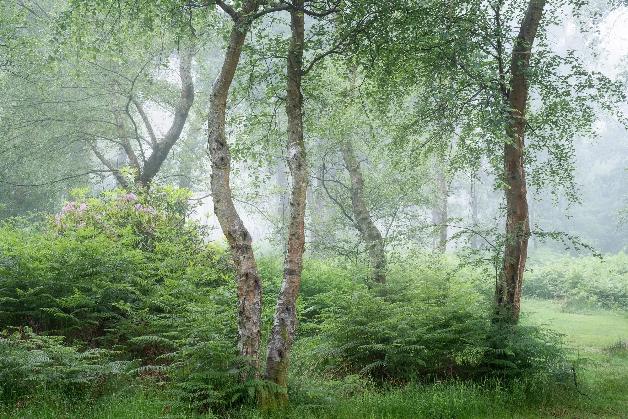
Fujifilm XT5 | XF16-55mm | 35mm | 0.5 seconds | f/10 | ISO400

Fujifilm XT5 | XF16-55mm | 49mm | 1/4 second | f/10 | ISO400

Fujifilm XT5 | XF16-55mm | 55mm | 1/8th second | f/10 | ISO400
On most outings with my camera, I’m happy to come home with one — maybe two — photos I’m pleased with and want to keep. But every so often, everything falls into place, and I come back with a much larger set of images I’m genuinely happy with. This was one of those times.
I’ve lost count of how often I’ve been out in great conditions but just couldn’t find a composition. My brain needs to switch into “composition mode,” and no matter how much I try, I can’t force it. My most enjoyable trips — and often my best work — happen when compositions seem to appear on their own, without much effort on my part. It doesn’t happen often, and usually I have to work much harder. But on this rare occasion, the scenes seemed to present themselves without too much hunting.

Fujifilm XT5 | XF16-55mm | 38mm | 1/3rd second | f/10 | ISO250

Fujifilm XT5 | XF16-55mm | 55mm | 1/5th seconds | f/10 | ISO250

Fujifilm XT5 | XF16-55mm | 37mm | 1/8th second | f/10 | ISO250
So, why do I keep setting those ridiculously early alarms during the summer? For mornings just like this one. The quiet, the mist, the soft light—they make the effort worthwhile. Even when the shots don’t come easily, being out there always gets my day off to the best possible start.
If you’re thinking about trying woodland photography yourself, I’d say don’t be discouraged by early starts or tricky conditions. Sometimes the best shots come when you least expect them. Keep exploring, and enjoy the calm of those quiet mornings.
If you enjoyed this post, feel free to check out more of my woodland photos or share your own experiences in the comments!
Until next time.
Trevor